


")
")


Mama Irene is an award-winning Greek handmade pasta brand, featured in Michelin-starred restaurants and prestigious retail stores such as “Galeries Lafayette” in Paris.

With growing exports and global awareness, the founding family decided to invest in a new visual identity that would emphasize the quality of their products and strengthen their international presence.
Over time, as more elements such as awards and certificates were added to the packaging, without a clear system, the design became messy.
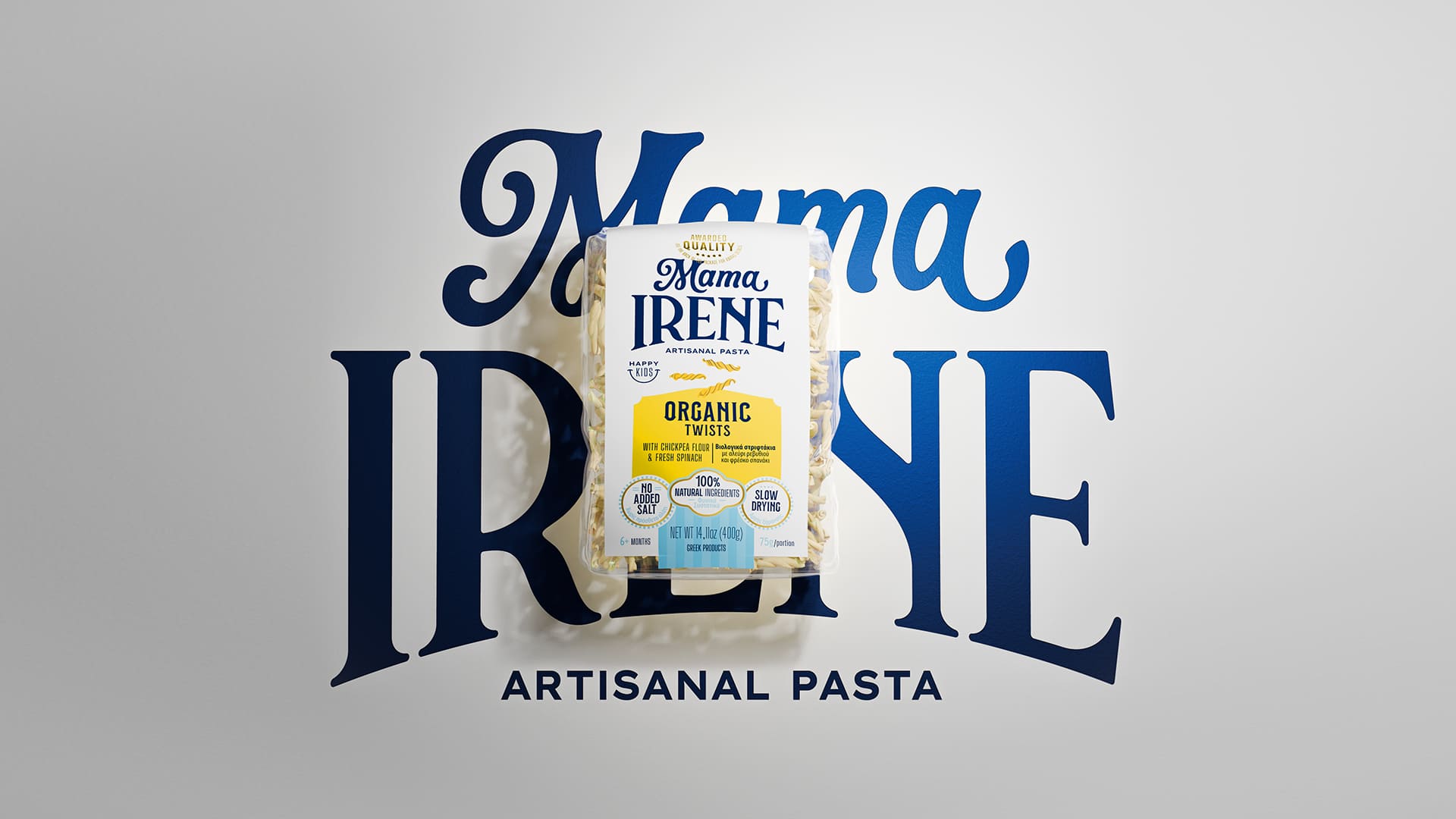
The new brand was created to convey the essence of handmade pasta while respecting family traditions. It stands out on the packaging and leaves a lasting impression on consumers.
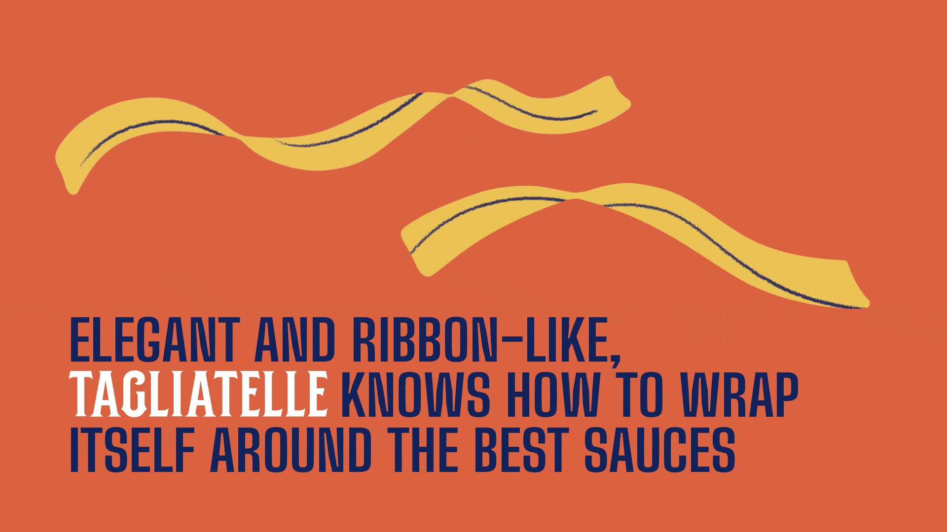
Illustrations were created to bring each pasta variety to life: fusilli became curly hair, orzo formed the treetop, and together they built Mamaland, a whimsical world where one can slide down a tagliatelle or dive into a pool of tomato sauce. Each product received its own illustrated representation, making the different varieties easier to distinguish.
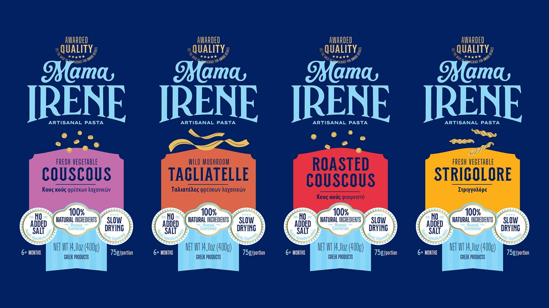
To organize the wealth of information that the brand needed to convey, we created a system of stamps and badges. This structure made it easier to present information in both Greek and English, eliminating the clutter of previous layouts.
The main challenge was to convey the playful spirit of the brand, without straying from the childish, balancing lightness and sophistication, while taking into account the high quality already recognized by consumers worldwide. The brand palette combines the colors of the Greek flag with bright accents of orange and light blue, creating contrast and freshness.
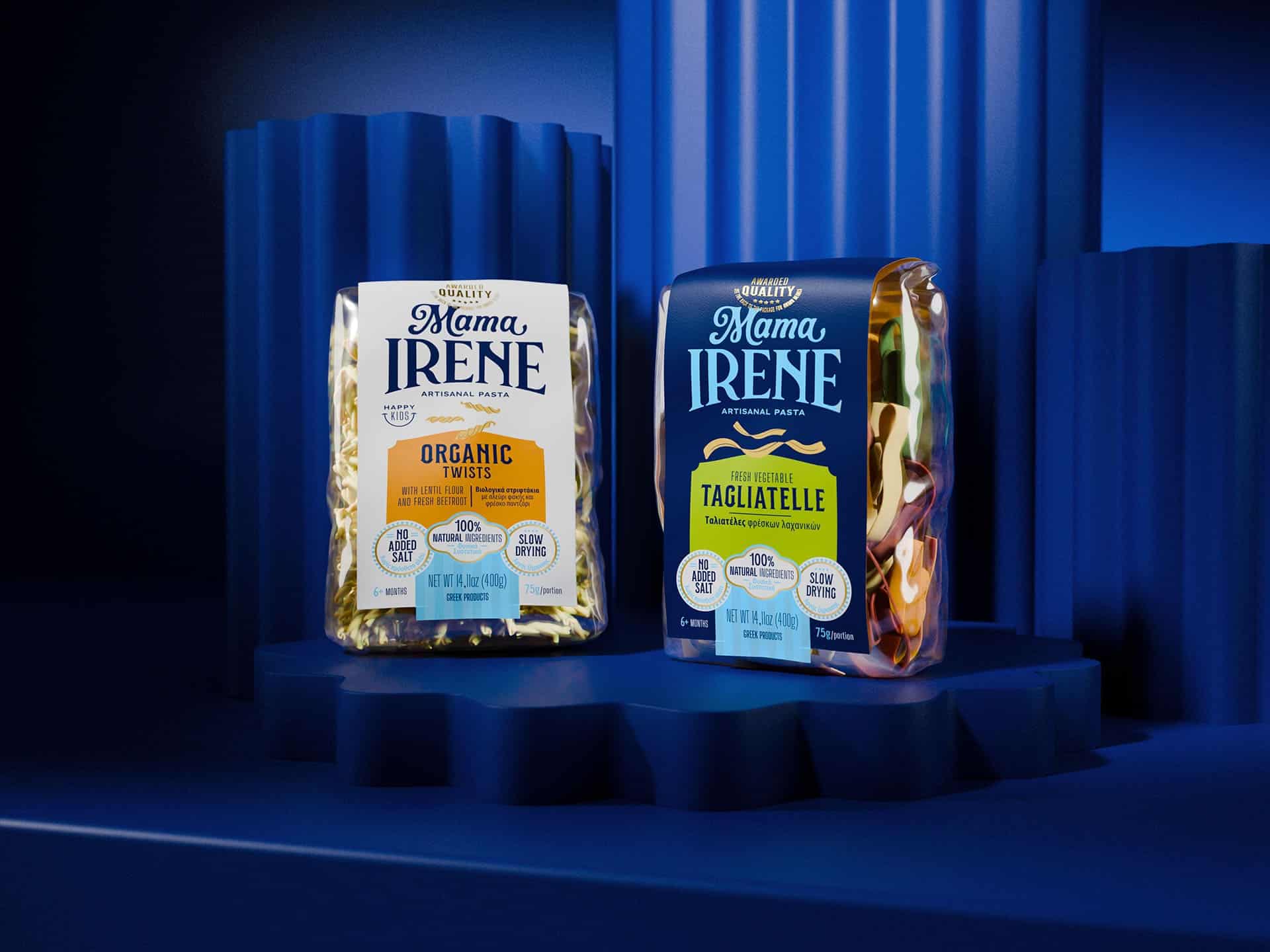
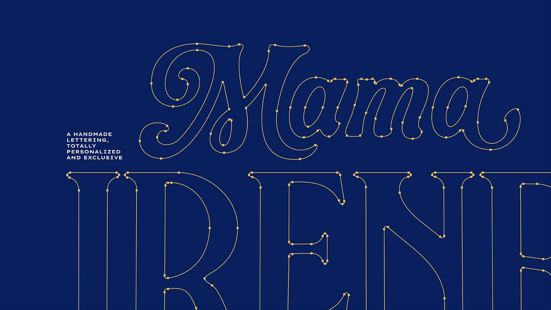
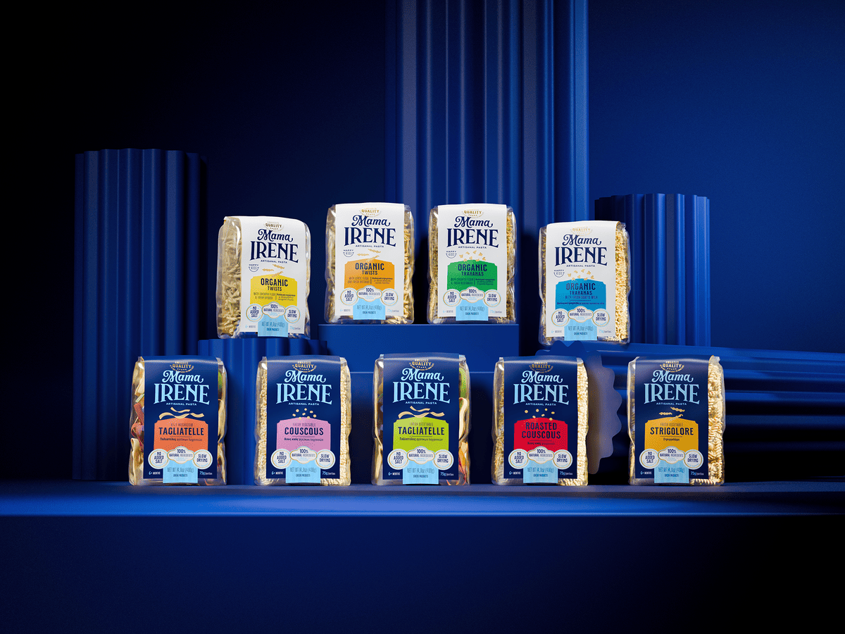
The typography reinforces this universe, combining modernity and tradition to express a unique position in the global market. On the packaging, all visual elements have been reorganized with a clear hierarchy, ensuring easy navigation and communication. A specific product color palette has also been introduced: bright tones distinguish each SKU, while base colors play an important role in all lines – dark blue for the traditional line and white for the organic line.
The process found a balance between the Greek heritage and the spontaneity of the founders, resulting in a vibrant, authentic, and proud brand. Avoiding the Italian clichés commonly used in the pasta category, Mama Irene confidently conveys its Greek identity, standing out with its uniqueness, memorability, and cultural expression.
Credits:


