


")


")


YouTube celebrates 20th anniversary and unveils bold brand evolution
This is one of the most eye-catching rebrands.

YouTube has updated its iconic red color with a new red-to-magenta color to celebrate its 20th anniversary, improving visual appeal and color consistency across devices. The subtle update improves accessibility, encourages user interaction, and reflects the platform’s ongoing evolution. The change may seem small, but it’s a smart design update with big implications.
The popular platform has unveiled a brand new global marketing identity, unifying its short video, music, TV, Premium, and kids brands into one unified design ecosystem. Featuring a cohesive structure that embodies YouTube’s playful spirit, the refreshed brand is flexible and dynamic, showcasing a vibrant identity that is ready for the future.
While we might think the best branding changes are a complete makeover, YouTube shows how tweaks, not redesigns, can be just as effective. With a new font, custom illustrations, and immersive motion design, YouTube’s new look is a beacon of creativity.
“When a brand lives everywhere, it risks feeling like nowhere,” said Kieran Mistry, head of design at YouTube’s Creative Studio EMEA and a leader on the rebrand project, in a press statement. “Our task wasn’t to reinvent YouTube, but to design a system that connects its many sides – unified but never uniform.”
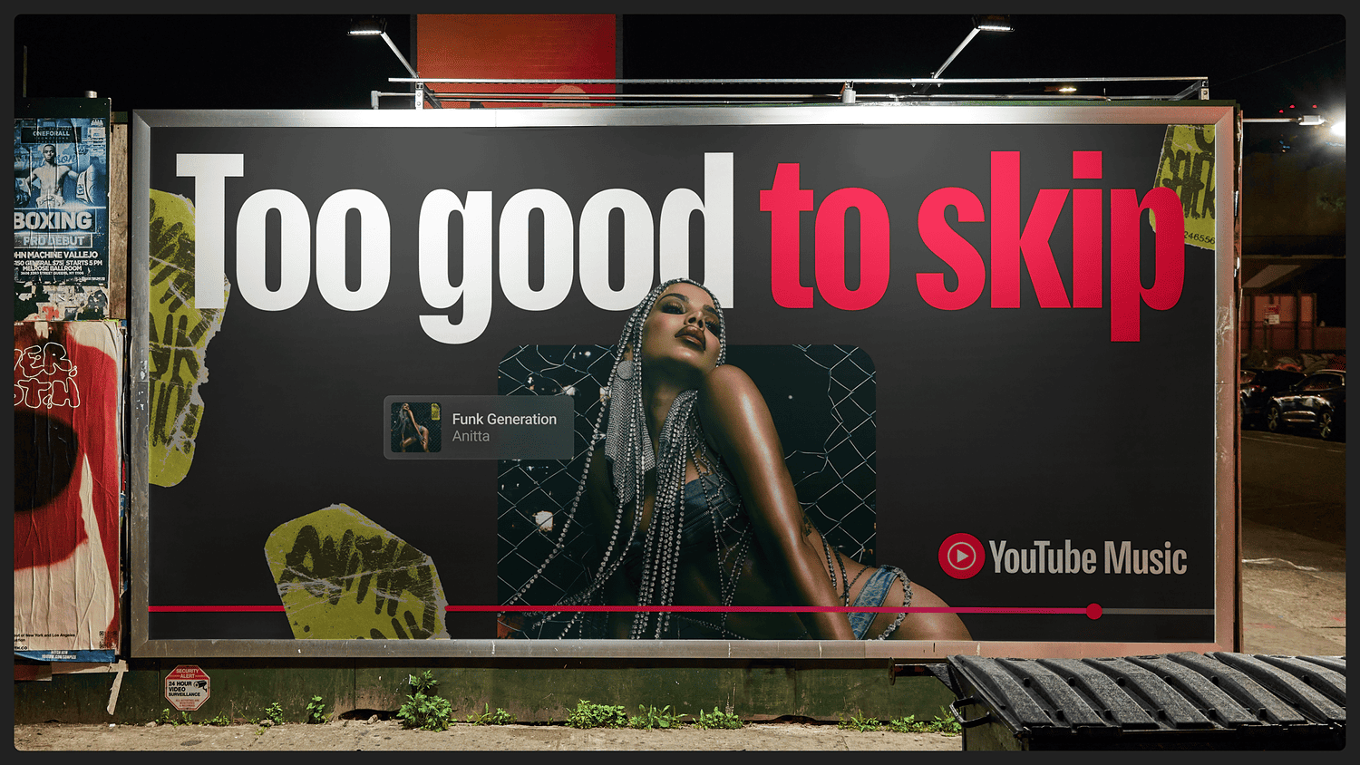
A demo of the new motion identity shows YouTube clips that move back and forth and jump in response to what’s happening on screen, mimicking the feel of creators’ videos. Other changes may be harder to notice for the average viewer. YouTube’s signature red, black, and white color scheme is still in place, as are user interface language like “like,” “comment,” and “subscribe.”
In the announcement, YouTube highlighted its desire to move away from a static visual language while emphasizing that its site is a full-fledged entertainment destination. The broader social media landscape is also changing rapidly, with the rise of generative artificial intelligence – one of Google’s main focuses – and the introduction of more e-commerce features to make video content easier to buy.
The creative team didn’t want to tear down YouTube’s existing identity, but rather enhance its iconic elements. “Our challenge wasn’t to reinvent YouTube, but to create a system that brought together its many facets – unified but never the same,” says Kieran Mistry. “It’s already a cornerstone of the internet. Our job was to evolve what people know and love, and make it feel expressive and connected for what’s next.”
In keeping with YouTube’s iconic brand, beloved elements like the iconic red, white, and black palette, the play bar, and UI cues have been revived. A new YouTube Display font, created in partnership with Sharp Type, brings new consistency to the brand, while illustrations created in partnership with Gesture Systems add a fluidity and playfulness that reflects the pillars of the brand.
In a first for the brand, new motion assets like the ‘Camera Shake’ bring an organic feel to the brand, reflecting the rhythm of content to create flexibility across the brand ecosystem. “The brand isn’t static anymore,” explains Matt Saint, who led design alongside Mistry. “It reacts to real content and culture. Evolving alongside new products, technologies, and audiences as YouTube continues to grow.”
Credits:
All images courtesy of YouTube.


