


")

")


Dragonfly Wine – unique brand identity and label design
Elegant wine bottle, label, and exclusive style.

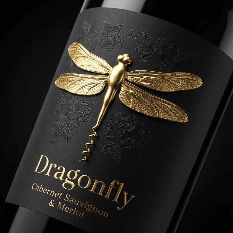
Dragonfly Wine branding, created by Packagenius design studio, explores how a brand symbol can evolve into a functional design element and become part of the wine ritual itself. The core idea is built around the dragonfly icon, with its tail stylized as a corkscrew, transforming a natural form into a sophisticated tool.

This transformation transforms the dragonfly symbol from a decorative graphic into a meaningful brand signature. The symbol is no longer just on the label, but actively participates in the opening of the bottle, creating a direct connection between identity and experience. The corkscrew shape adds elegance and purpose, transforming the act of opening a bottle of wine into a ritual guided by the brand icon.
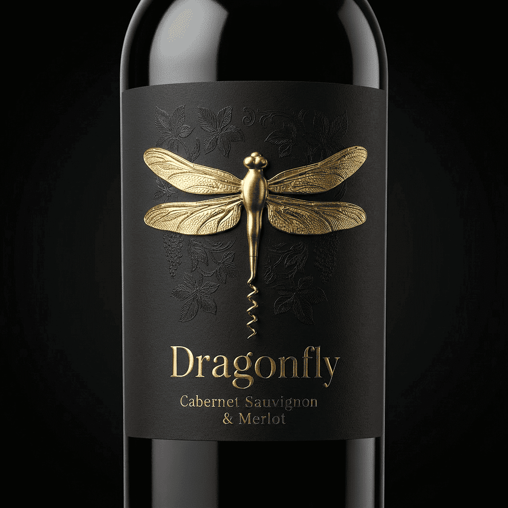
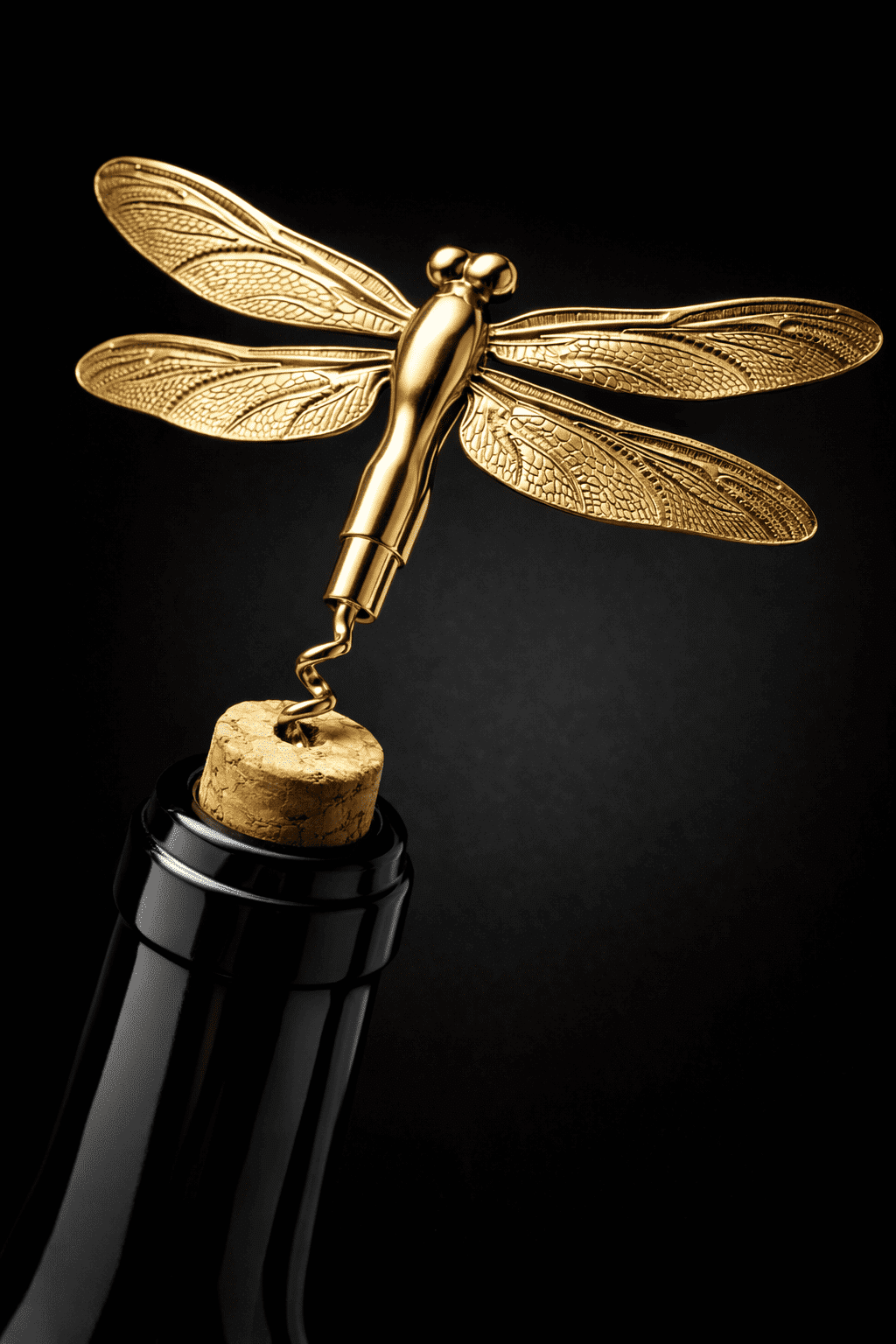
The visual language focuses on contrast and restraint. The matte black label is combined with a sculptural gold dragonfly symbol, allowing the icon to become a hero element. Subtle botanical textures complement the concept without competing with the symbol, reinforcing the idea of nature interpreted through craftsmanship.
This concept demonstrates how packaging can transcend aesthetics and become an object of interaction – where graphic design, symbolism, and functionality merge to create a distinctive and memorable wine brand experience.
Credits:
All images courtesy of Packagenius.


