


")
")


Profsoyuz gives Real Chips a loud packaging
The identity and packaging are designed for impact on shelves.

Real Chips packaging created by Profsoyuz is a new brand of corn chips aimed at a young audience that craves rich flavor, intense sensations, and lively interaction. The product is natural, crunchy triangles with bold flavors and a dense, rich crunch. No pretentious modesty.

The creative agency turned the triangular shape into the main visual element of the brand. It reflects the shape of the chip itself – sharp angles, sharp edges, confident appearance. The entire packaging system is built around this triangle, which acts as a compositional anchor and a strong visual symbol.
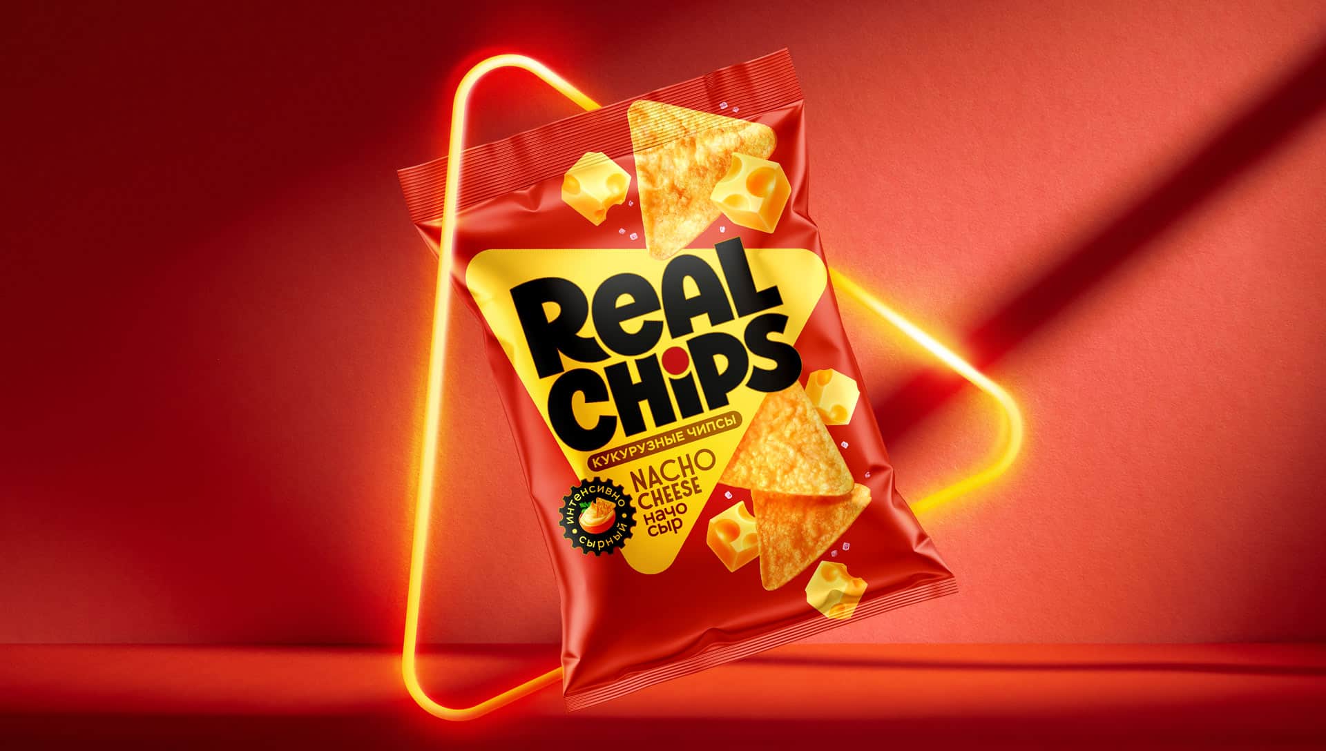
The logo is embedded within the shape – large, bold, and concise. The black color on a bright background creates contrast and style. The dot above the “i” is not just a typographic detail; it is a spice, a flash of flavor, a provocation in the word itself.
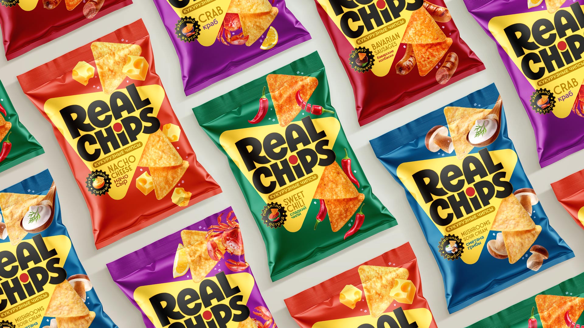
Each flavor has its own bright, distinctive background. Inert colors make it easier to choose on the shelf and maintain the integrity of the assortment.
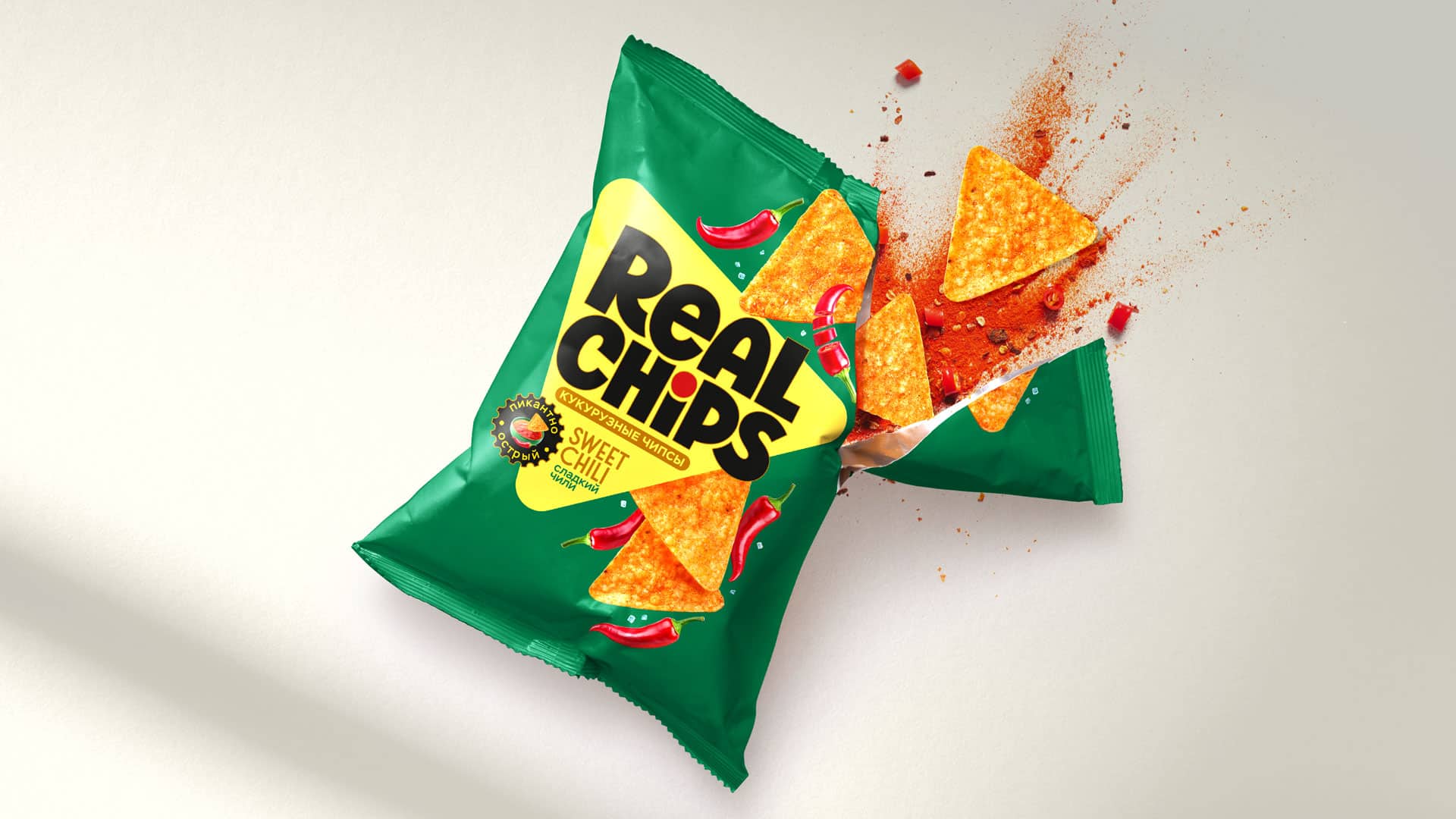
The food area is maximally customized and impressive. The fries look large and textured, with visible grains of salt and spices. Pieces of cheese, peppers, crab, mushrooms – everything looks juicy, realistic, and sincere. No illusions – just taste.
The design is not overloaded with details – everything on the package is designed for emotion, taste, and quick recognition. They have created a brand that says at first glance: this is really delicious. Real Chips does not pretend – they honestly show what is inside.

The result is packaging that looks crisp, stands out on the shelf, and makes a strong visual impression. This is not just any snack. It’s a visual strike against boredom and neutral brands.
Credits:
All images courtesy of Profsoyuz Creative agency.


