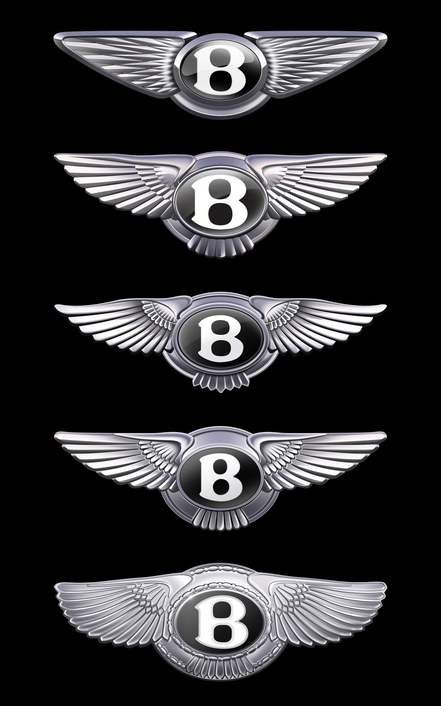
‘Bentley’ unveils a fifth logo change in 106-year history
Bentley is a luxury car manufacturer headquartered in Crewe, England. As we see before many car producers change their logo in luxury car segment the changes comes not so often.

Bentley has unveiled a simplified version of its familiar Winged B emblem, marking only the fifth branding change since the manufacturer was founded more than a century ago.
The new logo, which will appear on a new concept car to be unveiled on July 8, updates the “winged B” with wings that are “sharper and more dramatic than previous versions – more reminiscent of the angled wings of a “Peregrine Falcon”.
Take a look at the logo history of Bentley:

According to Bentley, the latest iteration, which was based on a concept by interior design team member Young Nam, is “the biggest change to the instantly recognizable mark in more than a century of history”. Then has been developed and detailed into the final version by Robin Page, supported by a small and dedicated internal team.
The main elements of the winged B emblem remain, but the wings are simplified and stylized in a diamond-shaped pattern, and the feathers under the central B are completely removed for the first time.
“If a luxury brand is the product of the stories it has created, then its emblem is its signature,” says Bentley director of design Robin Page.
“In an era of ever-increasing complexity and fidelity from digitalisation, an exercise of simplification and refinement is a modern necessity – and so the new emblem is cleaner, sharper and more impactful than its predecessor.”
“The new Winged B – and the concept car that introduces it – both symbolize a powerful, exciting future for this company and its exceptional, handcrafted products.”
The company also revealed a flat, line-drawn version of the logo, which is expected to be used as part of the branding, in an announcement video.
No matter how much the logo of this car has changed, it has retained its value by adapting to modern standards, and they are doing this well.


