


")


")


Display fonts are back in the spotlight
Display fonts, with their bold personalities and distinctive flair, are returning in modern design.

From web headers to packaging or logos, they appear everywhere, and for good reason. Today’s display fonts are smarter, more versatile, and better suited to the digital environment than ever before. 👀

If you’ve used display fonts in your designs before, you should consider whether they’re still as good as modern ones. Older designs have a limited number of fonts. And since modern variations are available in an unlimited amount, simply changing to a new font can give you a new experience and inspiration in creation of your designs.
bring character, clarity, and energy to any design project. Let’s go up to the whole article below. We hope you’ll find it needful.
What are display fonts?
Display fonts are fonts specifically designed for use at larger sizes. Unlike body text fonts, which are designed for long-term reading and subtlety, display fonts are designed to stand out. They are typically used for headlines, titles, logos, posters, and anything that requires visual impact.
They are not designed to be easy to read in paragraphs, but to convey the thought. These fonts can be “serif”, “sans serif”, “script”, “slab”, or “experimental”, but they are defined by their purpose: to grab attention, to highlight, and create a mood with just a few words. 👌
Display fonts creates an effect
There’s a reason why display fonts are making a comeback: they’re one of the easiest ways to give a design personality. With a single bold font, you can set the tone for an entire brand, campaign, or layout.
Display fonts work especially well in modern designs that inevitably tell a story because:
- They are able to grab attention instantly;
- They provide a unique style without adding extra graphics;
- They help reinforce a brand identity or convey the tone of a message in the simplest way;
- They give simple layouts an impression of individuality and completeness;
- They are used and preferred by the most important design and graphics studios;
- They are clearly and distinctly visible, and instantly understandable.
In times when scrolling is fast and attention spans are short, display fonts help your content stand out from the crowd, whether it’s a website banner or a social media ad.
Latest display font trends
The latest display font trends are setting the tone in the world of typography. Here, we’ll take a look at some of the key aspects and give you a sense of what’s hot right now:
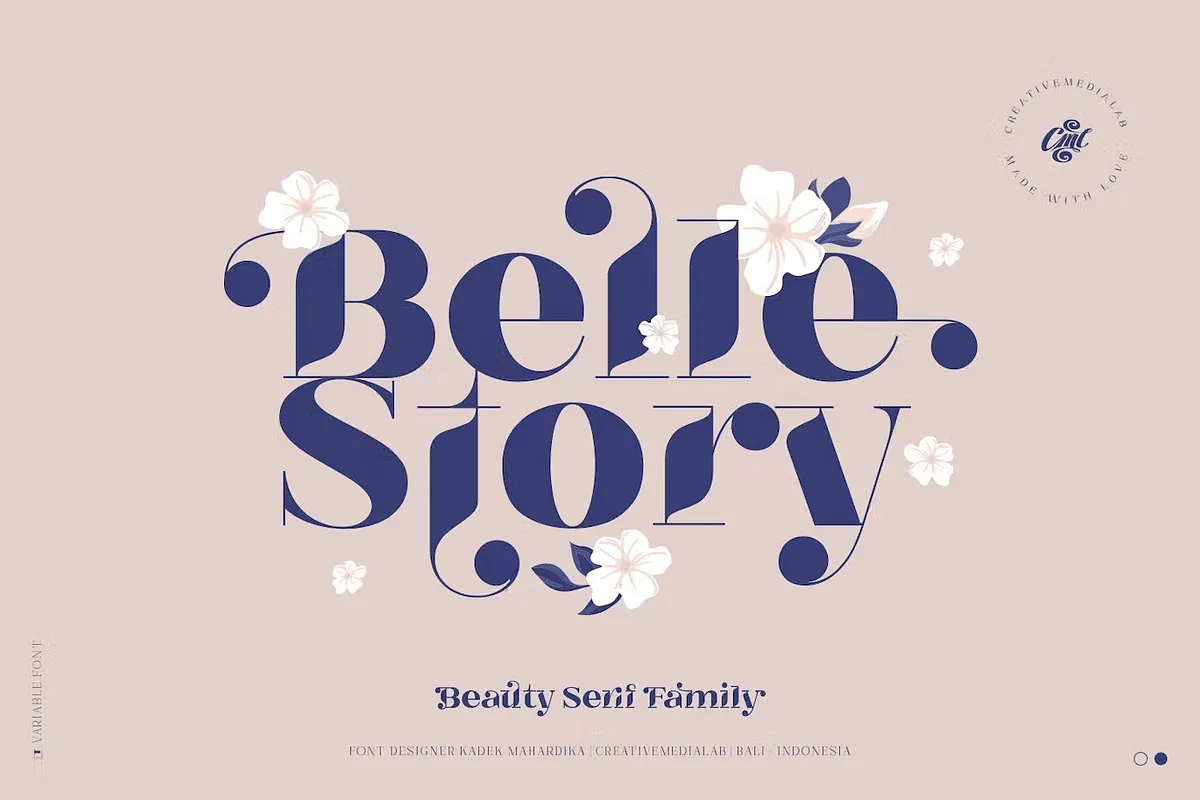
- Clean Minimalism
Modern minimalist display fonts are what really make a difference compared to previous fonts. Graceful shapes and letters created to the highest quality allow this type of typography to shine.
- Retro Booming
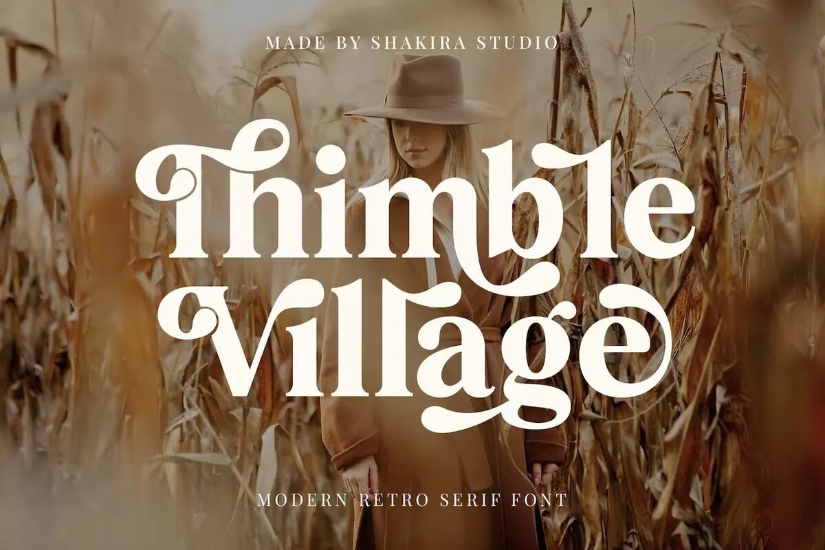
Many designers have created thousands of fonts that are both 70s, 80s and 90s, taking their retro style and making them modern, but with a touch of nostalgia. These retro fonts are definitely making a comeback.
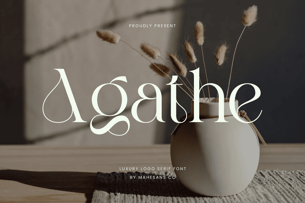
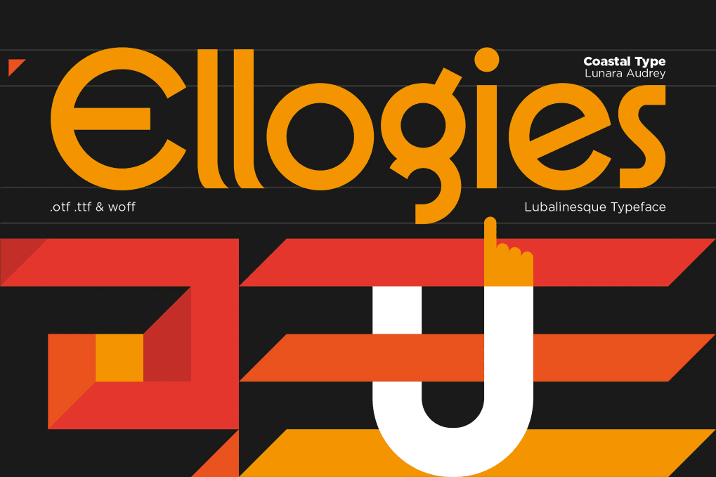
- Bod Serifs
Bold, reliable serif fonts are back with a bang. These fonts add sophistication and distinction, often used in editorial layouts, packaging, and brand headlines. They combine the elegance of traditional typography with the thickness of display design.
- Experimental Type
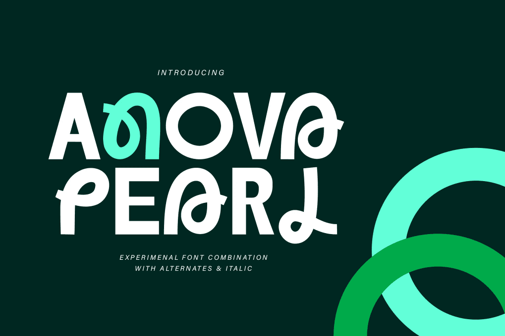
Experimental display fonts can be very interesting and beautiful. They will make unique logos, posters and flyers look perfect. They have a slightly illegible style, but that’s the point, they are different, special and come with a bang.
- Variable Timeless Style
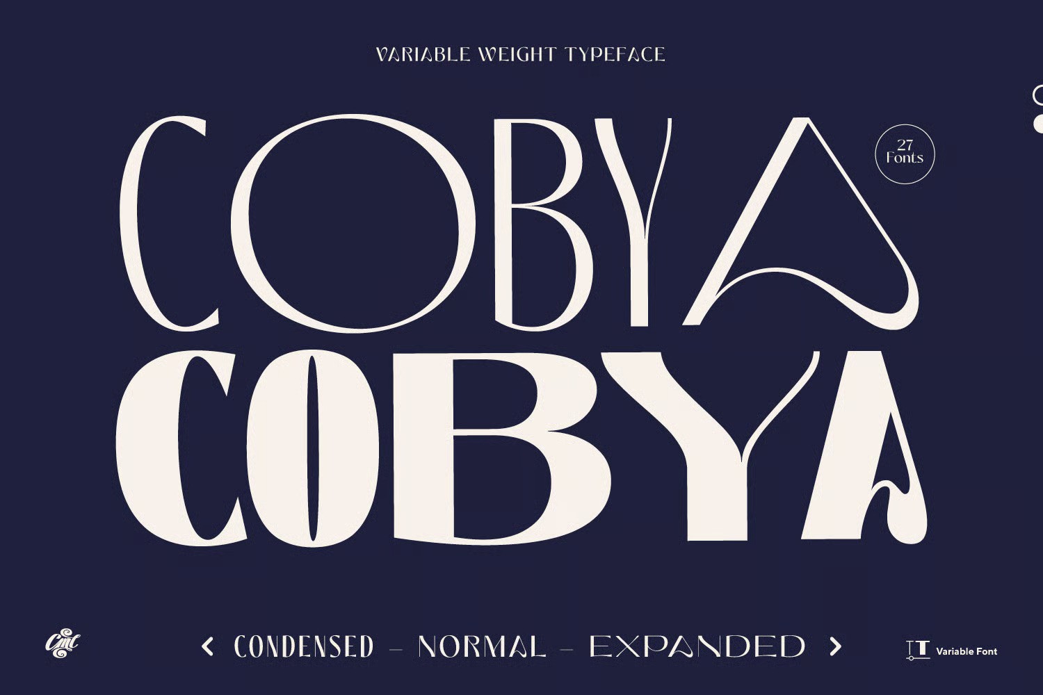
As digital formats become more dynamic, variable fonts are gaining popularity. In fact, they’ve always been on the rise. Designers are using display fonts that respond to interaction or include movement between letterforms, adding a layer of engagement to websites, apps, and videos.
- Geometric Dynamics
Geometric styles have always had their fans, but with the advent of display fonts, they have become even more popular than ever. Geometricity is a masterpiece and the flexibility of forms. If you are creating logos, covers, magazines, brochures and titles, these fonts will definitely be useful to you.
Where and when to use display fonts
Display fonts can be used anywhere you need text that is easy to read and has a clear meaning. Due to their decorative nature, display fonts are best used sparingly and thoughtfully so that they have the most impact without overshadowing the rest of the design.
Where they can appear:
- Headlines and Body Text: Make the top of a page or printed design instantly eye-catching. It doesn’t take much skill.
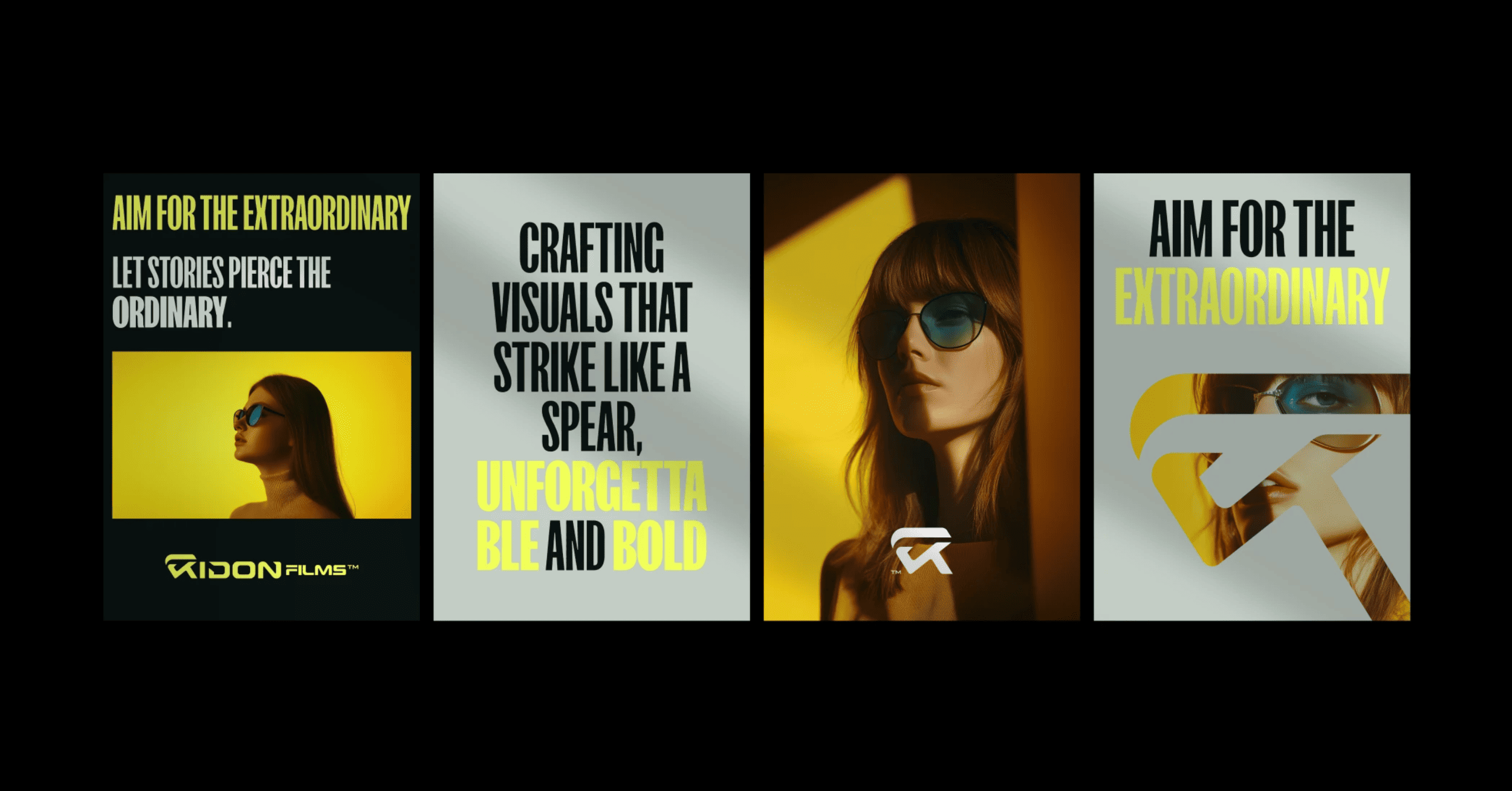
- Logos and Branding: Create a unique visual style with an iconic font. Thanks to the flexibility of display fonts, you can use it without a guilty conscience.
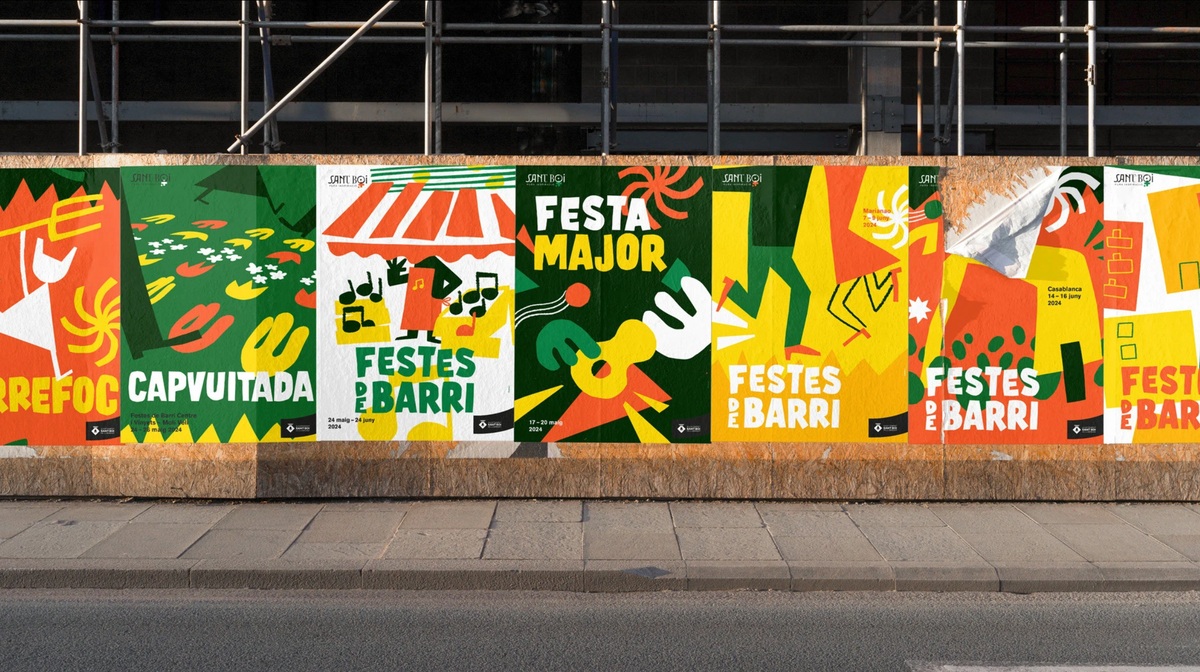
- Posters, Flyers and Brochures: Create bold compositions using only text and images when needed. Your design will be legible, sharp, and eye-catching.
- Social Media Graphics: Stop scrolling with dynamic and expressive text. It will suit any influencer’s graphic creation and distribution.
- Event Announcements: Highlight typography for a concert, gallery exhibition, or festival. You will see the positive impact these fonts will have on them.
Avoid using them in the body of text or in dense blocks of text, as their decorative nature can make them difficult to read. Contrast is key. Let the font do the heavy lifting in one area, while keeping the rest of the font clean and supportive.
Examples of display fonts in action
Here’s how different areas of design use bold typography effectively:
- Poster Design
- Magazine Cover

- Branding Design
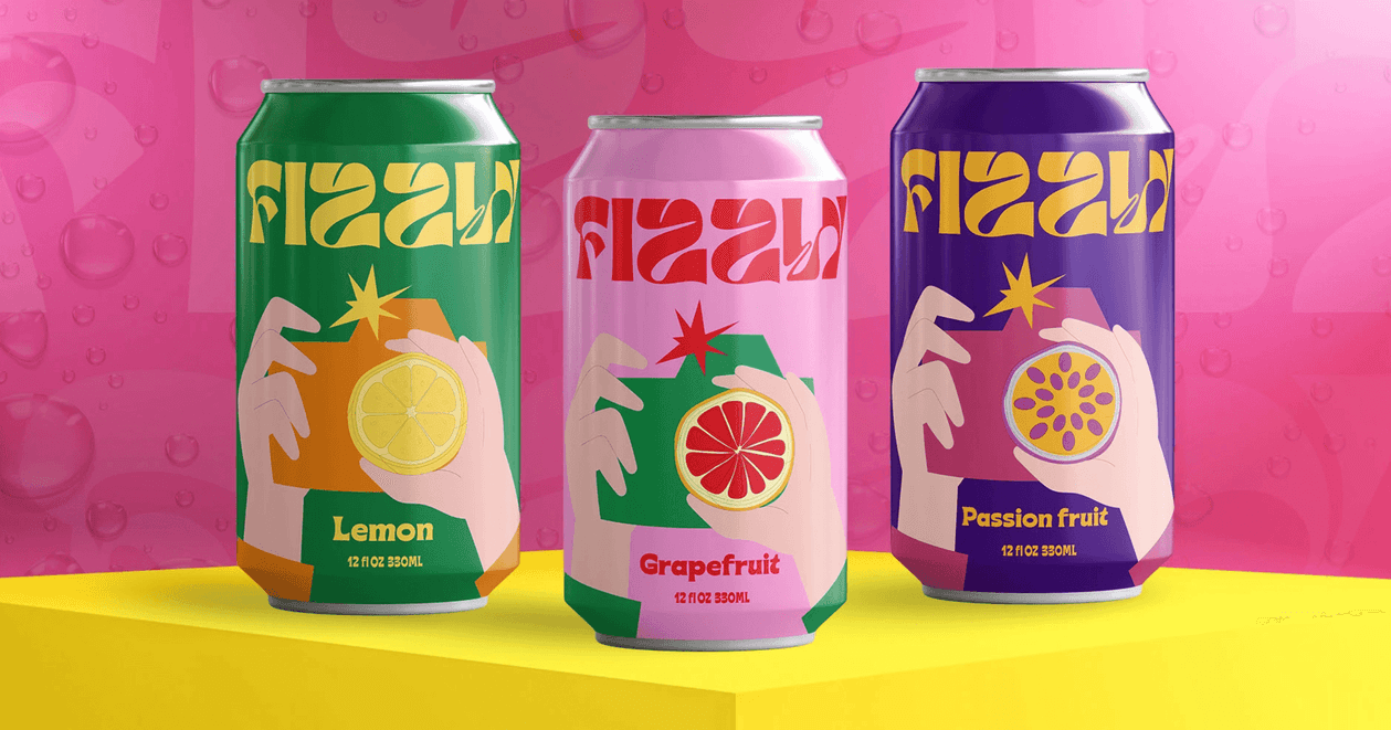
- Packaging Design
- Ad Campaigns
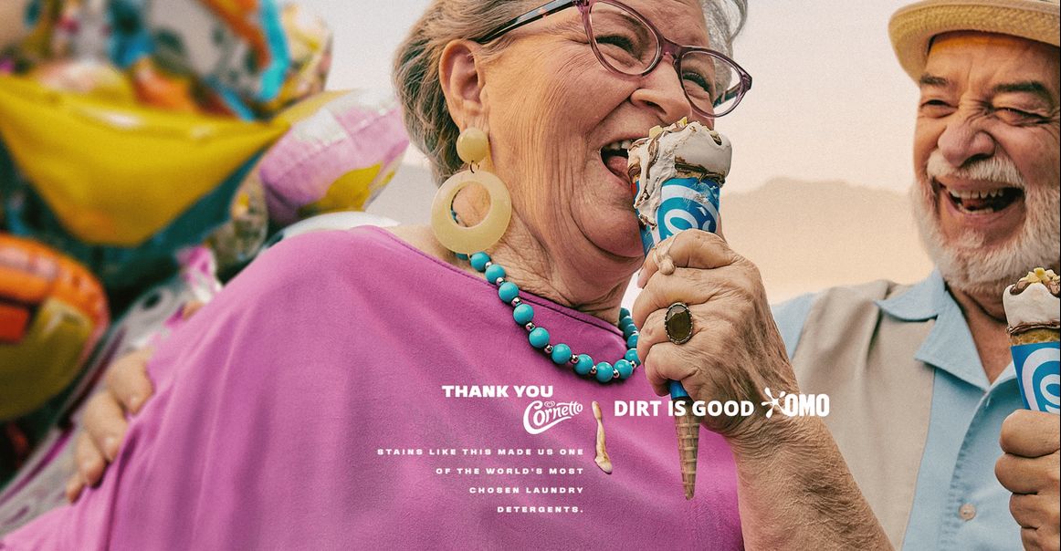
From billboards to social media ads, fonts help you quickly grab attention.
5 Tips to use display fonts effectively
Adopt these tips to make your design clean, attractive, balanced and unique:
1. Use display fonts sparingly
Display fonts are designed to make an impression, so use them for parts of your design that need the most attention, such as headings, titles, or short key phrases. Avoid using them for long paragraphs or UI elements where legibility is more important.
2. Use fonts that convey the message
Match the style of your display font to the tone and design of your content. A bold, geometric font might work for a tech brand, while a large serif font might look more classic or expressive. The font should reinforce the feeling you want to convey.
3. Keep secondary fonts clear and simple
Let the main font be the display font, and pair it with a clean, neutral font for the secondary font. Sans serif fonts like “Inter” or font families like “Georgia” are great for body text that needs support but not competition.
4. Stick to one display font for each design
Mixing multiple bold fonts can create visual overload. Choose one font and base your design around it. For variety, use different weights or alternate characters from the same font family.
5. Don’t rely on trends alone
Just because a font is trendy doesn’t mean it’s right for your project. Choose fonts that fit your message and will still look good months or years down the road, especially when building a brand.
Final Thoughts
Display fonts are timeless. There are many of them. The choice is huge. Of course, it is difficult to find the right font that will suit your design. So be patient when searching.
And I invite you to visit this website as often as possible, where you will find impeccable fonts for your projects. I create font collections for free and commercial use. So don’t be lazy and check out my selections. In addition, I share tips that will help you understand much easier.
I wish everyone success and involvement in the world of design.


