


")
")


Disegno revamps ‘Melbourne Symphony Orchestra’ for a new era
The new brand is based on a bold organizational idea - “Shape of Sound” - that expresses the power of music to move us physically and emotionally.

Disegno has revamped the Melbourne Symphony Orchestra (MSO) for a new era, presenting a bold identity to celebrate the orchestra’s 120th anniversary. The MSO is not just an orchestra, but a timeless and evolving cultural force in a rapidly changing city.

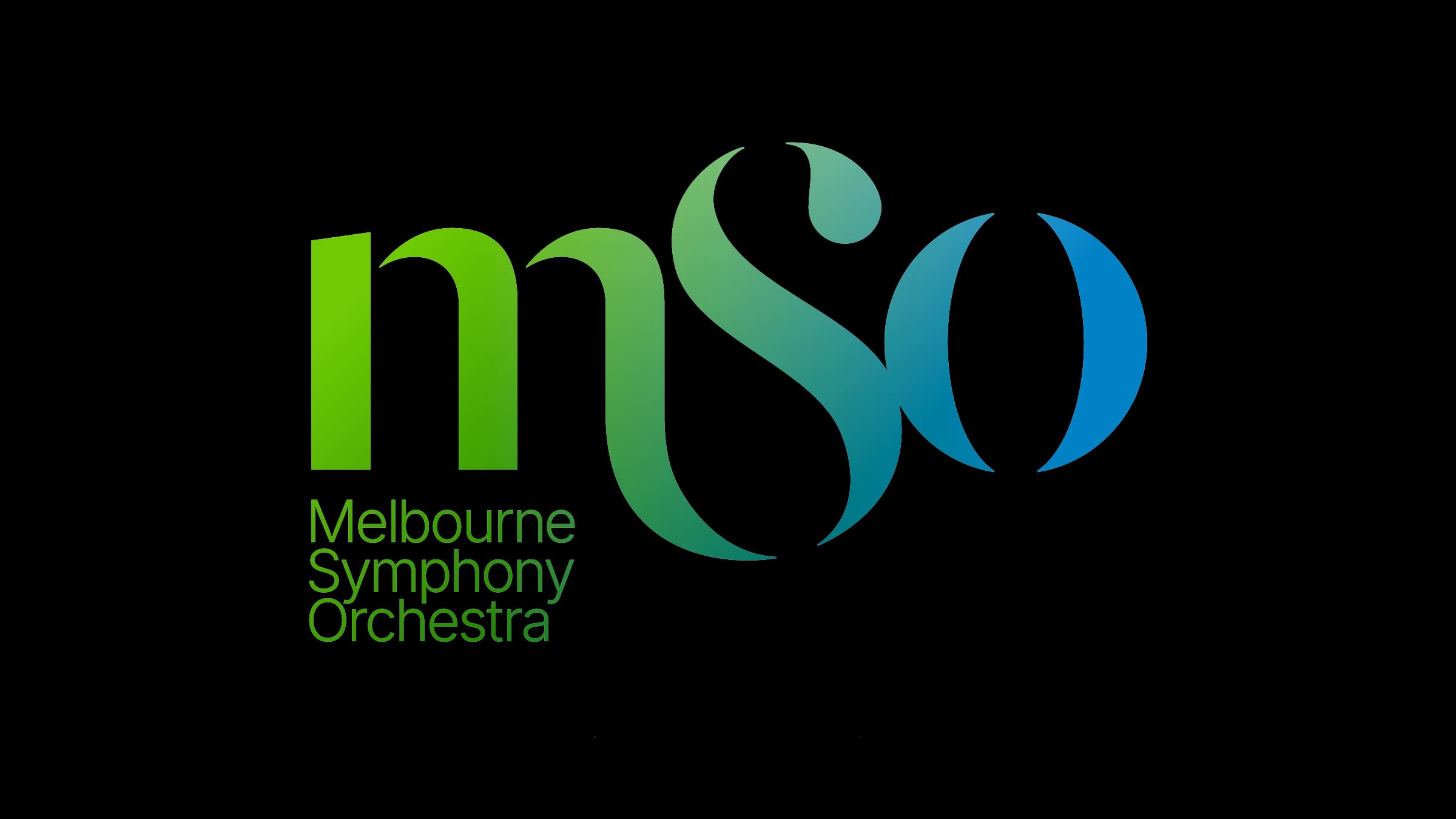
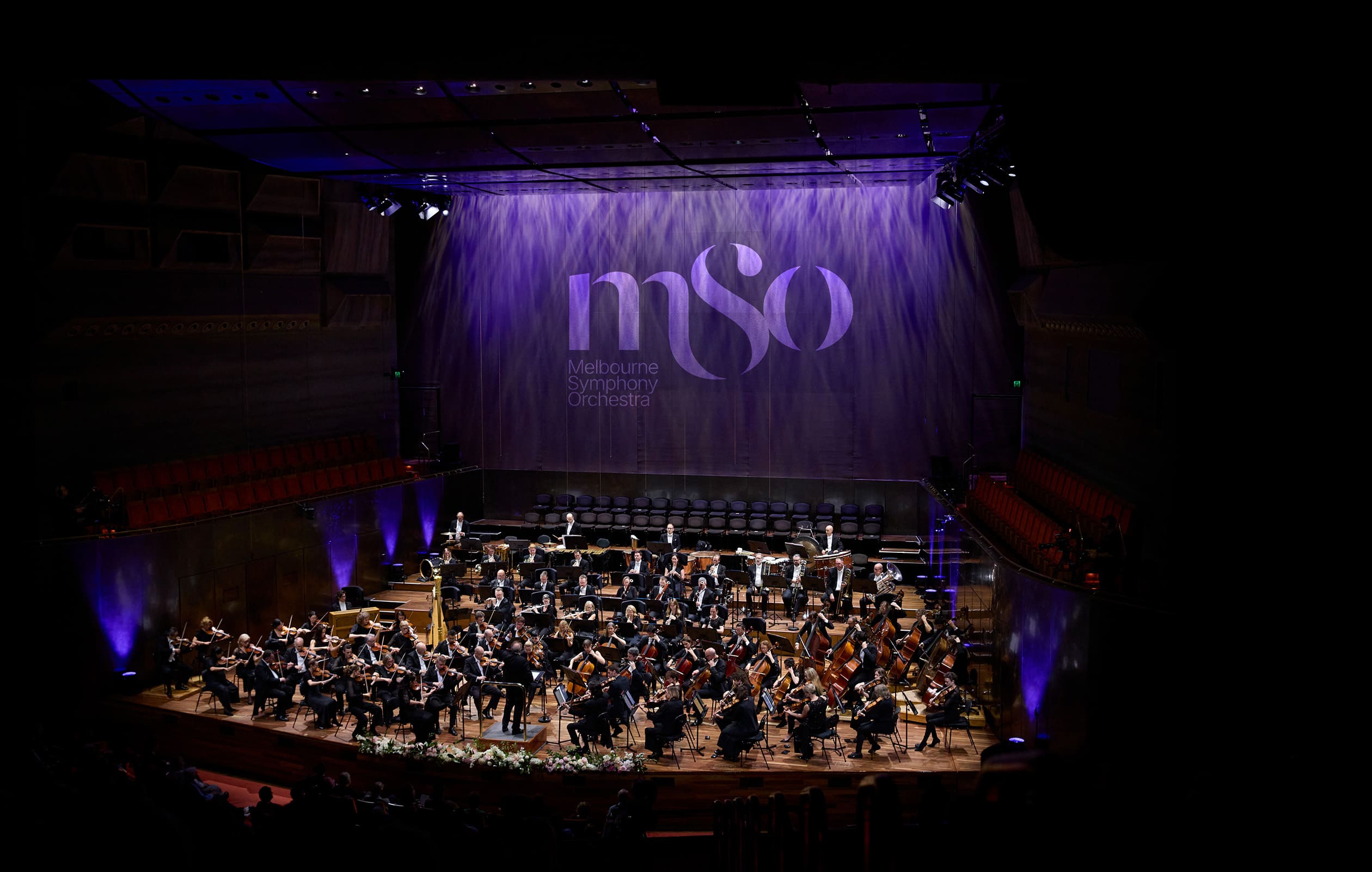
At the center of the new identity is a custom logo, where each letter has a meaning: a grounded “M,” a flowing “S,” and a resonant, open-bracketed “O.” This visual rhythm balances gravity with energy, complemented by a disciplined grid, expressive color palette, and flexible typographic system.
Everything is designed to feel alive – as dynamic as the performances it represents.
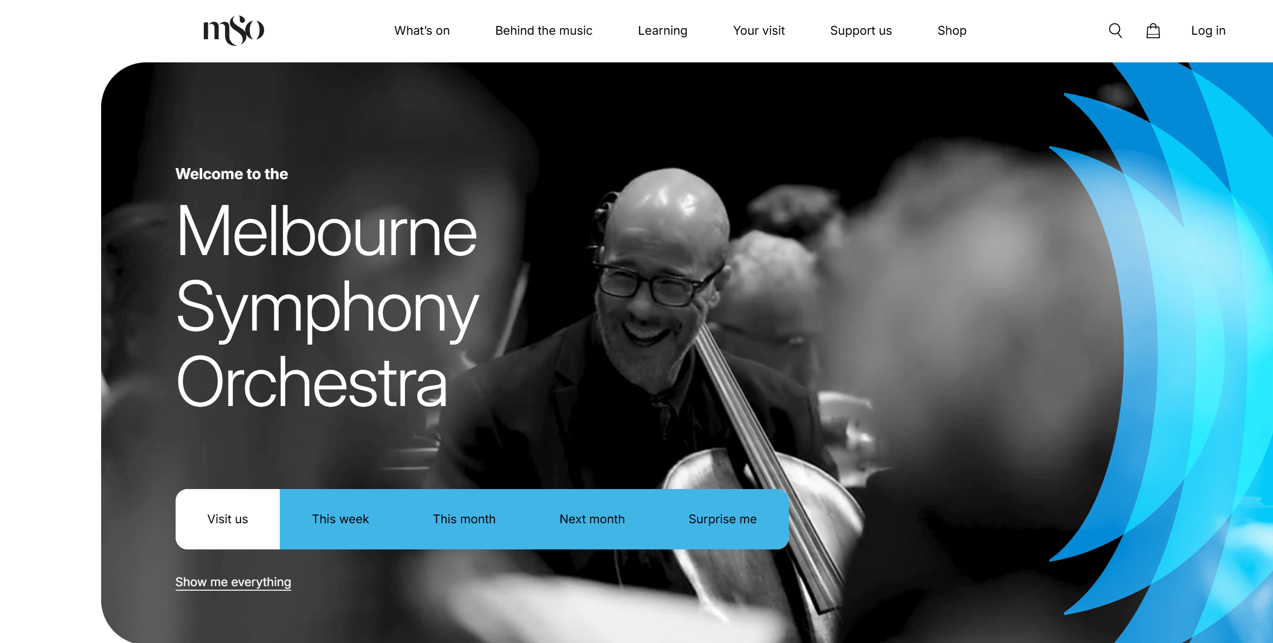
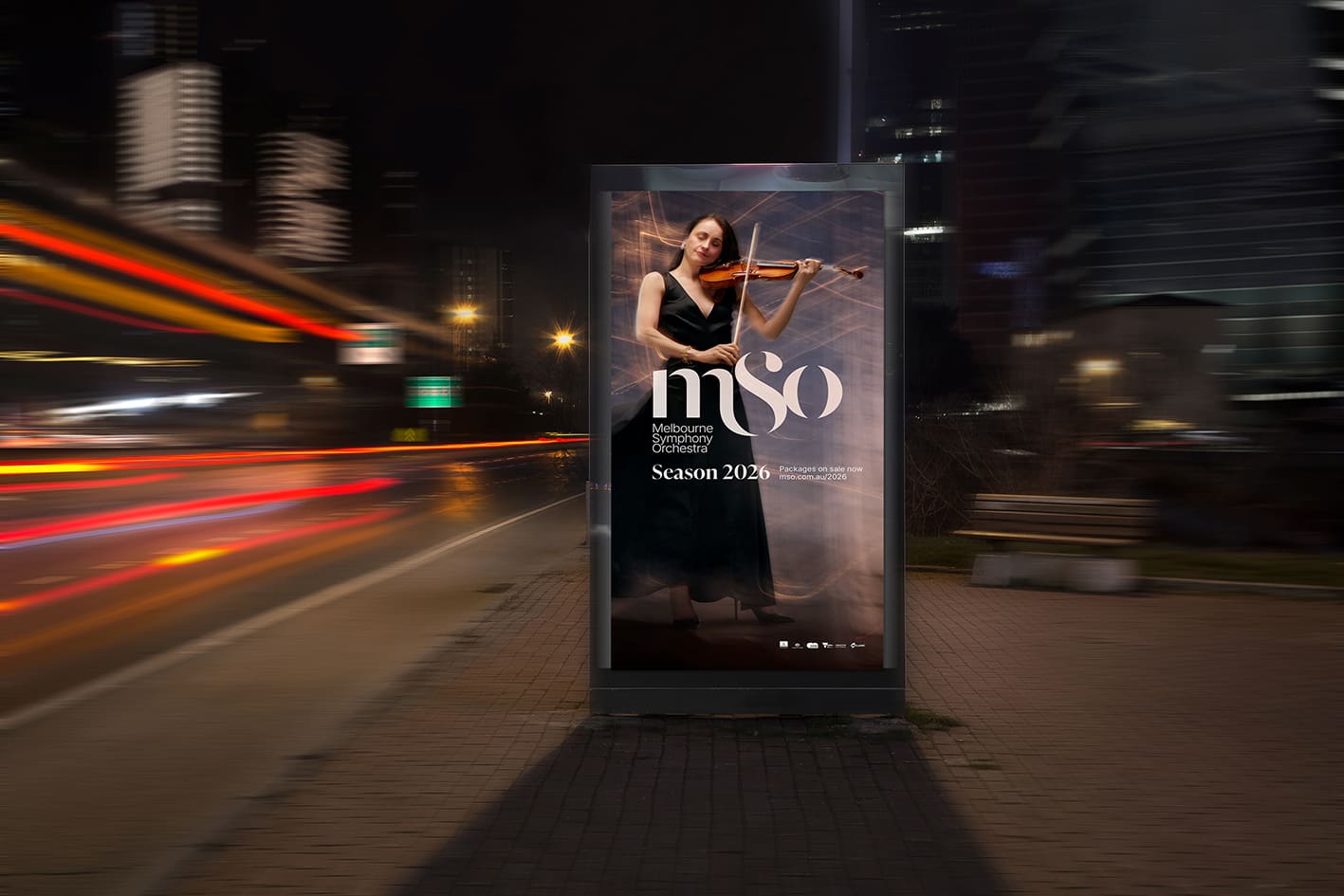
The first major launch came with the 2026 season’s “Music That Moves Us” campaign, shot by acclaimed photographer Lucas Allen. Eschewing static portraits, the campaign featured MSO musicians moving against an atmospheric Melbourne backdrop, capturing the energy and humanity of live orchestral music.
As partner and head of strategy Aaron Turner explains, “This was a cultural exchange between Melbourne and the Melbourne Symphony Orchestra – an opportunity to not only reflect the city’s cultural identity, but also to enrich it.”
CEO Richard Wigley calls it “a brand that expresses our soul and strengthens our strategy… it doesn’t just look right. It feels right.” Director of Brand & Communications, Jayde Walker, describes it as “a new language” that invites every generation in, while Director of Sales & Marketing, Dylan Stewart, sees it as a growth tool for a city with a swelling population and appetite for shared experiences.
Through “Shape of Sound”, Disegno has created a living identity system – elegant yet vibrant, deeply rooted in heritage yet ready for the future – enabling the MSO to connect with local and global audiences for decades to come.

Photography courtesy of Disegno.com.au.


