


")
")


“Our bold, color-driven design reflects the energy inside – simple, striking, and impossible to miss. Every bar is crafted to power your workouts, sharpen your focus, and satisfy your cravings with unapologetic flavor. In a world full of clutter, Refuel stands out – minimal in look, maximum in impact.” – said Tandem creative director Habi Girgis

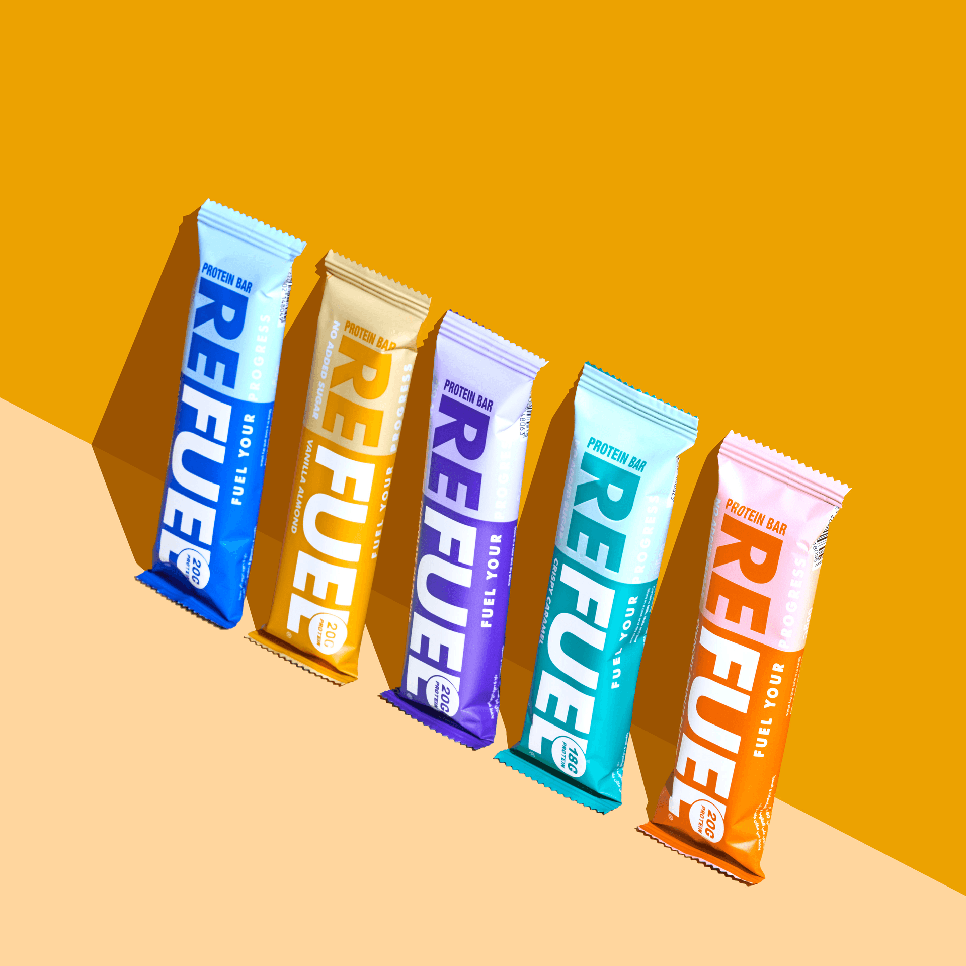
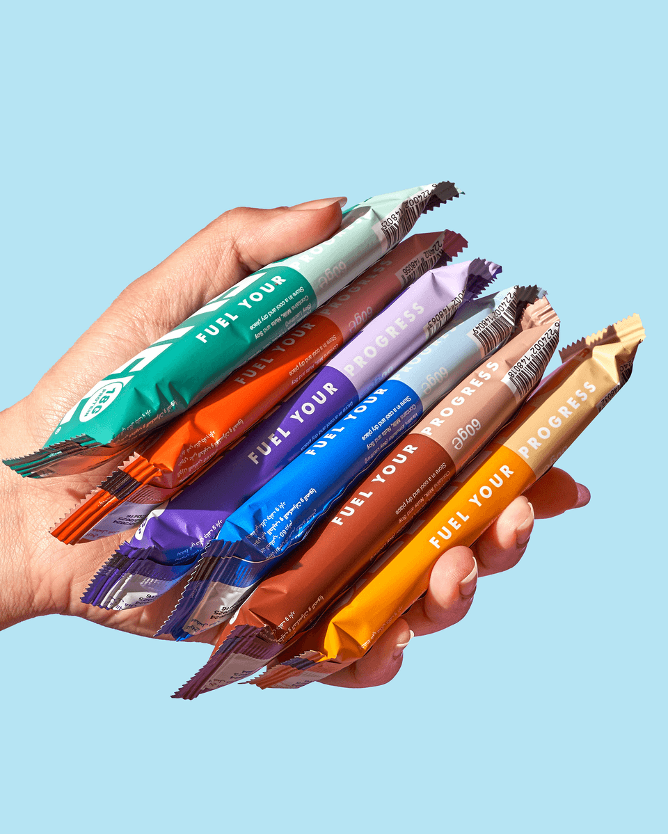
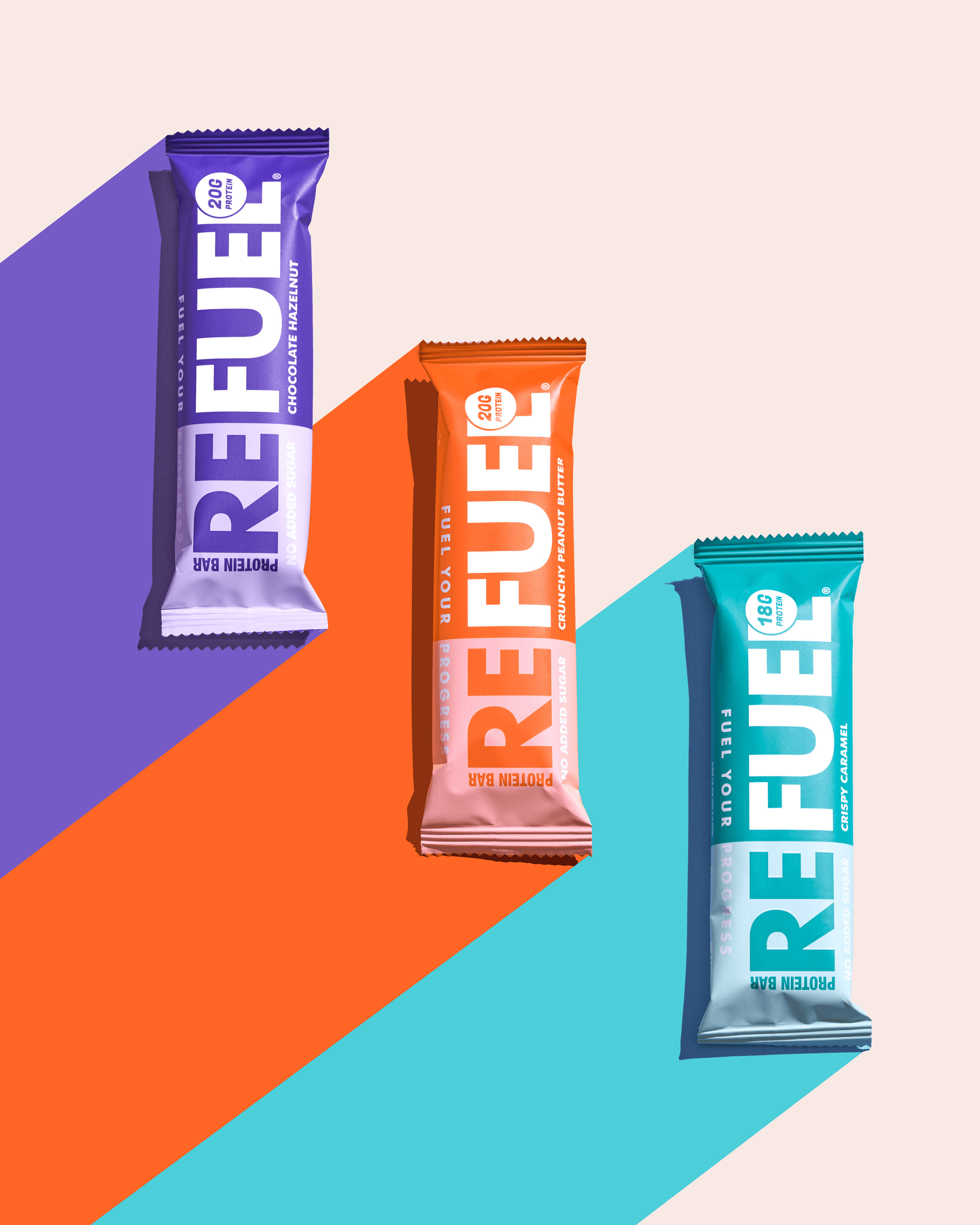
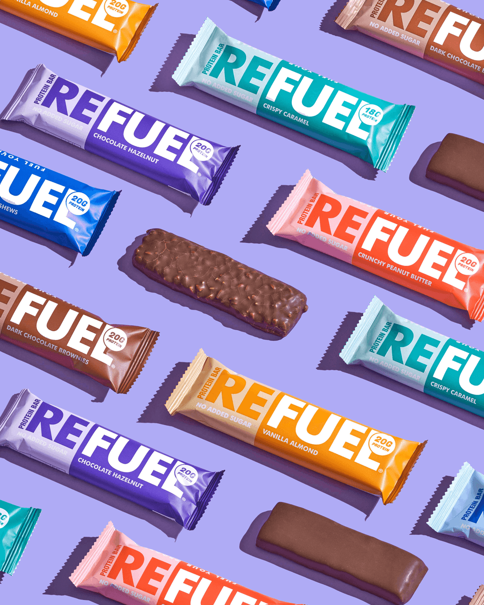
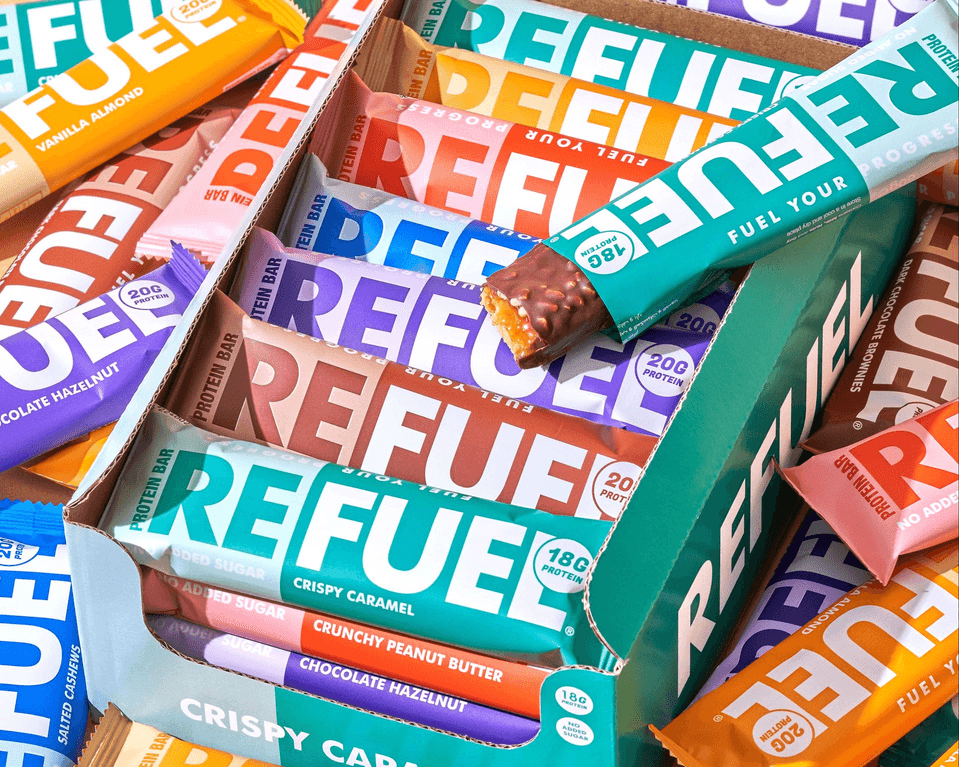
Bright, well-lit, overhead or dynamic angled shots show a variety of colors and flavors together (like a vibrant mosaic). Lifestyle and action-packed moments – urban runners, cyclists and climbers – contrast with relaxing moments of recovery, demonstrating Refuel’s versatility as a burst of energy and as a means of recovery.
The minimalist style ensures a consistent brand impression across packaging, advertising and digital channels. Bold text and unique, carefully selected colors make the packaging even more enjoyable and engaging.
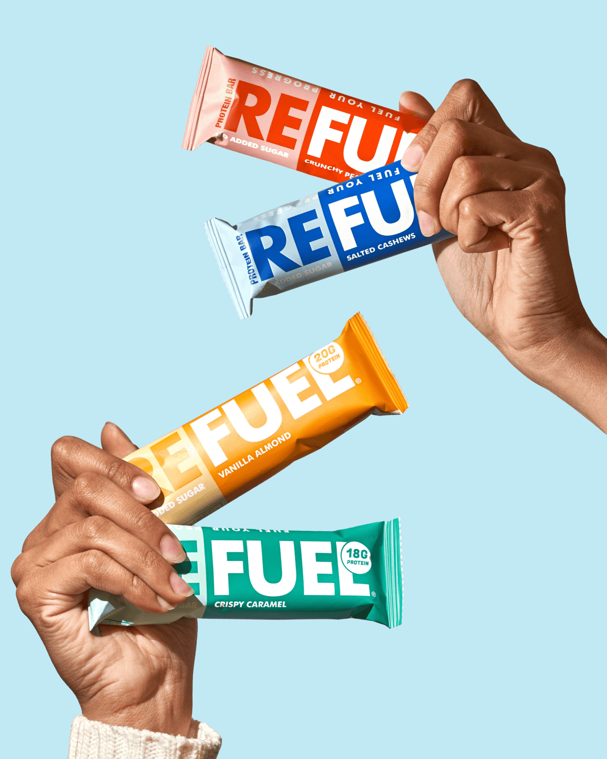
Refuel protein bars were captured by renowned photographer Yusuf Gamal. His exceptional shots will not let you get tired of your daily routine. The photographs are so captivating that you want to grab and taste this snack. Refuel is definitely a minimalist rebrand worthy of attention, with the potential to get even more.
Photography courtesy of Yusuf Gamal.


