


")
")


Designed by JDO to unify its range and amplify its mission of becoming a 100% positive impact business. Founder Matt Williams said that the craft beer brand previously lacked cohesion and consistency in a category dominated by fierce competition.

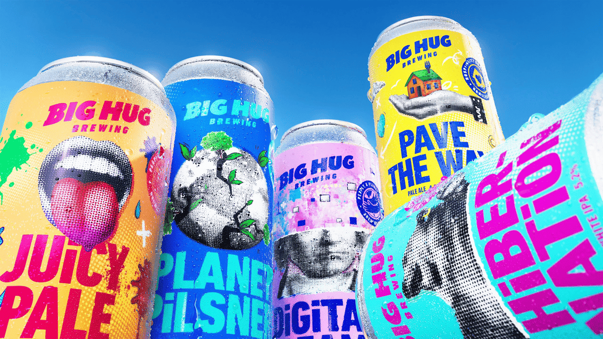
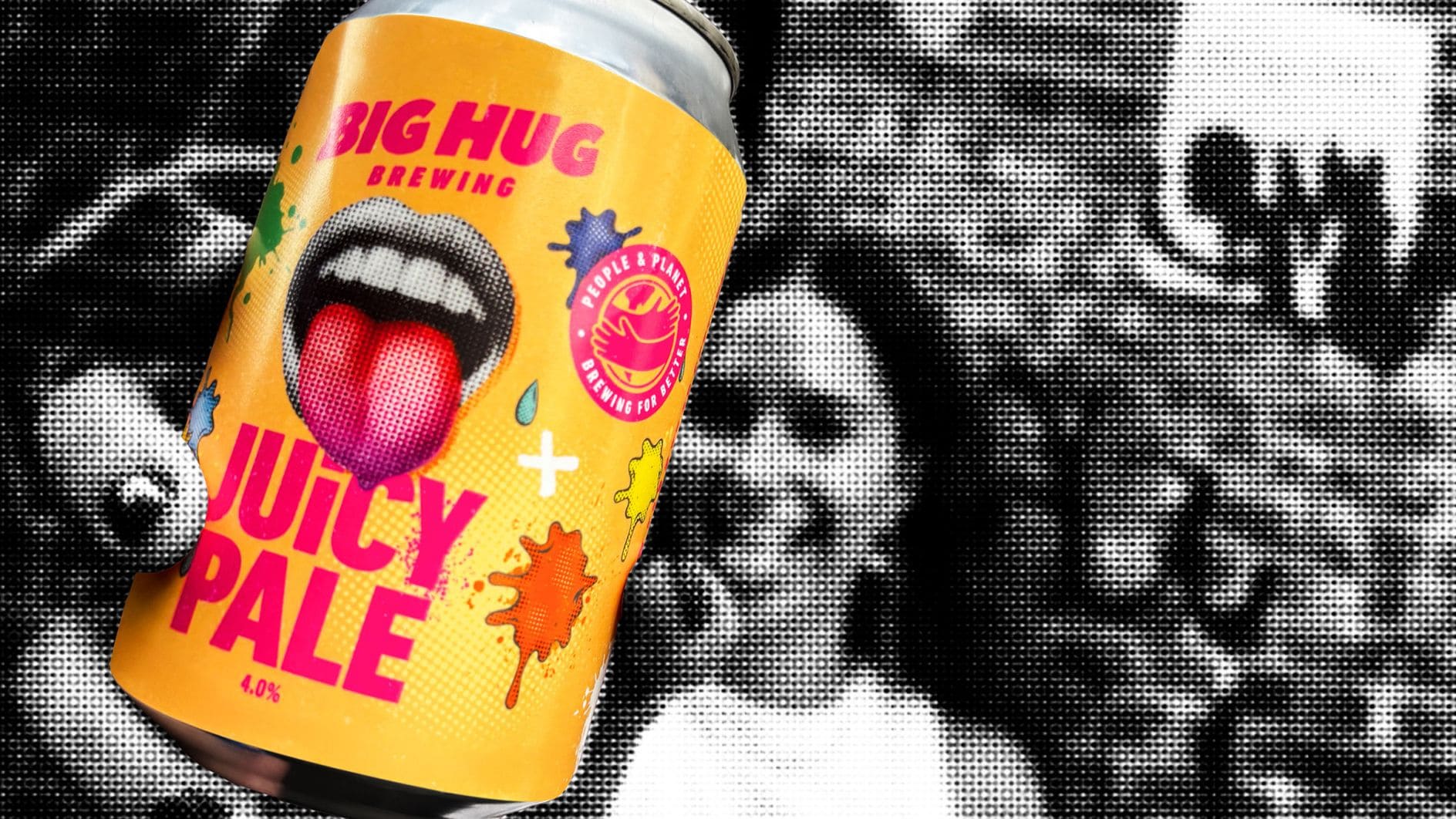
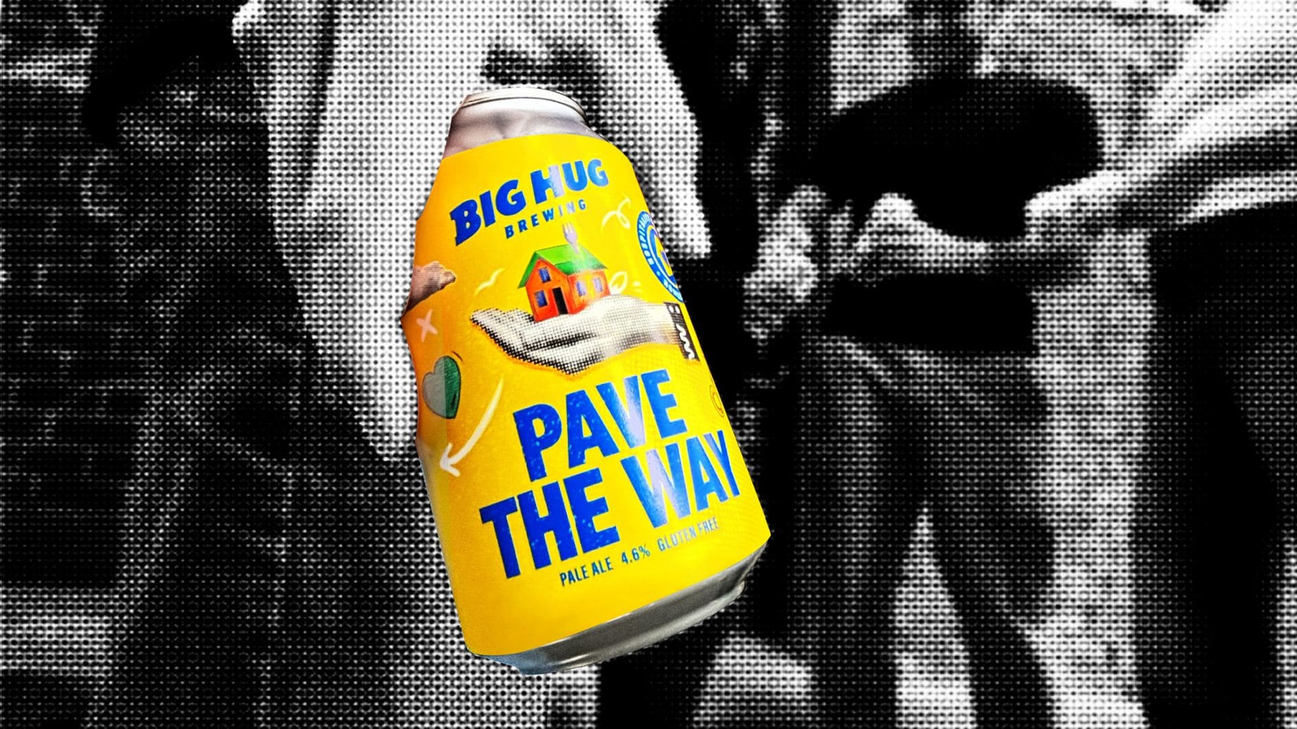
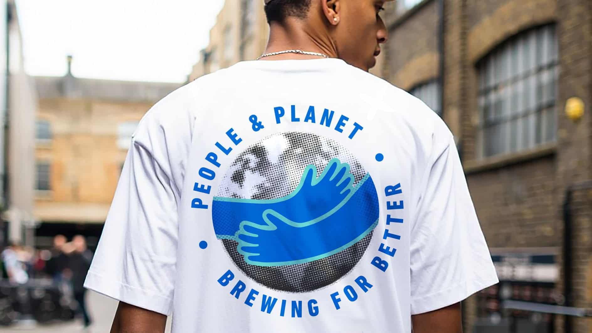
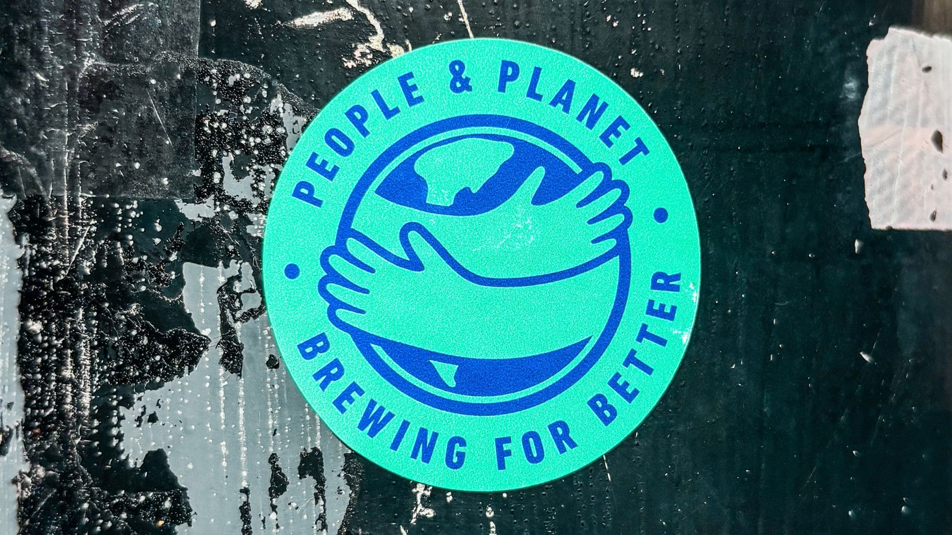
Williams added that he felt the product needed to better reflect the mission of the company. As such, the company has revealed a completely new can design, at the heart of which is a ‘World Hug’ logo symbolizing the brand’s mission to create social good.
JDO was tasked with creating a visual system for Big Hug that matched its ambitions. The resulting refreshed brand was launched at the London Craft Beer Festival, putting purpose at the forefront while retaining the wit and individuality that originally set the brewery apart.
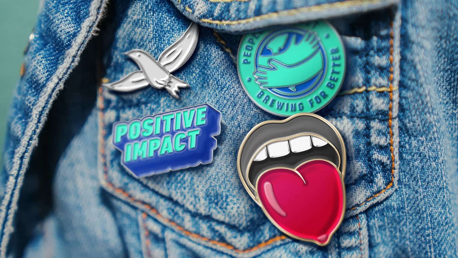
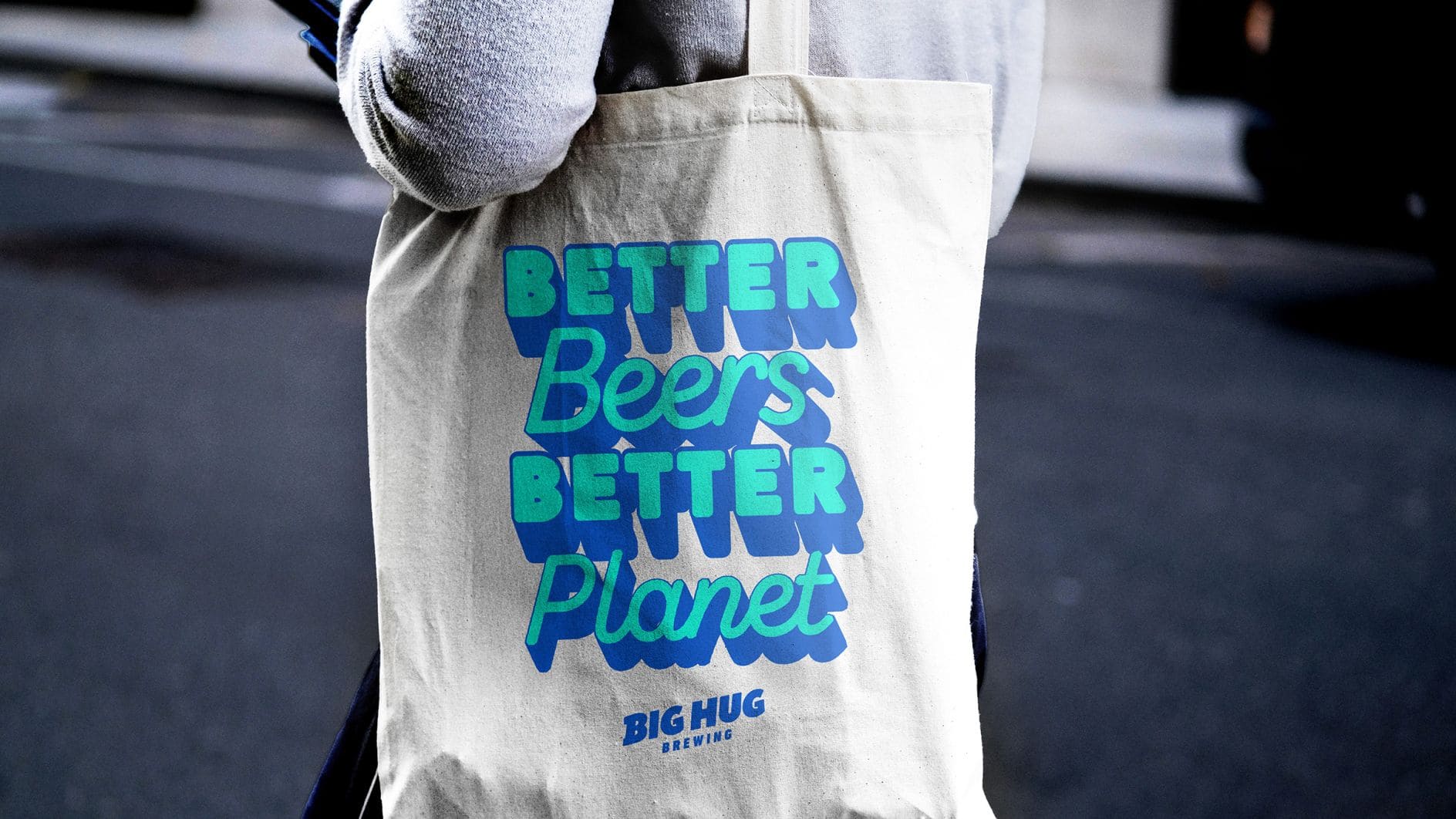
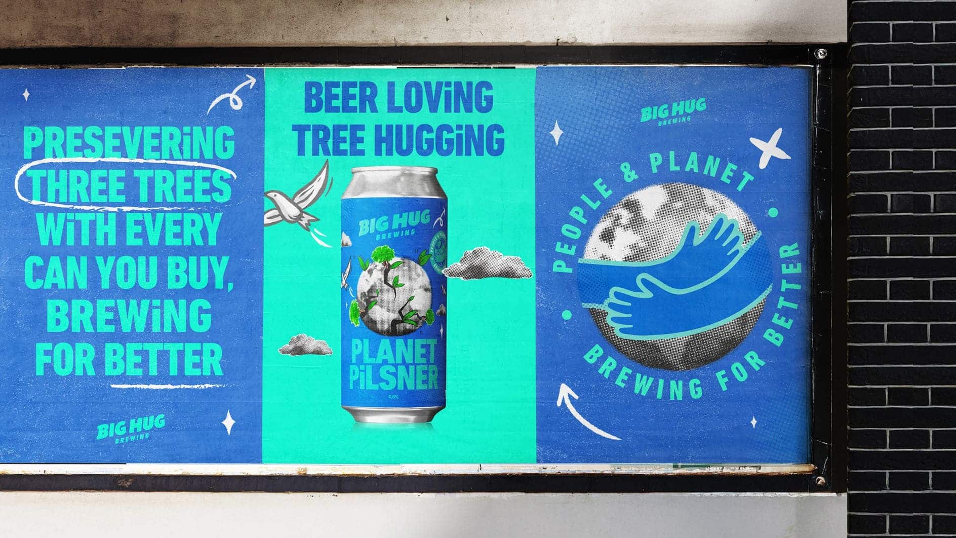
Since its inception, Big Hug Brewing has donated a portion of the profits from select beers to charities addressing homelessness and youth challenges. The new brand platform, summed up by the slogan “Brewing for Better” extends this ethos across the business. Each beer now has a story and purpose, which are conveyed as a key design feature.
On the new look, Williams said: “Our proposition moving forward is to bring our purpose-driven ethos front and centre. To support people and the planet, and to really establish ourselves as a purpose-driven brand.
“Consumers want brands that are purpose-driven, that have strong social values at heart, whether it’s supporting their local community, re-purposing materials, or being as environmentally conscious as possible and we can offer that. It’s about infusing purpose with profit and doing what we can to give back.”
Dan Bowstead, design director at JDO, the company hired for the rebrand, added: “Big Hug came to the table with a strong purpose and loads of personality. Our task was to set the brand up for growth with a bold, clear identity that stayed true to Big Hug’s roots. It was about taking all that wit, energy and passion for making a difference – and making the brand impossible to ignore.”
The UK craft beer scene has become synonymous with eclectic illustration, unusual typography and fearless colours. Big Hug’s new identity captures this energy, but delivers it through a more consistent framework.
Williams says: “One of the things JDO told me early on is that they help brands deliver on their promises, bringing ideas to life through powerful, effective experiences that people can see, feel, and believe.”
“For me, that’s exactly what they’ve done. Whether it’s on-trade, off-trade, online or in the real world, Big Hug now reflects our mission with endless optimism and a powerful punch.”
The new look was launched in bars, retail outlets and online this month, and Big Hug hopes to inspire not only repeat purchases but also repeated good deeds.
Photography courtesy of JDO and Big Hug Brewing


