


")
")


‘Chiva Fit Granola’ Identity by ADD Branding
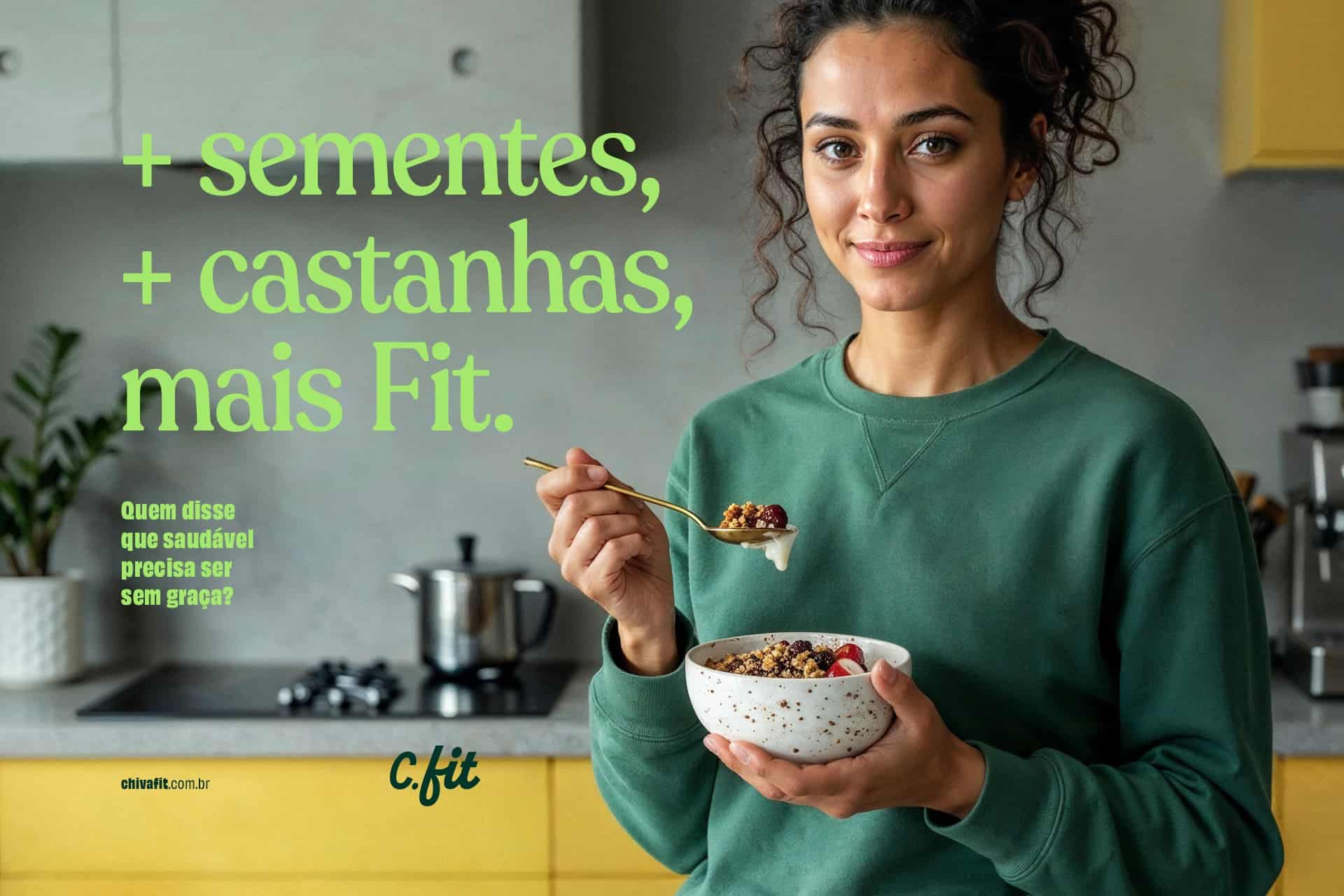
Chiva Fit is a Brazilian healthy food brand born in the countryside of Minas Gerais.

The company has a clear vision: to offer granola made with real ingredients and without artificial additives. In a market full of similar products and generic messages, Chiva Fit positions itself as an authentic alternative – natural, affordable and applied to real life.

The challenge was to create an identity that would clearly, easily and visually convey these distinctive features. The brand had to convey its commitment to health, rich taste and simplicity of ingredients on the shelves – all in a modern, distinctive and competitive way.
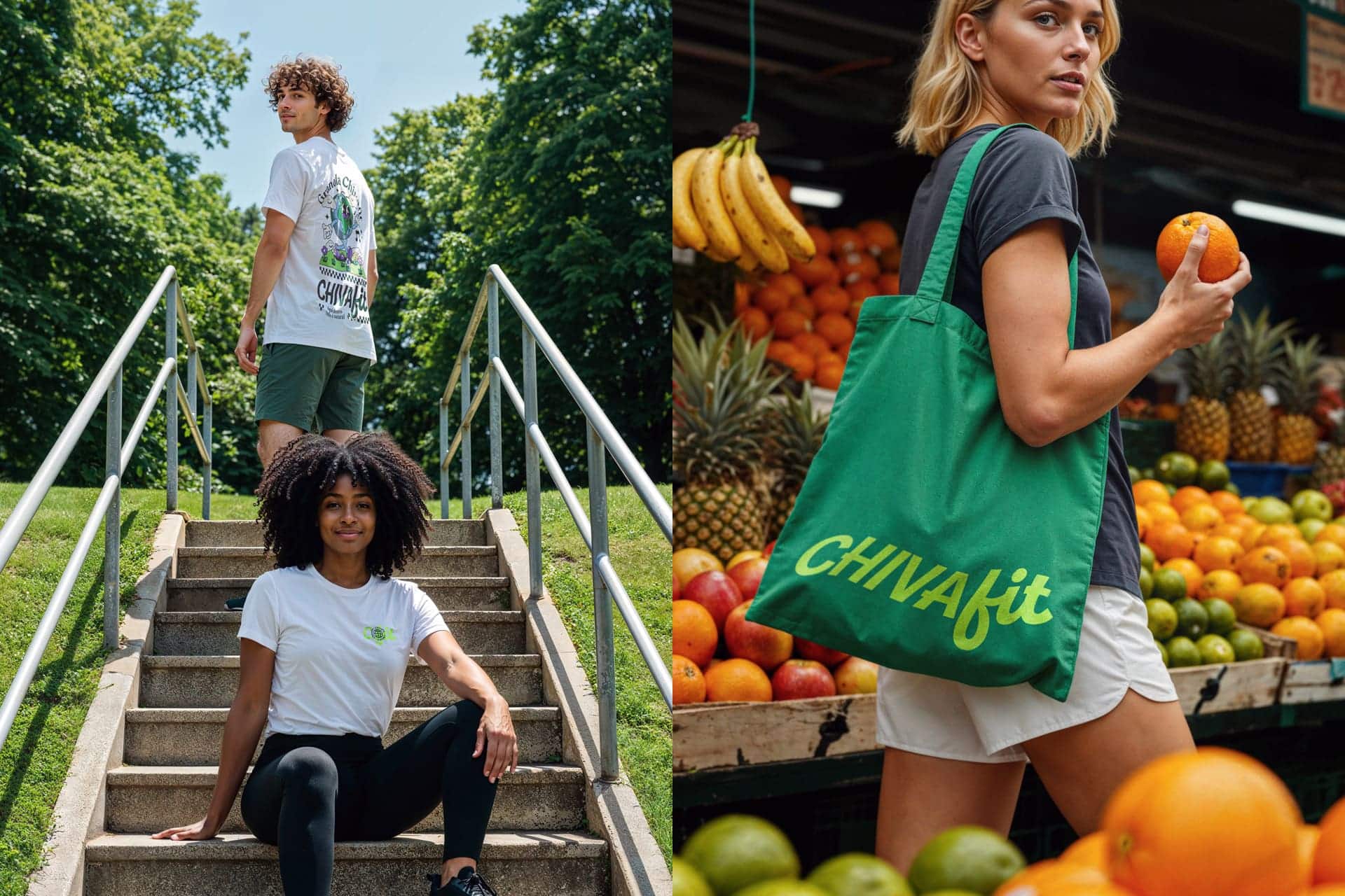
The visual identity is based on the concept of everyday balance: health that fits. Hand-drawn organic shapes and authorial illustrations reflect this symbolic connection between well-being and routine. The packaging features a strategic front window that reveals the product and acts as a visual pause, a direct and conceptual transparency that reinforces the brand’s pride by showing what’s inside.
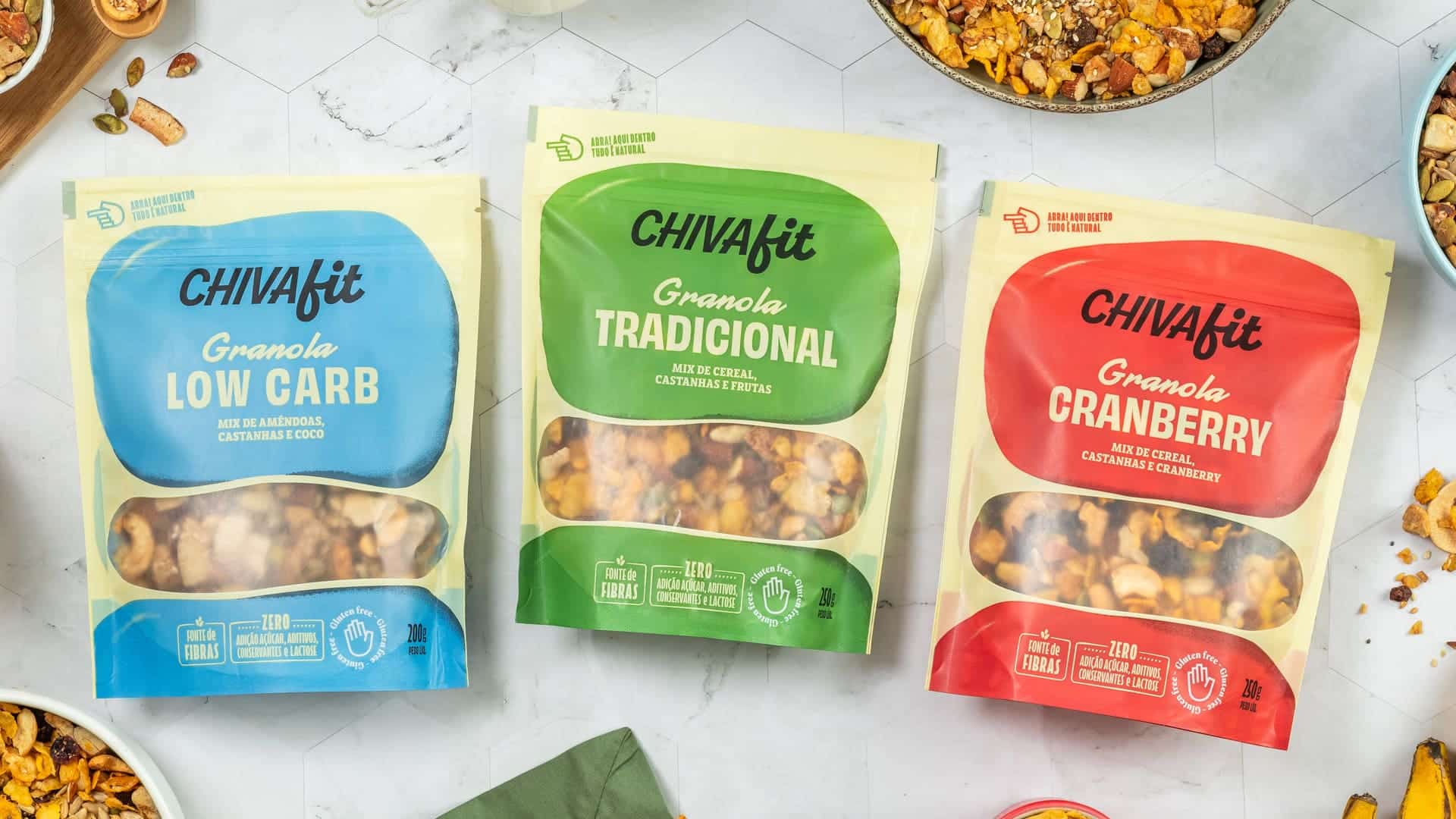
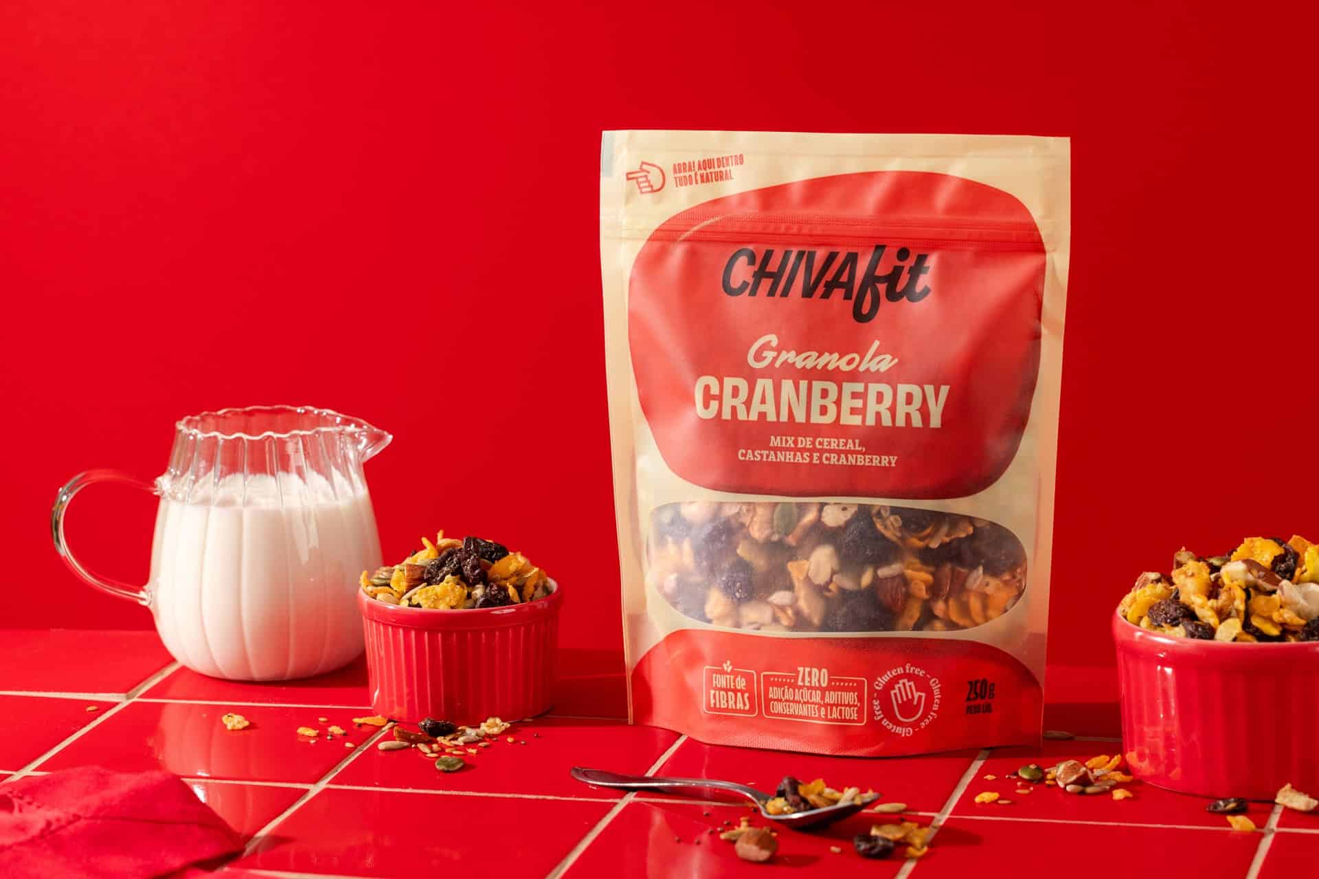
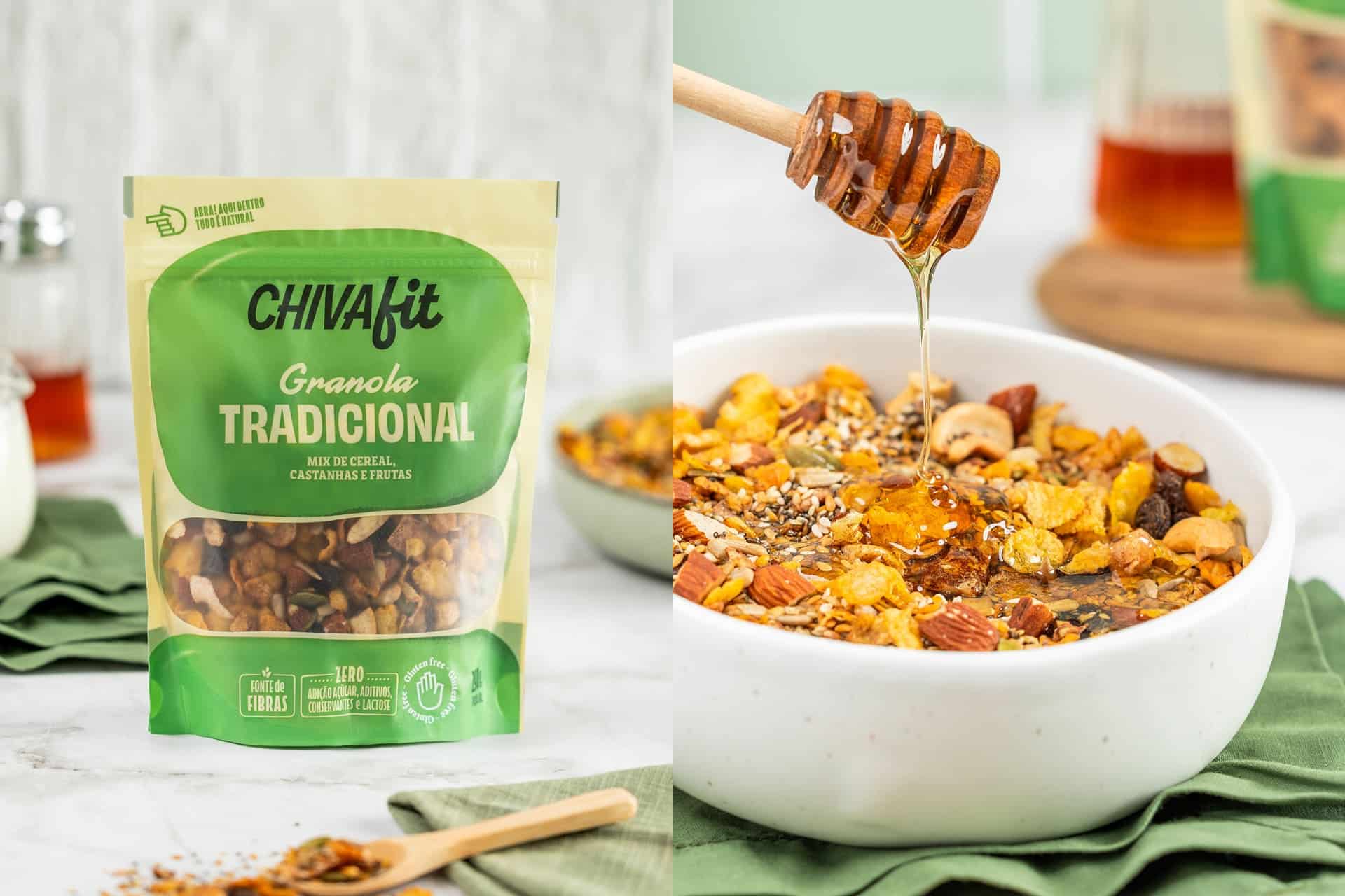
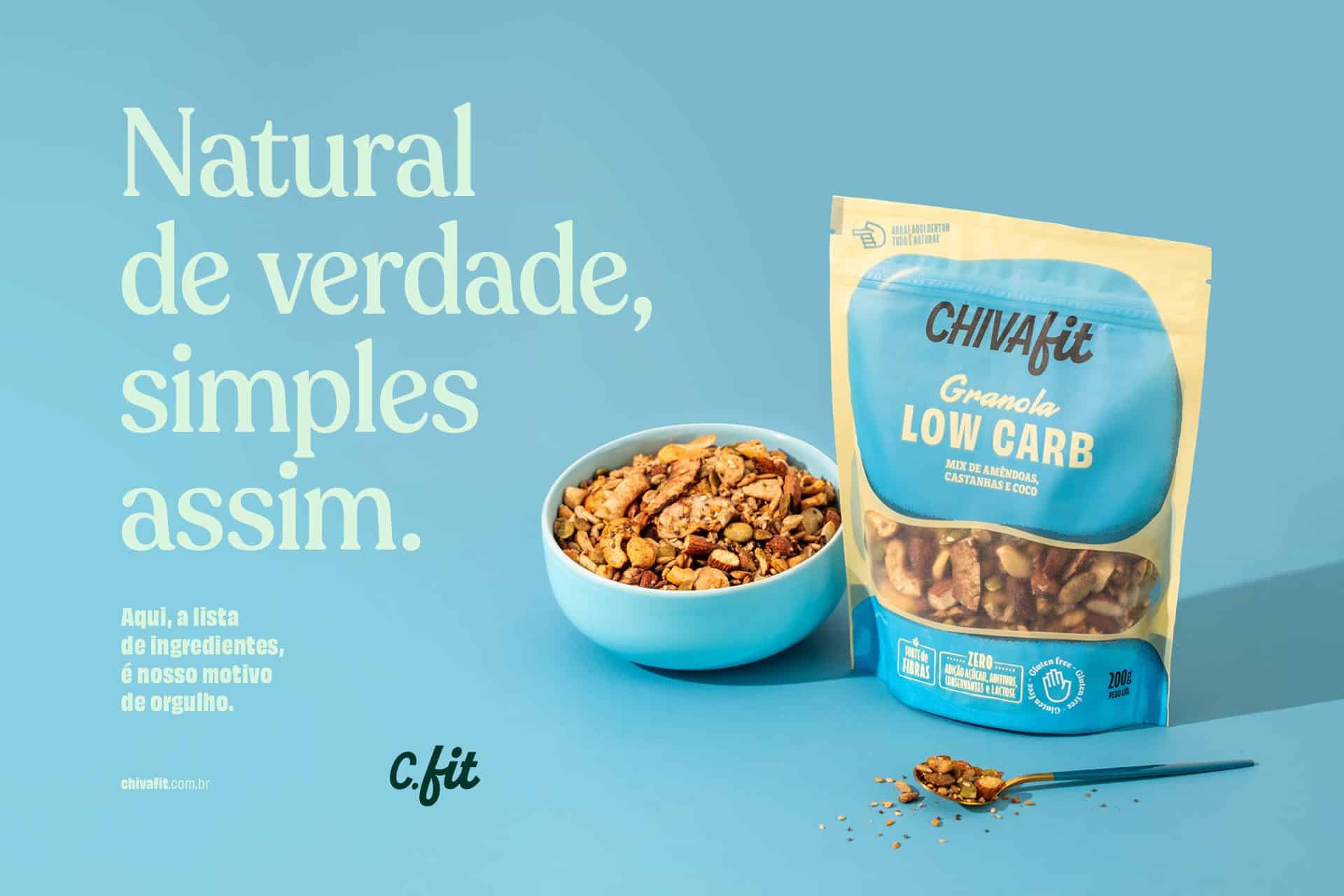
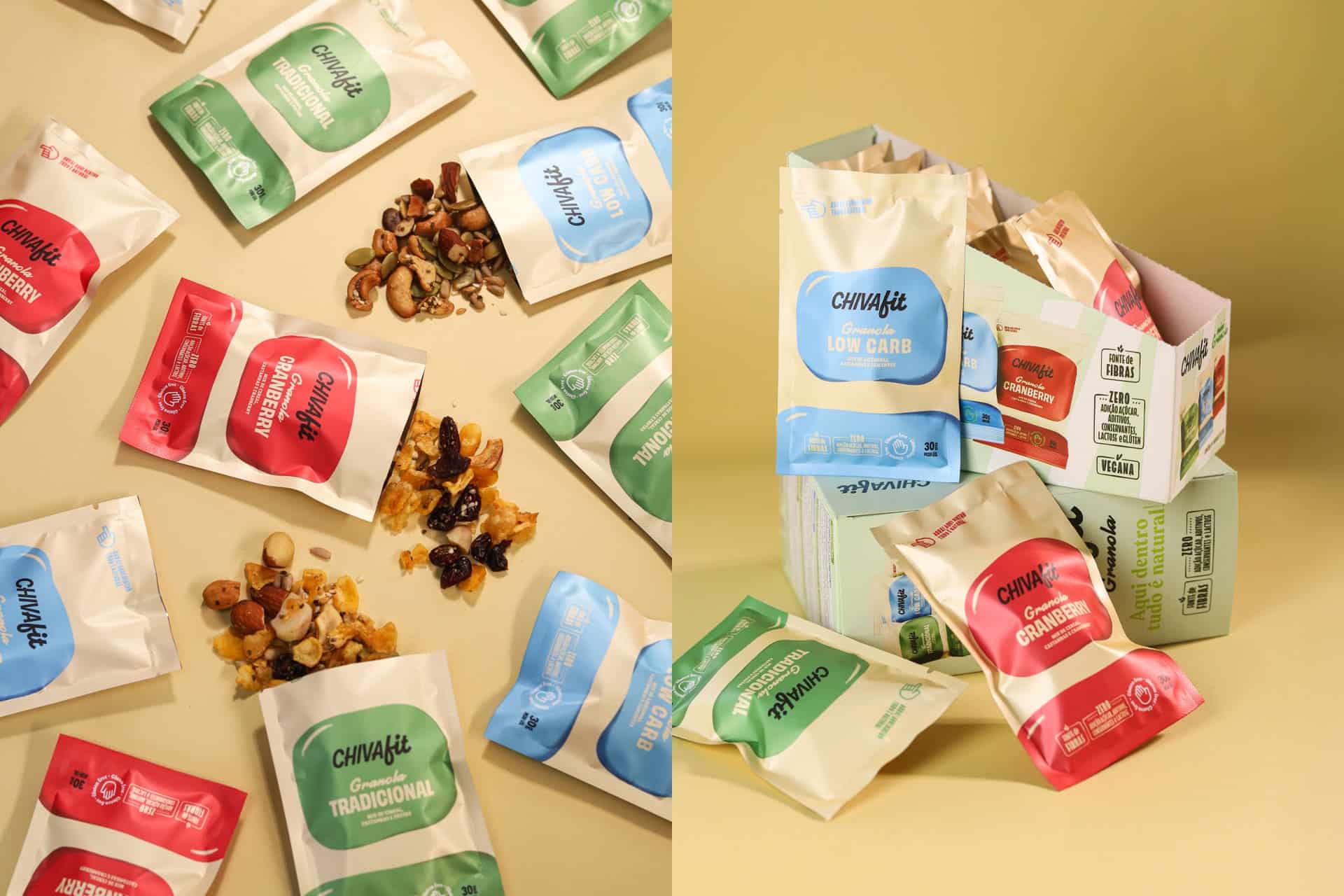
Each package has its own color combination. The packages are organic, natural and inspire health for everyone. Graphic elements combine informational clarity with emotional appeal, balancing the rational side of health with the sensory pleasure of food.
This project is a clear example of how strategic design and a strong visual identity can transform a small brand into a national business.
Credits:
Photography courtesy of ADD branding and Jordy Ribeiro


