


")
")


Two years after ITV X launched, the broadcaster has unveiled a refreshed identity that simplifies the design framework, elevates the spark yellow color and introduces a new motif called “The Apex.”

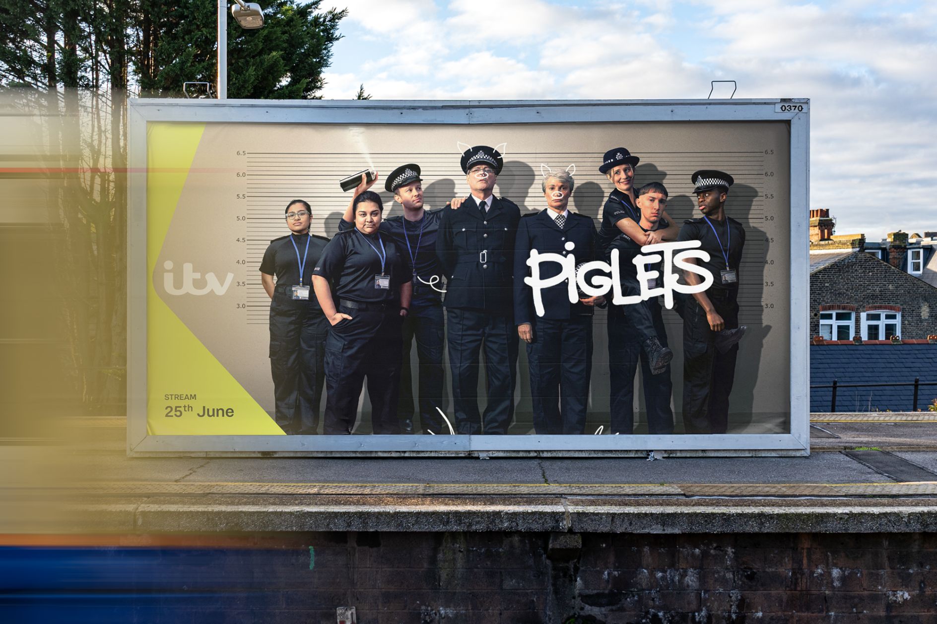
The decision comes as ITV’s marketing continues to expand across more platforms and formats than ever before. From billboards and broadcast trailers to TikTok ads and CTV campaigns, the new system is designed to ensure ITV is consistently visible wherever audiences see it.
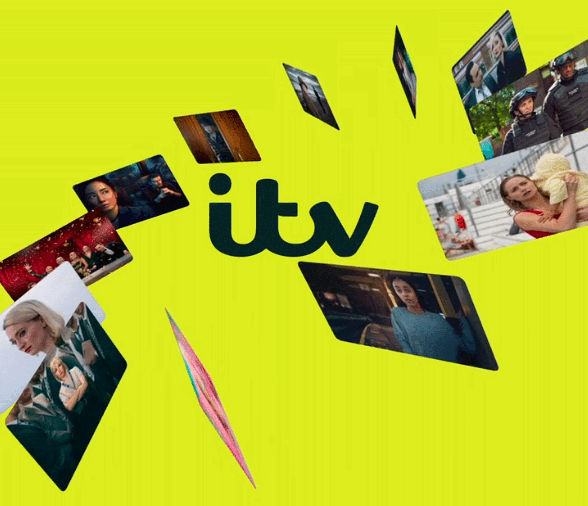
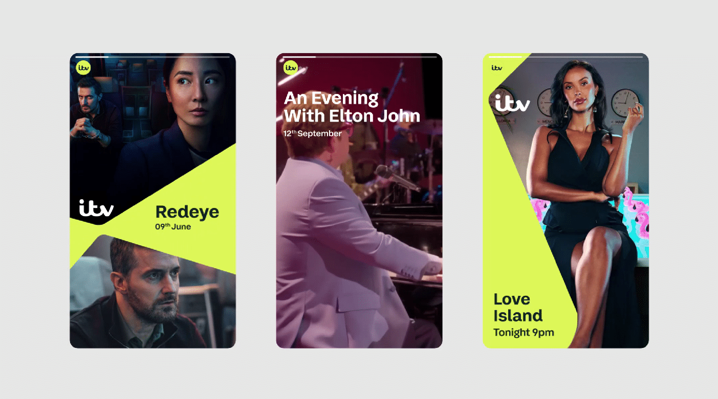
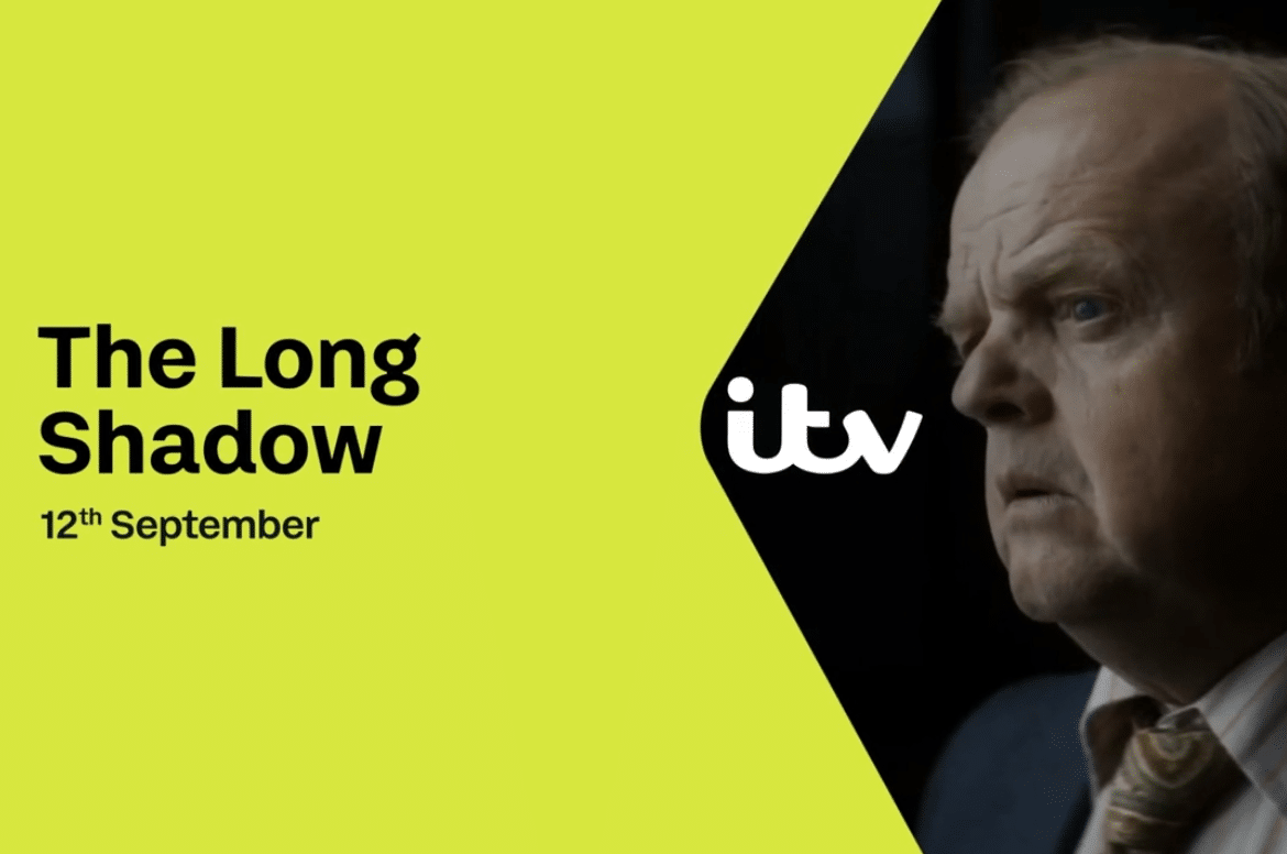
We confidently connected show content directly with the master brand using a unique device called “The Apex”. The Apex is the point at which the ITV logo and the content lock together. It allows us to show a snapshot of a wider brand universe, consisting of a myriad of shows orbiting around the logo.
The Apex is not one static sign, but a flexible system with over 50 dynamic variations. The panels move, shift and expand around the ITV logo, creating a sense of energy and movement, while leaving space for the content to shine.
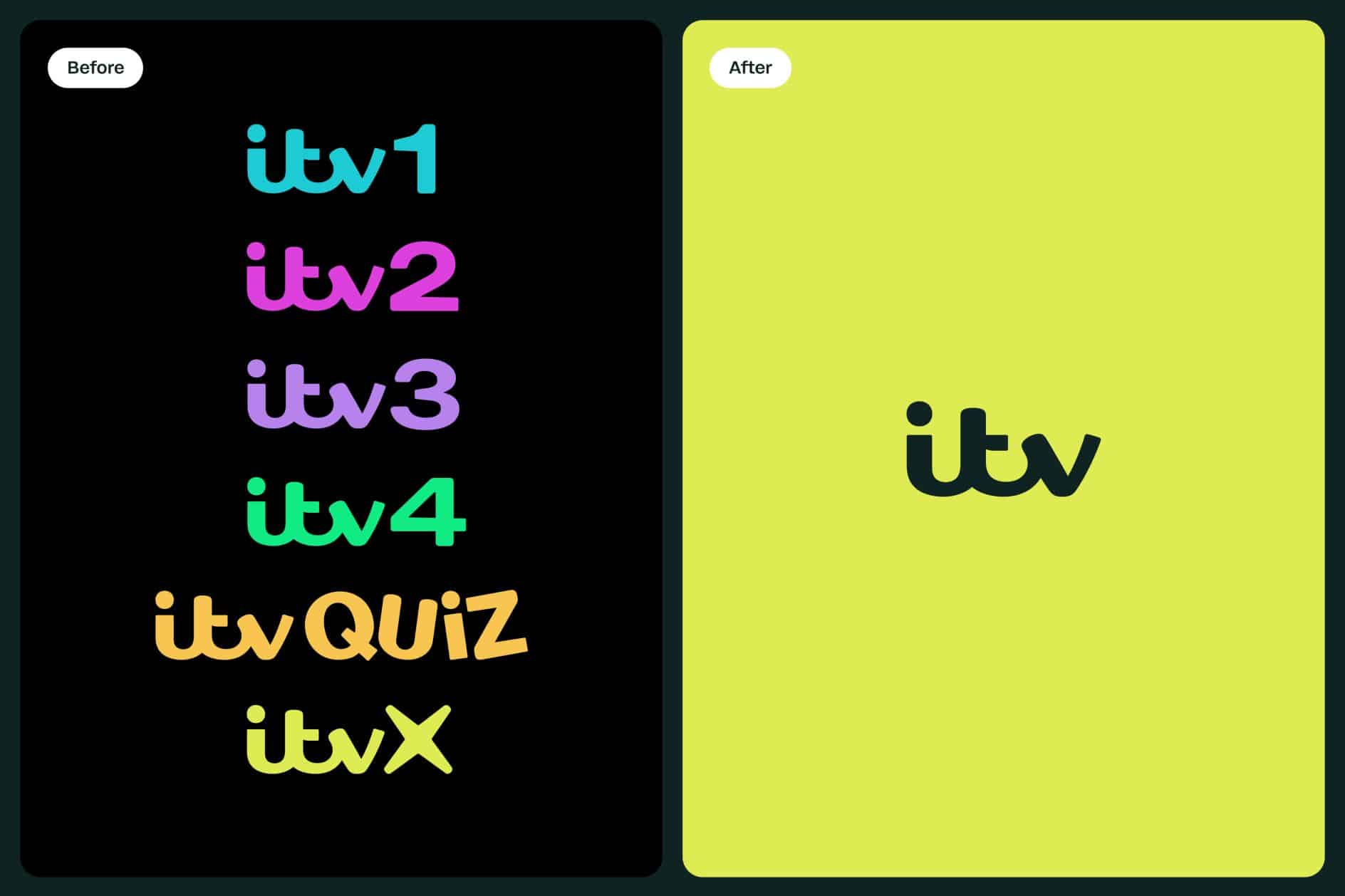
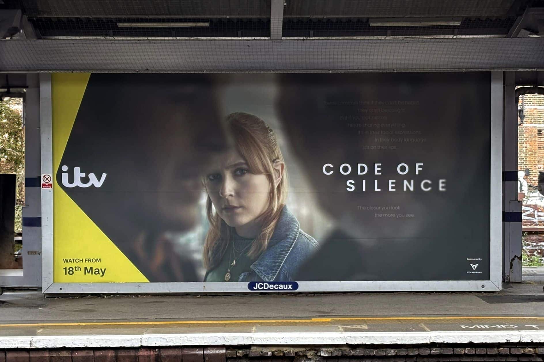
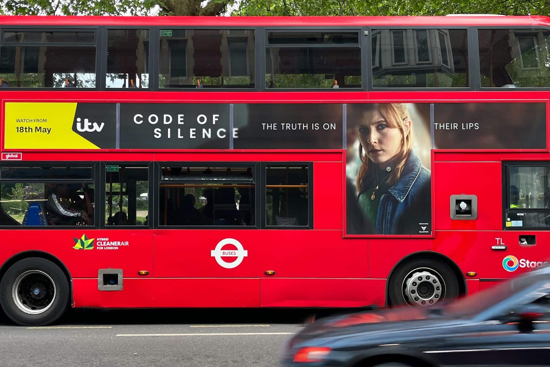
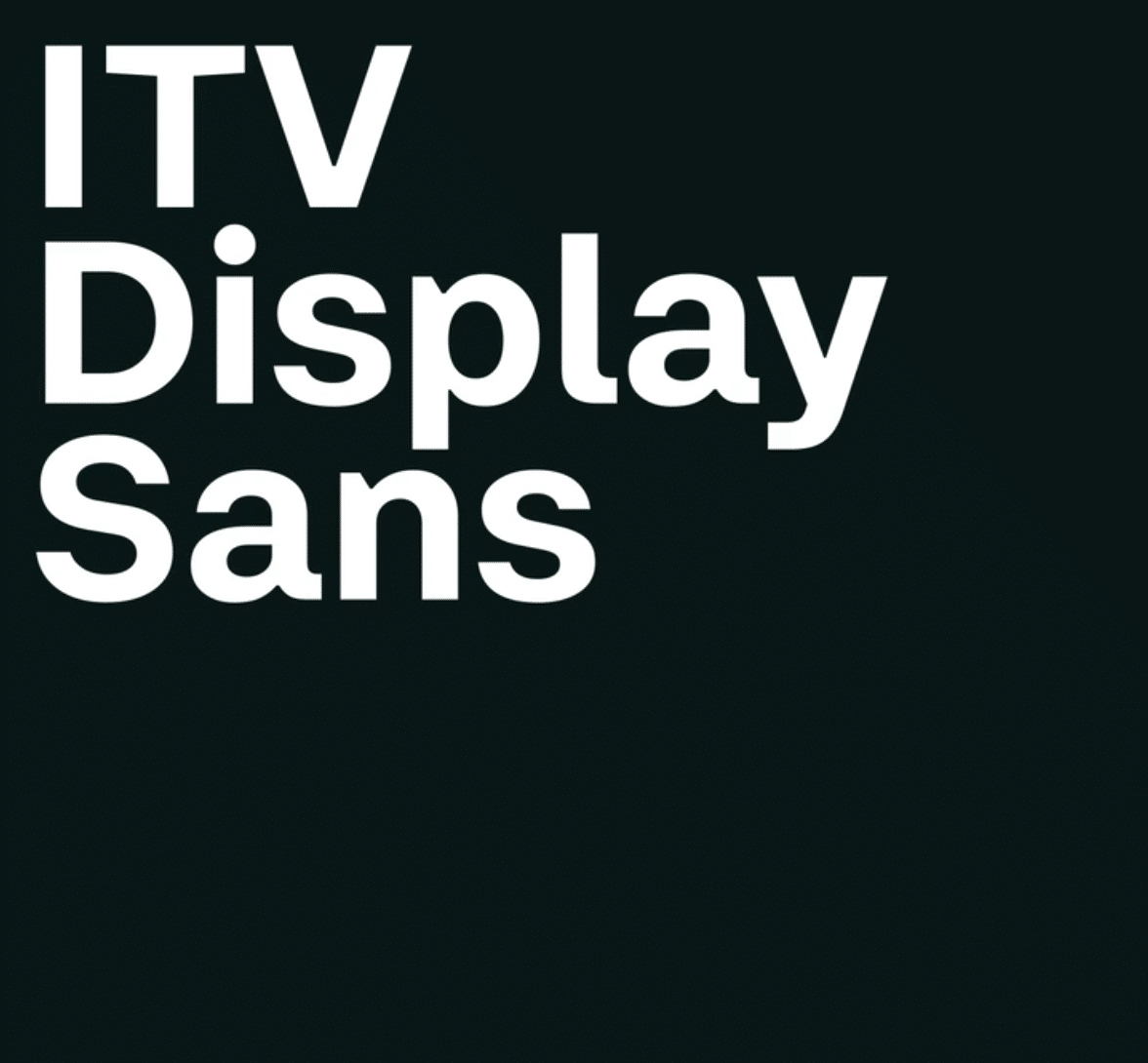
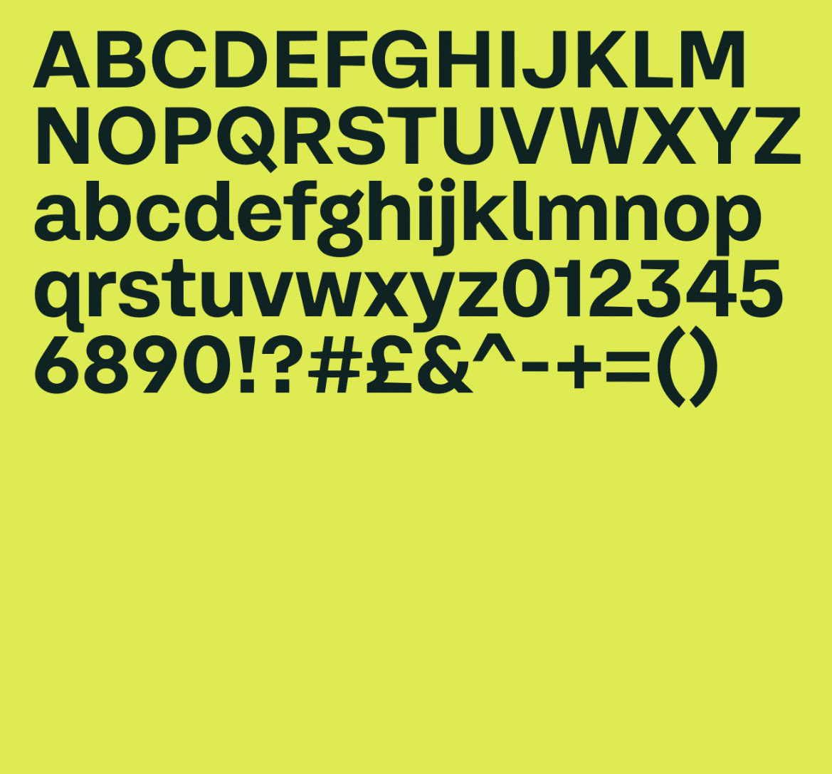
The Studio Kiln reduced the brand’s color palette, removing all sub-channel colors, and instead moved ITV into a world of bright yellow – a color that had gained significant brand recognition thanks to ITV X. Finally, they reduced the font library from seven to one and started working with fonts from ITV Display Sans in two weights: bold and medium.
In practice, the new design had to work hard across hundreds of use cases, from TV trailers to outdoor billboards, and so the apex became the unifying tool. “It could have felt overwhelming, but The Apex gave us a way to generate infinite variations without breaking consistency,” says Charlie Hocking, creative director at Studio Kiln.
“Now the ITV masterbrand gets the attention it deserves, sitting confidently alongside all the incredible content we produce. I can’t wait to see all the ways it’ll come to life – watch this space.” Studio Kiln believes that this project offers a valuable lesson that many brands can learn from.
“Simplifying isn’t about losing things – it’s about giving the brand more confidence,” Charlie adds.” ITV showed that by reducing their colours, typefaces and sub-channels, they didn’t end up with less, they ended up with something stronger and more flexible.”
The new identity marks the first time that ITV’s core brand has been applied consistently across the marketing funnel. In a competitive and fragmented entertainment landscape, this consistency aims to help ITV stand out in both its identity and content.
Credits:


