


")
")


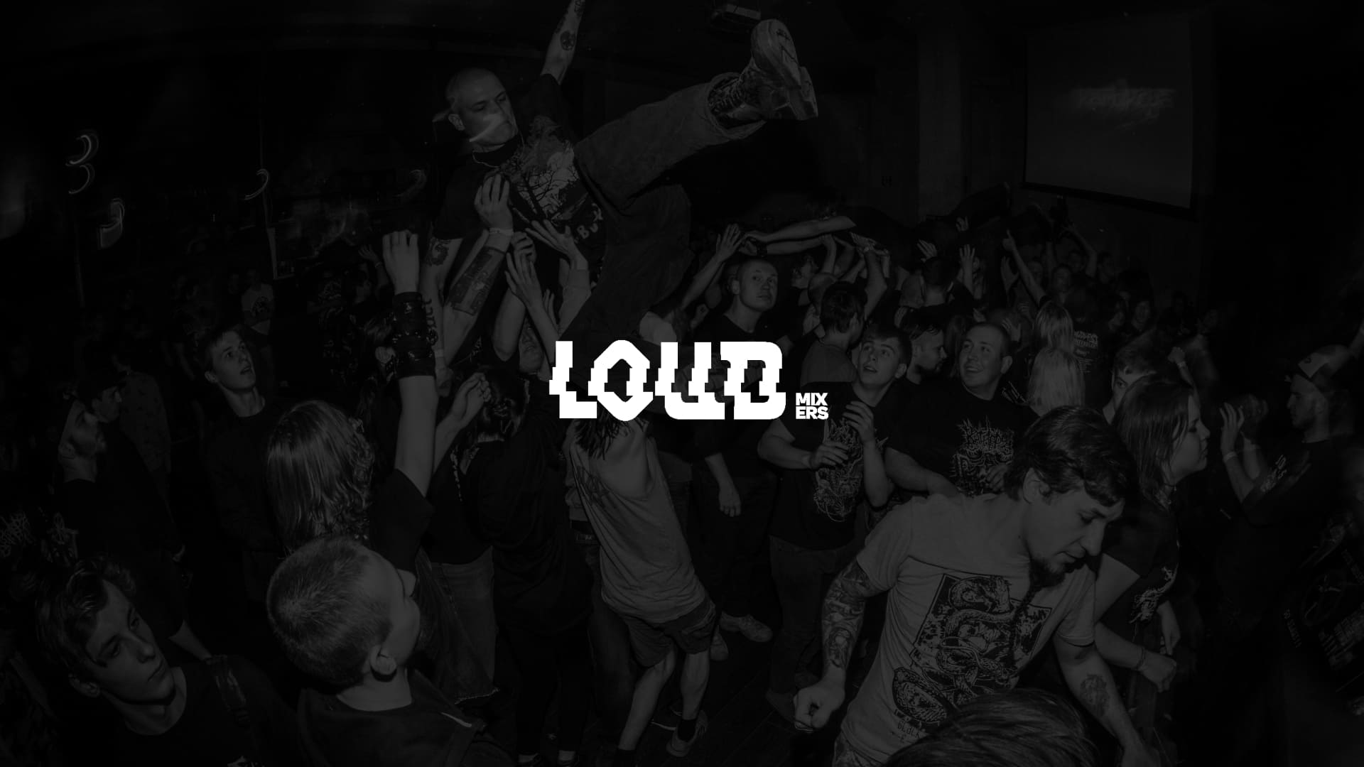
‘Loud Mixers’ identitity brings the true spirit of punk
No corporate gloss. No playing it safe.

Loud Mixers is a mocktail brand created for the counterculture: punk rockers, misfits, and DIY enthusiasts. While most soft drinks tend to lean towards a polished brand and wellness-focused imagery, Loud Mixers rejects this narrative.
The strategic goal of this project was to create a brand that would not just exist on the shelf, but would intervene in the culture, celebrate rebellion, amplify voices, and offer an alternative to corporate-fueled narratives about sober living.

To refine this idea, I explored what “loud” means beyond sound: jackhammers, bass vibrations, balloon pops… maybe even a screaming baboon. But the brand needed to go beyond noise, it needed to embody boldness, energy, and fearless action.
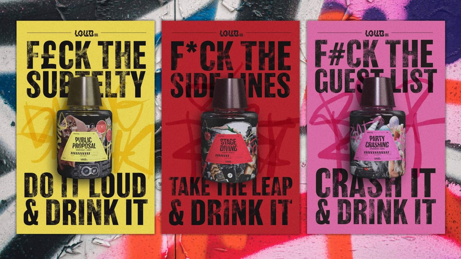
Loud means being brave enough to dance on stage, propose in public, or even crash a party. It means honoring those who make noise in your life. Drink loud. Be loud.
Eva Morenets
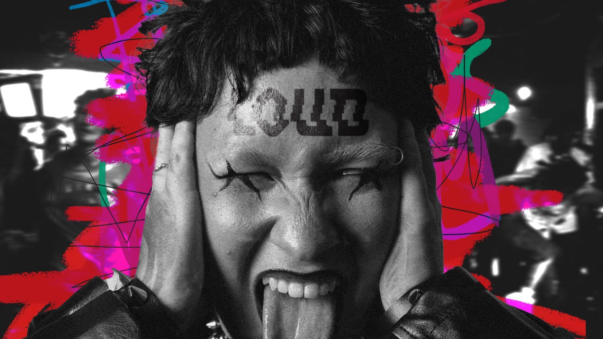
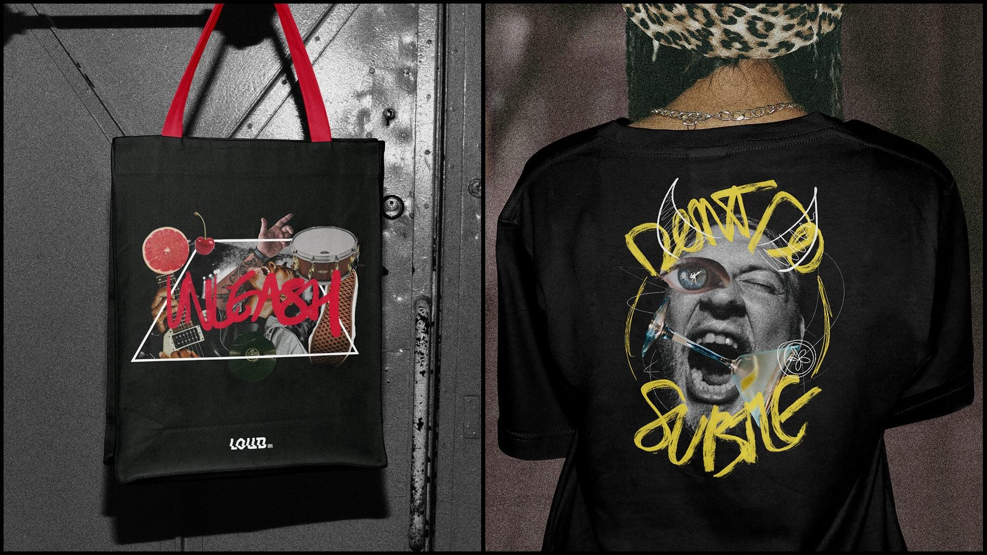
Graphic designer Eva Morenets draws inspiration from magazine culture, skateboarding, rebellion and the underground music scene. The identity incorporates collage, cut-and-paste layouts, imperfect typography, grainy photography and chaotic compositions.
The result is a raw, DIY visual energy that feels more lived-in than manufactured. This design intervention directly challenges the conventional imagery of health-focused, non-alcoholic brands, positioning Loud Mixers as an authentic alternative for those who don’t see themselves reflected in polished marketing campaigns.
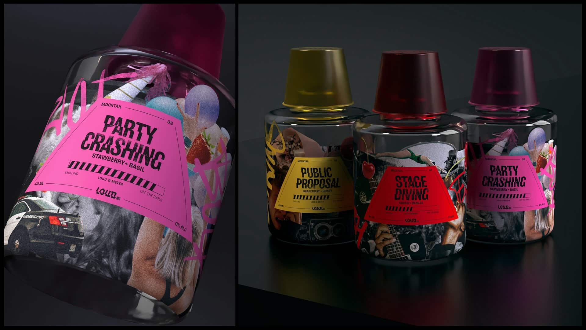
Sustainability also plays a role at Loud Mixers, despite corporate norms. Drinks are poured into reusable glass bottles, reinforcing the brand’s commitment to durability and reuse.
It’s not about disposable consumption; it’s about creating something that lasts, just as punk rock culture itself has endured decades of change. Punk is a world where being loud is not just accepted but celebrated. Drink Loud. Be Loud.
Credits:


