


")
")


Bento Grids: Website UI design trend of (2026)
Bento grid layouts are gaining popularity due to their clean, modular structure.
")
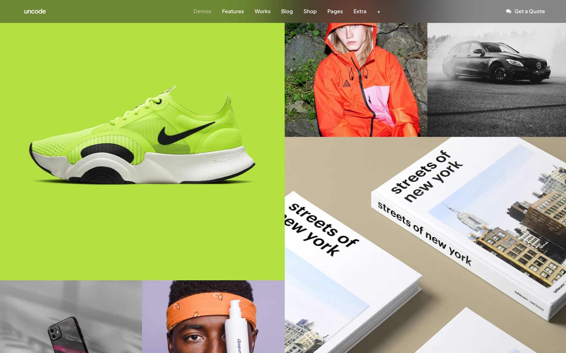
A Bento Grid is a layout system that divides content into distinct, modular sections, similar to how a bento box divides food into compartments. Each section can vary in size and shape but is arranged in a structured tiles-like manner. The Bento grid system is effective for displaying a variety of content types in an organized and aesthetically pleasing way.
I would like to focus on one that I particularly find fun and big for this year – Bento Grid = grid of boxes.
Bento Grid – allows creators to create a beautiful website that displays all their links, content, and social media profiles in one place. It’s a great way to showcase their work and give your audience a complete picture of who they are and what they’re passionate about.
The Philosophy Behind Bento Grids
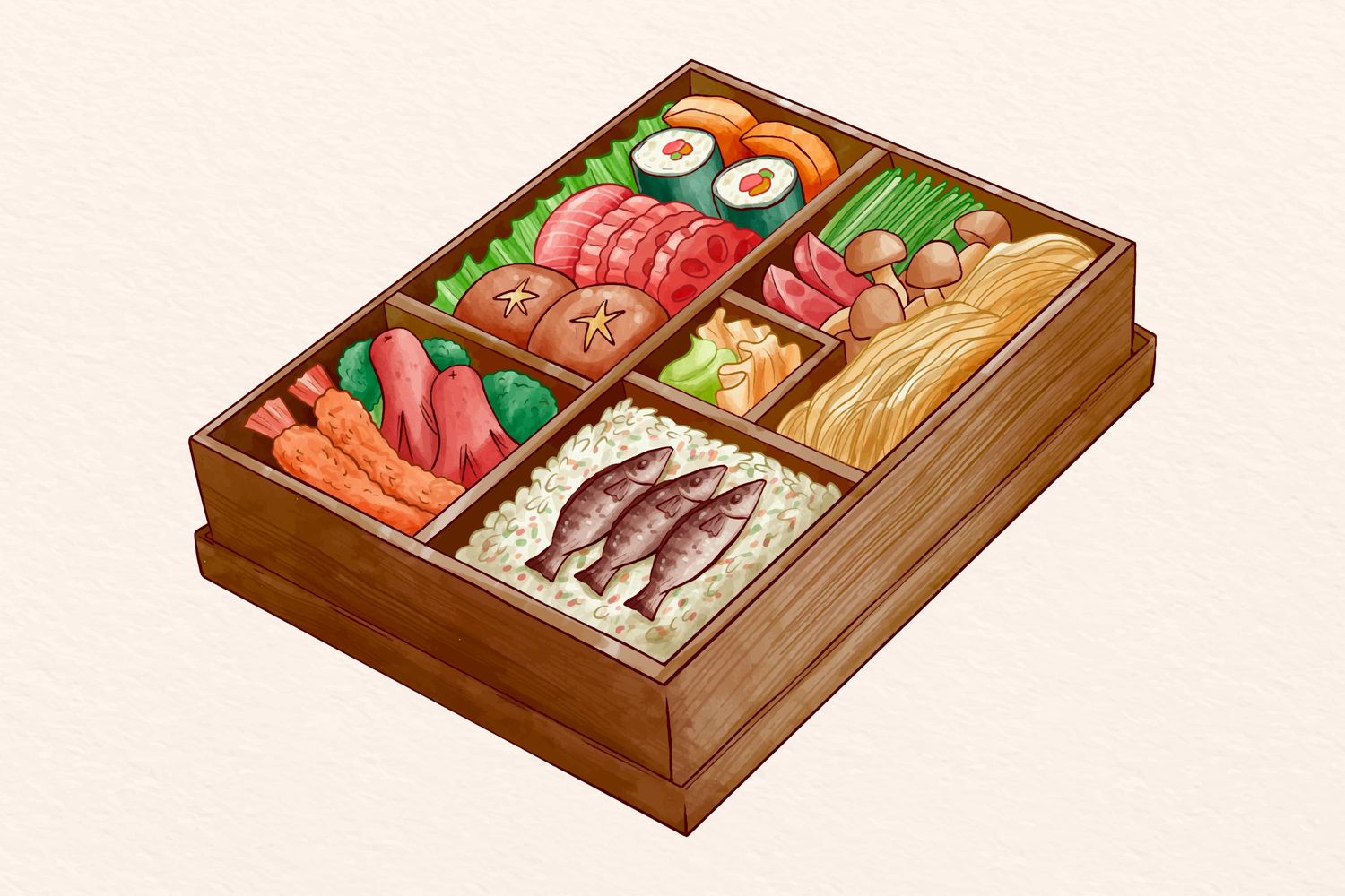
The Bento Grid concept stems from the Japanese tradition of serving a variety of dishes in a single, segmented container called a “bento box”. This presentation not only ensures a balanced meal, but is also pleasing to the eye with its organization and simplicity.
Translated into website design, bento grid platforms offer a similar experience: diverse content organized into distinct areas, making it accessible and aesthetically balanced. Bento’s Grid philosophy is based on compartmentalization and organization. It creates a predictable rhythm that users can follow, reducing cognitive load and improving the overall user experience.
The symmetry and order of the design provide a sense of calm and control, appealing to users’ desire for simplicity and structure in the chaos of the internet.
Key Elements
- Modular sections
Each section of the Bento Grid is a self-contained module that can store different types of content. These modules may vary in size and shape, but they are arranged in a way that maintains the overall harmony of the layout.
- Consistent margins and padding
Maintaining consistent margins and spacing between modules is essential to creating a visually appealing Bento Grid. This consistency ensures that each section feels distinct, yet part of a cohesive whole.
- Responsive design
The most important feature of Bento Grids is their adaptability to different screen sizes. By using responsive design techniques, you can ensure that your grid layout adapts seamlessly across a variety of devices, providing an optimal viewing experience.
- Visual hierarchy
Effective Bento Grids use visual hierarchy to direct users’ attention to the most important content. By varying the size and importance of different modules, you can create a natural flow that guides users through your layout.
How to Create a Bento Grid
Step 1: Plan Your Content
Before you create a Bento Grid, plan the content you want to display. Determine what types of content you have, such as images, text, videos, and how they should be grouped and prioritized.
Step 2: Define Your Grid Structure
Decide on the overall structure of the grid. Consider how many columns and rows you need and the relative sizes of each module. A sketch can help you visualize the final design.
Step 3: Design Each Module
Create individual modules, ensuring they fit within the grid structure. Focus on the content within each module, using consistent margins and padding to maintain a clean and organized look.
Step 4: Implement Responsive Design
Use CSS Grid or Flexbox to create a responsive Bento Grid. Define rules for how the grid should adapt to different screen sizes, ensuring that the layout remains consistent and user-friendly.
Step 5: Test and Iterate
Test Bento Grid on different devices to make sure it looks and works as intended. Gather feedback and make any necessary changes to improve the overall usability and aesthetics of the layout.
Examining the Trend
Modern Bento grids are often characterized by clean lines, geometric shapes, and clear division of space. They usually consist of:
- The title of the feature;
- A short description of the feature;
- Some infographic or interactive content.
This trend is driven by the positive impact on user experience. A well-implemented Bento Grids helps users navigate a website easily, quickly accessing information without overwhelming them with choices.
How Did it Gain Popularity?
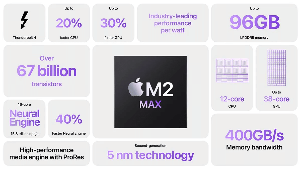
One faction believes that the Bento Grid trend was influenced by Apple’s promotional videos, which featured grids of their product specifications and features. They found a way to make the usually boring lists of specifications visually appealing by arranging them in a grid with a combination of images and typography.
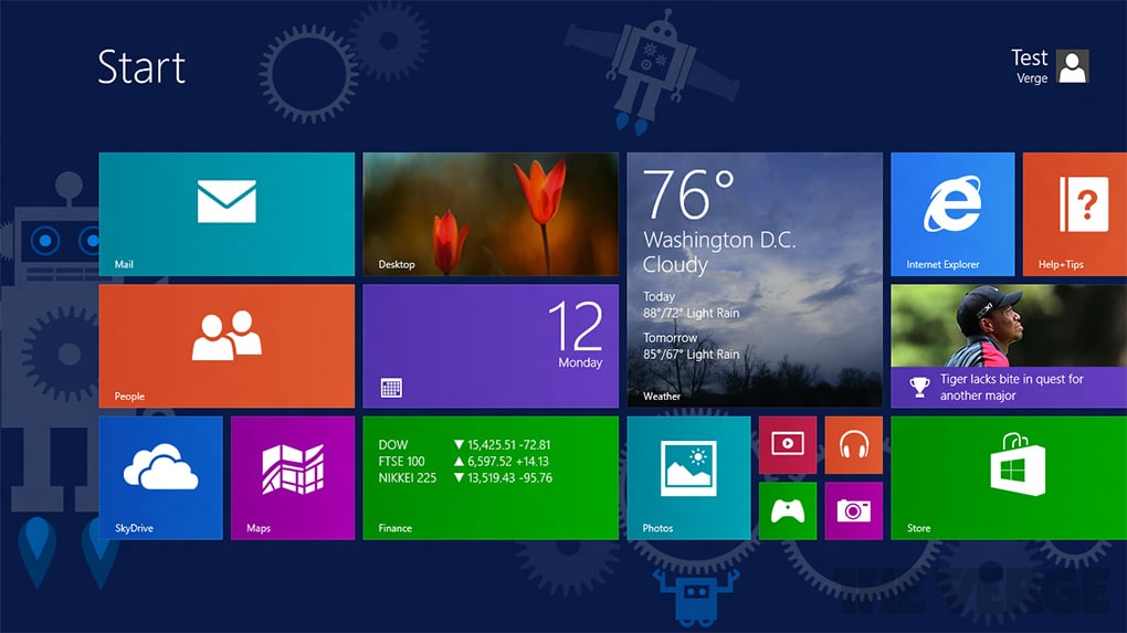
There is a second faction that believes that the true origins of the bento grid trend can be traced back to when Microsoft introduced the Metro Design Language in the Windows 8 operating system.
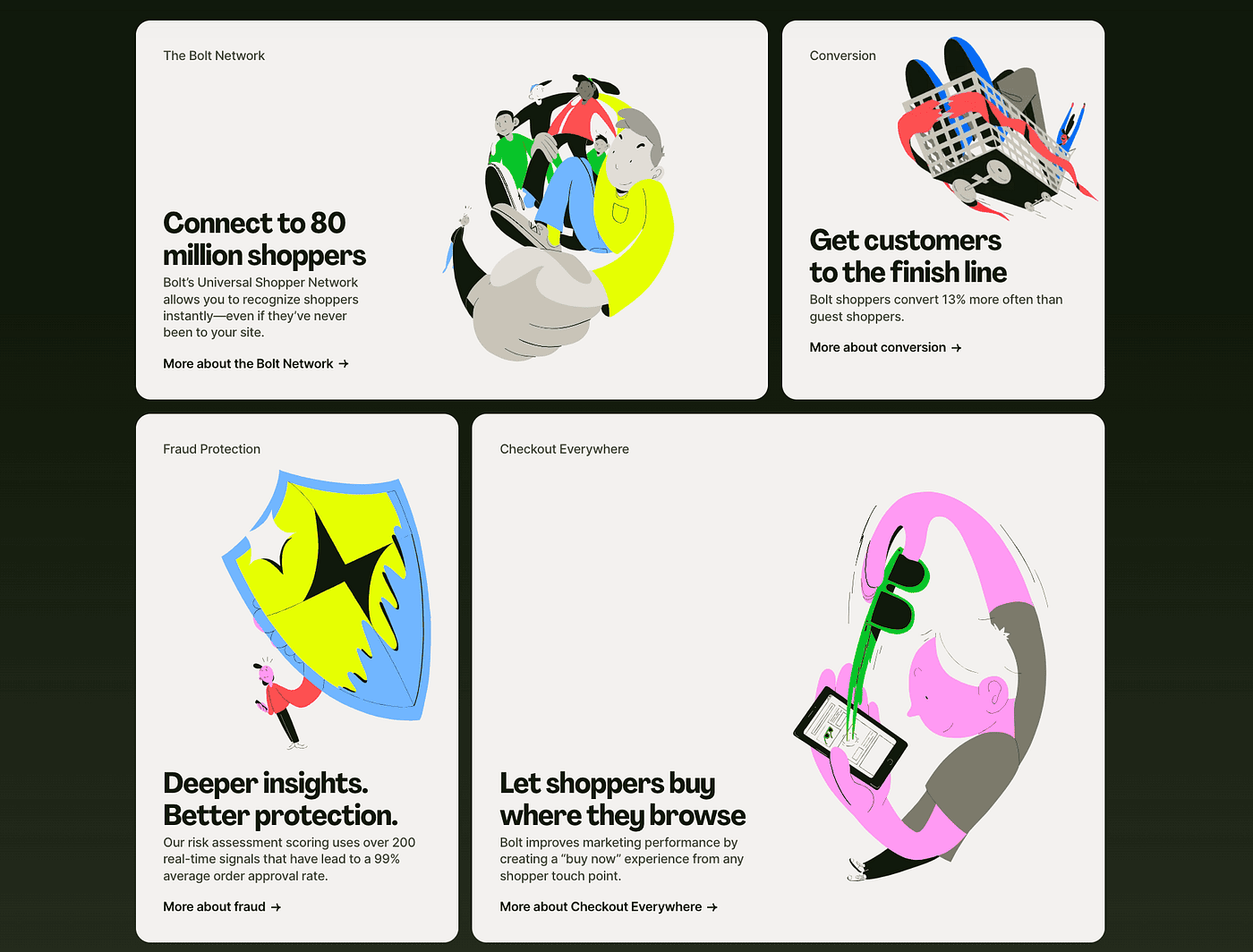
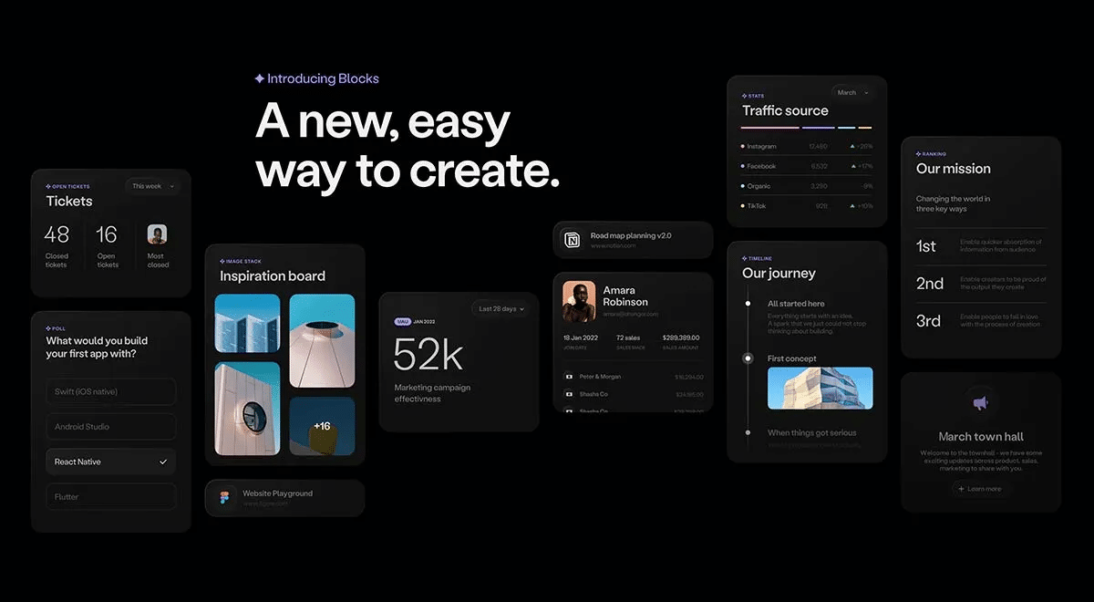
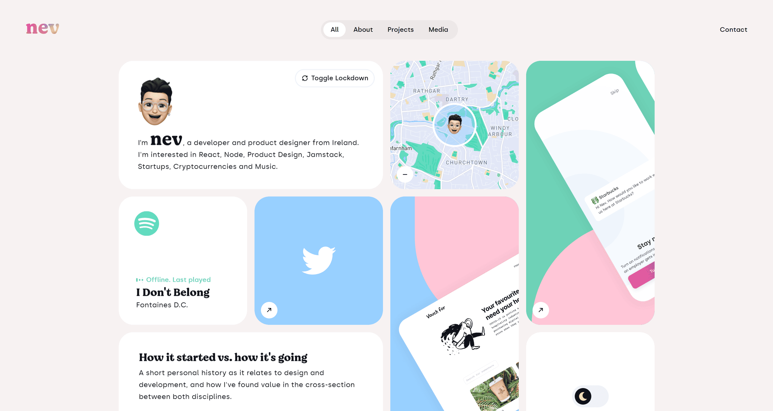
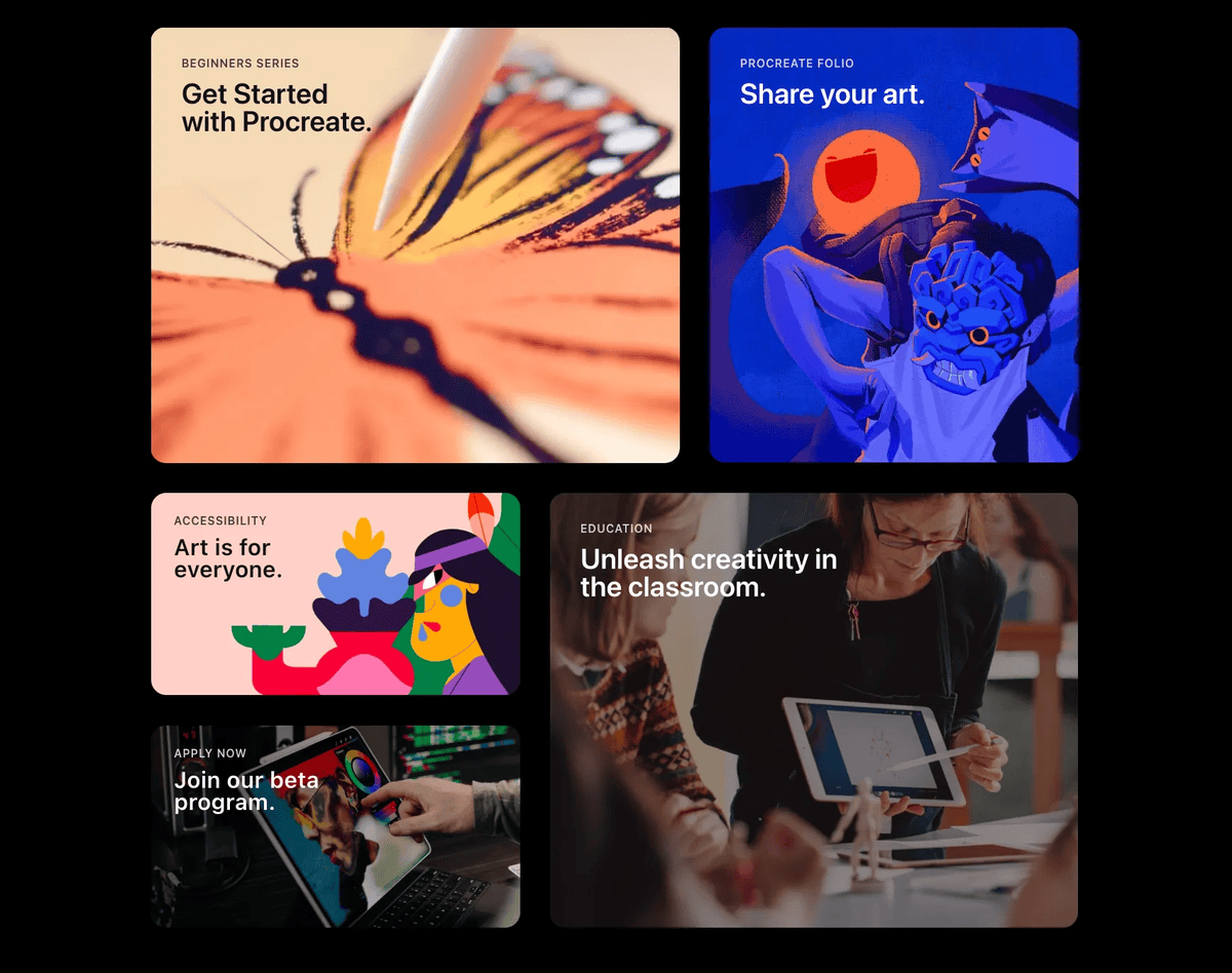
Best Website Examples
Here the top website layout examples who are using Bento Grid:
Final Thoughts
Bento Grids stand out as a significant trend in contemporary web design, offering a combination of aesthetic appeal and functional clarity. They reflect a design ethos that values order, beauty, and user-centricity.
As web technologies evolve, the principles of Bento Grids will continue to shape best practices, encouraging designers to create experiences that are not only visually appealing but also intuitive to navigate.
Credits:
")
")


