


")
")


EDIT revamped the ‘English National Ballet’ brand
The brand identity was refreshed to better reflect their mission of opening up the possibilities of ballet.

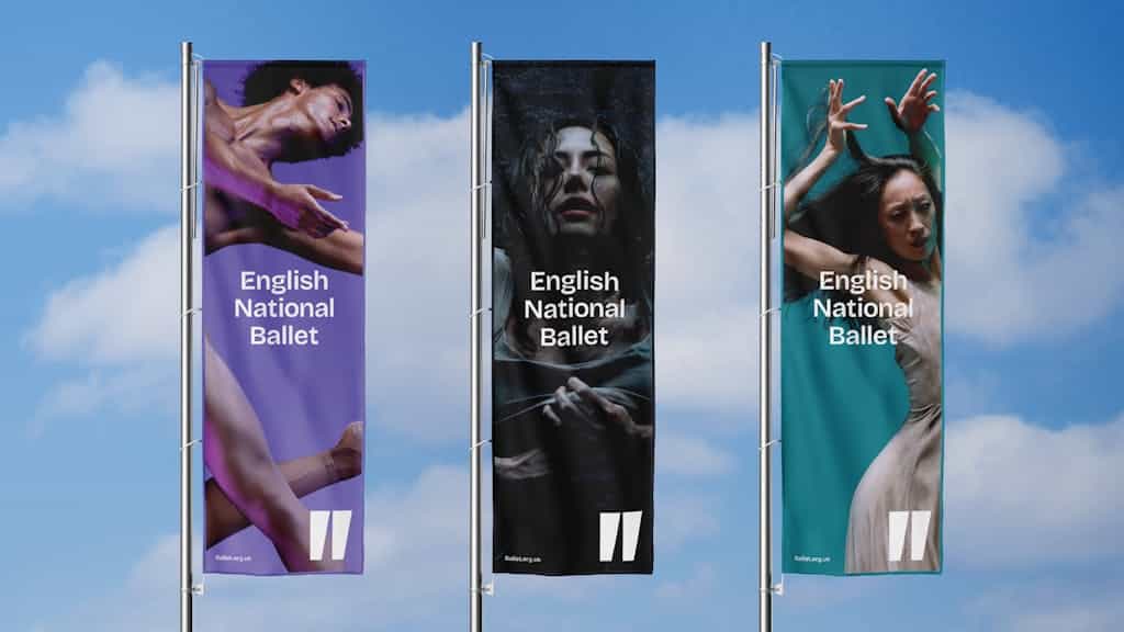
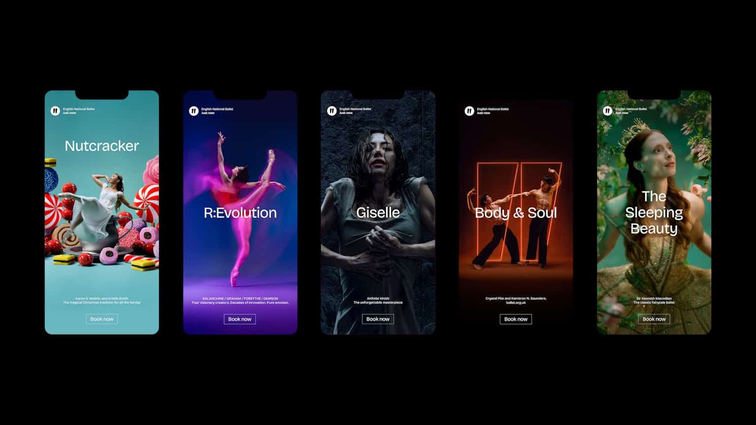
EDIT Manchester-based studio has significantly contributed to the renewal of the English National Ballet (ENB) brand identity, which will now delight ballet lovers around the world with its sophistication, elegance, creativity and more colors.

The company, which recently celebrated its 75th birthday, performs a mix of classic and contemporary shows across the UK and around the world. It also runs a wide range of community programmes, “to take world-class ballet to the widest possible audience.”
The company’s rebrand is more than just a new look – it’s a renewed commitment to creating meaningful, moving experiences for everyone. It honors the company’s rich heritage while looking confidently to the future.
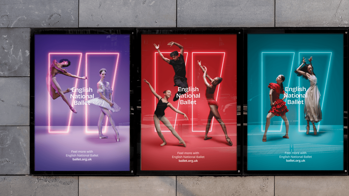
Designed to reach a broader, more diverse audience, it invites everyone – from longtime ballet enthusiasts to first-time visitors – to experience the emotional power and beauty of ballet.
“English National Ballet has always been about evolution, not just of the art form, but of how we reach and resonate with audiences everywhere. Our new brand identity is warm, bold, and human – just like the work we share on stage, in studios, and online – enabling us to connect with more people, in more ways”. – said Artistic Director, Aaron S. Watkin.
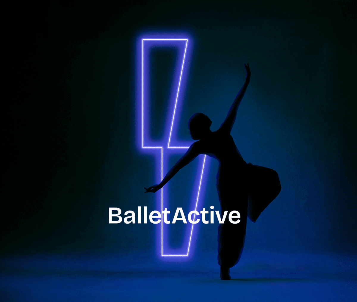
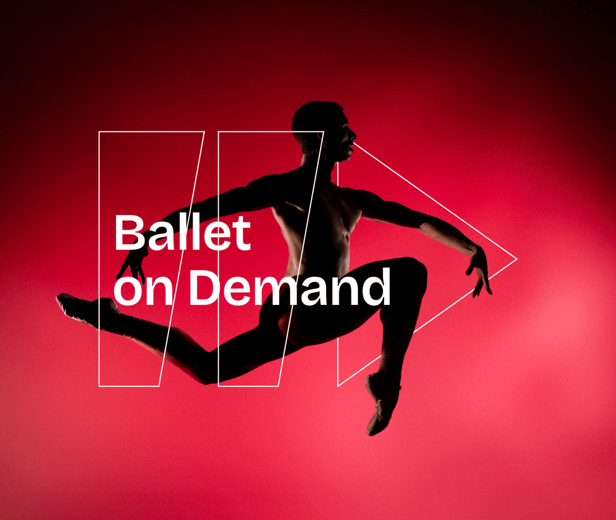
“EDIT’s approach was all about adding more energy, more feeling and more presence to the brand. From the fluid open-source typeface to the emotive brand photography, everything was designed to help English National Ballet connect with more people and share all the incredible ways that audiences can benefit from what ballet has to offer.” – explain Karen Hughes, Creative Director, EDIT.
The EDIT team put everything in place as it should be. Added new typography from Google Fonts (Bricolage Grotesque) and the same type was chosen for the copy, due to its “fluid elements.”
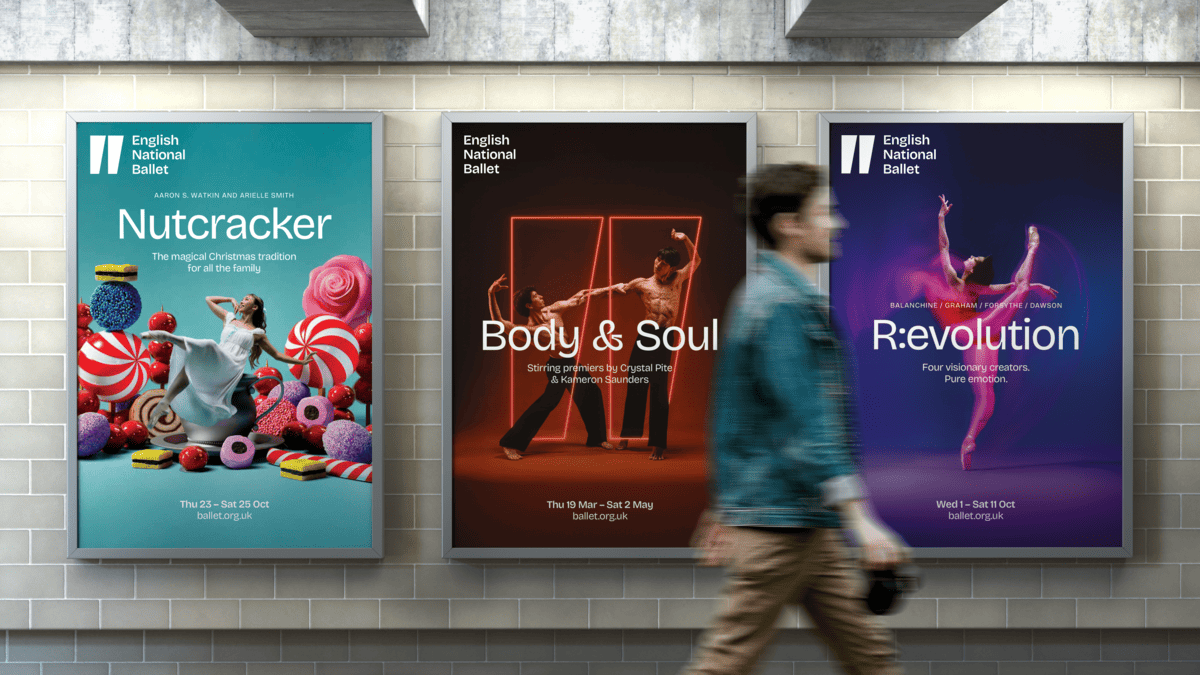
This desire to mimic the dynamism of the artform also drove a renewed focus on the brand’s motion design. “It felt quite static in its previous form, so there was so much potential with the motion to add more energy,” – Hughes says.
The team also wanted to bring more emotion into the identity. That influenced the motion design, the art direction and photography, and even the colour palette, where different shades represent different feelings, and gradients are used to show how emotions bleed into each other.
“The key idea was to feel more with English National Ballet”.
“That might be passion, happiness, anger, sadness – whatever it is, you’re free to feel it with us.”
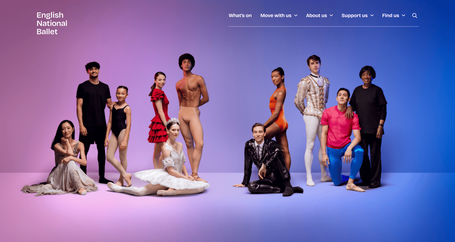
The new website was created by London-based agency HdK, which like EDIT and Boardroom Consulting specializes in working with cultural institutions. The site’s more user-friendly design reflects the broader ambitions of the brand refresh. explain explains a director of marketing and communications Lisa Leigh.
“The reaction has been really encouraging, but I think we’re just at the start,” she says. “We have a system that can be flexed in lots of different ways, and we’re still working out exactly what that might look like going forward.”
Credits:


