


")
")


Pizzeta brings Italian authenticity according to their traditions
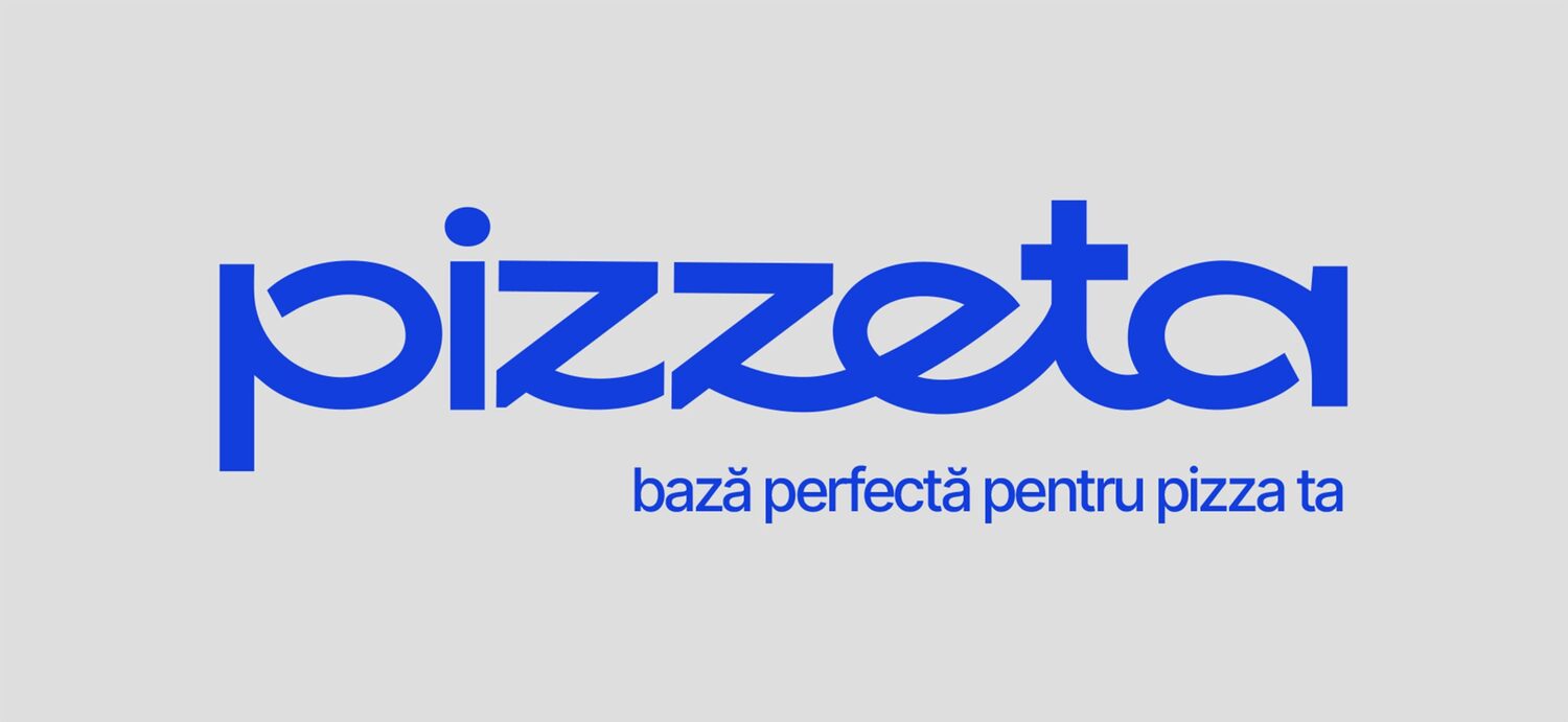
Pizzeta - packaging that reflects Italian.

Pizzeta is a handmade pizza base, carefully made with natural ingredients and without compromise. The slow-fermented pizza base has the perfect texture – crispy on the outside, soft on the inside – and the authentic taste of Italian pizza right at home.
The challenge for the BroHouse branding team was to turn this authentic simplicity into a memorable brand: a familiar, friendly name, a natural logo and packaging that conveys lightness, warmth and the joy of easy cooking.

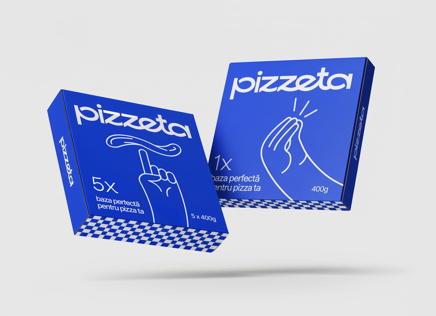
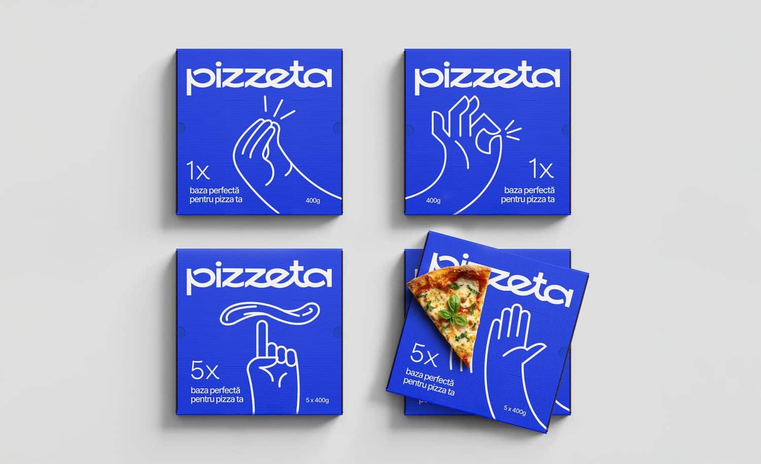
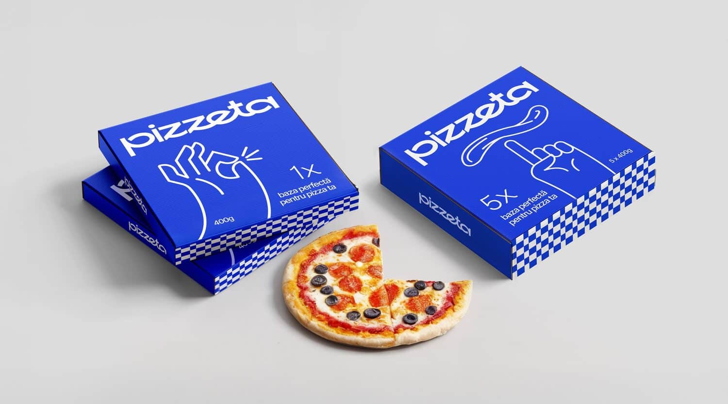
The visual identity and packaging express Italian authenticity without clichés. The minimalist logo conveys an effortless elegance, while the packaging uses clean, fluid illustrations inspired by Italian hand gestures – a universal language of expression.
Set against a fresh blue background, the design looks modern yet emotional, transforming simplicity into a recognizable Italian signature.
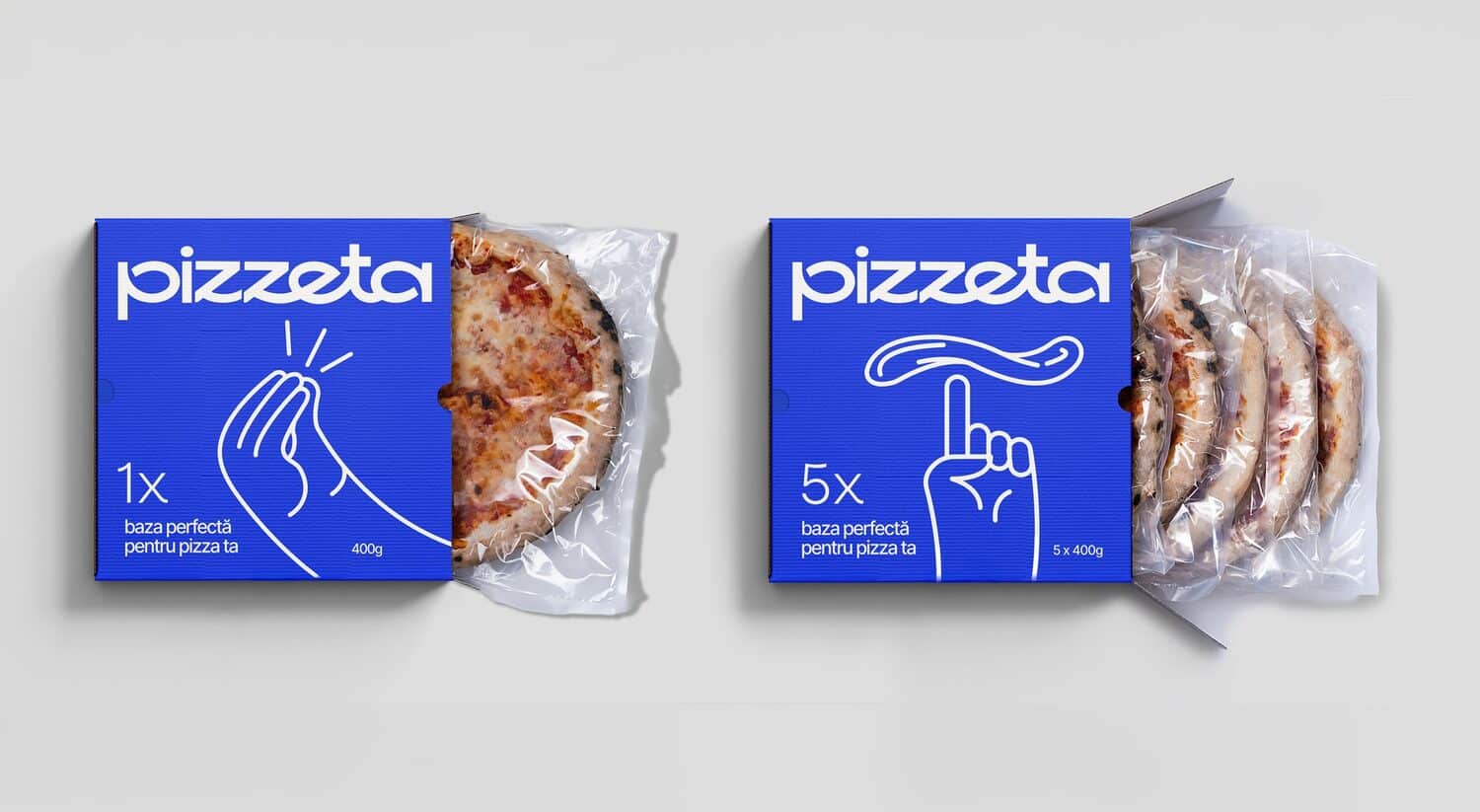

Pizzeta inspires Italian authenticity through design that speaks the way Italians speak – with their hands. The BroHouse team captured the emotions and rhythm of Italian life with minimalist illustrations inspired by iconic hand gestures.
Each gesture conveys warmth, spontaneity and personality, transforming the packaging into a visual conversation – expressive, elegant and unmistakably Italian.
The clean blue background and smooth line drawings provide a modern, sophisticated take on Italian heritage, avoiding clichés like pizza slices or flames.
Instead, the design celebrates simplicity and human connection, embodying the essence of the brand: natural, authentic, and effortlessly joyful. The Pizzeta packaging doesn’t describe Italy – it gestures towards it.
Credits:


