


")
")


20 Magazine fonts to create superior covers
These fonts have an indescribable style, and are versatile enough to create modern magazine layouts.

Choosing the right magazine fonts is a remarkable thing. There’s something magical about how the perfect font can transform a simple article into an engaging narrative that readers can’t put down.
You may also like:
In this comprehensive guide, we’ll explore the world of charming magazine typography, revealing the secrets of the fonts that make publications irresistible. So roll up your sleeves and let’s dive into this typographic adventure together.
Just take a look at our list below and choose your favorite font to download. We have collected free and premium fonts so that you have what to compare. Wish you success in creation of these editorial designs easily.
Without wasting any time, let’s move on to the magazine fonts:
Abang Fashion – branding font
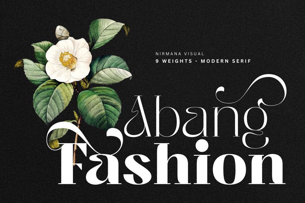
a luxury typeface with 9 Weights, full set of lowercase and uppercase letters, numerals and punctuation, multilingual symbols. Suitable for the titles, logos, typography, clothes, magazines, brochures, packaging and much more.
Yoshida magazine font
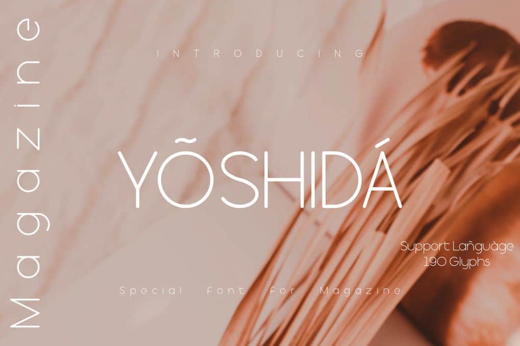
A great choice for writing that requires a lot of paragraphs in a magazine or tabloid. Best for titles, covers, branding, posters, display purposes, and many more others.
Koolegant elegant serif font
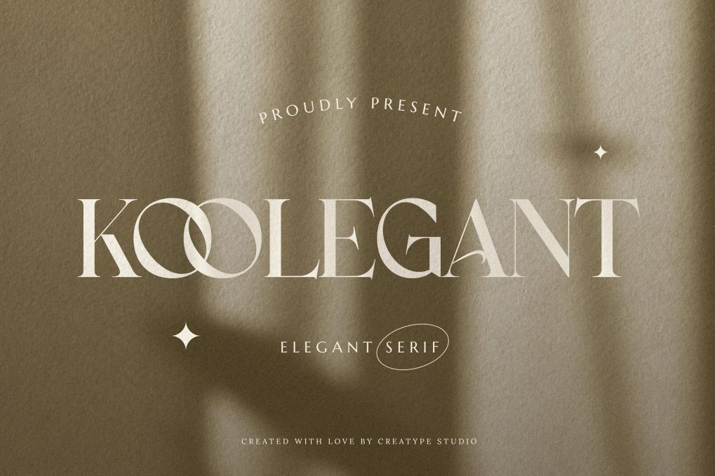
A fashionable and modern elegant serif font with some sexy stylish extras. Perfect for branding projects, logos, wedding designs, social media posts, advertisements, product packaging, labels, and more. Tons of glyphs, ligature and alternate, PUA encoded, multilingual support.
Royal Hefana – elegant font duo
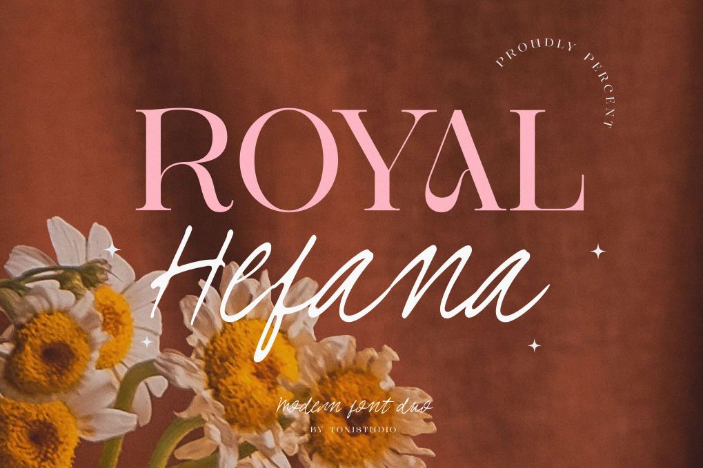
A luxurious duo font consisting of a classic, elegant serif and a graceful signature script. Ideal for magazines, editorial, logos, posters, covers, headlines, and more. Comes in uppercase and lowercase characters, numbers, punctuation, multilingual support.
Marqum – art deco font
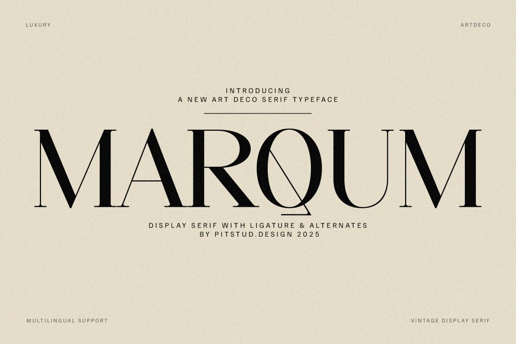
A refined serif typeface that brings sophistication, prestige, and timeless beauty to creative projects. Comes in uppercase, lowercase, numbers, punctuation, symbols, alternates, ligatures, stylistic sets, and multilingual support.
Harlet – modern sans serif font
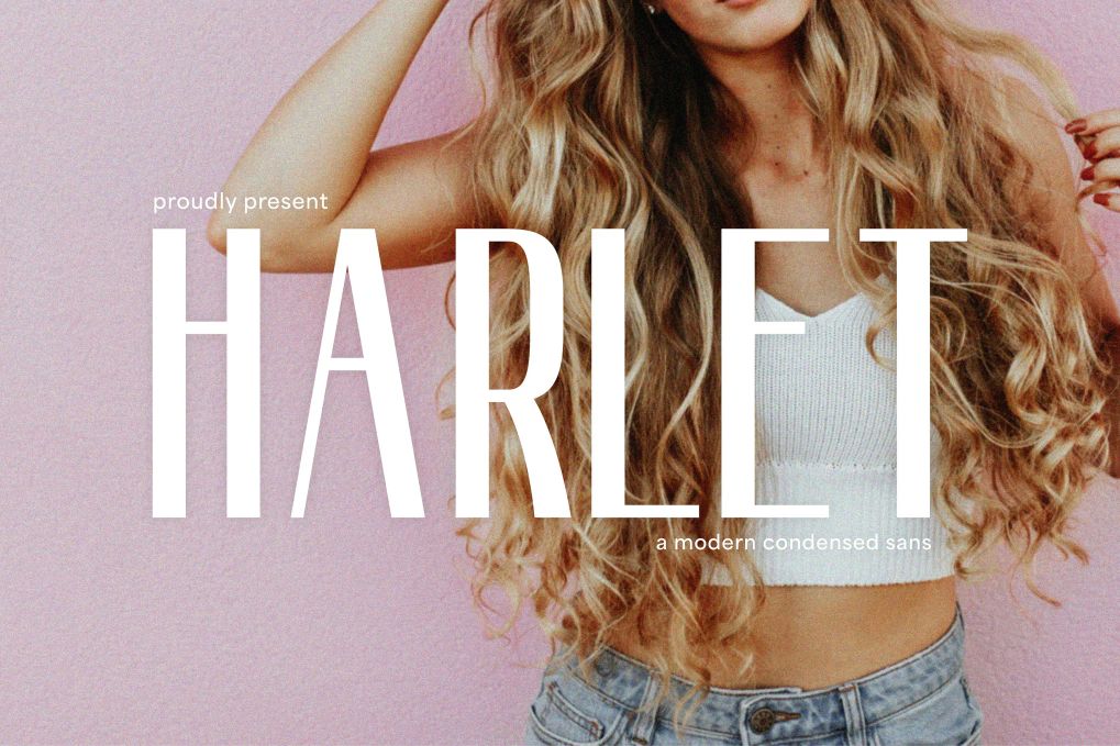
A sleek and modern condensed sans-serif typeface. Perfect for fashion branding, editorial designs, social media graphics, and minimalist layouts. Comes in uppercase, lowercase, numbers, punctuation, and multilingual support.
Daily Magazine – free font family
- Free for personal use only.
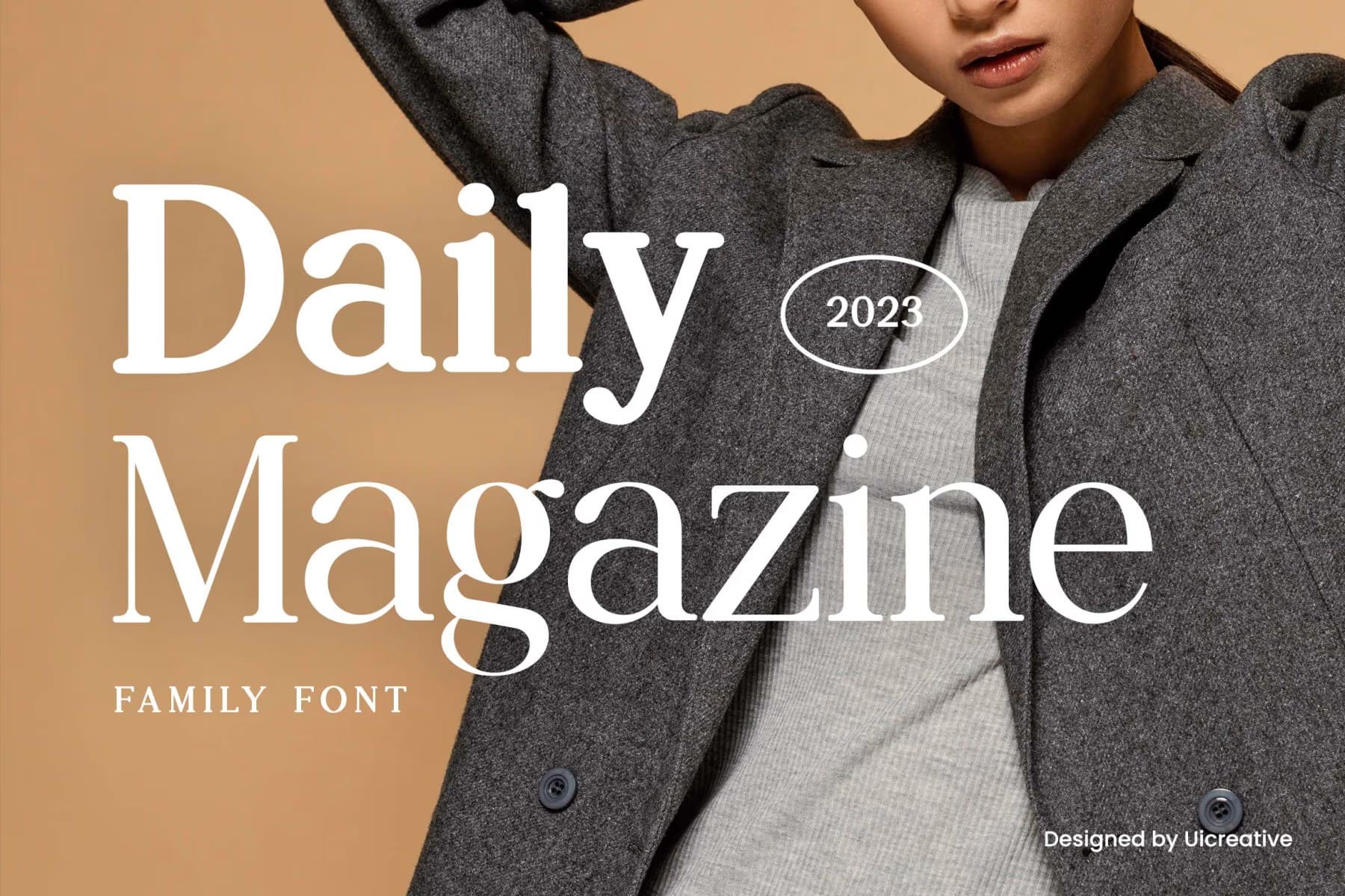
A magazine, newspaper free display font family so good going for your designs such as titles, headlines, posters, and more.
Engraved – free classic serif font
- Free for personal use only.
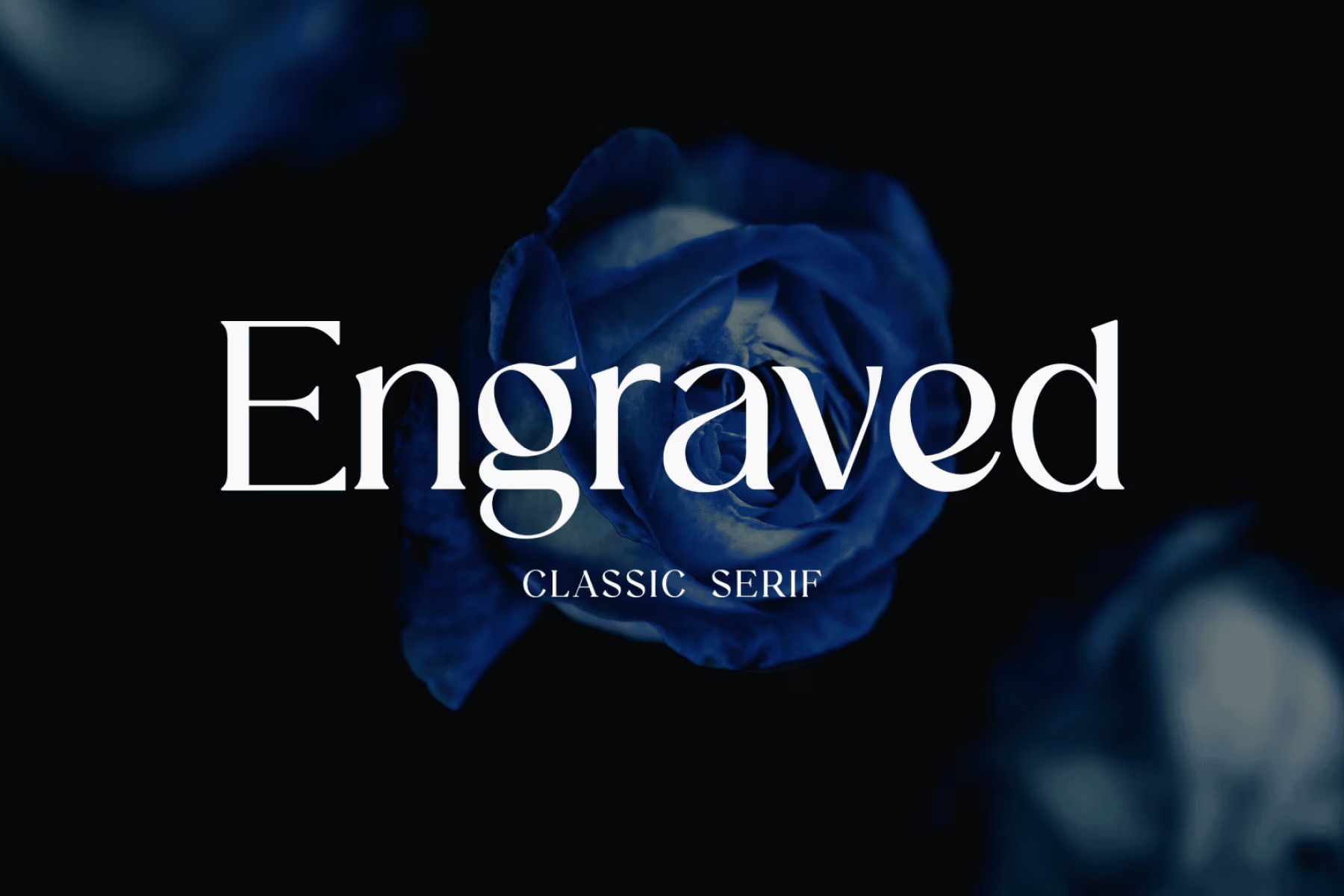
A free classic serif font ideal for your design projects such as titles, headlines, posters, magazines, newspapers, and more.
VOGUE – modern display font
A modern all-caps display typeface with a character of it’s own. Perfect for headlines, big text, branding, logotypes and display usage. Comes with 5 weights (Thin, Light, Regular, Bold & Extra Bold).
Restora Neue – bold serif font
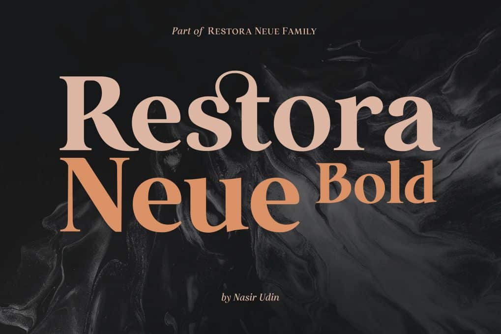
It’s a mix of old-style roman serif styles. Its sharp and longer serif with a bit touch of medieval. The set of special ligatures and stylistic alternates can be perfect mates for your brand. It is well suited for book covers, editorial, branding, advertising, and more.
Figo Shiftz – editorial font

A classical editorial serif typeface that blends the timeless elegance of traditional typography with a refined contemporary touch. It offers 250+ alternates and ligatures, enabling limitless creative expression – from dramatic headlines to perfectly composed body text. Comes with 9 weights.
Magazine elegant serif font
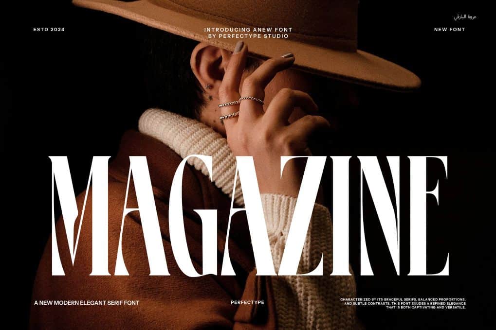
This font has sharp serifs that add detail to each letter without making it too busy. This means it works well for both big titles and smaller text. It adds a classic and fresh look to editorial and branding projects, making designs look professional and clean.
ENOVELLA – sans serif font
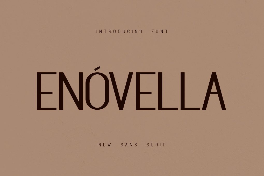
A standard sans serif font so good going for your designs such as magazines, editorial, titles, covers, layouts, posters, and more.
ZT Nature – free font
- Free for personal and commercial use.
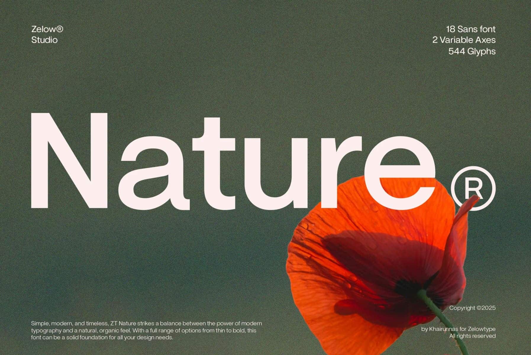
A free magazine display font for your editorial and magazine needs. Ideal for magazines, logos, big and small texts, covers, titles, and more.
Intro – free display font
- Free for personal and commercial use.
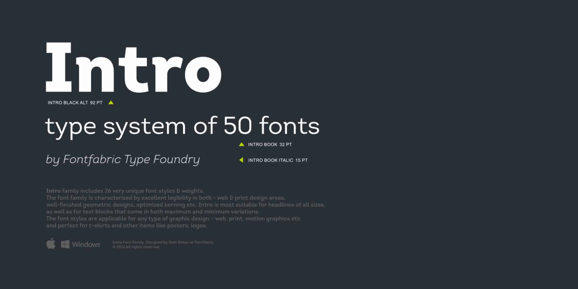
A free display title font for your creative magazine layouts, covers, and headlines.
Garute – free display font
- Free for personal and commercial use.
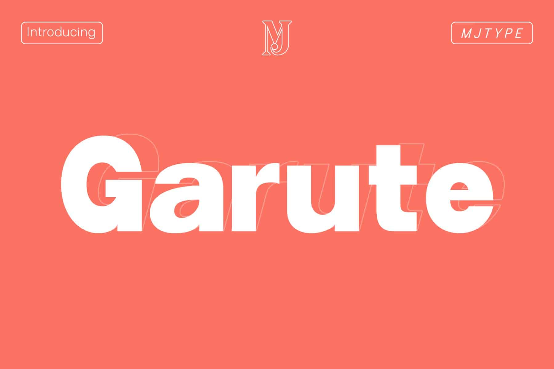
A free and simple display font so good going for your editorial or magazine designs.
Great Actors – modern retro font
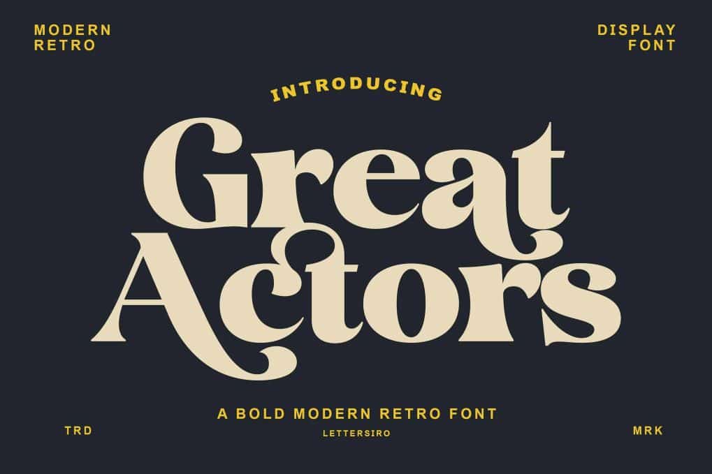
A bold serif font that blends the charm of retro typography with a fresh modern twist. Designed with expressive curves, unique ligatures, and eye-catching alternates. Supports multilingual.
Mighty Quite – modern sans serif font
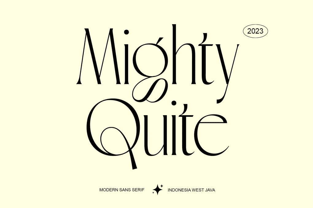
A stylish font that is both classic and minimal. Perfect for feminine logos marks, fashion mastheads and editorial designs. OTF and web font versions, letters, numbers, punctuation, and multilingual support.
Brozeri – casual serif font
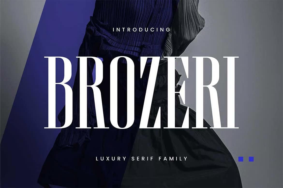
A condensed serif typeface with bold contrast and striking contours. Available in 4 weights. Perfect for headlines, labels, fashion branding, logos, posters, magazines, editorials, and more. Comes with multilingual support.
Regina – Art Nouveau font
An Art Nouveau-inspired sans serif display font that draws from the beauty and grace of the late 19th-century artistic movement. A perfect choice for artistic branding or high-end visual projects. Comes in accents, PUA encoded, and multilingual support.
FAQ’s:
What is a magazine font?
Magazine font is specially designed and used for printed layouts and cover. These fonts are usually chosen for their legibility, ease of reading, and space-saving properties. They are used to convey important news headlines, text, and other text elements in a clear and easy-to-read manner.
What kind is the best magazine font?
The most popular newspaper fonts are serif and sans-serif fonts, as they are believed to help legibility and guide the reader’s gaze through the text.
What makes a font feel like a magazine?
Fonts that immediately scream “magazine” have something vague about them, but they’re actually a combination of very specific design characteristics:
- Most traditional magazine fonts, especially old-style ones, are serifs. They draws not only on old-fashionable, but also modern typography while providing fine detail that helps with smooth reading.
- Magazine fonts typically have a moderate contrast between thick and thin strokes. Too little contrast looks dull, while too much can cause printing problems and reduce readability at small font sizes.
- Space efficiency requires slightly compressed letterforms. Real magazine fonts are designed to fit more characters on a single line without sacrificing legibility.
- Letters need to be strong, well-defined shapes that can withstand less than ideal printing conditions. Subtle fonts simply don’t fit in a magazine environment.
Where can I use magazine fonts?
Magazine fonts are useful not just for magazines. Their authority, legibility, and efficiency make them perfect for many areas of designs such as:
- Editorial Design;
- Corporate Design;
- Academic Publications;
- Digital Applications;
- Branding Designs;
- Newspaper Designs.
Common magazine font mistakes to avoid
Even experienced designers can fall into typography traps that undermine the effectiveness of their magazine.
- Too many different fonts can create visual chaos and confuse readers. The best magazines typically use no more than three or four fonts throughout the publication.
- While unique fonts can create visual interest, they should never compromise readability. If readers have difficulty reading your content, even the most beautiful typography has been of no use.
- The font you choose should reinforce your brand identity with each issue. Constantly changing fonts can confuse readers and weaken brand recognition.
- Without a clear typographic hierarchy, readers don’t know what to focus on. Good magazine typography naturally guides the eye through the content.
Conclusion
I hope you find the font you’ve been looking for. Don’t hesitate to try, experiment, and apply different fonts to make your design project stand out as much as possible.
I have put together all the best free and premium fonts that I think will make you better as others. Of course, you can search the Internet, where there are many more, but I hope that our site will help you decide in one place the most suitable option for you. I wish you all success.


