Art&Graft helps ‘Line Mobility’ to realize its ambitious urban transport idea
The London Studio helps "Line Mobility" design believe in the future of transport.
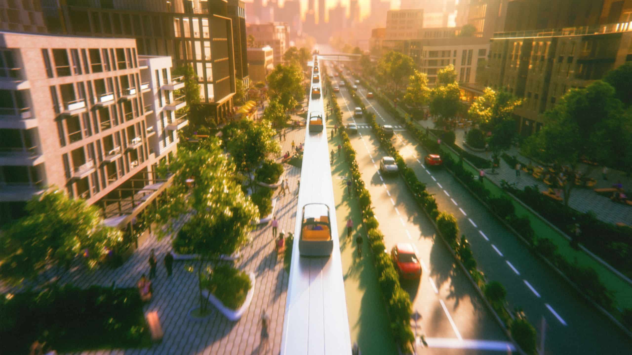
Cities are busier than ever. Our roads are overloaded, and public transport is increasingly congested. Getting from point A to point B has never been more difficult, so it’s interesting to learn about a startup born out of this frustration, with a bold idea to rethink how we travel in the future.
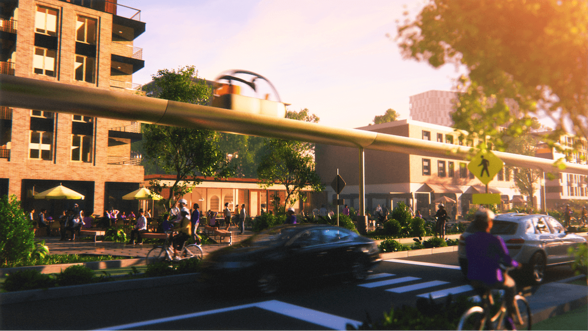
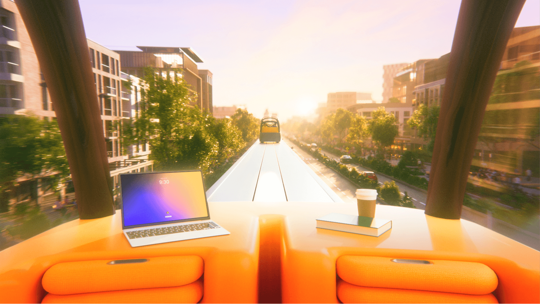
But instead of improving existing infrastructure, Line Mobility is offering a completely new approach. Something you might expect from the movie “Back to the Future”. They hope to create personal, point-to-point transportation using automated cars that ride on elevated rails above traffic. No schedules or transfers, no terrible congestion. Just direct, on-demand transportation designed for people, not cars.
It’s a bold idea that we can’t even imagine. So the biggest challenge may be convincing us of its reality – especially when the product doesn’t exist yet.
That’s where Art&Graft comes in. The London-based studio collaborated with Line Mobility ahead of the launch and had to create the entire brand experience from scratch. Not just how it looks, but how it feels, sounds, and earns trust. In this case, you can forget about superficial aesthetics. The key was to create a believable, reassuring, and workable futuristic transport system.
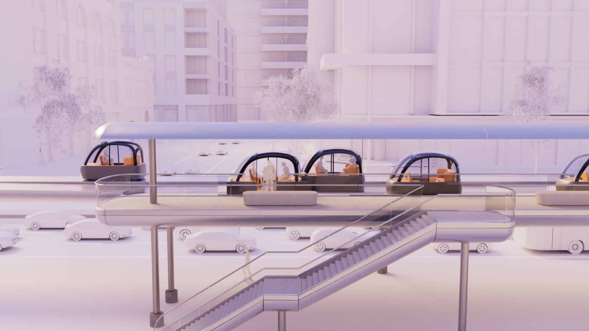
Building on Fazer’s early strategic framework, Art&Graf translated the Line brand’s pillars into clear design principles to guide all future work. From identity to movement, from film to web – every touchpoint needed to balance optimism and realism.
At the heart of the brand is a special triangular logo. A sign that speaks of structural stability and forward movement. Because let’s face it, what you want to feel most when you look at Line Mobility is safety and reliability.
The smooth, intersecting paths of the logo also symbolize the choice: to stay on the current path or to choose a completely new route. The same geometry is applied to the design of Line’s transportation centers, closely linking the digital brand with the physical infrastructure offered.
The early images seem speculative. But in the end, they seem lived-in and real. It’s a deliberate move to move us from curiosity to confidence.
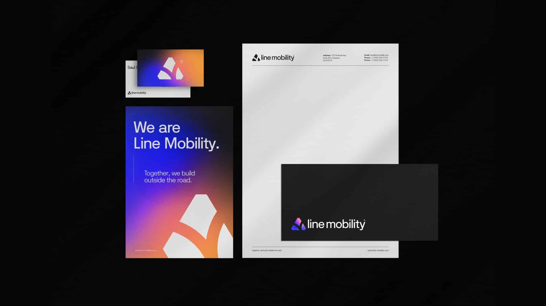
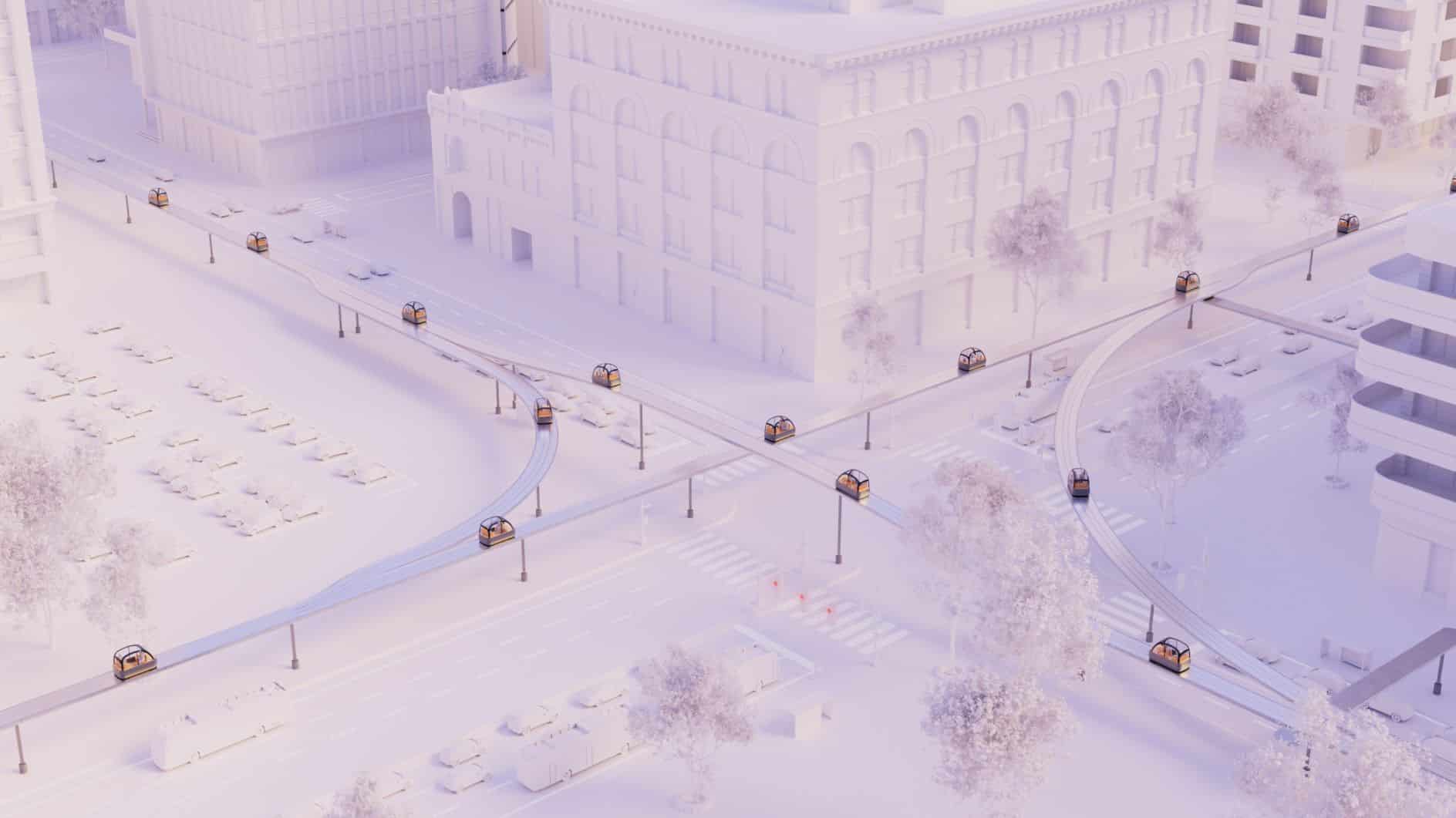
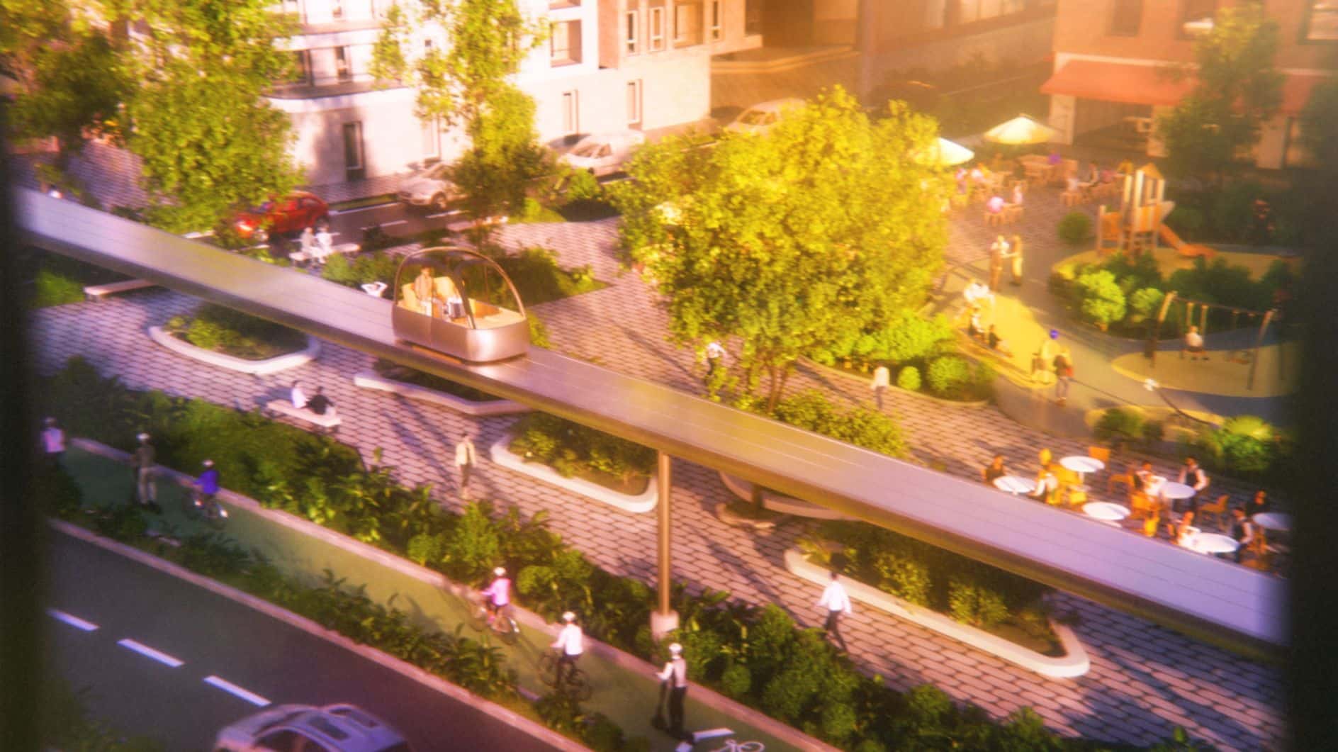
Throughout the campaign, design is used to further build trust. Soft gradients and elegant typography create a sense of calm and clarity. Detailed 3D images bring the technology to life. Photography provides a human perspective that allows us to visualize this innovation in the cities of the future.
Since Line Mobility didn’t have its own design team, it also needed a system it could actually use. Art&Graf provided a clear, practical brand bible, along with modular diagrams and data tools that allowed the team to communicate complex ideas simply and consistently as they grew.
The visual language is seamlessly conveyed on the Line website, where a clean, intuitive layout reflects the brand promise. It’s certainly full of optimism, and the seamless user experience is built around a theme of trustworthiness.
Credits:
All images courtesy of Art&Graft.


