


")
")


Autumn shades: expressive colors of this season
Autumn whispers its arrival in shades more eloquent than words could ever convey.

This season’s quintessential tapestry, rich in earthy and vintage hues, is not just an aesthetic choice; it’s a storytelling device to create warmth, depth and nostalgia for that transitional period when it’s cold but the sun’s rays still tickle. When birds leave their homeland and other animals large and small seek this refuge.

In this blog post, we have selected the most sophisticated shades of the fall season and presented them with pictures and descriptions. All of them will create a real impression and a desire to use these colors in your autumn designs, because each color has its own HEX code, with the help of which you will find the one you like so much.
You may also like:
In summary, the rich reds and golden yellows of autumn will not only be colors, but also companions in creating a visual, and they will definitely be trending this season.
Berries
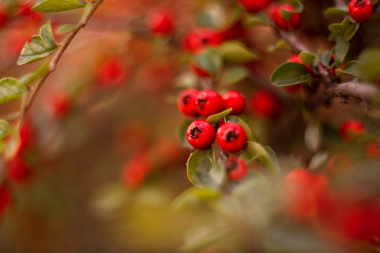

Bright red and an environment of indescribable beauty that will literally jump you into the autumn time.
Velvet Leaves
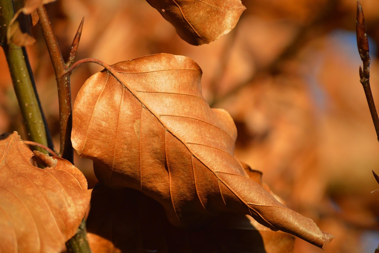
The expressive autumn has arrived, the velvety beauty of the leaves comforts us to breathe in the sunlight.
Autumn Bird
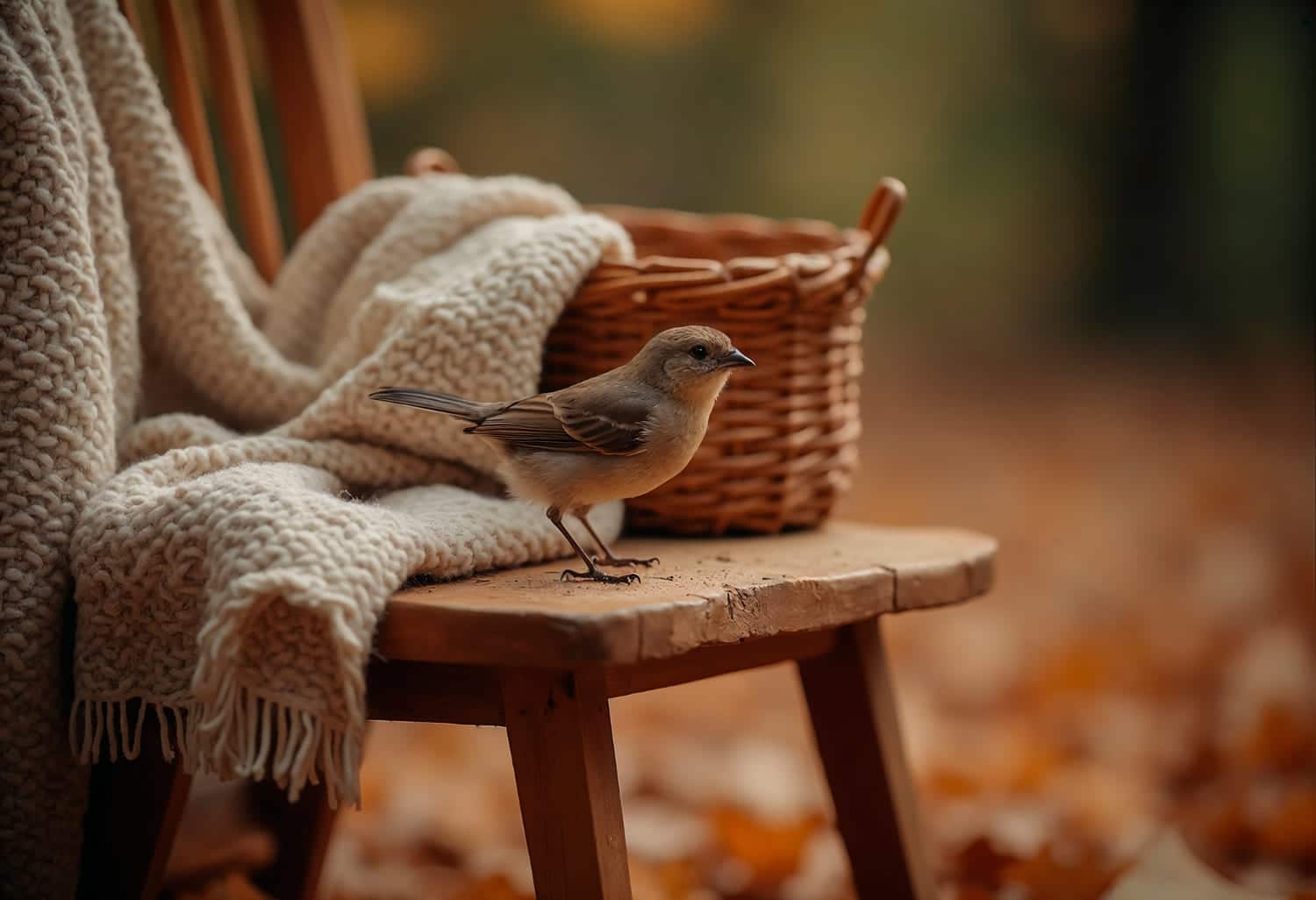

It’s incredibly beautiful when nature and animals come together. The color scheme is perfect for this season’s designs, so don’t wait any longer and try these colors.
Spicy Fall
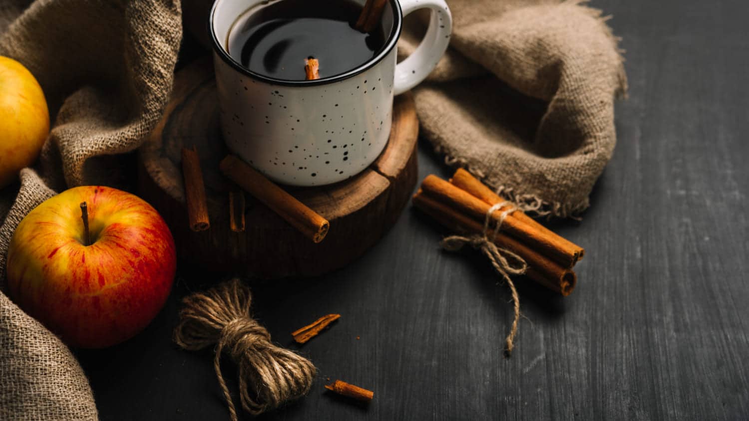

Autumn can also be expressive in flavor and various spices like cinnamon and cloves. These colors are stunning.
The Rain is Coming
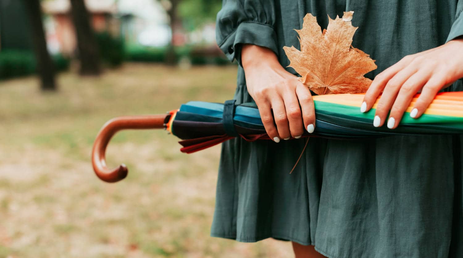

Autumn is the time when it rains and you need a colorful umbrella. The greenery is still fresh, slowly receding into the unknown.
Autumn Fun
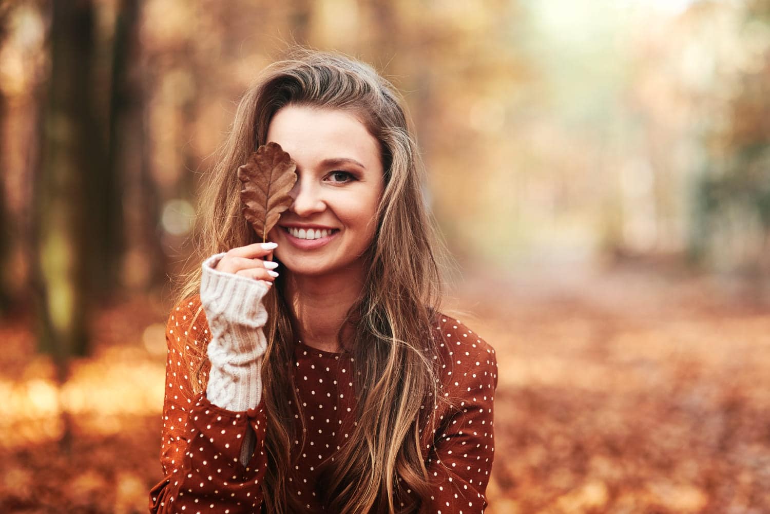

Don’t be afraid of autumn’s pranks. Be mindful of every moment and enjoy every season.
Coffee Ritual
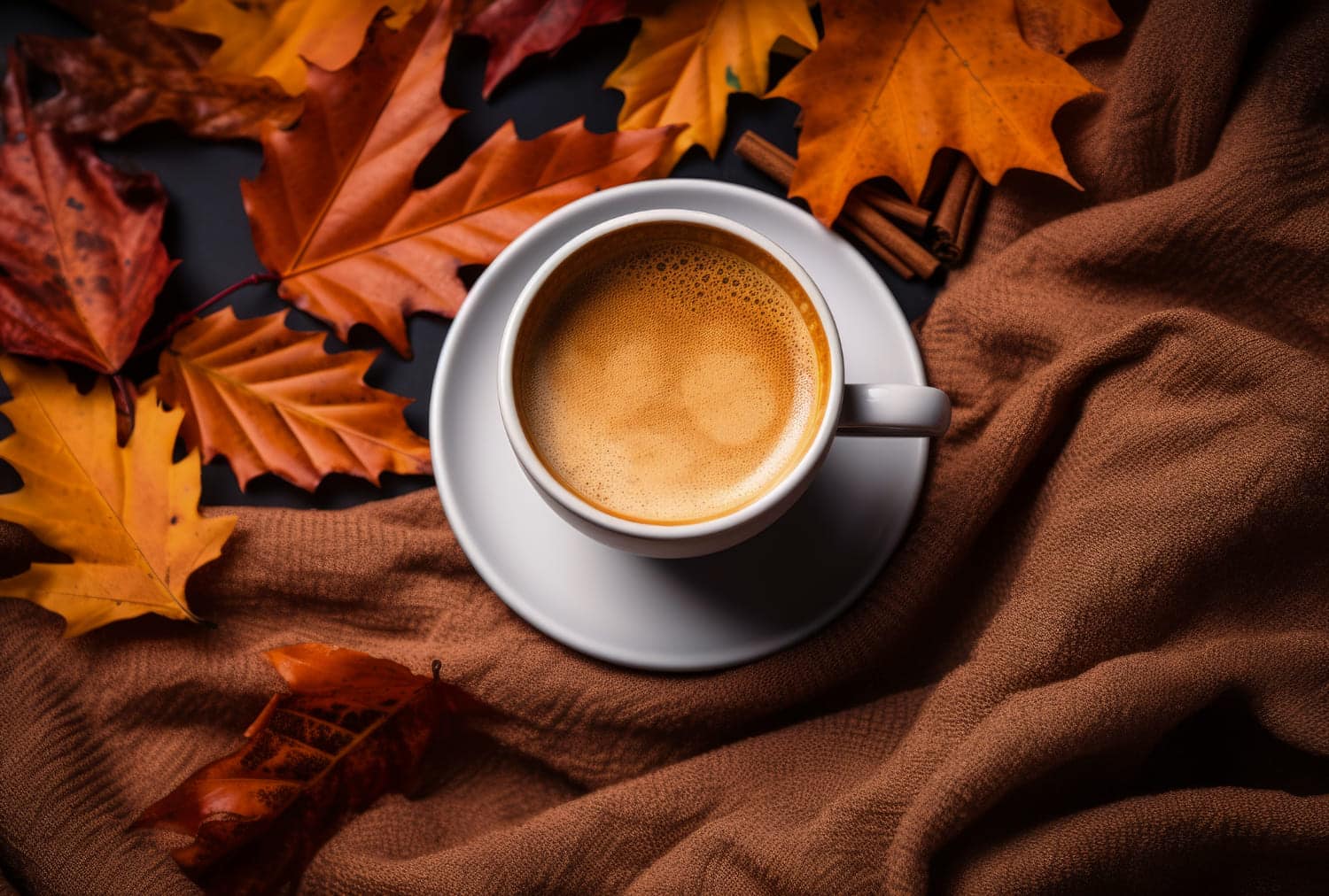

A coffee mug is perfect for a cold autumn afternoon. This rich color will definitely make your design elegant.
Chestnut Goodness
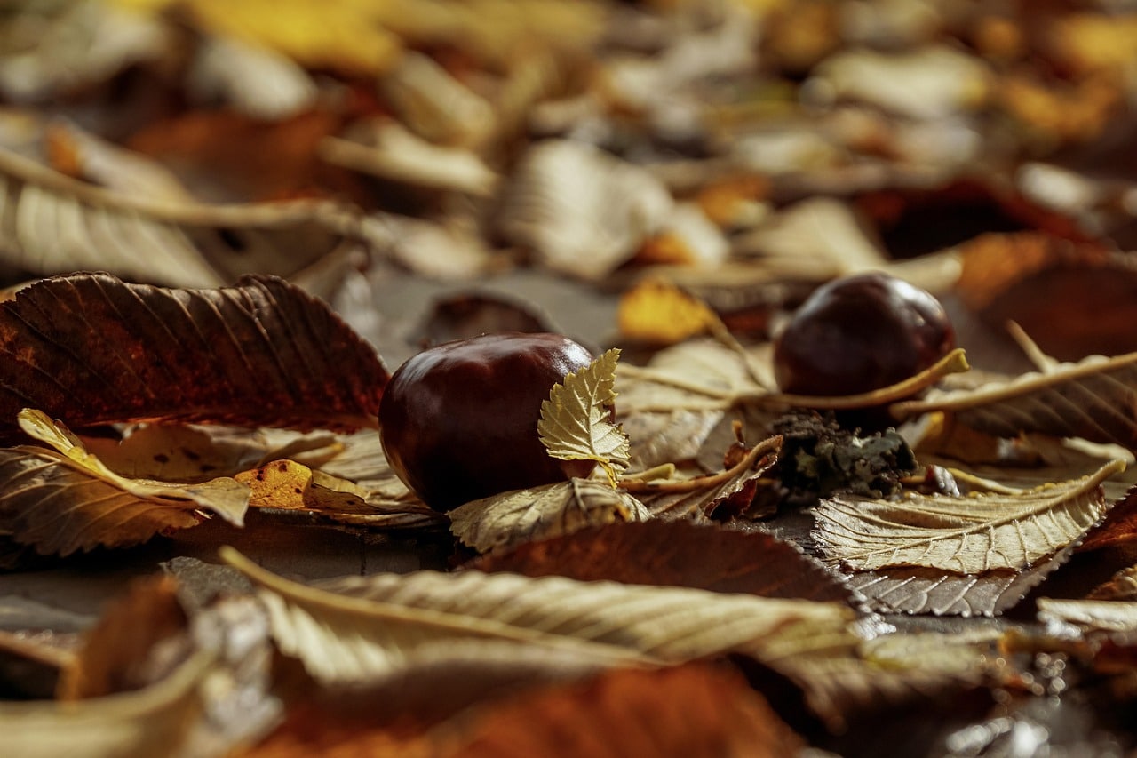

Chestnuts hidden among the leaves radiate warmth and a cheerful mood.
Girl Holding Candle Lantern
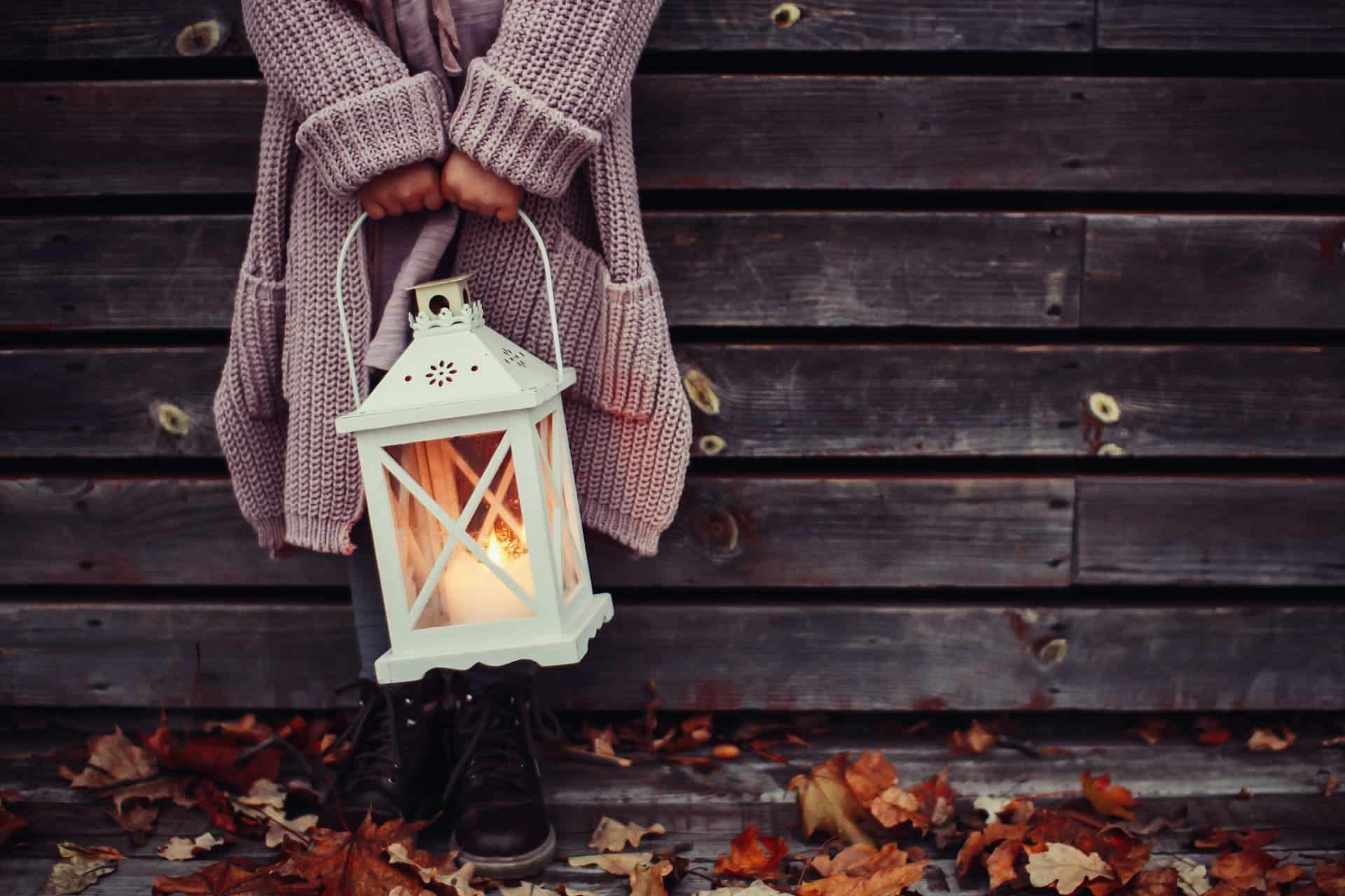

Deep autumn, darkness pursues light. The young girl and lantern creates a mysterious pleasure that can only be found in autumn.
Pouring Coffee Into a Cup
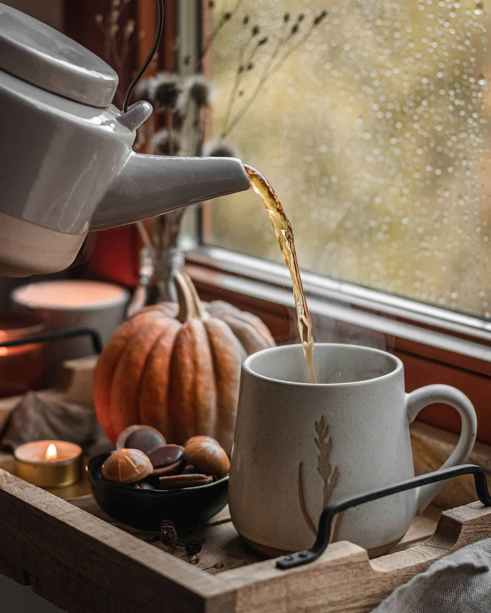

If you’ve ever visited your grandmother, this photo is definitely in the old-fashioned style. Its colors are perfect for creating a vintage atmosphere.
Why autumn palettes a real gold for designers?
Before I dive into the uses of these palettes, let me tell you why I believe fall colors are some of the most powerful tools in a designer’s arsenal. Fall symbolizes transition, comfort, and harvest.
These are integral themes that resonate deeply with people on an emotional level. These colors are associated with our psychological state of warmth, safety, and abundance.
From a design perspective, fall palettes are incredibly versatile. They can be rustic or sophisticated, bright or subtle, traditional or modern. The key is understanding how to balance warm, rich tones with the right neutrals and accent colors to achieve the desired mood.
The ability to feel
The beauty of fall color palettes is that they can look both classic and modern. Here’s how to incorporate these seasonal hues into any design:
- Autumn colors are naturally rich and complex, making them perfect for creating visual depth.
- While autumn palettes are inherently warm, introducing cool neutrals like soft gray or white can help keep them from feeling too overwhelming.
- Fall colors are just begging to be paired with rich textures. Whether it’s the texture of weathered wood, the softness of wool, or the elegant surface of leaves, these palettes come to life in the colorfulness of design when combined with tactile elements.
- Drawing on the vibrant patterns of autumn leaves, it is possible to use autumn colors in geometric or organic shapes that create visual interest without overwhelming the overall design.
Psychology of autumn colors
Warm reds and golds evoke feelings of energy and excitement, while remaining more approachable than their brighter summer counterparts.
Browns and oranges evoke stability and reliability – qualities that become especially important as we transition into the more energetic winter months.
Even darker purples and burgundy shades convey luxury and sophistication, without the coldness often associated with darker shades.
Autumn colors in different design contexts
Don’t be afraid to experiment and use autumn colors, which can help you take a step forward with consistency and some distance. You can try to create:
- Brand identity and logo designs;
- Architecture and interior designs;
- Digital designs;
- Packaging designs.
Conclusion
I love the autumn period because it is some kind of magic. It is the upcoming Halloween and Christmas joy. It is relaxation after the sunny and very hot summer months. I also love the autumn color palette, I hope it reminds you of something too?
This is a moment when everyone is doing something, more work, less entertainment, but with a cup of tea, wrapped in a blanket, you can meditate and welcome the first winter snowflakes.
Autumn is nostalgia, it is a time of reflection, so I wish you to take advantage of it and do not seek, do not harass, let life flow in its own way. enjoy!
Credit: pixabay.com


