


")
")


Bilingual alphabet lessons for kids by Mighty Big Love
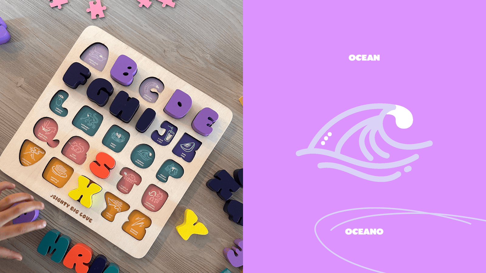
Meet the bilingual alphabet "El Board".

Learn how Mighty Big Love uses a minimalist bilingual alphabet design to connect English and Spanish through a custom font and cohesive visual system.

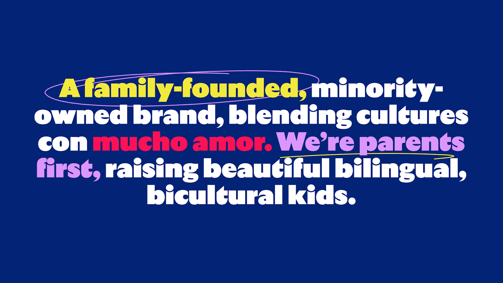
Jessenia and Greg Gayle faced a common obstacle that many parents face when raising children in bilingual homes. Standard educational toys often treat translation as a secondary consideration, resulting in visual and linguistic confusion.
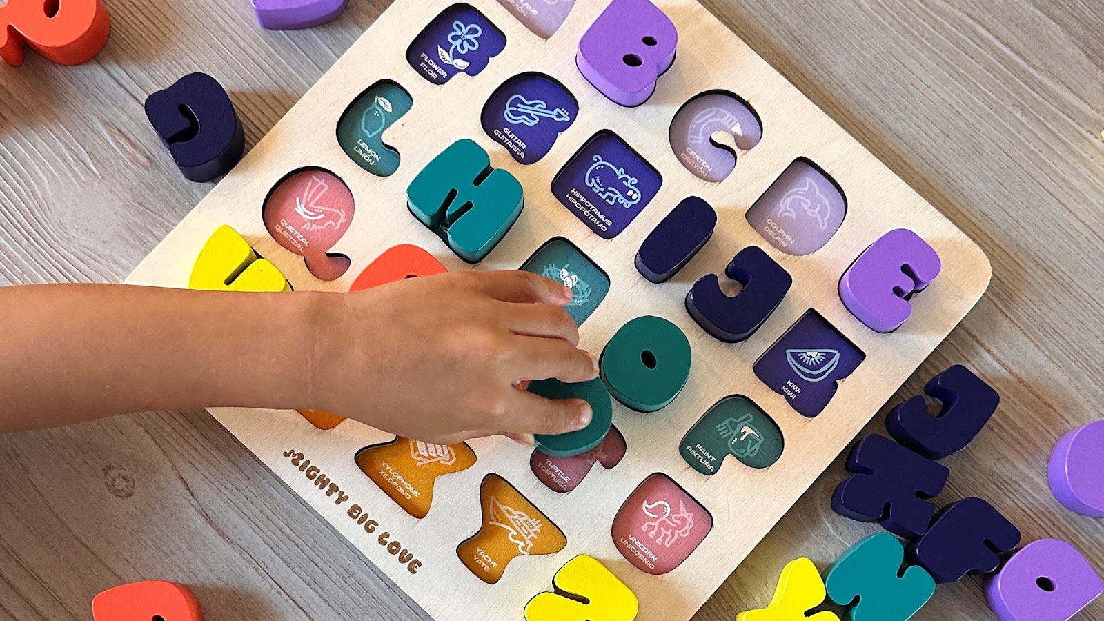
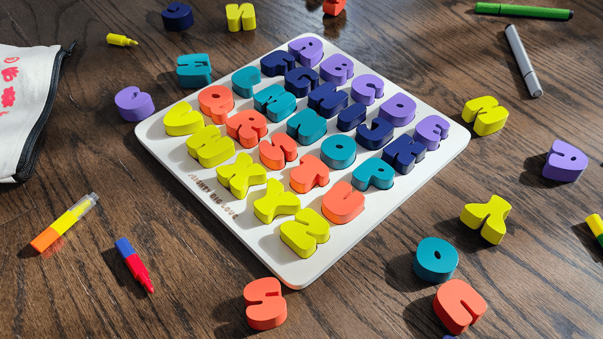
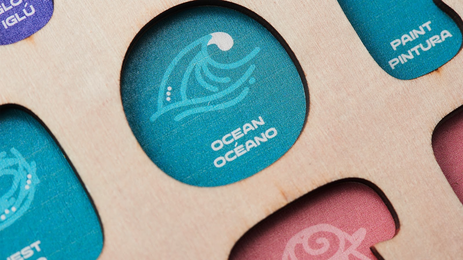
When a child sees the letter “Z” for “zebra” but hears “cebra” in Spanish, the connection is lost. To solve this problem, the duo introduced Mighty Big Love and their flagship product, El Board. This wooden alphabet puzzle uses a unique bilingual alphabet design, where each selected word begins with the same letter in both English and Spanish.
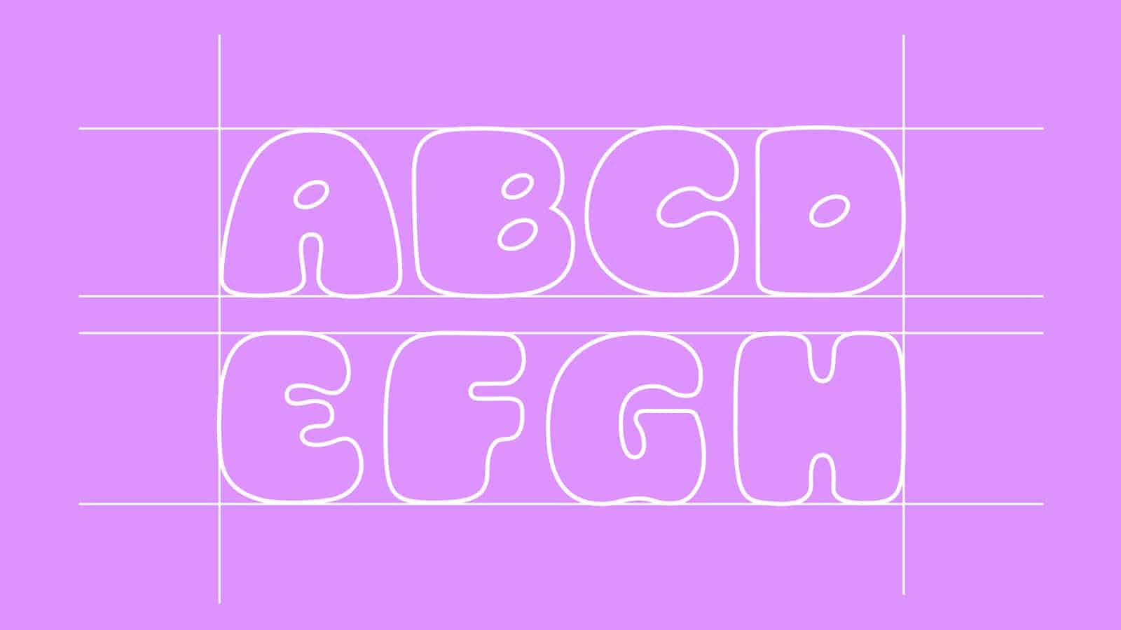
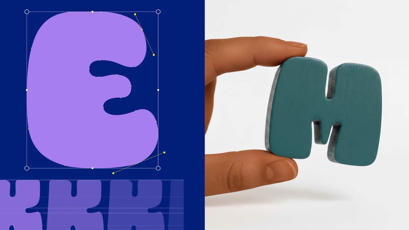
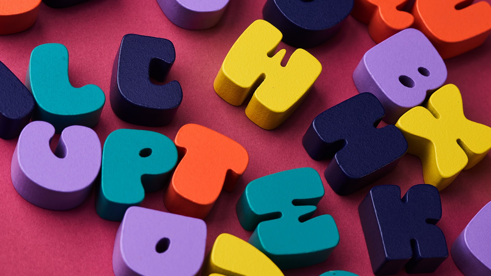
The design eschews the cluttered aesthetic of traditional children’s toys. Instead, it takes a minimalist approach that focuses on clarity and soul. Greg Gayle created a typeface specifically for the project. This custom typeface is bold and playful, yet maintains a clean structure that helps with early character recognition.
The choice to create a new typeface rather than use an existing one ensures that the brand’s personality remains authentic and consistent across the A to Z spectrum.
The visual narrative on the El board is based on original linear illustrations. Each icon features consistent lines to create a unified visual system. These clean shapes help young minds process information without unnecessary distractions.
By getting rid of unnecessary elements, the design emphasizes the essential connection between the letter, the image, and the bilingual terms. This awareness reflects the modern multicultural home, where design and practicality must coexist.
The project is successful because it treats bilingualism as a primary design constraint rather than a secondary feature. The Gayles have used their Latino and Caribbean roots to create a product that is both modern and personal.
It is an exploration of how editorial design principles can enhance physical learning tools. By focusing on a cohesive framework from the start, they have created a tool that sparks curiosity and builds confidence in young learners.
This work shows that great design often begins with a personal need. The result is a project that, as Jessenia notes, feels “us,” reflecting a specific cultural identity through a universal minimalist prism. Every detail – from the wood grain to the custom-made letterforms – helps make culture part of the everyday conversation. It’s a masterclass in purposeful bilingual branding.
Credits:
All images courtesy of Mighty Big Love.


")