


")
")


A Polish creative studio BNA and Victoria Cymes in great cooperation has unveiled the new brand identity for Tłocznia Cymes.
Victoria Cymes is a leading producer of fresh fruit and vegetable juices in Poland. They specialize in providing high-quality, minimally processed juices made from local ingredients, including carrot, carrot-celery and apple juices from the Walcz Lakes region.
After 35 years of organic growth, expanding its range to include cocktails and lemonades, the time has come for a visual and strategic transformation and the creation of a fully consumer-focused umbrella brand under the new leadership of “Cymes Press”.

The Polish word Tłocznia translates as “juice press” evoking the artisanal, hands-on process of extracting natural freshness.
“The creative concept was inspired by the daily challenge of delivering freshly squeezed carrot juice to stores before breakfast. It was this story that inspired the BIG IDEA, expressed in the slogan “We deliver freshness”. This slogan is the brand’s promise to consumers, the axis of communication and the starting point for creating a brand identity system.” – told Dominika Sikora, Senior Brand Consultant at BNA.
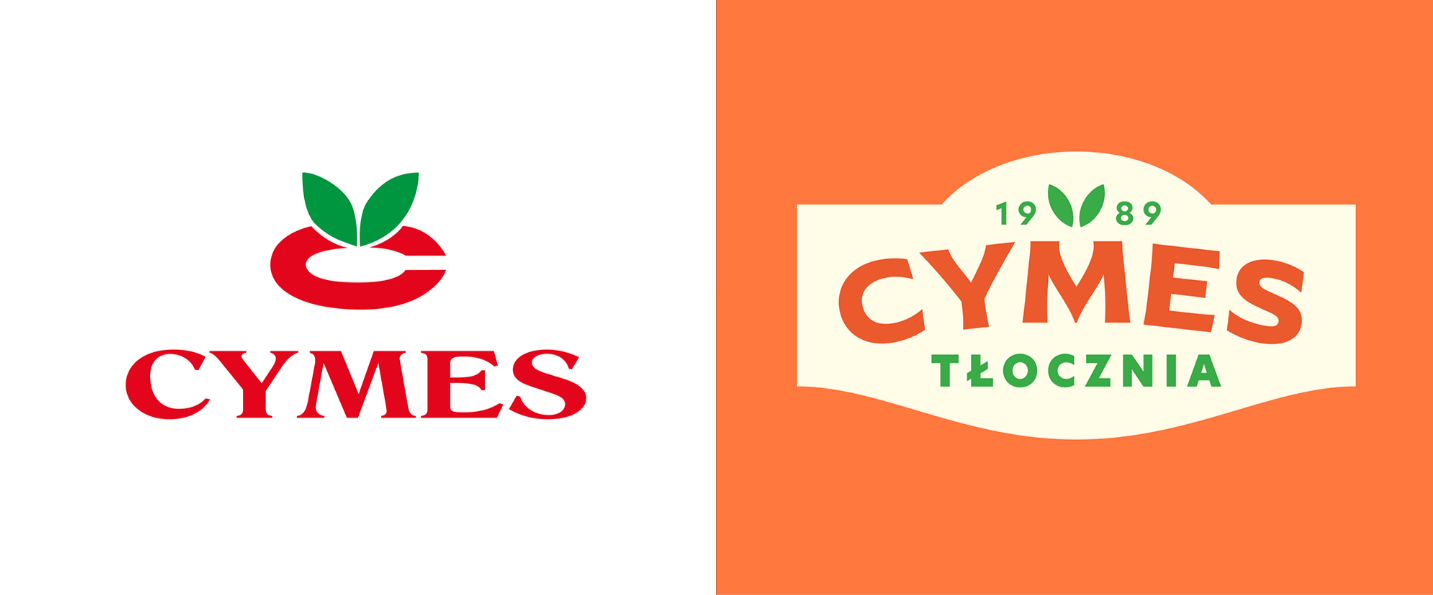
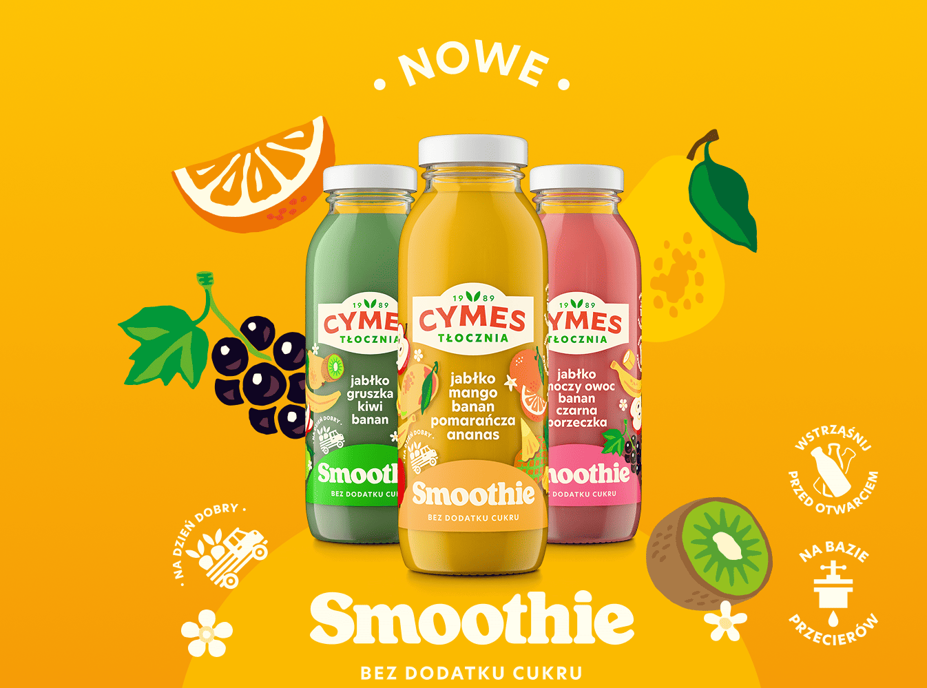
We wanted to keep what Cymes people loved and valued: authenticity and naturalness. We subtly incorporated the DNA of Cymes carrots into the new logo. We also added the year of establishment – 1989 – to the brand, paying tribute to our experience and heritage. We created a consistent and flexible packaging system for our broad portfolio.
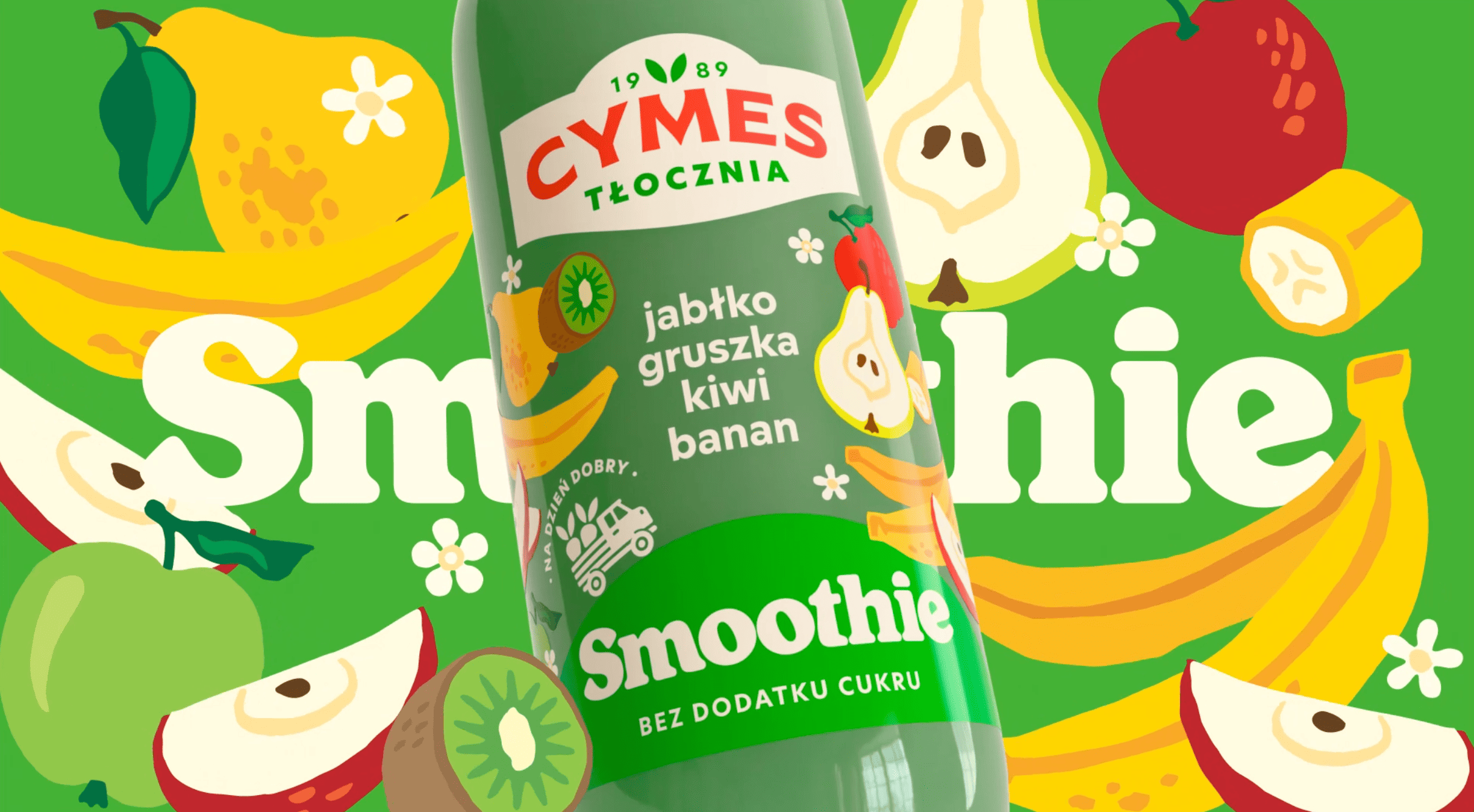
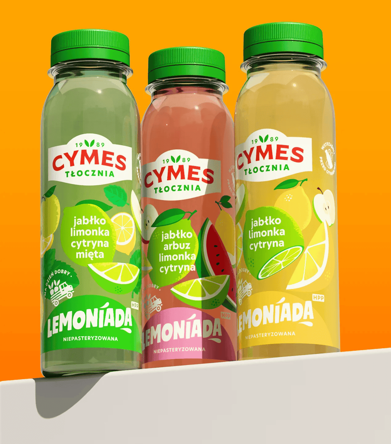

Typography plays a special role, combined with bright illustrations and photographs – the character of each product line reflects both the taste and personality of a particular category.
The biggest success of the rebranding is that the new identity feels like a natural extension of the brand that consumers have trusted for decades, as evidenced by the spontaneous positive reactions from employees, retailers, and customers.
Photography courtesy of “BNA and Victoria Cymes”.


