


")
")


Bulletproof unites identity and culture with ‘Smirnoff flavours’
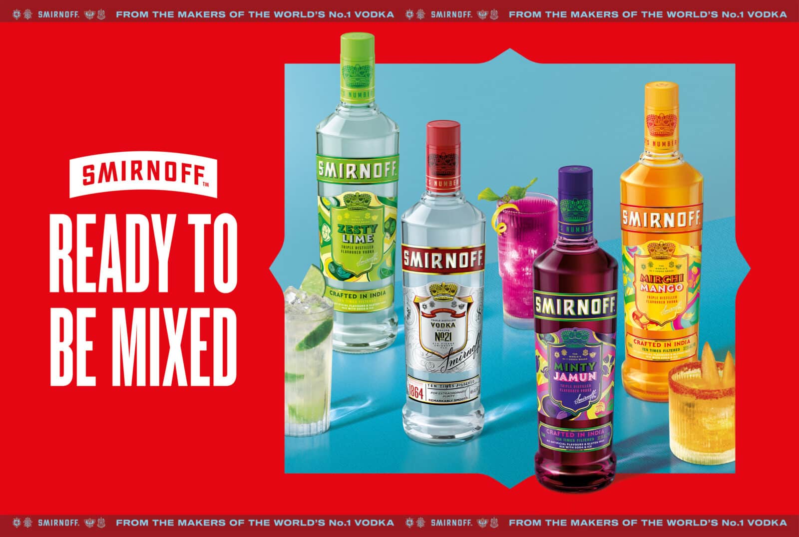
"Smirnoff Flavors" launched with stunning success, both for Diageo and in the Indian market as a whole.

Smirnoff is one of the most recognizable vodka brands in the world, known for its bold personality, self-confidence, and vibrant design energy, all driven by a structured global framework. As India’s youth audience grows – globally minded yet deeply rooted in culture – Smirnoff saw an opportunity to broaden its relevance.
By seamlessly integrating its global identity with the vibrancy of Indian culture, this range redefines what it means to be an international brand in a local market.

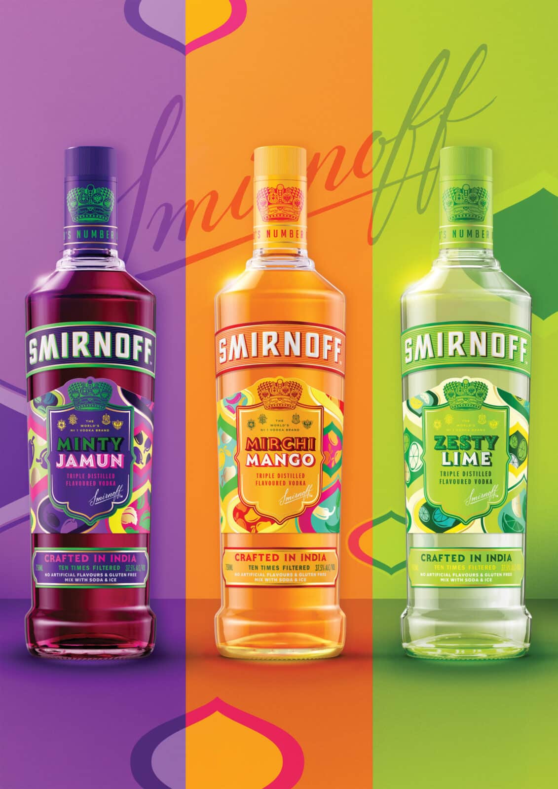
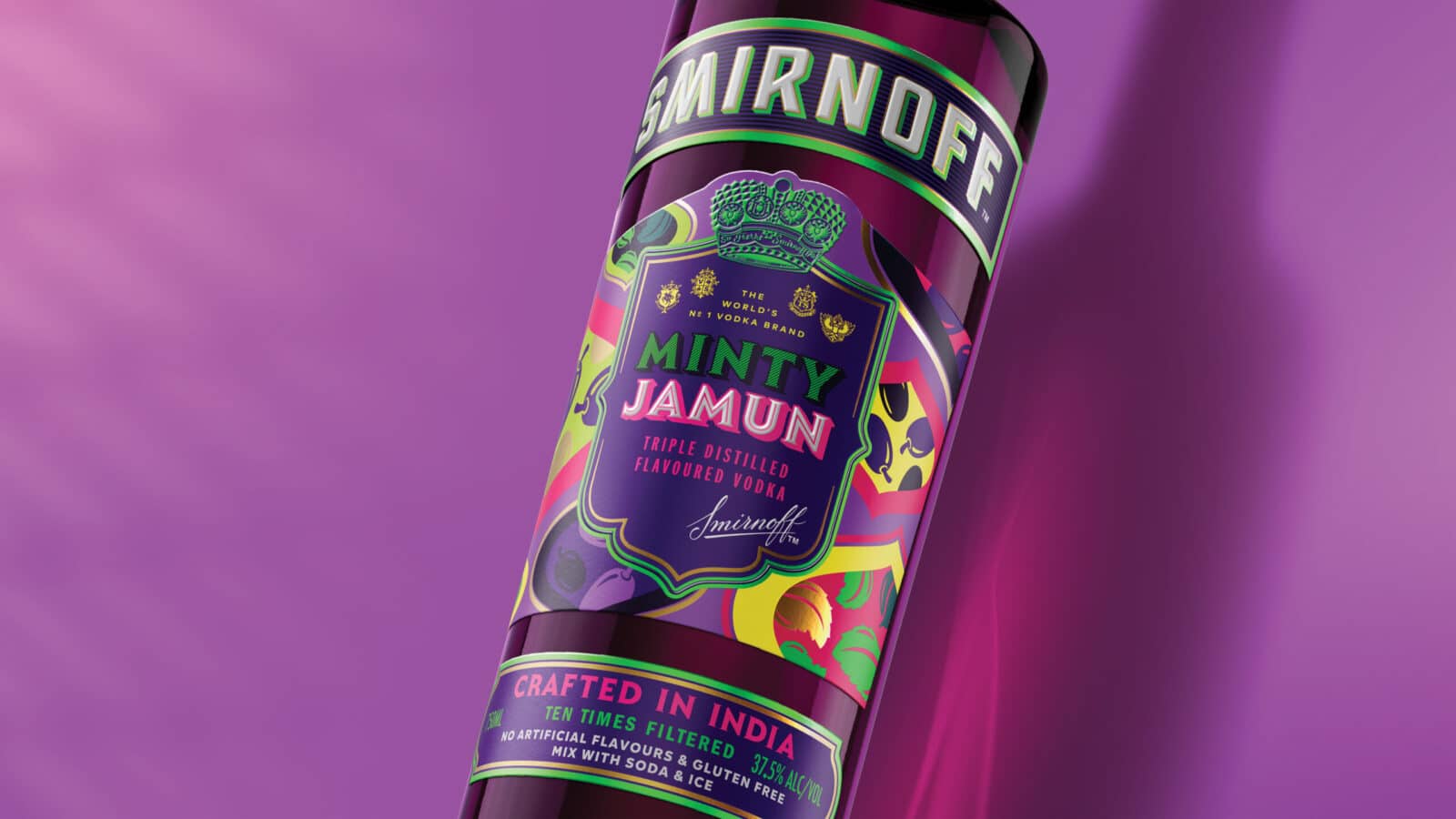
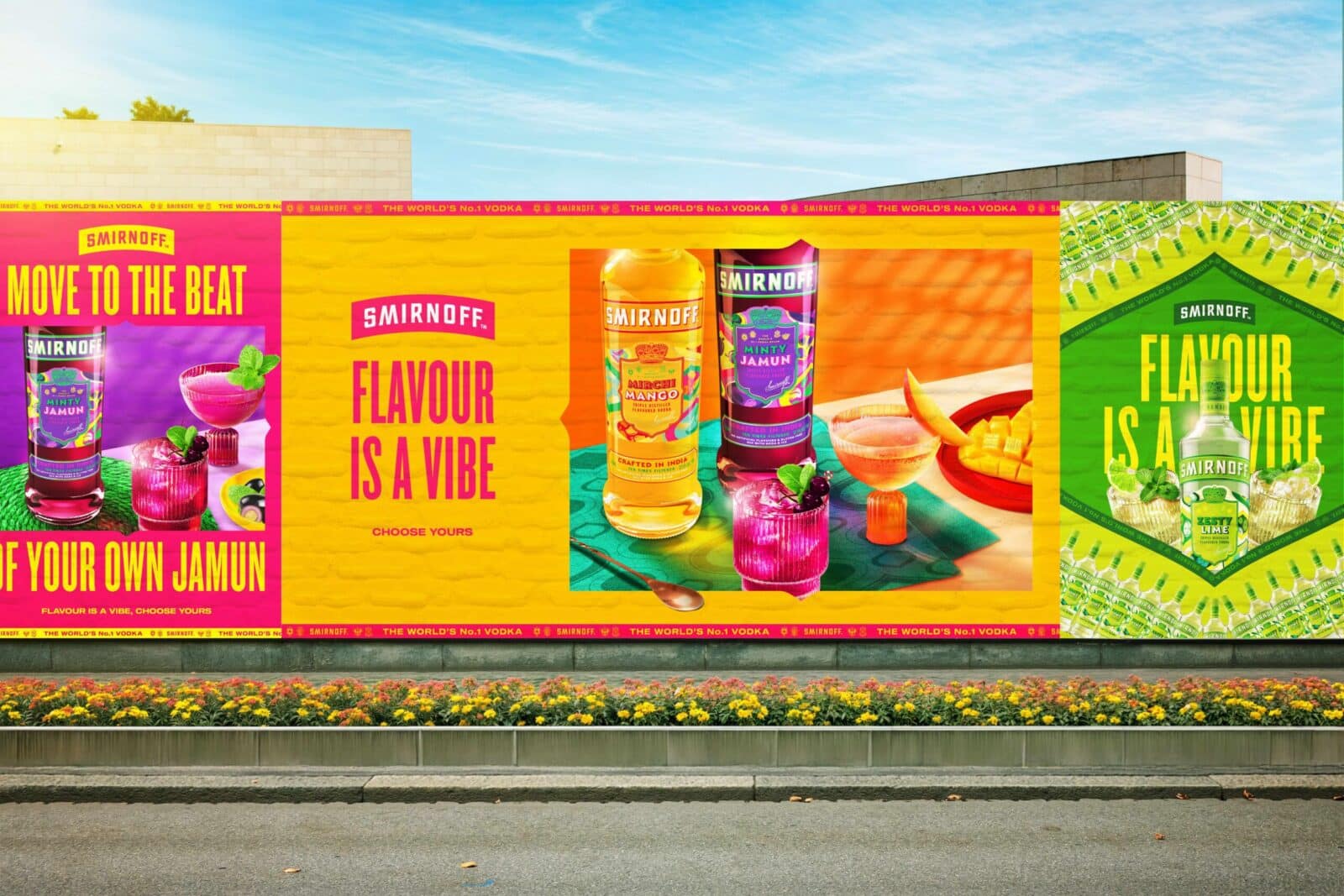
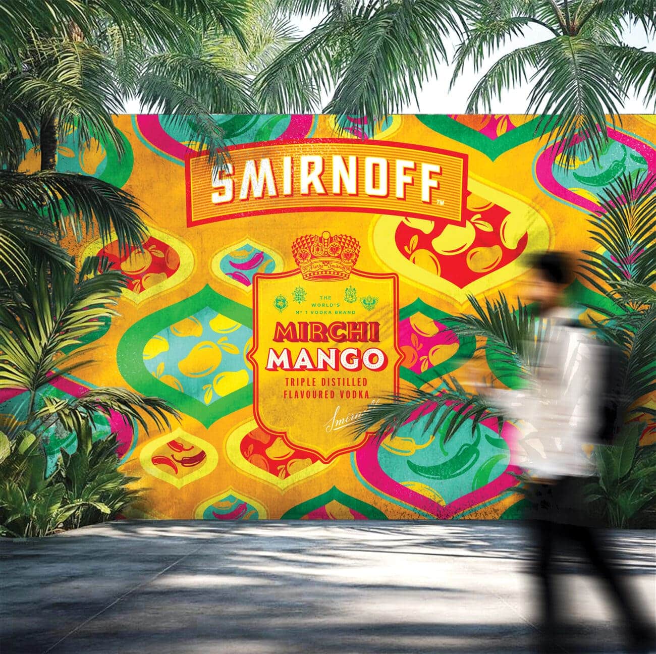
The challenge was to expand Smirnoff’s flavour portfolio in India in a way that felt bold, modern, and unapologetically Indian, yet still unmistakably Smirnoff. This wasn’t just a product extension; it was an opportunity to reimagine how the brand could look and feel in a new cultural context. It marked a shift in identity. The launch of three India-exclusive flavors – “Minty Jamun”, “Mirchi Mango”, and “Zesty Lime” – was driven by one goal: to give Smirnoff an Indian identity.
According to branding and designing agency Bulletproof, “the core of our strategy was the idea of packaging as a bridge connecting global brand codes with the nuances of local culture. We believed that design could do more than decorate a product: it could tell a story, evoke emotions, and create lasting relevance.”
“We retained key Smirnoff equities, such as the shield, structured layouts, and confident typography, while reimagining the design language through Indian textures, colors, and symbolism. The result was a system that remained globally recognizable while expressing rich local character.”
The design was inspired by a pattern system inspired by Indian textiles, Mughal architecture, jali screens, and traditional crafts. Hand-painted motifs were applied in layered compositions that created harmonious yet different narratives for every taste.
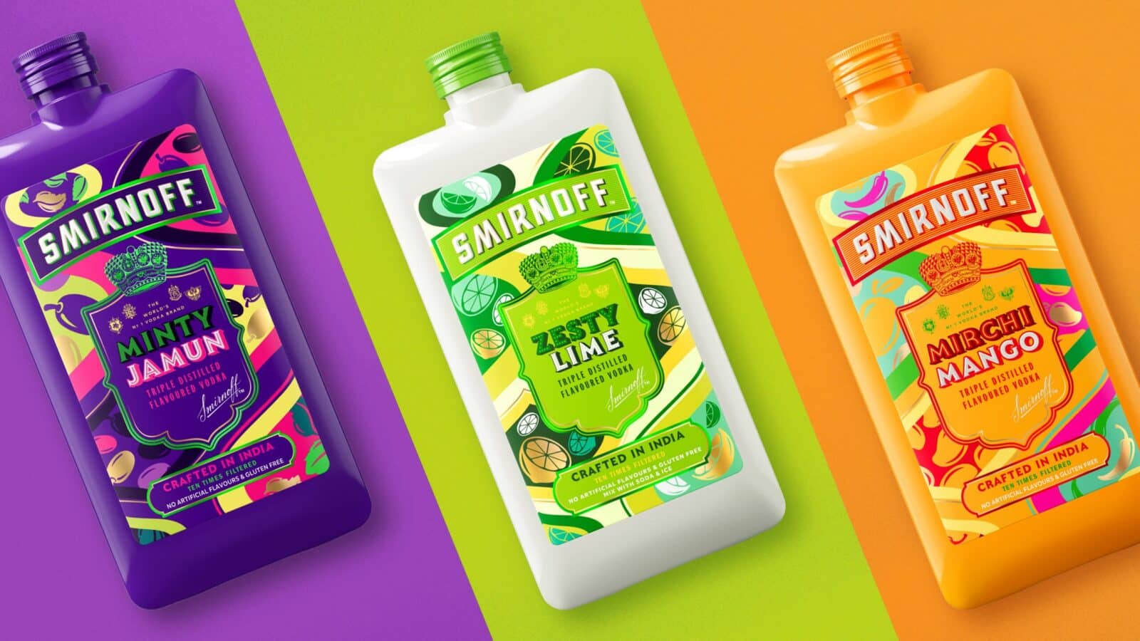
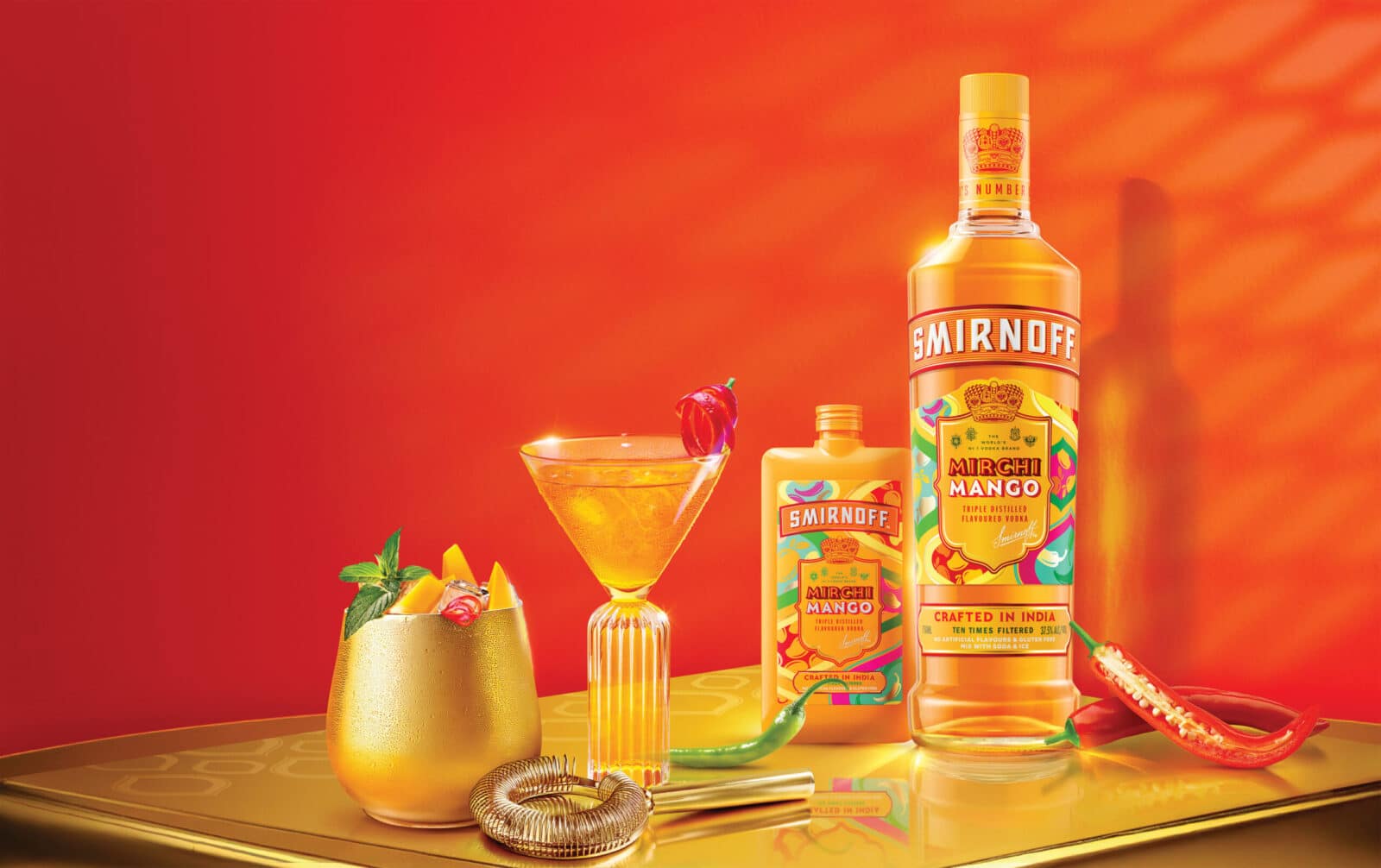
At the center of each label was the Smirnoff shield, transforming it into a storytelling frame. The ingredients were illustrated – swirls of jamun and mint leaves, sliced mango and red chili pepper, zesty limes – woven into knife-inspired shapes and architectural grids. These compositions blended whimsy and structure.
These designs opened up storytelling opportunities across retail and social channels, driving visibility, engagement, and demand. They gave Smirnoff new relevance to a new generation, and the flexible visual system was built with scale in mind.
The packaging quickly became a topic of discussion. “Diageo India” design head received unprecedented interest on “LinkedIn” after the launch post, with users from across the country asking where they could buy it. Internally, the line is now being called a case study in how to extend brand value with cultural sensitivity and strong visuals.
This was more than a new product line; it marked a creative shift. Smirnoff Flavours demonstrated that packaging could be both cohesive and expressive, global and local. Through design, the range not only expanded the portfolio – it extended the meaning of the brand, linking global heritage with the hearts and homes of India.
Credits:


 control in your hands")

