


")
")


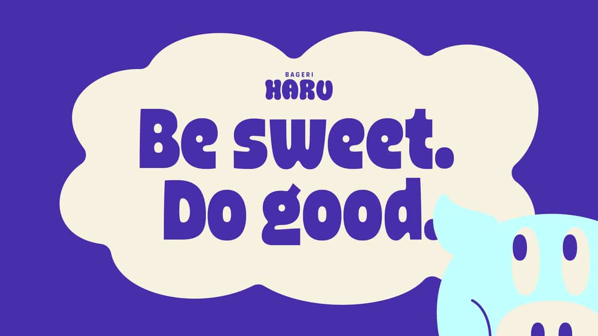
Daughter’s project ‘Haru’ is purely a concept
Haru sighed and stated: A sky made of kindness.

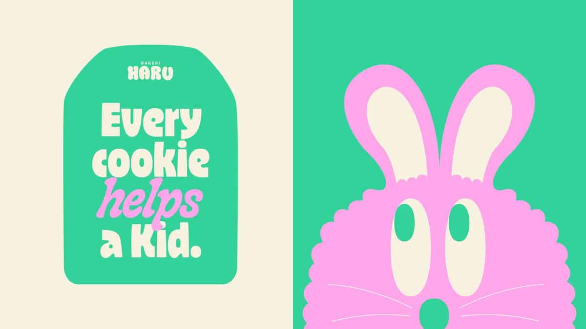
On Sunday, my daughter Haru and I baked together – cookies, cupcakes, whatever seemed appropriate. There was no plan, no goal, just time spent together, making something with our hands. At some point, Haru decided he wanted to share those cookies with our neighbors and raise money for children with cancer. It didn’t require a brand or a strategy. It was just a small, honest gesture.
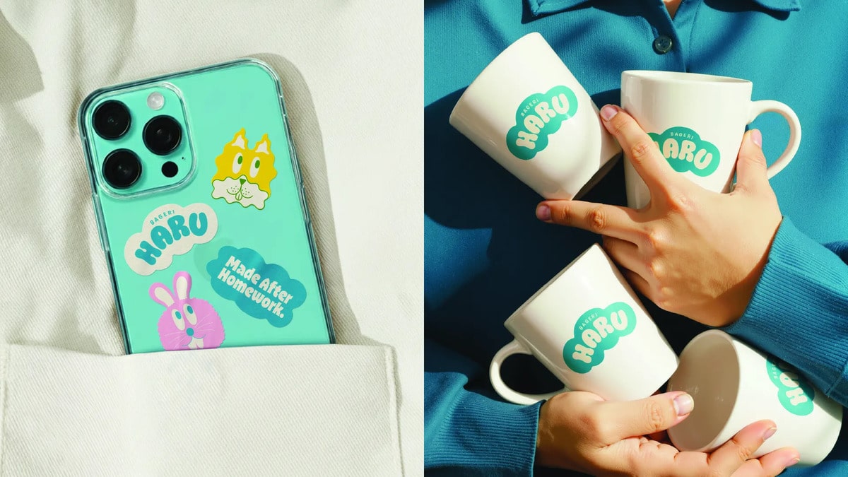
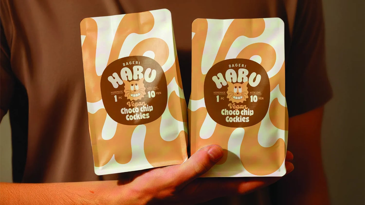
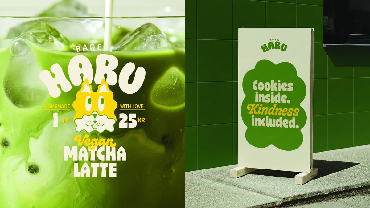
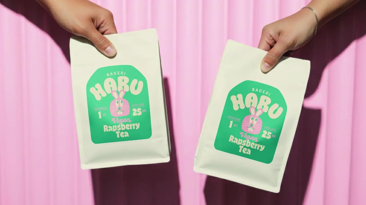
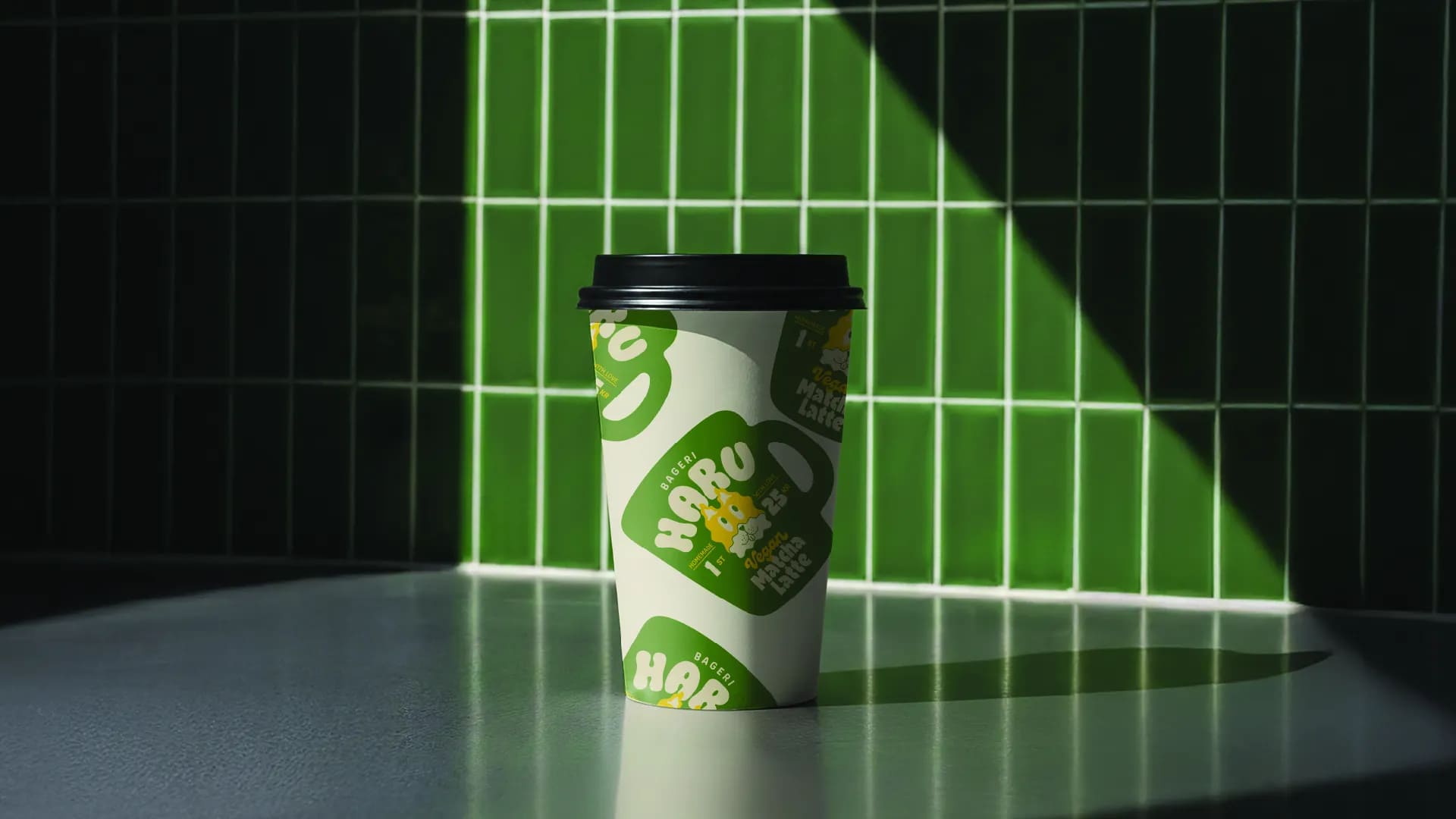
It was only later that the idea began to take shape. Haru’s name means sky or clouds in Japanese, and this became the basis for the visual language. The cloud shapes act as flexible figures, transforming into cookies, cups, or imaginary figures – similar to shapes in the sky.
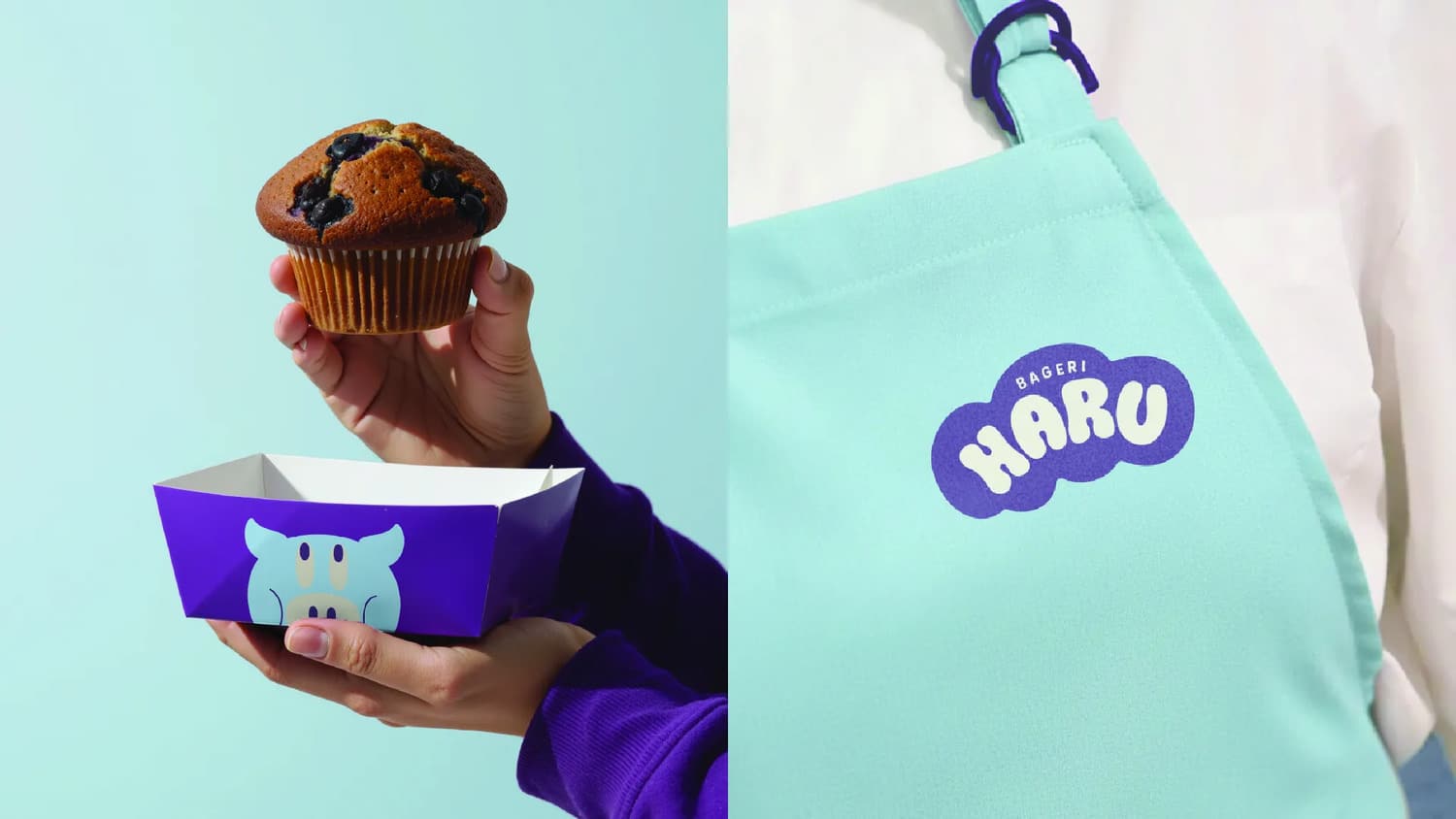
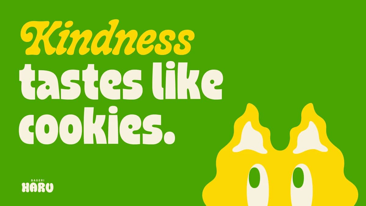
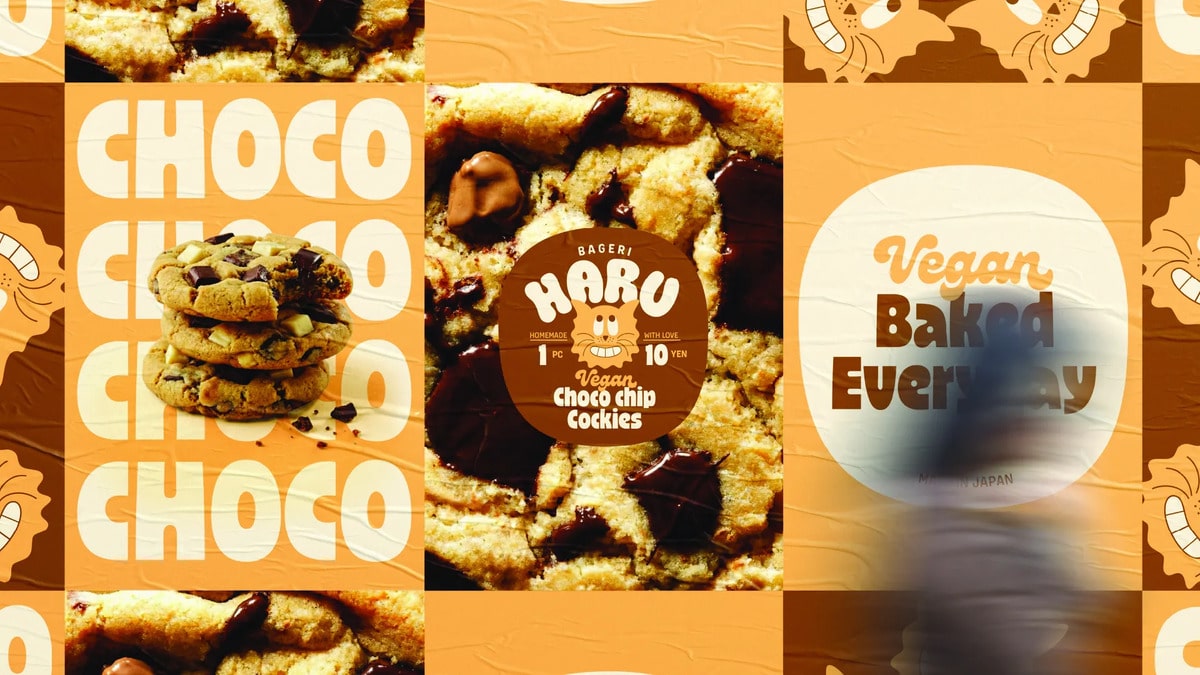
Playful animal characters grace every product simply because they seem fun. Soft, rounded typography and bright colors reflect childhood, warmth, and optimism.
This project is purely a concept. It was never intended as a production or commercial brand – it’s just a small, playful design exercise created for my daughter, inspired by a moment we shared. It’s not about building a brand. It’s about preserving a moment – one shaped by imagination, generosity, and time spent together.
Credits:


