")
")


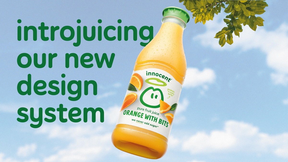
The innocent drinks which was founded in 1999 and acquired by Coca-Cola in 2013, felt its brand had become fragmented across its range, including smoothies, juices, health shots and coconut water.
After a failed deal with a design studio, they turned to strategist Silas Amos, who according to innocent creative lead, Finlay Hogg describes as having a “unique ability to talk about marketing and design,” and Amos hired Derek&Eric to work on the design.

The challenge, Hogg says, was to simplify a brand architecture and design approach that had become complicated and confused over time.
“Over the years we’ve launched loads of new recipes,” he says. “We tried to do everything the right way, but we could have paid a bit more attention to how everything worked together. Everything followed a different design system, and we lost the look of a market leader.”
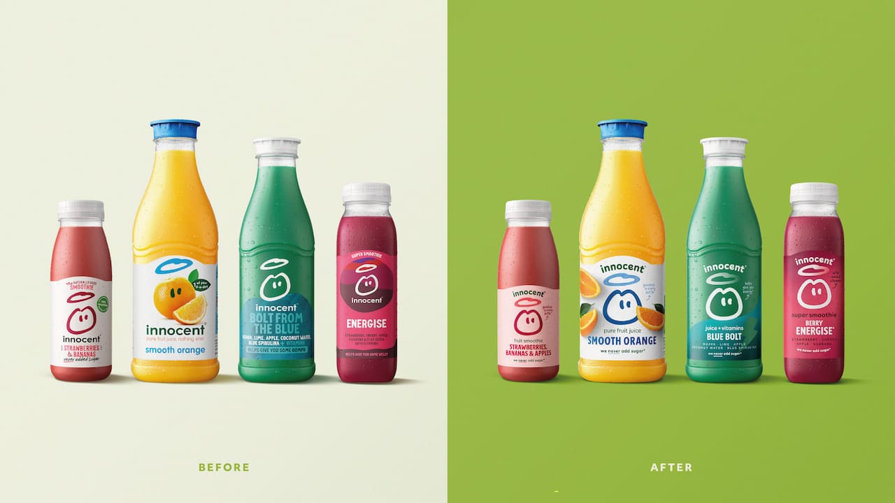
This made it difficult, he explains, for both existing and new customers to “navigate” the range of innocent’s offerings. And Alex Stewart, creative partner at Derek&Eric says this diminished the so-called halo effect, “one drink leading to another, and that overall brand impact.”
Stewart says the aim of the new work was to “simplify and rationalise” the design system across the different products. The challenge then was to ensure every design decision reflected this key strategic aim.
“We were holding ourselves up to that at every single stage of the process,” he says. “There were times where we were going, ‘Oh, but for this range, maybe we do need to be a bit different.’ And every time we had to look at ourselves and say no, we’re going to keep strong to our principles.”
This fed into what Stewart calls “a responsible brand refresh.”
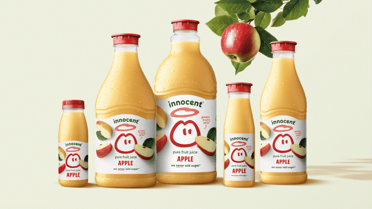
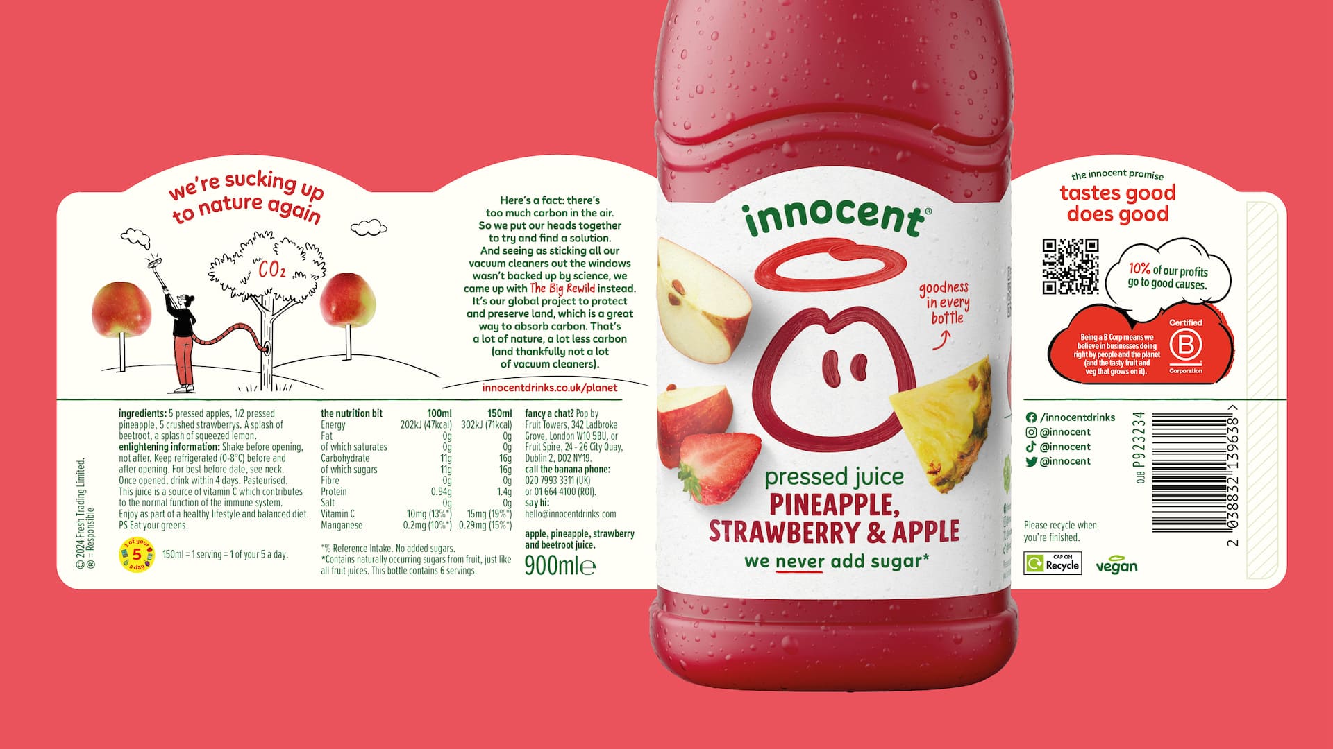
The Derek&Eric team worked with typographer Rob Clarke and illustrator Laura Silveria to refine the core visual assets, including the logo and a new arched wordmark. Clarke worked on “hundreds of iterations” to find a look that worked for everyone.
“Those handcrafted elements made it more expressive without changing its core essence,” Hogg says. “It brought that confidence back. We described it like a piece of fruit sitting in a fruit bowl – it needed that plumpness that makes you want to pick it.”
“We focused on every single element, because there were going to be minimal assets on every pack.” Hogg says.
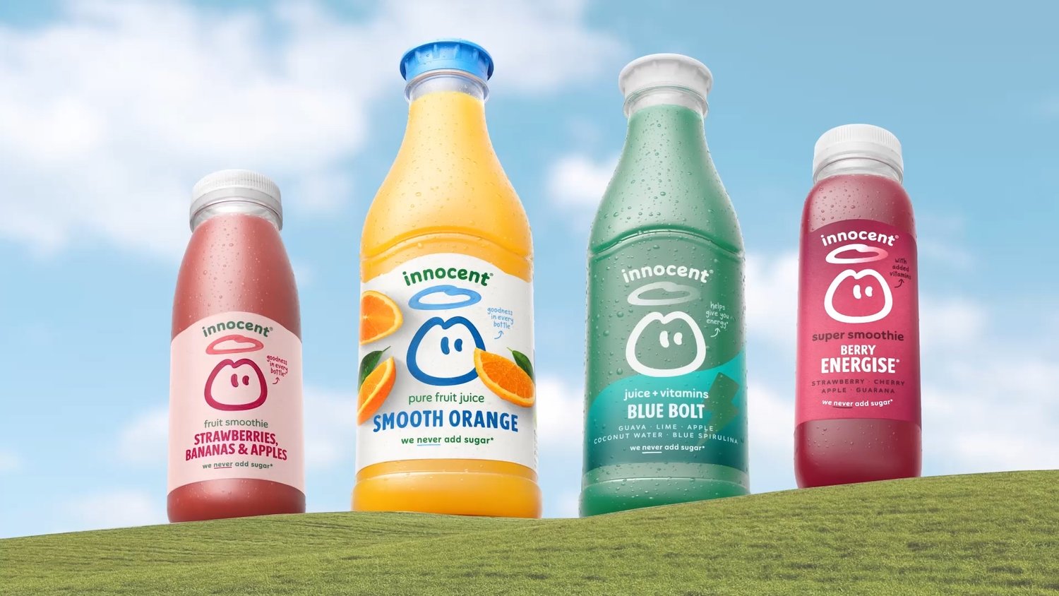
According to Stewart, one of the biggest challenges was creating the right back-of-pack design system, which needed to balance nutritional value and ingredient information with the storytelling and lively text that Innocent is known for.
“Across the project, the hardest thing was finding the simplest solution in every given scenario,” Stewart laughs.
And on a recent trip to Germany, Stewart was thrilled to see the new-look bottles on the shelves.
“It was brilliant to see it functioning in a different market, in a different language, and surrounded by other brands that we don’t have in the UK,” he says. “I was proud that it was still so prominent.”