


")
")


Fintech brand ‘Tilt’ has been perfectly revamped
A design that will not leave anyone indifferent.

Financial brands have earned a reputation for being formal and often a bit boring, but that doesn’t have to be the case for everyone. Tilt, a fintech company that aims to empower people without delving into their financial past, is changing that stereotype.
Created by branding agency Ragged Edge, the Tilt brand has been revamped and is aimed at “for the working rather than the wealthy,” with a distinctly human appeal.

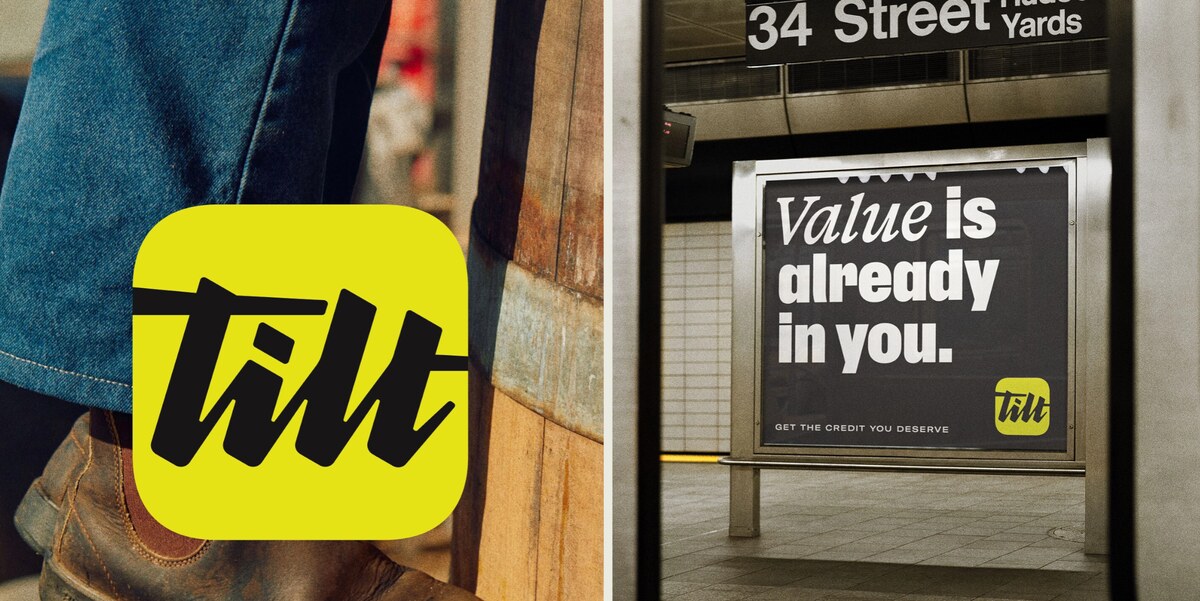
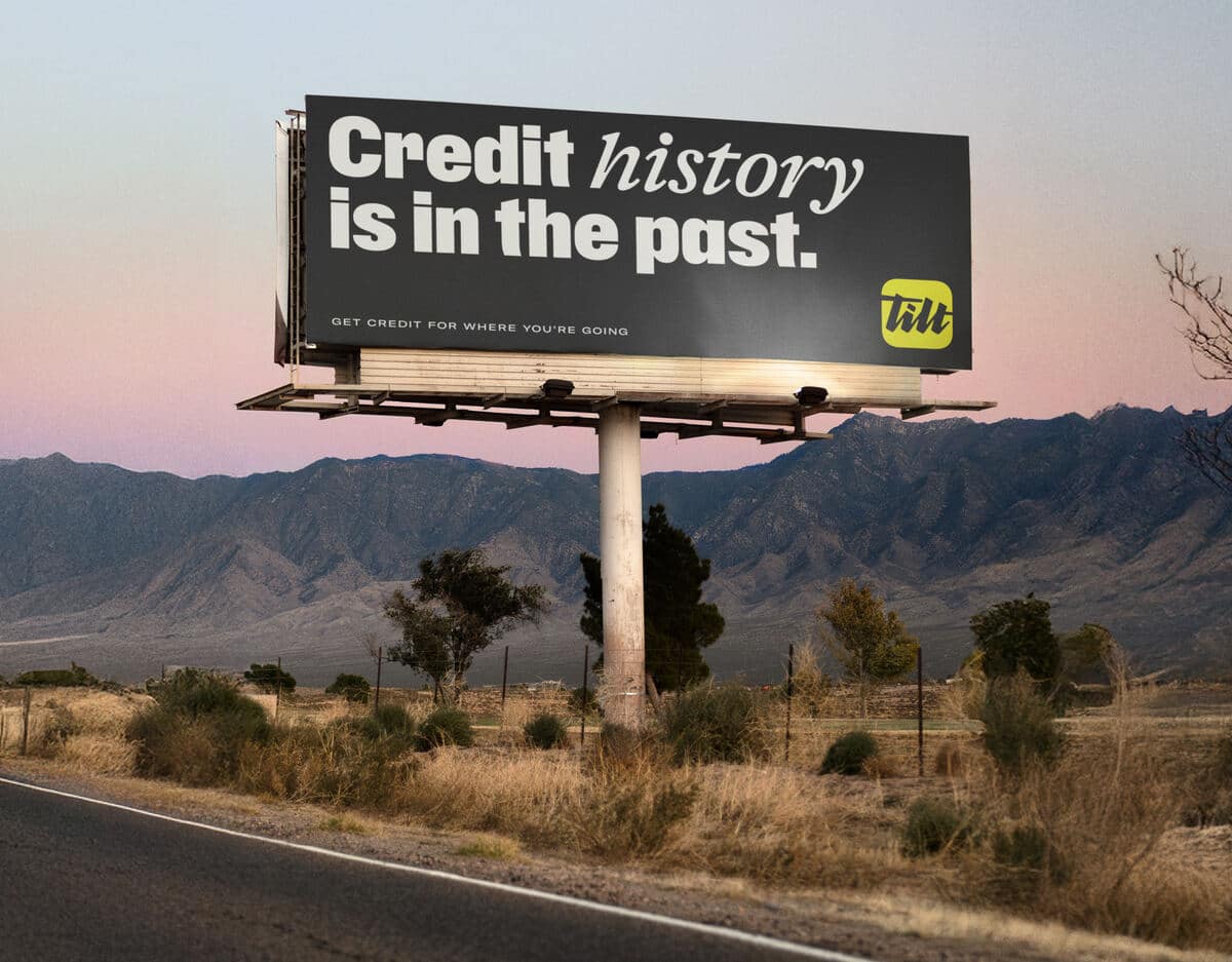
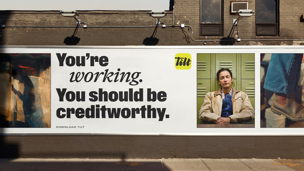
At the heart of the brand refresh is a new logo with distinctive typography that creates a unique appeal. The bold design reflects Tilt’s clear approach to finance, while the teal color scheme adds optimism and character.
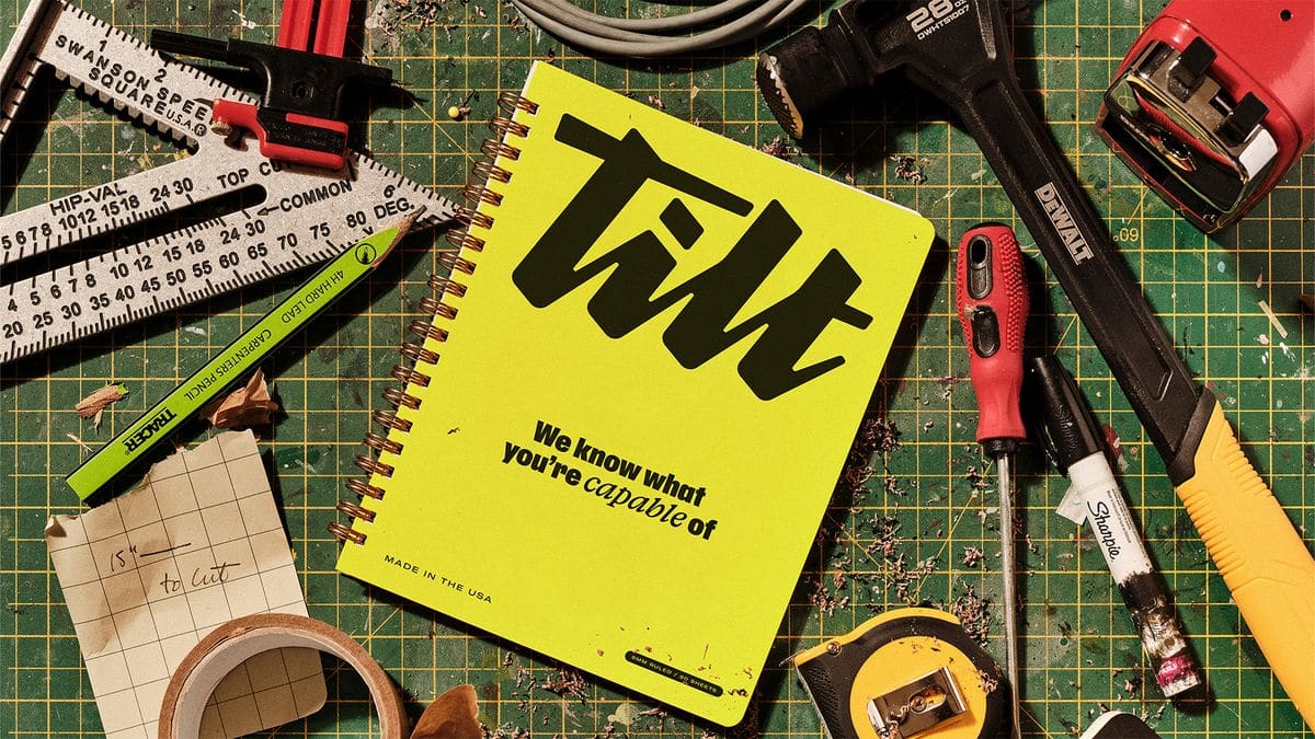
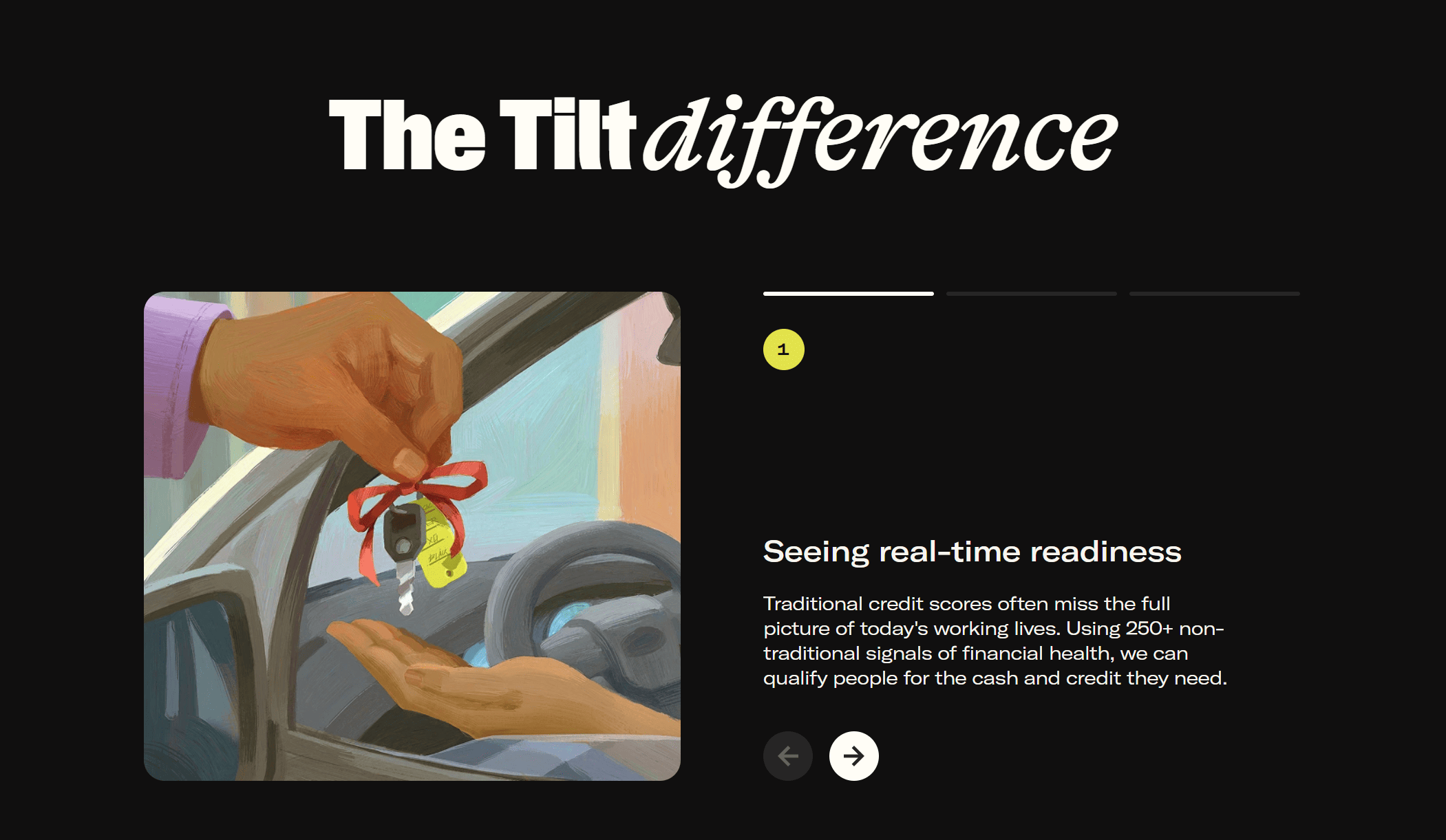
The brand’s personalized headline features a slant that creates a sense of dynamic progression. Combined with illustrations created by Pearl Chuaynarong, the visual elements convey an imperfect, abstract style, emphasizing the human imperfection of the brand.
The Tilt brand voice is one of passion and action, coupled with openness and agility to change.
“So many brands try to act like your friend. But Tilt customers don’t need another friend,” says Fia Townshend, copy director at Ragged Edge. “They need help kicking down doors. So the Tilt voice has an urgent and unwavering belief that emboldens people to keep pushing.”

“So many brands try to act like your friend. But Tilt customers don’t need another friend,” says Fia Townshend, copy director at Ragged Edge. “They need help kicking down doors. So the Tilt voice has an urgent and unwavering belief that emboldens people to keep pushing.”
“Designing a financial brand to feel this alive meant finding the right balance,” adds Jessica Bong-Woon, associate creative director at Ragged Edge. “We wanted Tilt to welcome newcomers while still resonating with those who’ve felt let down by the system. That tension between grit and warmth became central to the brand.”
“This wasn’t about creating another friendly fintech,” adds Matt Smith, Executive Creative Director at Ragged Edge. “Tilt needed a brand with teeth. One that could challenge outdated systems and credit people for their potential. That clarity of purpose is what makes this rebrand transformative.”
Credits:


