


")


")


It seems like Google has decided it’s time for a big change, and is preparing one of the most striking visual updates in Android history. If you thought your smartphone screen had reached its limit of perfection, the tech giant has other plans.
The upcoming Android 17 operating system promises to say goodbye to the usual, solid backgrounds and take a completely new direction that will definitely cause discussion among tech enthusiasts.

According to data obtained by 9to5Google from an internal beta version of the system, the developers are preparing for a visual revolution.
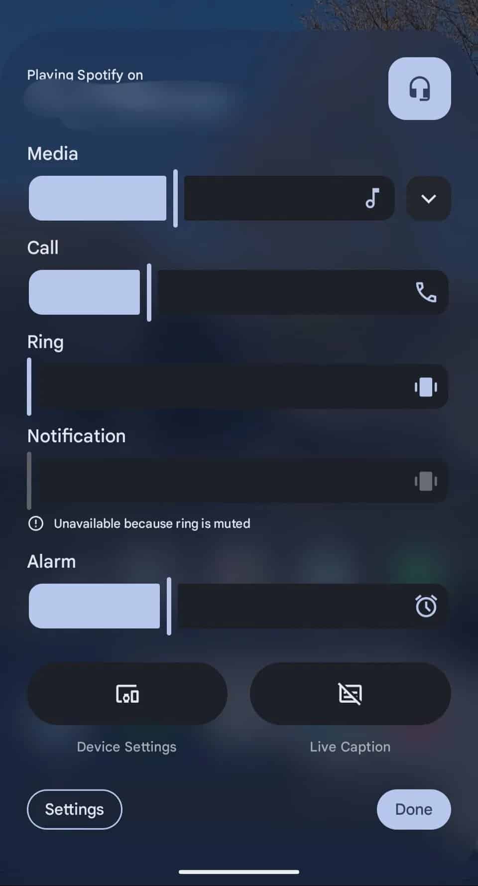
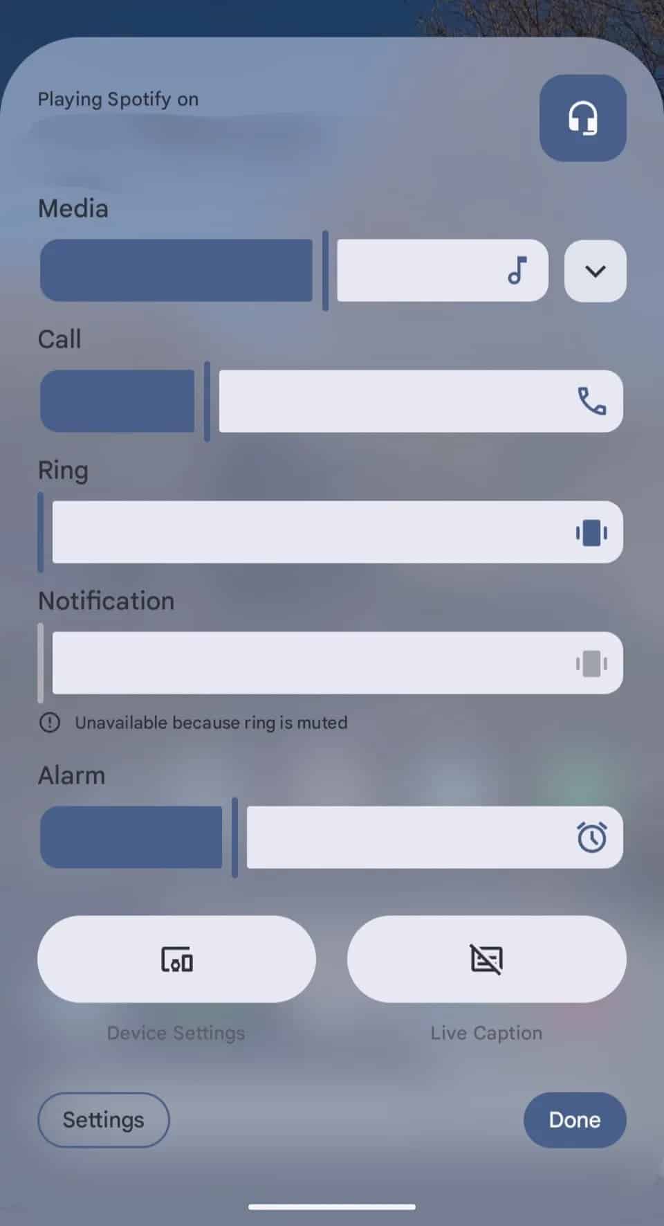
The main innovation is the abandonment of blinding, solid color backgrounds, replacing them with modern, transparent overlays with an elegant blur effect. This means that the phone’s interface will become “lighter” and deeper, and users will no longer be completely separated from what is happening in the depths of their screen.
Glass effect: beauty or functionality?
The new design will make many key interface elements partially transparent. Imagine adjusting the volume, checking battery level, or changing settings in the quick bar, and you’ll no longer be doing it on a gray or black “board” but on a semi-transparent layer through which you can see the apps running in the background or your screen saver.
These changes will affect almost all the most frequently used system components: from volume controls to notifications. However, Google reassures those who like personalization – the ability to choose your favorite accent color will not disappear anywhere.
Transparent elements will simply be subtly tinted with your chosen shade, creating a seamless and stylish look that adapts to the user’s taste, not the other way around.
Inspiration from competitors?
To prevent the new beauty from becoming a headache when trying to read text, Google engineers have come up with smart solutions. It is planned to use additional blurring of background objects and automatic darkening where necessary. Visually, this solution is incredibly reminiscent of the “liquid glass” technology introduced by Apple, which we have already seen in iOS 26 and iPhone 17 models.
True, sources say that Google’s interpretation will be somewhat more moderate and less radical than that of its competitors from California, in order to maintain a balance between aesthetics and convenience.
End of confusion or a new habit?
In addition to the aesthetic “transparency” update, Android 17 is also preparing for a functional overhaul of the notification system, which may take some getting used to. The notification panel and quick settings, which were often combined until now, will be separated.
To see notifications, you will need to swipe down from the left corner of the screen, and to access settings, from the right. This navigation scheme is already very familiar to iOS users, so it seems that Android is aiming to unify the user experience by adopting proven solutions.
Functionality will become stable
Although this update is mainly focused on visual pleasure and the “face” of the system, the main functionality will remain stable. However, a separate and important development direction will be dedicated to mobile game fans – it is promised that the platform’s gaming capabilities will be significantly expanded.
The most impatient have little time to wait – it is expected that the final version of Android 17 will see the light of day in June of this year or a little later.
Credits:
Image:


