Honda unveils revamped logo to adorn all future models
Honda's new logo will gradually shape the company's new identity.
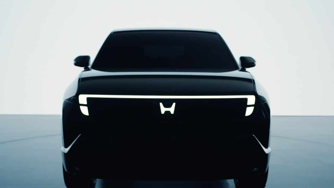
When Honda unveiled its “Zero Series” concepts, it not only marked a bold new direction for the brand but also a bit of an identity shift that paid homage to its rich history, reimagining the iconic “H” we all love and adore.

Like most car brands over the past decade, Honda has finally ditched the skeuomorphic metallic look in favor of a flatter, simpler version of its “H” symbol. And now Honda has announced that the new logo will begin to be used on electric vehicle “models launched in 2027 and beyond.”

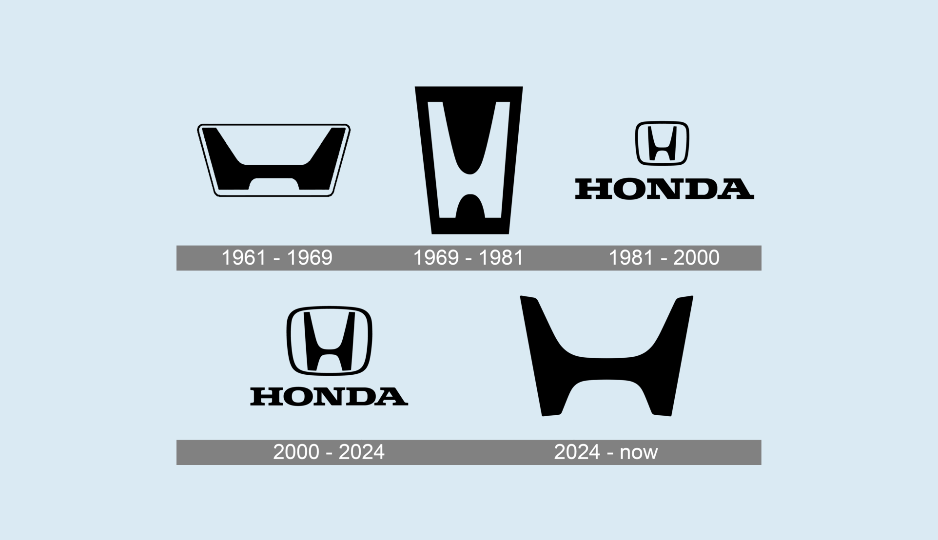
The letter mark retains its curved corners, but its upper parts have been stretched wider, and the entire logo is thicker and more squat. The updated design resembles the brand’s original logo from the 1960s.
Meaning and history
The new logo is meant to resemble two outstretched hands.
The brand was founded in 1946 by Soichiro Honda to produce engines for motorized bicycles as well as complete motorcycles, thus beginning the journey of the Honda wing logo. An independent car manufacturing company emerged in 1948.
In 1962, they began producing cars, including the Honda Civic. The first car, a small commercial pickup truck, featured the Honda car logo on the hood, which bore the brand’s first logo. The second mass-produced car was a sports car with a 2-door roadster body style.
The founder of the brand, Soichiro Honda, was a talented engineer. He dropped out of school at the age of 16 and never returned to study. Despite his lack of education, he learned a lot in auto repair shops. He was about 20 years old when he managed to open his own auto repair shop.
The first Honda Auto badge was created in 1961 and remained with the brand for eight years. It was a dark burgundy rectangular logo with two light blue, almost white elements. The upper part of the badge featured a massive stylized letter “H” with vertical strokes drawn diagonally from the center – a precursor to the Acura division emblem. The emblem was placed above the capital letter logo, using a subtle traditional serif font with full letterforms and clear outlines.
Returning Back
“The idea was to go back to zero – rethink what it means to build and sell cars, to look at Honda’s roots with fresh eyes.”
After that, the logos changed until they returned to the 1960s era. Since 2024, it has been improved and sleeker, but with new technologies, everything can be done much more sophisticatedly. The stretched extra-bold “H” in solid black is now drawn against a transparent background without any framing. The softened contours of the emblem balance its masculinity and massive bars, representing a confident company that values innovation and technology.
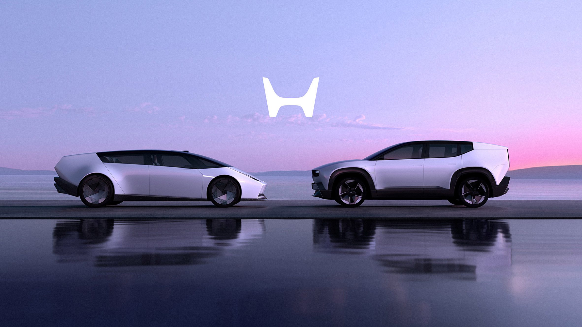

Now Honda says the new H model isn’t just for EVs. It will represent the entire range of cars. The badge, which has graced Honda cars for decades, will soon launch a new chapter that will reflect more on the brand’s movement than what’s under the hood.
The updated logo debuted on two Honda car concepts unveiled at CES 2024 as part of the brand’s launch of the “Honda 0” Series.
According to the brand, this generation of EVs is rooted in its Thin, Light, and Wise development strategy, which focuses on five core values. They include proselytizations such as “outstanding electricity efficiency”, “artistic design,” and “oneness with the vehicle”.
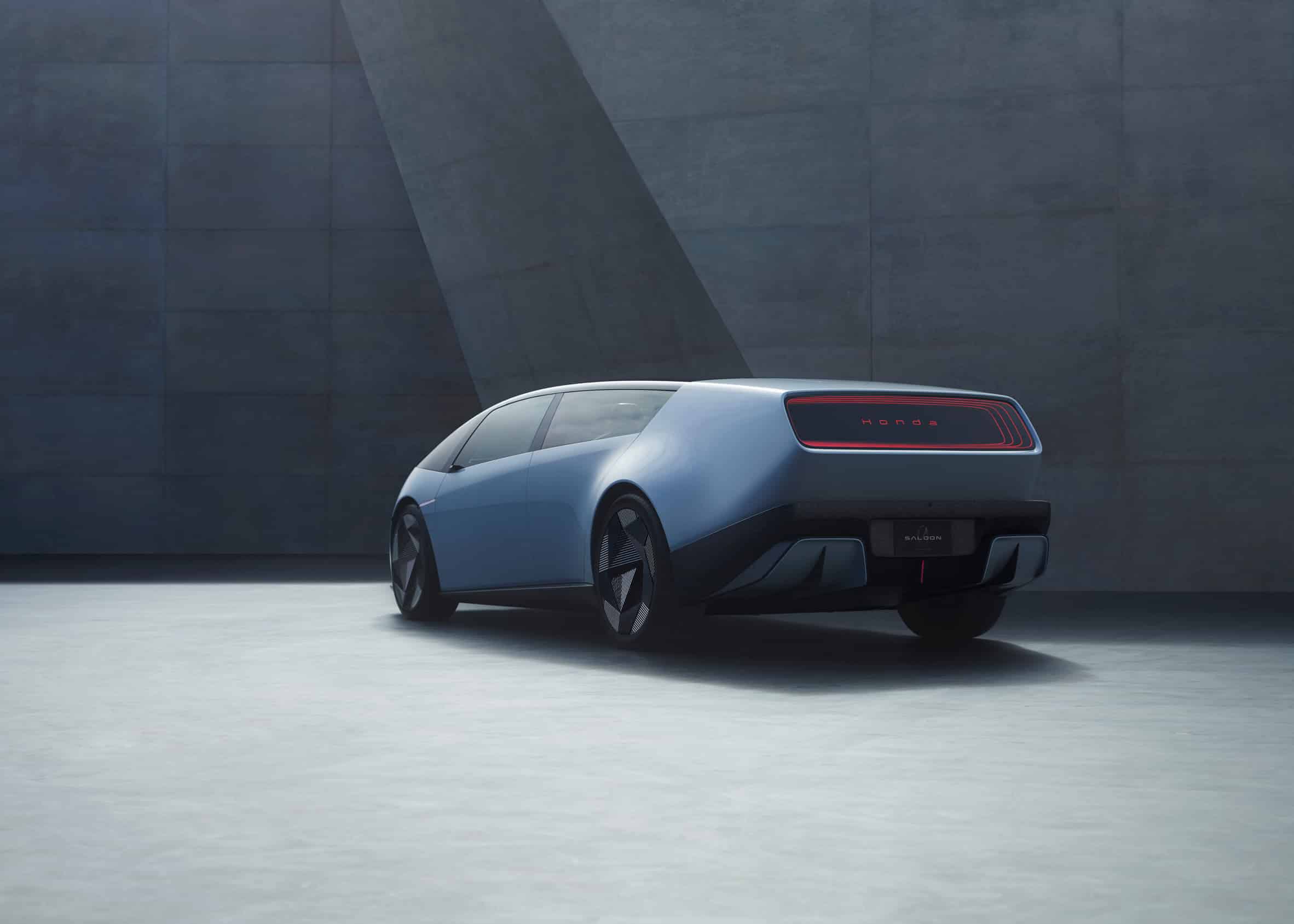
The brand was also used on two 0 Series prototypes unveiled at CES 2025. The prototypes, a sleek four-door sedan and SUV with swept-back rear wings, feature a new H on the front hood. The prototypes also featured a sans-serif Honda logo at the rear, surrounded by rectangular taillights.
What is Honda?
Honda is one of the largest Japanese companies, operating in many fields and industries, but is best known internationally for its automobile and motorcycle divisions. The brand’s cars and motorcycles are considered among the best representatives of Asian brands and are distributed worldwide.
Credits:
All images courtesy of Honda.


