


")
")


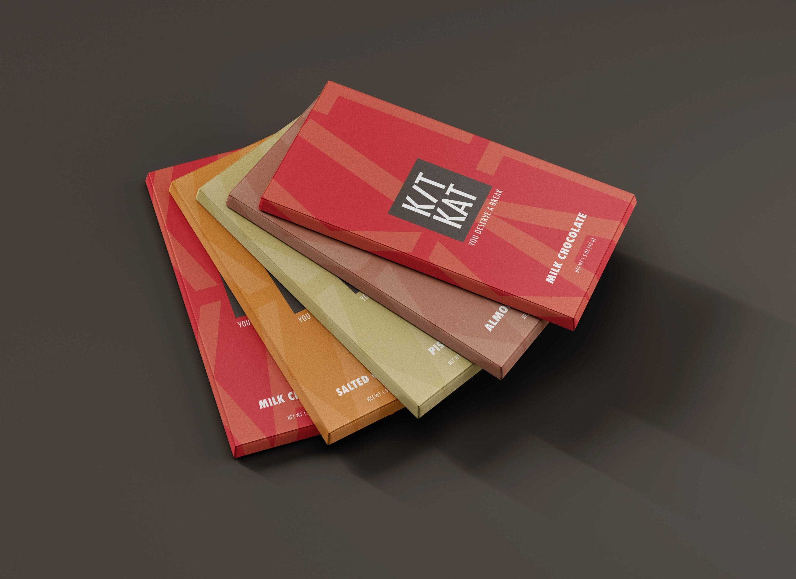
This project undertakes a modern redesign of KitKat packaging, aiming to enhance both functionality and visual presence while preserving the brand’s iconic identity.
The challenge was to reinterpret a globally recognizable product in a way that feels contemporary, refined, and relevant within today’s premium packaging landscape.
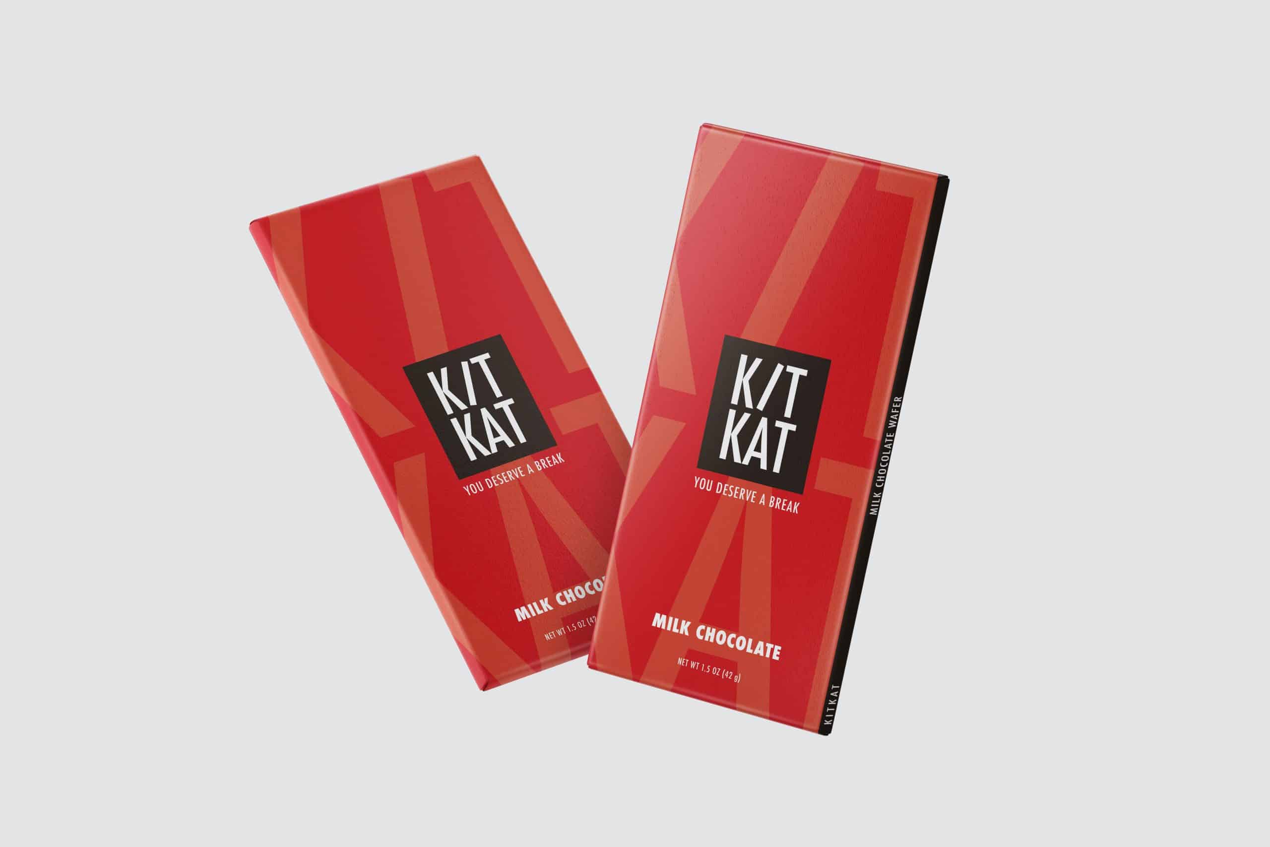
The redesigned design builds on the core KitKat color palette for instant recognition, while returning the visual system to clean, minimalist elements. Simplified typography, refined hierarchy, and thoughtful use of space create a more confident and modern aesthetic.
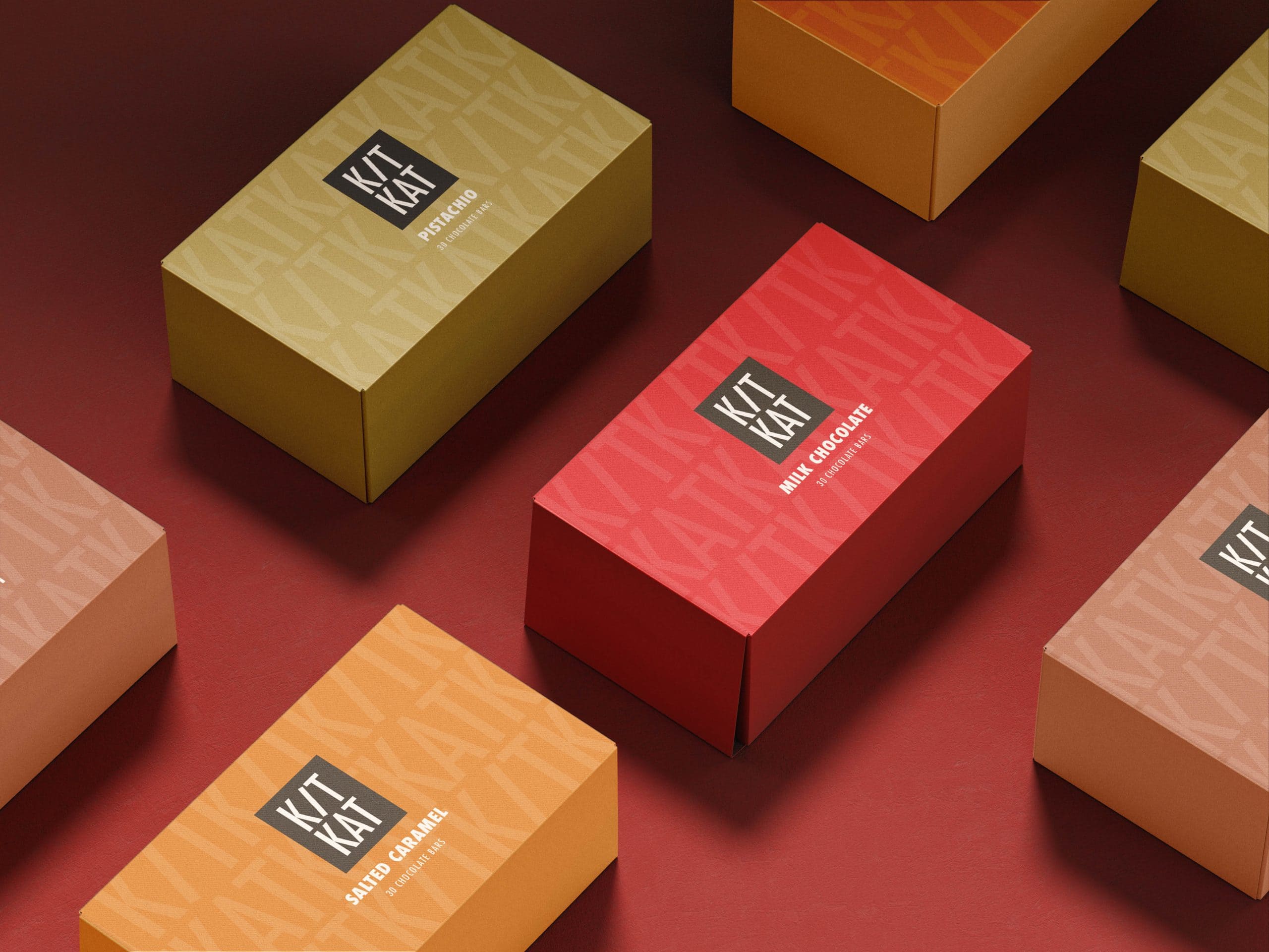
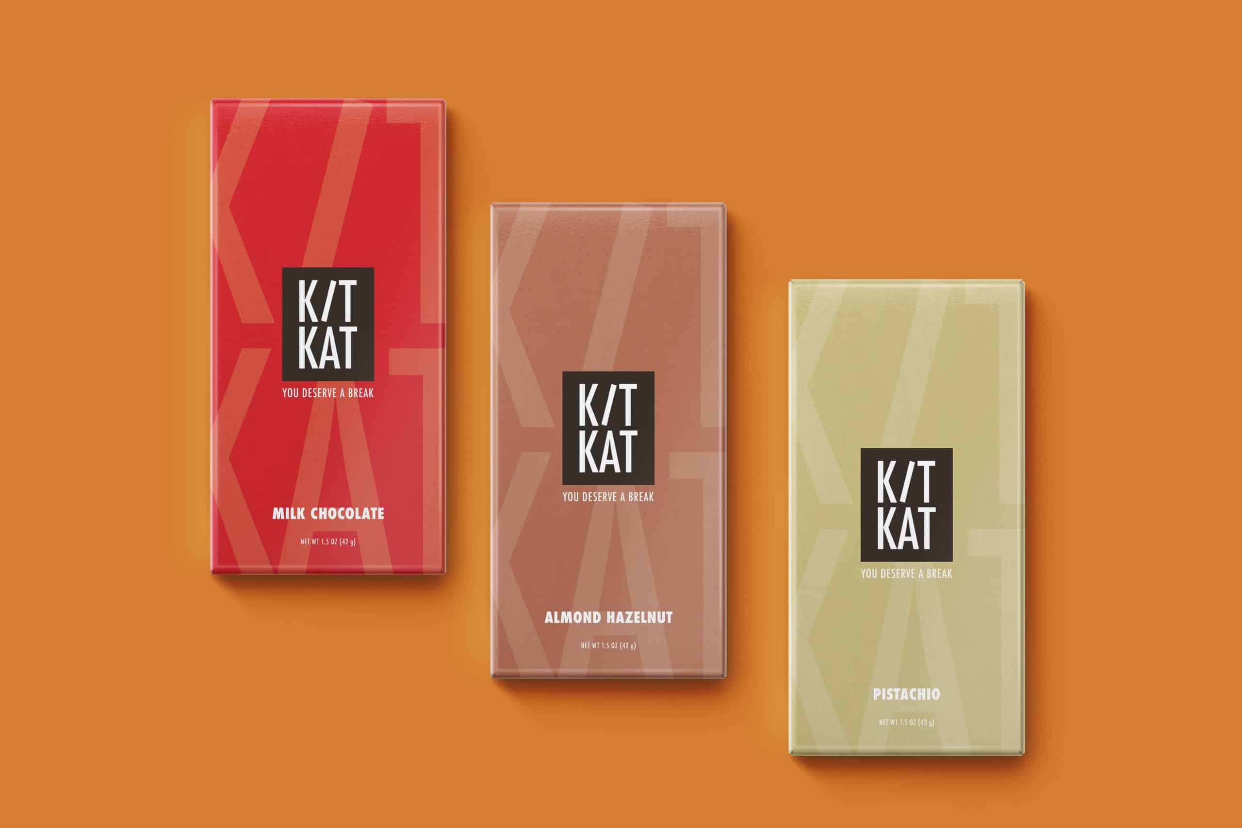
To demonstrate the system’s flexibility, two conceptual variants were presented, illustrating how the design can be extended with new product lines while maintaining coherence and adaptability.
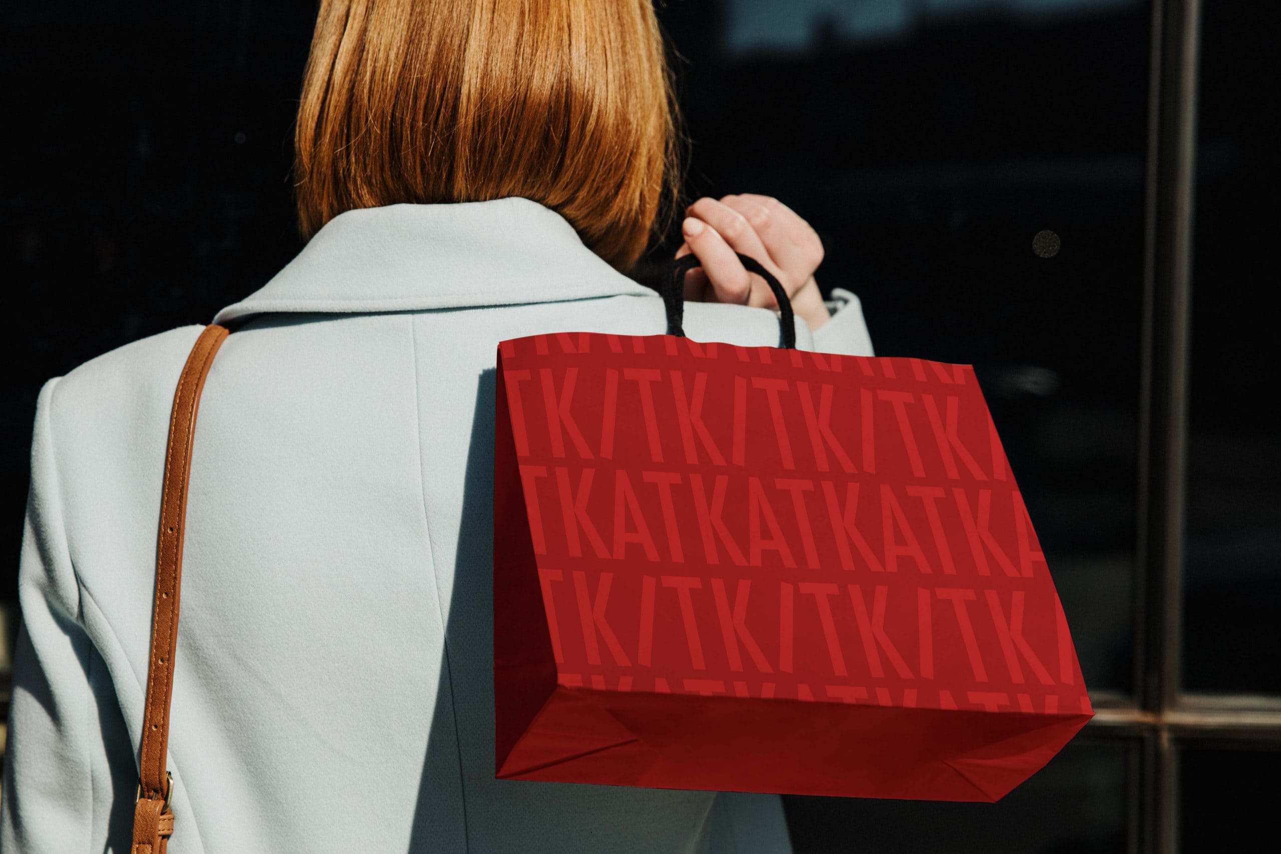
The result is a refined, modular packaging system that combines heritage with modern design thinking. The updated look improves shelf visibility, increases clarity, and helps the brand grow in the future – proving how understated and thoughtful design can take an iconic product’s identity to the next level without losing its identity.
Credits:


