


")
")


‘Kuwait Luxury’ real estate visual identity by Ahmed Ghazi
This project is more than a logo design; it is the creation of a comprehensive identity system.

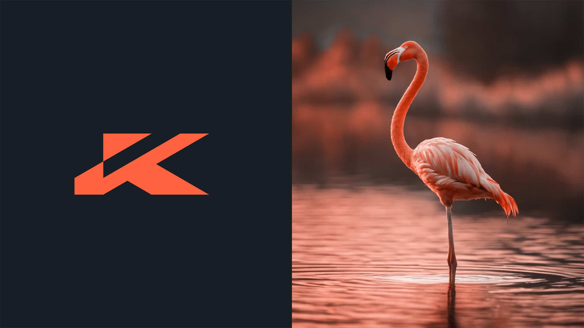
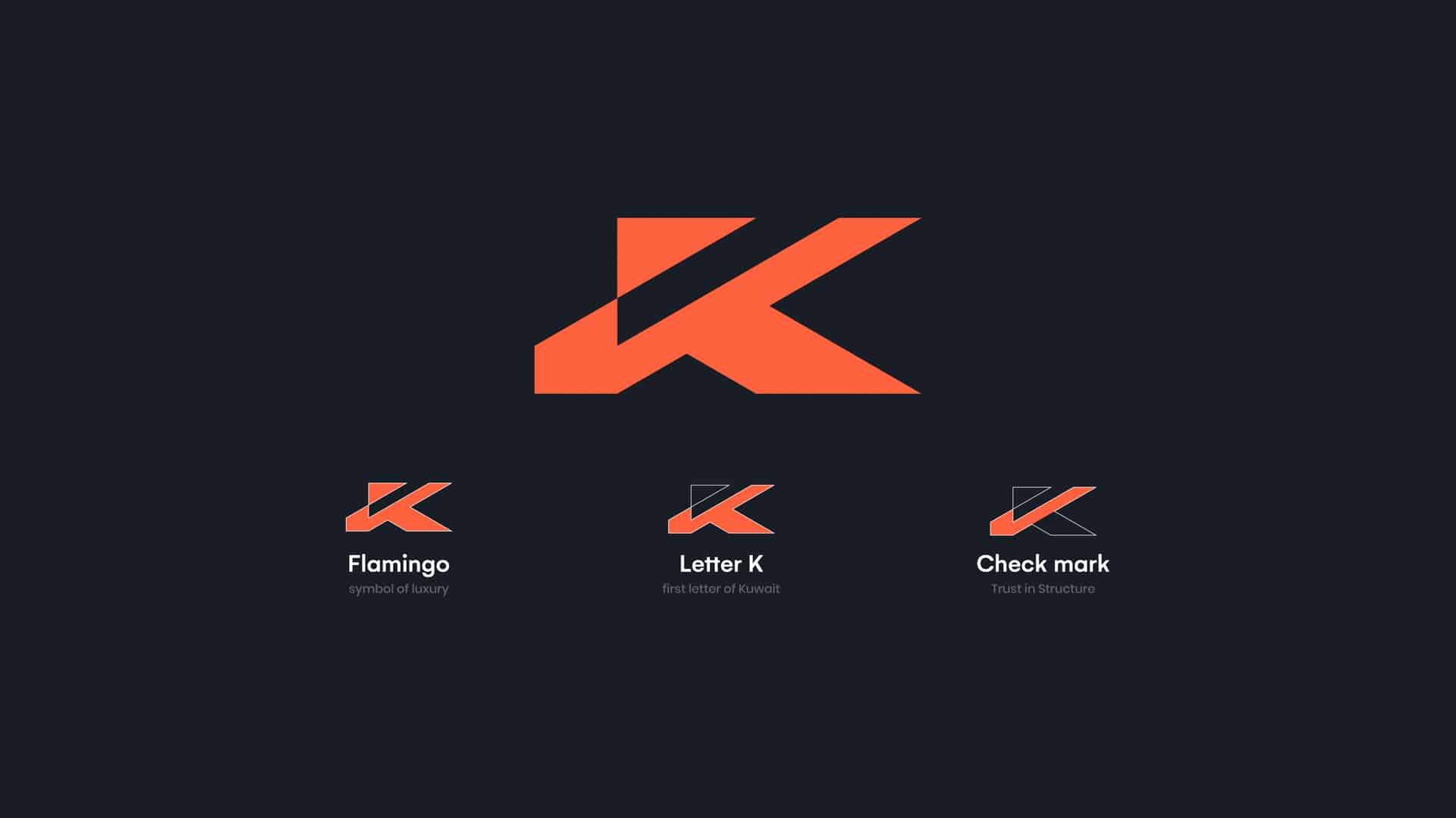
A real estate company specializing in the luxury property sector. The logo is designed around the concept of “quiet luxury” – a clear and confident visual image without visual clutter or unnecessary complexity. The icon is derived from the letter “K”, the first letter of Kuwait, which forms the structural foundation of the identity and is a direct symbol of local belonging and rooted stability.

The letter is constructed with sharp geometric angles and precise lines, reflecting solidity and institutional stability – two essential elements in the world of luxury real estate investments.
Integrated into the geometric structure of the letter, the check mark element emerges as part of the symbol, symbolizing trust, quality assurance, and well-calculated investment decisions. The check mark element is not a decorative element, but a structural component, reinforcing the idea that reliability is not a visual statement, but a fundamental pillar of the brand identity.
The composition also includes an abstract reference to the silhouette of a flamingo – a symbol of elegance, rarity, and exclusivity, interpreted with a contemporary visual approach that connects the brand to the refined lifestyle it represents.
The upward visual direction of the logo conveys a sense of growth and increasing value, making the design a visual translation of a vision focused on continuous development and long-term increasing returns.


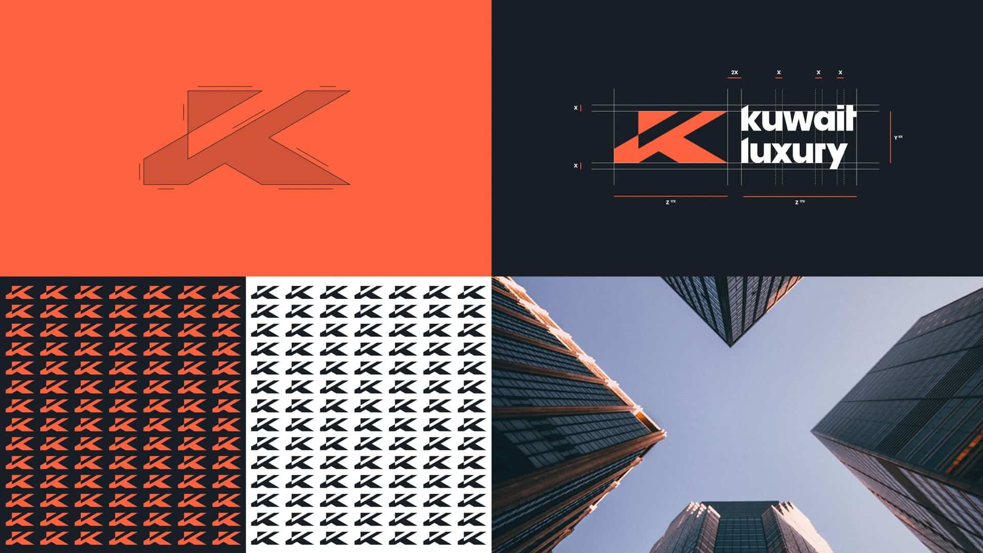
The color system is based on a conscious contrast between a warm coral tone and a deep, dark background.
The coral color symbolizes refined courage, ambition, and positive energy in a fast-paced, dynamic market, while the dark background enhances the sense of luxury, depth, and self-confidence.
This balance of vitality and sophistication creates a strong visual image that enhances memorability and gives the brand a modern character suitable for the luxury real estate sector.
The color system is highly adaptable to all company materials – both digital and printed, ensuring consistency and adaptability of the identity.

The visual philosophy is based on smart minimalism, aiming for the highest semantic density with the fewest possible elements.
The design does not rely on ornamentation or superficial visual effects, but on the clarity of the concept and the solidity of geometric constructions. This approach reflects the brand’s mindset, according to which true luxury lies in precision, discipline, and balance.
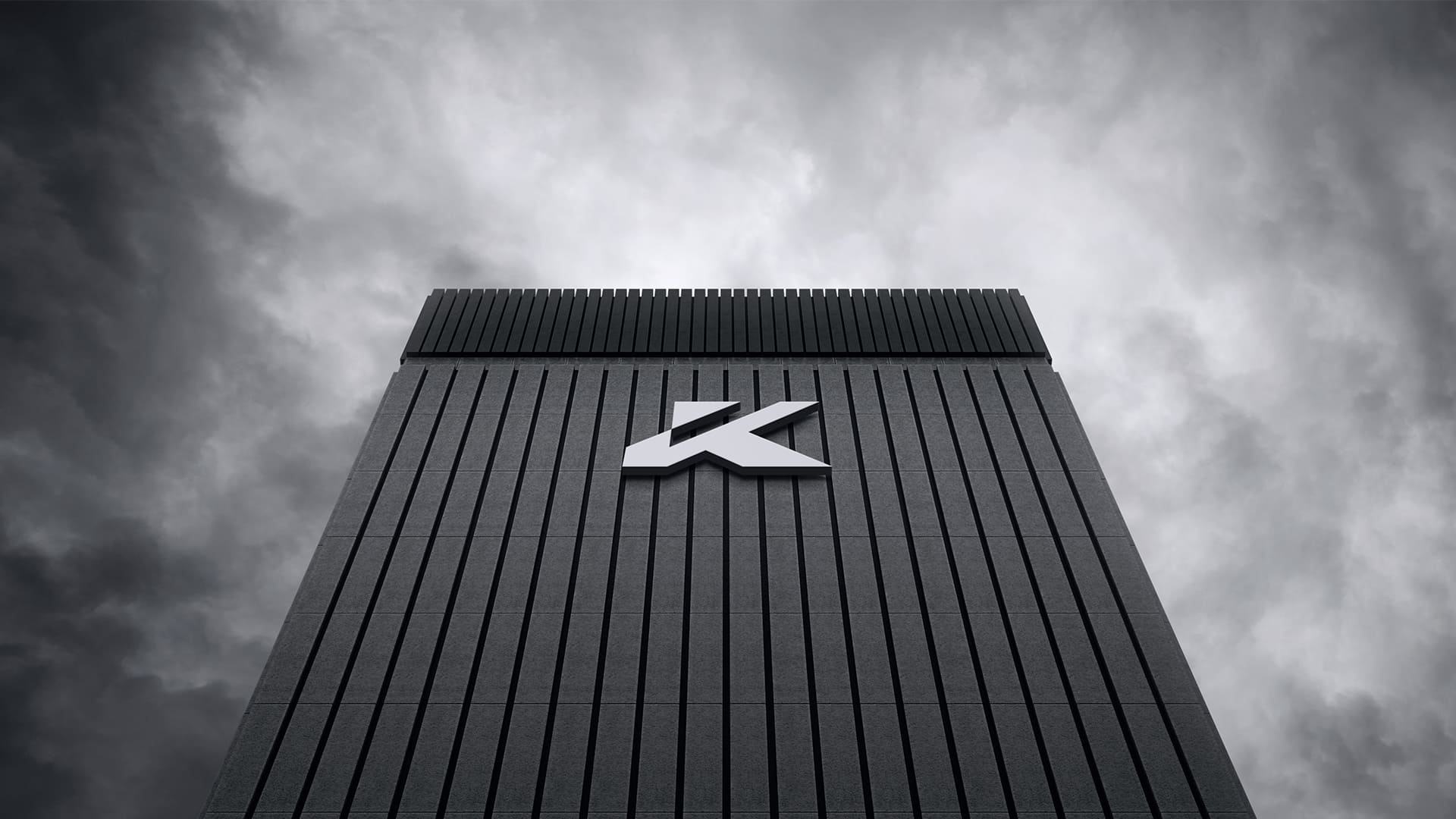
The balance of bold lines and negative space gives the logo great flexibility for adaptation and ensures clarity across a variety of scales and platforms, from large-scale signage to digital icons.
Overall, the identity reflects an integrated visual system that embodies trust, growth, and stability – the core values on which the company is built.
Credits:


