


")
")


Landor rebrands ‘Pearson’ to expand its position in education
The rebranding is part of the company's effort to present itself less as a publisher and more as a provider of inspiration across the entire life cycle, from formal education to professional learning...

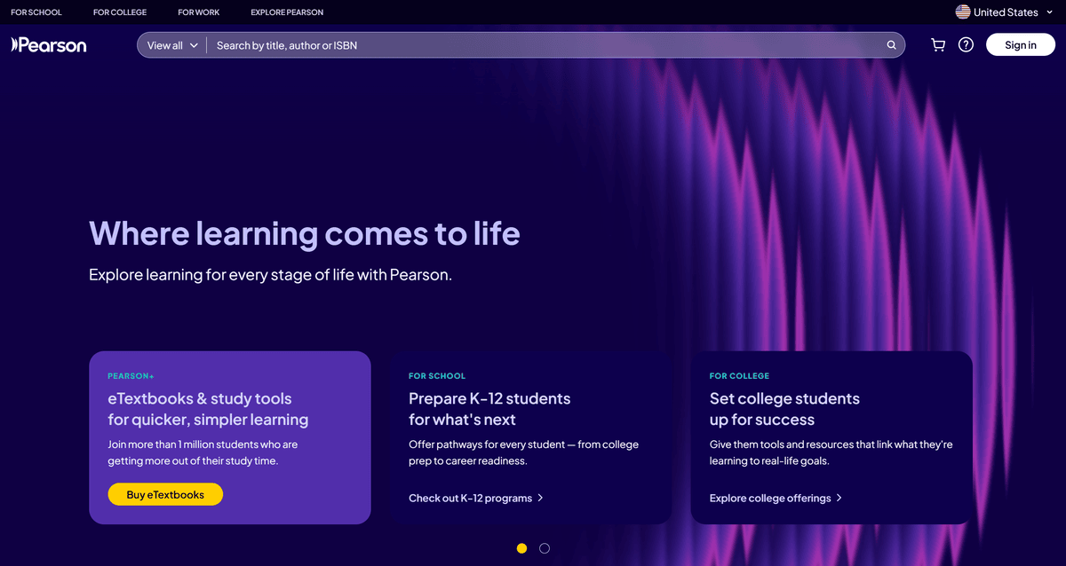
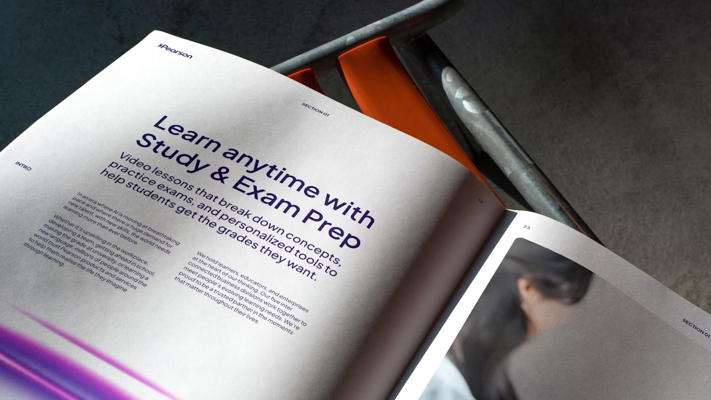
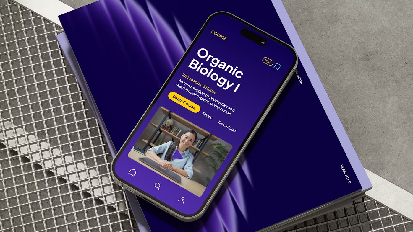
A design agency Landor has rebranded and creates a new brand identity to Pearson as a lifelong learning company.
“Today, we are known as an educator textbook company, and we’re on a mission to change that,” says Pearson’s vice president of global brand, Rachel Exton.
Changing a brand is not an easy task, so it took a lot of effort, but changing the look of this education company breathed new life into it.
Accordingly, a complete package was created, from the logo, color palette and web design, which have a lot to say, effortless colorfulness, and other attributes that adapt to it, and the logo, it can be said that everything was 100% successful.
The Ambitions
“Our ambition is to be the global leader in AI-powered learning, empowering both educators and learners to unlock better outcomes through smarter, more personalized experiences,” Exton explains.
The previous logo, which launched in 2016, was created by Together and built around a new badge developed by Freemavens. A question mark and an exclamation mark came together to form a thumbprint ‘P’ symbol in a blue roundel.
The rebrand needed to reflect “the explosion of digital ecosystems and the new ways people learn throughout their daily lives”, says Landor’s executive creative director, Graham Sykes. “Our commitment to help people realize the life they imagine through learning.” he adds.
When creating the new brand, the client relied on academic research that shows that people who spend more time learning, both in formal and informal settings, are more likely to say they have a purpose in life, Landor described.
The New Logo
The new logo comprises a wave symbol and a wordmark. “The logo is a symbol of momentum. That wave isn’t just a design flourish, it’s a statement,” says Sykes. “Learning sets off a chain reaction. It doesn’t stop at knowledge; it moves through lives, careers, communities.”
The logo was drawn in by Landor’s typographic studio in Milan, as deliberately open, bold and human. “No sharp edges, no elitism. Just confidence and clarity, because learning should feel accessible to everyone.”
New Color Palette
When Speaking about color palette the Sykes explain that the deep purples ground the brand in credibility, while the vibrant accents bring energy, optimism and a sense of motion. “This isn’t a static identity, it’s built to evolve, to grow. Just like the people we design for.”
Brand New Font
The brand’s typeface, ‘Plus Jakarta Sans‘, gives Pearson clarity with character, he adds. “It’s clean, flexible, and legible across every touchpoint, but it’s not sterile. There’s warmth in its rhythm and openness. It speaks the language of modern learning: smart, inclusive, and ready to scale.”
The new font also supports Latin, Cyrillic and Vietnamese – vital for a company operating in multiple languages.
The success of the new brand, including awareness and familiarity, will be measured through Pearson’s annual brand health check. So the agency’s work with Pearson continues, says Exton: “As part of our brand relaunch, we are reviewing our brand architecture in partnership with Landor.”


