


")


")


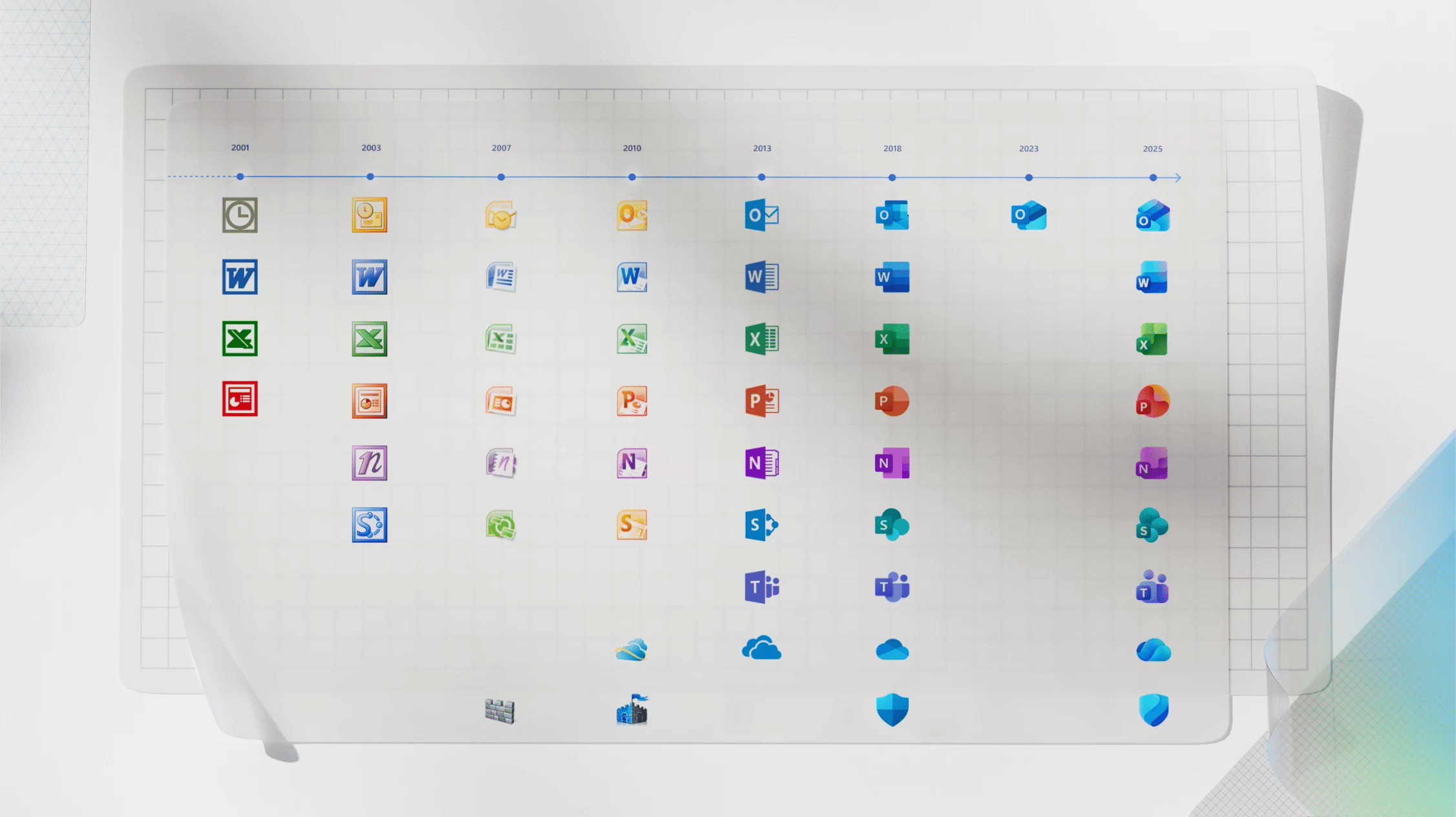
In the coming weeks, you will see the icons on your Windows computer updated. Some of the most recognizable tech iconography will be redesigned for the first time since 2018. Microsoft is updating the logos for many of its most popular 365 services.

There are new icons for Defender, Excel, OneDrive, OneNote, Outlook, PowerPoint, SharePoint, Teams, and Word. The new icons have more fluid shapes rather than the rigid icons previously used.
Microsoft’s Jon Friedman, CVP of design and research for the software, wrote a blog post explaining the changes. He says, “Sharp edges and crisp lines are replaced by smooth folds and curves, giving the icons a sense of playful motion and approachability.”
The brand has also applied this update to the color scheme, focusing on richer and brighter shades for each icon.
Friedman also explains how the company had considered dropping the letter icons from logos, such as Word and OneNote, as part of the redesign. He says, “Their brand equity is so strong, however, that we decided to keep them – maintaining our heritage while also modernizing them through a more cohesive visual integration with the overall design.”

The brand has also tried to simplify each of the logos. It was inspired by Microsoft’s work on the Copilot logo, which debuted in 2023, as well as the influence of AI services across all of Microsoft 365. Friedman says, “A reflection and a result of Copilot’s transformative impact, the new designs visually complete a cycle where art and truth continuously shape each other.”
The below image from Microsoft shows the history of its Office iconography.
The new icons will be coming to you across all your devices, like desktop, web, and mobile.
Credits:


")