


")
")


Olga – a fashionable minimalist visual identity
Explore the minimalist visual identity for Olga, a fashion brand by João Menezes and K M.

Olga presents a case study of how to create a brand that takes a step back to allow the wearer to step forward. The project addresses a common problem in the fashion market. Many brands try to dictate how women should dress or shop. They impose specific styles or follow short-term trends.

Olga chooses a different path. She rejects the idea of guiding or correcting the client. Instead, she offers a space based on respect. The designers focused on a clear goal from the beginning. They chose not to follow trends. They avoided imposing choices on the audience.
This creates a unique position in a crowded market. The clothes are not at the center of the brand. They are treated as a consequence of the brand philosophy.
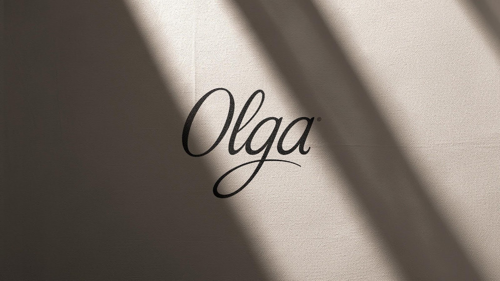
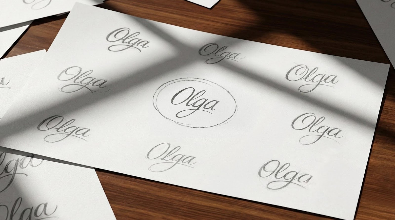
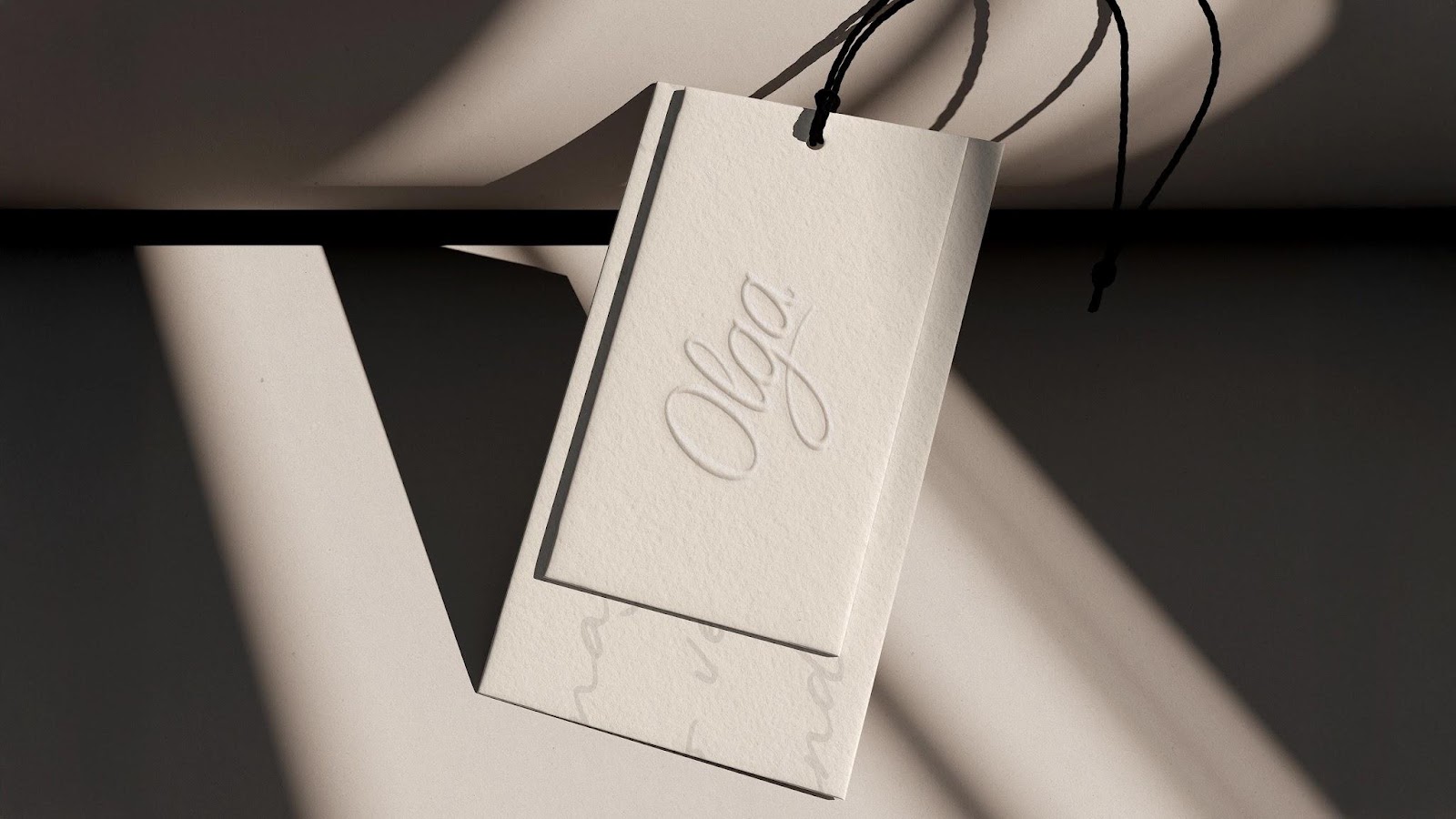
The visual identity reflects this core idea of freedom. The logo is a key element. It acts as a handwritten signature. This choice reinforces the feeling of intimacy. It also hints at authorship. The signature is personal and strong. It feels more like a human touch than a corporate one. This choice helps the brand feel like a consumer.
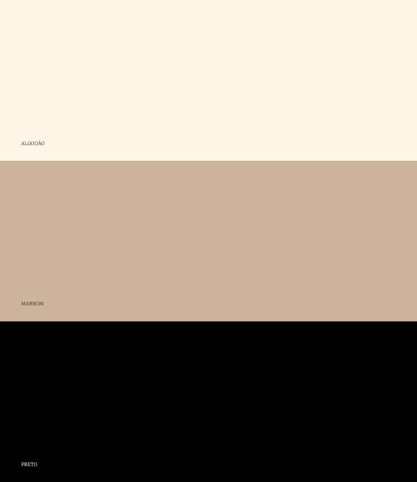
The designers used specific materials to give it a physical feel. This tactile feel ensures consistency across all touchpoints. Whether it’s a tag or a digital space, the brand feels the same. The result is a clear and strong identity. It’s ready to grow without losing its original meaning.

João Menezes and K M collaborated with Raphael Freire to bring this vision to life. They focused on simple adaptations. This simplicity is intentional. It allows the brand to remain flexible. A complex identity can sometimes hinder the product.
Here, the identity complements the product without overpowering it. The brand acts as a space where women can enter and feel heard. There is no pressure to adapt. It is a bold move in an industry that is often driven by rapid change. By ignoring trends, Olga creates longevity. The brand identity feels timeless because it is connected to a person’s signature.

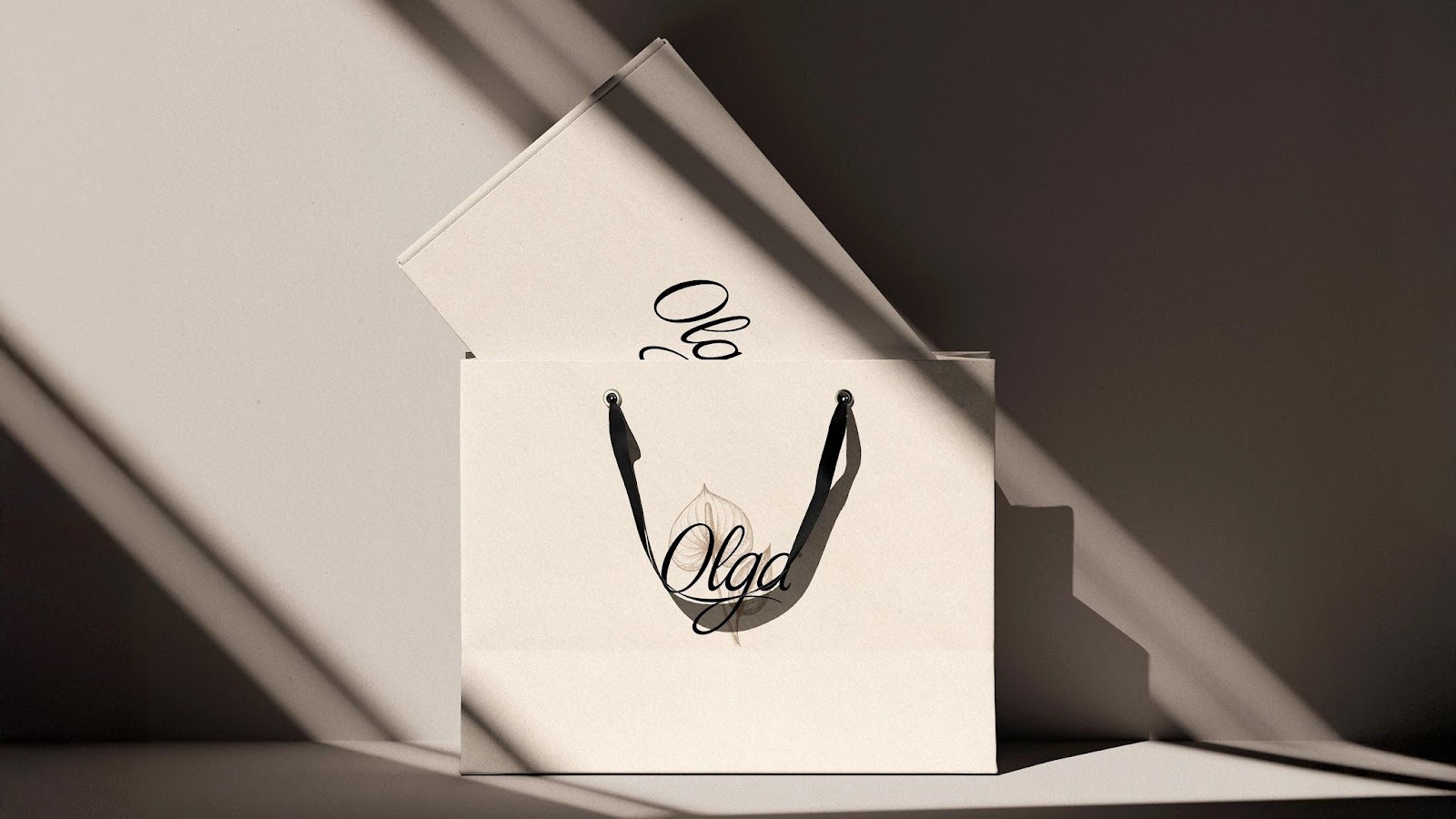
The project shows that visual identity can be a powerful tool for respect. It moves away from the noise of traditional retail. It moves towards a calmer and more confident stance. The focus on materials and feel adds a layer of quality. It shows that details matter. Each application of the logo is done with care. Such consistency builds trust with the audience.
A brand is not just a logo; it is an experience. It is a space created for autonomy. This project reminds us that good design often involves knowing what to leave out. By removing the fluff, Olga’s soul becomes clear.

Credits:


