


")

")


Only has rebranded Cambridge Audio, a much-loved British hi-fi brand founded in 1968. The Manchester-based studio, founded by brothers Daniel and Matthew Tweddle, began working with the company in late 2023.
Cambridge Audio wanted an agency with experience in both music and industrial design, as the new identity spans products, digital, marketing and communications.

Nick Udall, marketing manager at Cambridge Audio, says the work was driven by the need to attract and engage a wider range of consumers.
He says the company had “an early mover advantage” when it first got into streaming, but its brand still tended to speak to the older, male audience that tends to dominate the hi-fi market.
“When you look at the data from the streaming giants, there are more female listeners than male,” Udall explains. “We needed to change not just the brand, and how we look and feel to a younger and more diverse audience, but also the product set that goes with it.”
Daniel Tweddle, Only’s strategy director, says the key thing was to “avoid the temptation to pivot everything towards the sensibilities and tastes of the new demographic you’re trying to reach.”
“The thinking here was not to pivot from one group to another, but to broaden out the definition of who we were trying to speak to,” he explains. “What do they have in common? It’s passion and enthusiasm for music, so we wanted to build around that feeling.”
And both Savage and Udall say the brand had to resonate internally too, among staff whose shared love of music manifests in different ways.
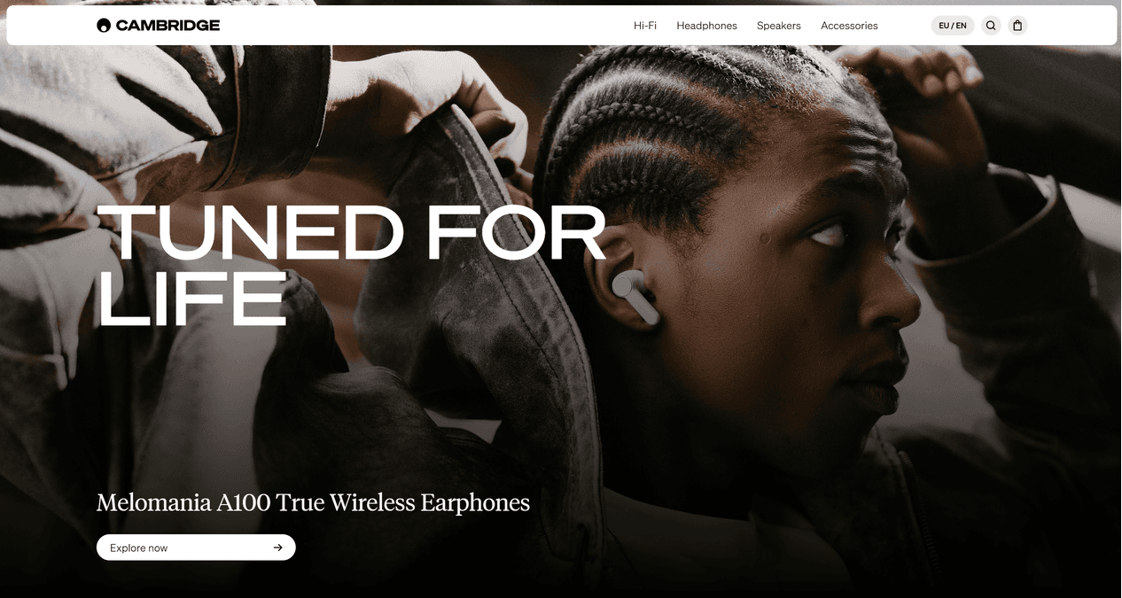
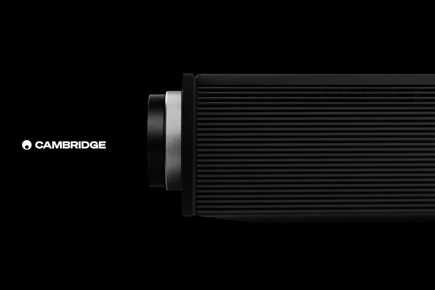
The company had already developed a brand idea – “made with music” – and wanted to keep this mark – a small circle within a larger one.
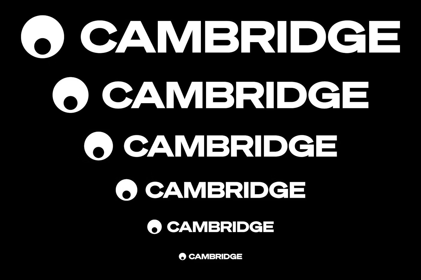
But Only changed the way the mark is used with the logotype, allowing them to appear independently – “to give them more power in different contexts” – and redrew the logotype.
This was a tricky job, Matthew Tweddle explains, because of the many manufacturing and production processes that shape how it appears. “There are so many ways that it’s seen on the products,” he says. There was a lot of consideration about the weighting of each letter and a lot of nuance in the way it’s designed.”
“It allows us to communicate in a wide range of tones to different audiences at different times, while always feeling consistent,” Matthew Tweddle says.
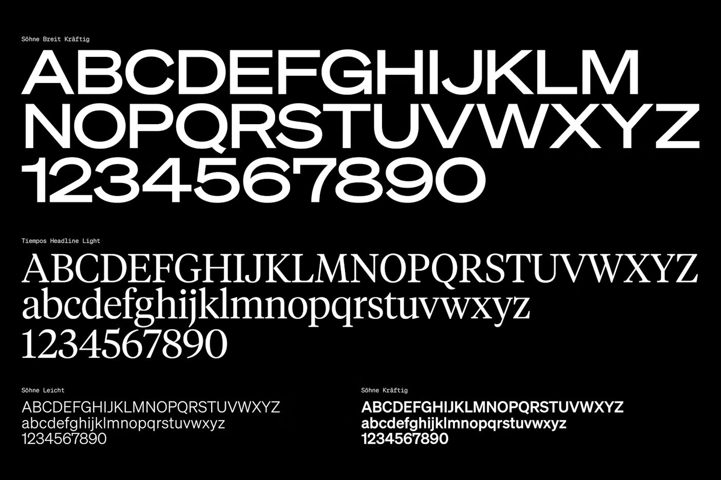
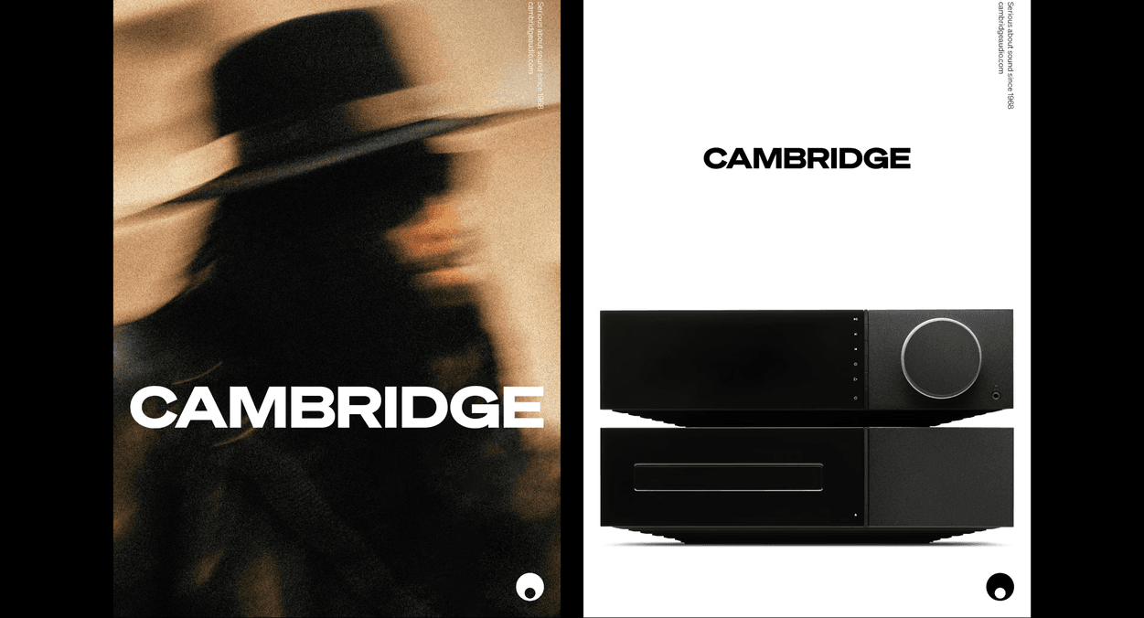
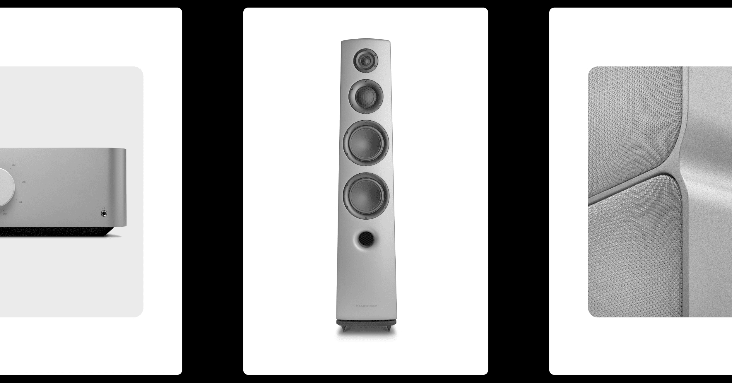
The colour palette focuses on black and white, but there are other colours, inspired by designs from the Cambridge Audio archives, which are being rolled out too, most notably a burnt orange.
Over the period of working together, Matthew Tweddle says they encouraged the Cambridge Audio team “to take design as seriously as they do engineering.” Through those conversations, “the scope of what started out as an identity project has grown and grown.”
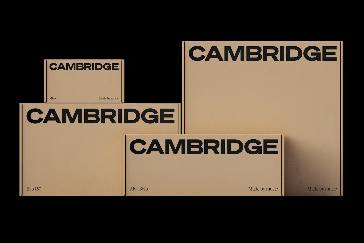
Daniel Tweddle says the new audiences the brand wants to reach “really care about the aesthetics of the products, not just great sound,” and that had to shape every design decision, from the product screens’ UI to the packaging and the new website.
“The technology has always been amazing, but the interface itself, and the design of some of those elements, didn’t give you that immediate sense of a best-in-class experience,” he says.
Photography courtesy of Only and Cambridge Audio.


