


")
")


Showcase of red websites: 25 top designs
Come and see how many amazing red websites there are, maybe you will be impressed and use red color in your web design.

Red is probably the most commonly used color in web design. Are you interested in creating an outstanding website design with vital elements that will seamlessly grab visitors’ attention? Use vibrant colors like red in your web design layout without waiting for anything.

You may also like:
Showcase of Red Websites
These red color palette websites offer impressive and innovative design inspiration that you can apply to your projects. They will serve as examples for you, which you can try to clone for your own web space.
Consider how red is used on popular and official websites. Whether it is a background color or a bright accent color, red can really catch the eye. Dive into some of these red website design inspirations and let your brain fantasize, create, and realize. It’s a very flexible color when it comes to style.
Red is the color of passion, the color of blood and, they say, the color of winners.
awwwards.com
So, without further ado, let’s jump into the red websites examples that will blow your mind:
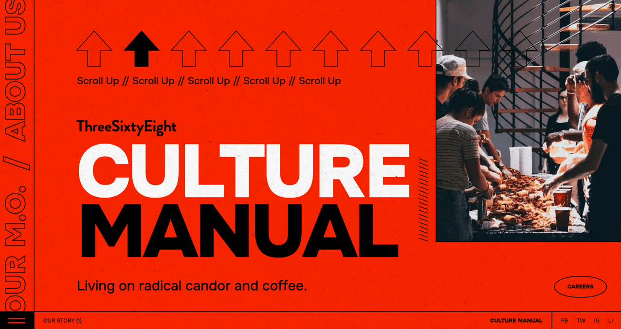
1. Culture Manual
A passionate and charming website layout in bright red with black accents. Suitable for business, modern activities or small student news.
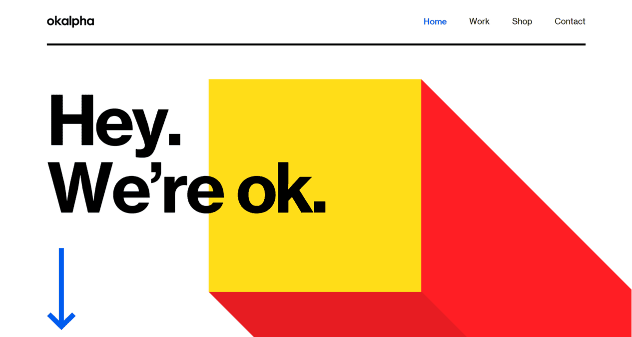
2. Okalpha
A simple yet unusual website layout dominated by white and red colors. A design suitable for both small websites and large projects.
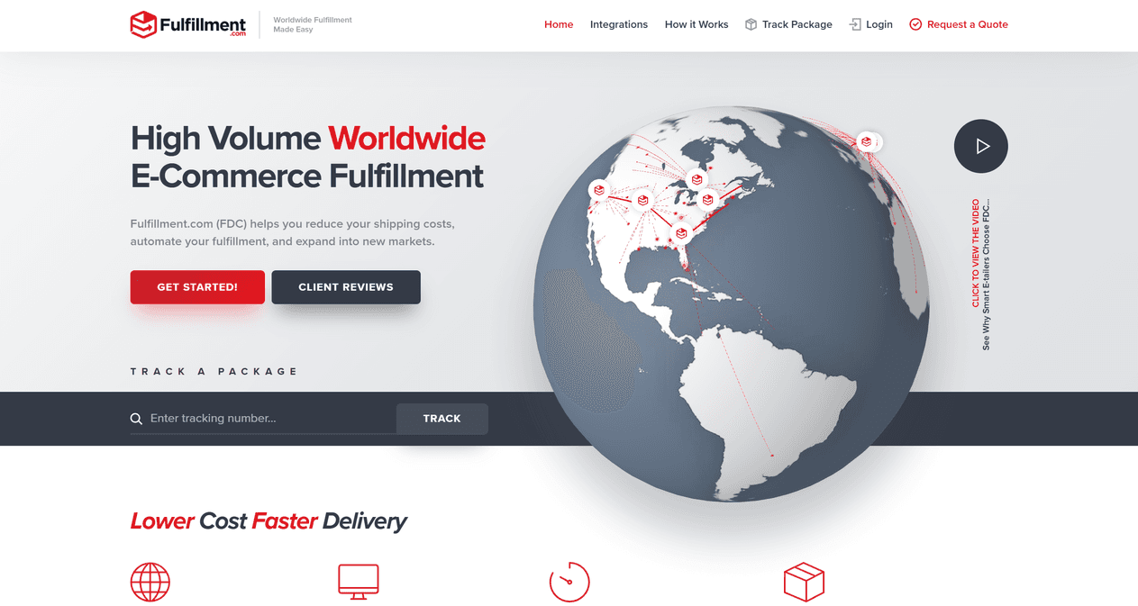
3. Fulfillment
A business-like web design that you can’t take your eyes off. The dominant colors are red, gray, and white. If you work with the world, this layout is really business-friendly.
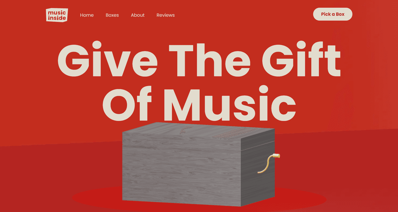
4. Music Inside
The fulfillment of every musician’s wishes is their website’s aspiration. It is red in color, which emphasizes the passion for music. The music box allows you to understand the essence of this page.
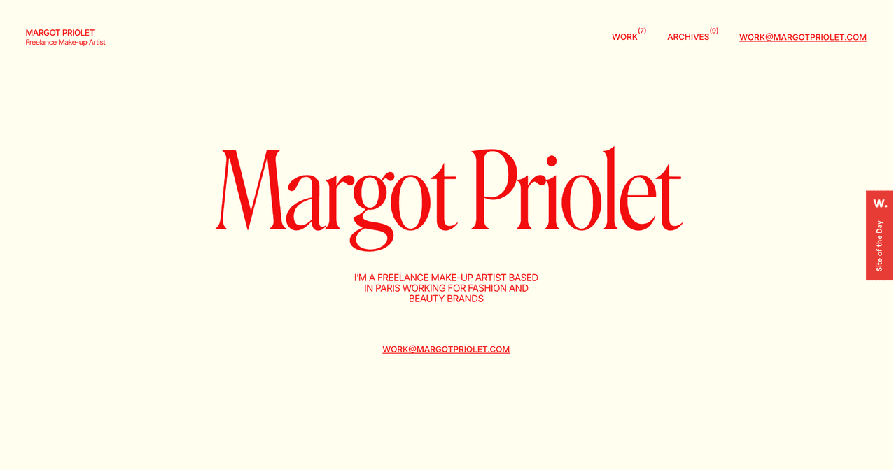
5. Margot Priolet
A personal blog for reading, interest and endless enjoyment. The yellow background and red menu, logo and title create a visually special, attention-grabbing layout.
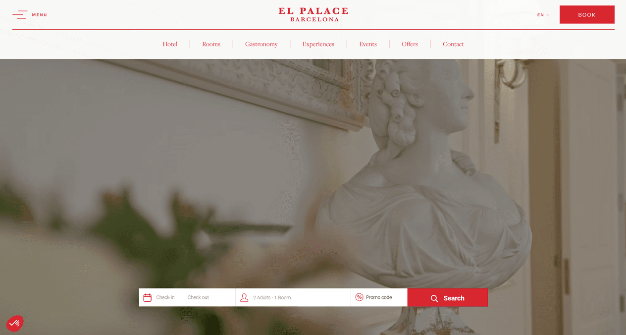
6. El Palace Barcelona
A simple yet royal web layout for a hotel in Barcelona. A bit of red to highlight the most important information and a video to create a sense of movement.
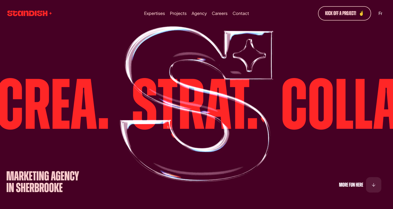
7. Standish
A motion design marketing agency website with some red accents. An interesting solution leaves many questions that one wants to answer after visiting.
8. Baunfire
A portfolio review website in red layout. Simple design with a bit of movement. What more do you need?

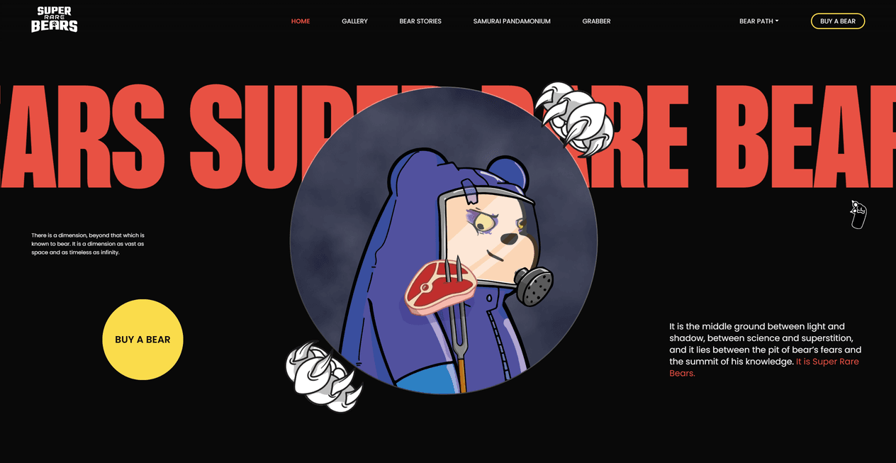
9. Super Rare Bears
An interesting solution that brings more color than red. The layout is mostly black, with red text as an accent, which is bold.
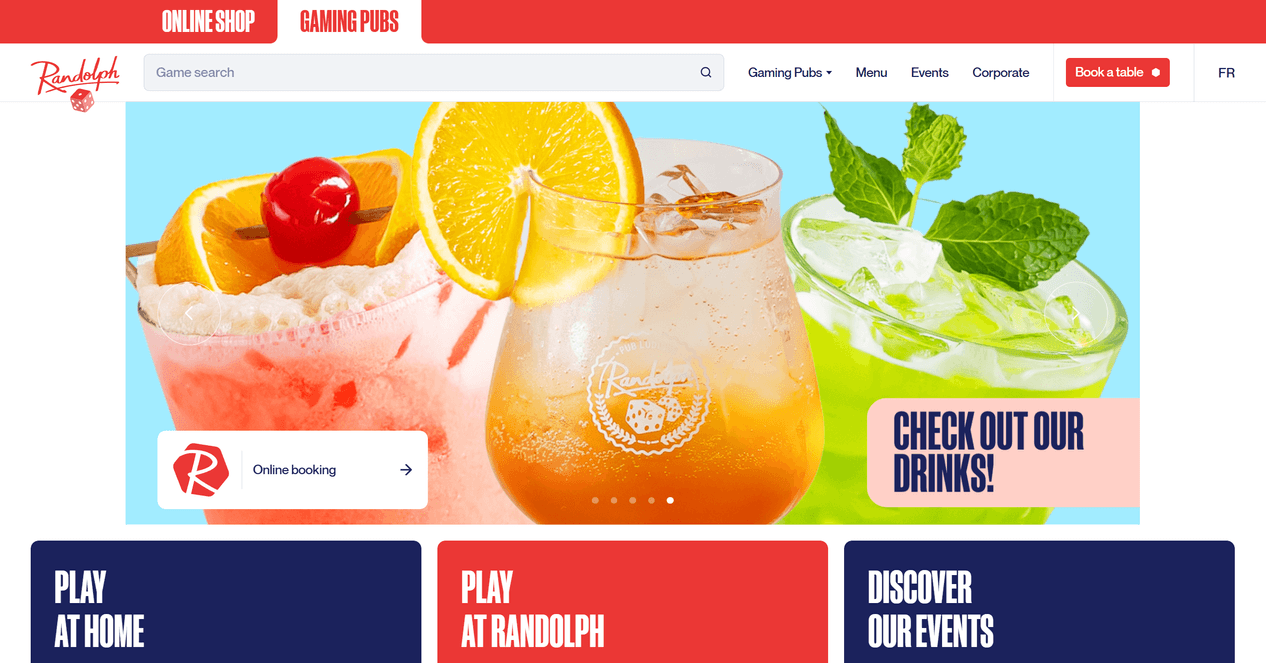
10. Randolph
The detailed website design is combined with a few colors, with white and red dominating, as the layout is suitable for a pub, so it’s worth exploring.
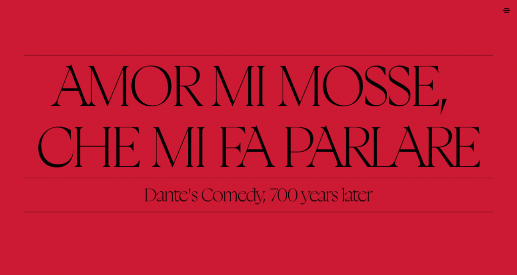
11. Divina Lingua
A simple red with black accessories website layout, which is suitable for art gallery, portfolio or others. Modernity is hidden, so discover it by visiting.
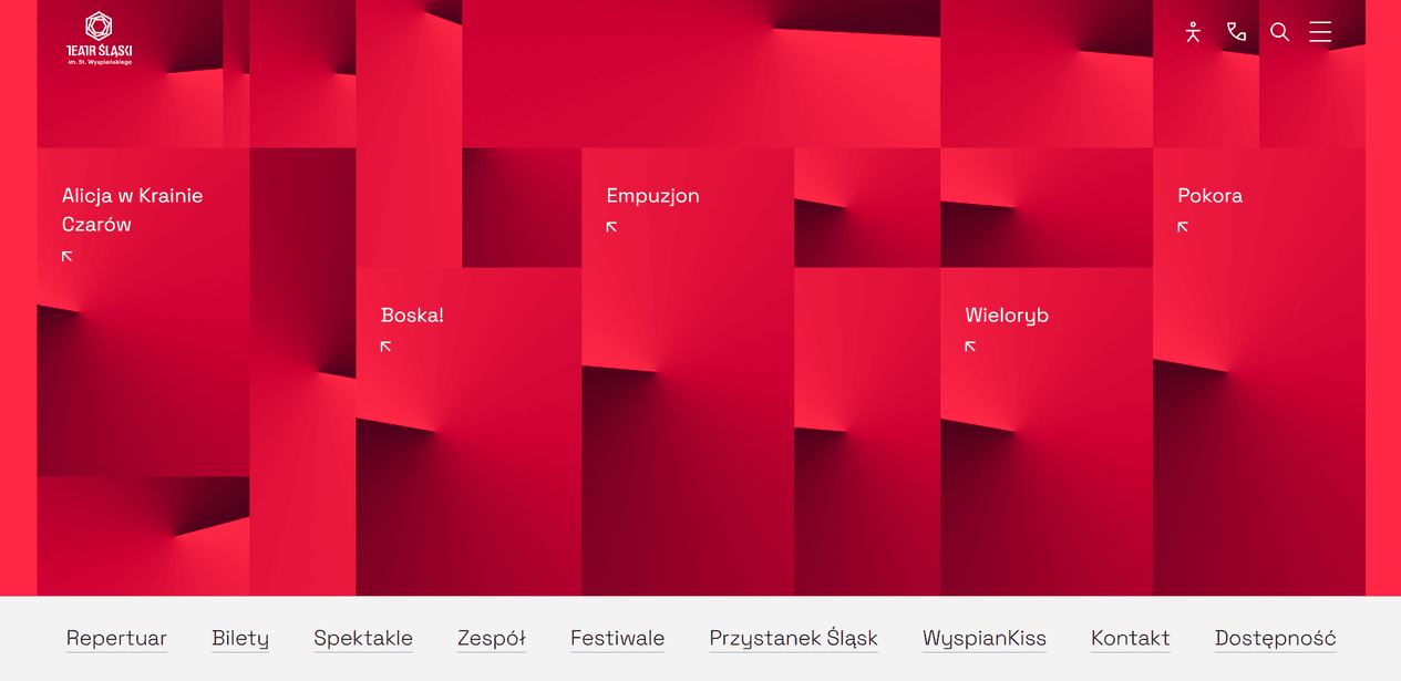
12. Silesian Theater
Modern, promising and expressive theater website layout. On hover shows images and links are moving. An interesting solution and suitable for fans of contemporary art.
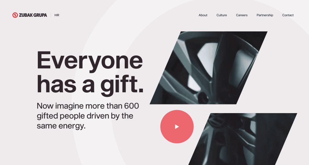
13. Zubak Grupa
Decorated in light red in background with bright red in the logo and accents in the website layout. The video inserts look great and vibrant.
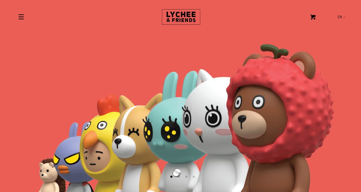
14. Lychee and Friends
Playful and, one might say, simply beautiful website layout for childrens. The red color adds charm, and the 3D shapes add volume.
15. Dumpling Delivery
A light pink with dark red and textured gaming website layout that feels nostalgic and a bit retro.

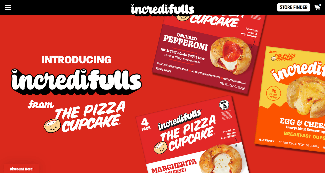
16. Incredifulls
Black, red website layout and white text with bold shadows. This incredible website looks modern at any time, simply engaging and delicious as pizza.
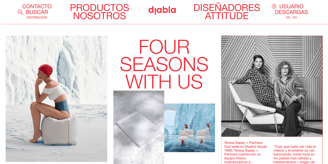
17. Diabla
The original design with integrated images in the layout is highlighted with a red logo, menu and texts. This website exudes modernity and simplicity at the same time.
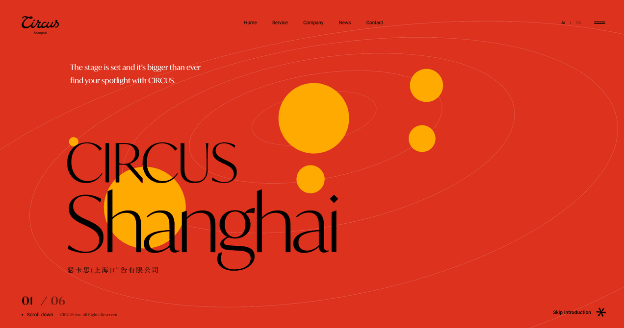
18. Circus Shanghai
The all-red website layout with orbiting yellow circles like planets. The black logo and texts create an intriguing atmosphere.
19. Tomi Palonen
A graphic designer’s personal website, where dark layouts blend with a red logo and accents to create a look that is stunning.

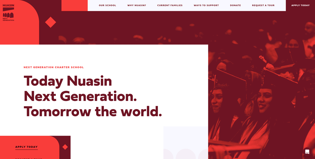
20. Nuasin
The school’s personal website, which is full of red, covering most of the site with white inserts, looks great. A real website for a real school.
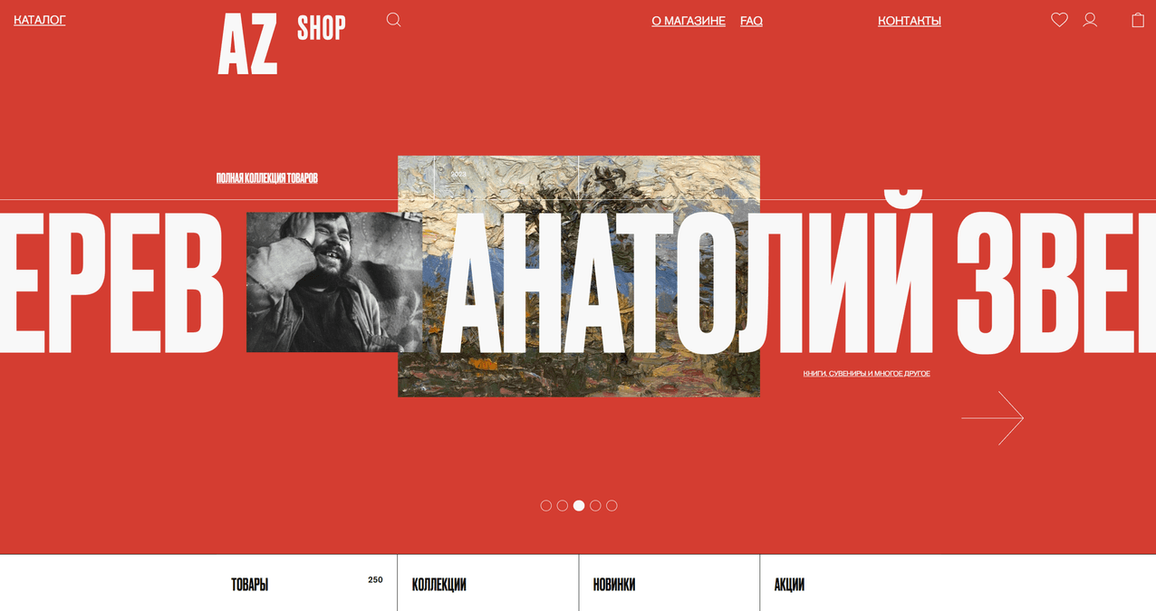
21. AZ Museum Shop
This red-and-white website is easy to view and read, it contains a lot of information about the museum, and a running line with white text provides freedom of movement.
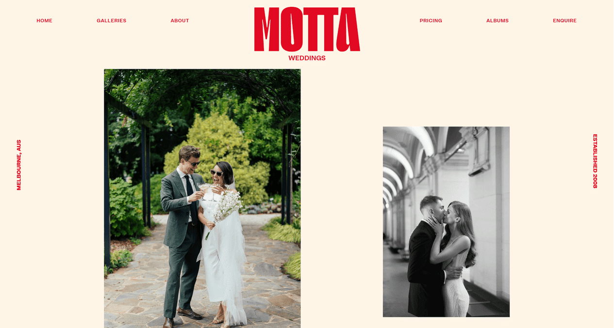
22. Motta Weddings
A simple, easy to create, yet versatile website layout. Designed for weddings, it looks exciting with dedicated photos.
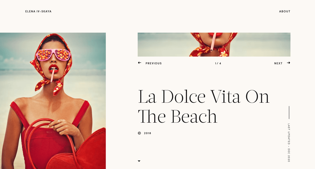
23. Elena Ivskaya
A charming personal model website where you can admire the beautiful photo galleries. Light layout and red accents makes this website beautiful.
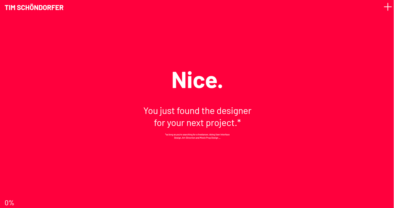
24. Tim Schöndorfer
A personal art freelancer website with a lot of red. The minimalist layout gives a lot of bright sparkle to the eyes. The minimalist menu and a little text show that it is modern, although simple.
25. Spline
Another website layout full of rich red. Minimalistic with modernity goes very well. The red background and black text create elegance.

FAQ’s:
Is red a good color for web design?
Red website design can be a high-risk, but also high-reward choice.
- It is generally considered the visually dominant hue in the color spectrum, making it almost impossible to ignore.
- It’s about energy, determination, and action – three qualities that brands in competitive sectors are likely to want to demonstrate.
- This color speeds up decision-making. Consumer psychology studies show that the color red encourages impulsive purchases.
The downside of red color in web design
The color red seems to have a negative aspect for some web design solutions, such as:
- The color red is physiologically stimulating, meaning that prolonged exposure can cause eye strain or cognitive fatigue.
- In certain contexts (finance, healthcare, government), it can mean danger, loss, or error.
- The wrong tone can change from passionate to aggressive very quickly.
What does red mean in web design?
The color red has a multi-layered meaning:
- Biological response: Red increases heart rate and adrenaline levels. That’s why it’s used in STOP signs – your brain is programmed to notice it.
- Cultural resonance: In the UK, red can represent heritage (Royal Mail, London Bus), authority (historically the red coats of the British Army) and tradition. Globally, it can represent luck (China), celebration (India) or danger (Western safety signs).
- Marketing function: Red naturally draws the eye to key elements, making it effective for calls to action, product highlights, and time-sensitive offers.
- Observation: Combining the color red with plenty of white space, clear typography, and clear navigation can help your users feel energized instead of overwhelmed.
How to use red effectively?
The color red is very important in website design. It can evoke emotions and motivate users, but there are some aspects that need to be carefully considered in order to use it effectively:
- You should use red strategically and sparingly. Too much red can overwhelm viewers, making it difficult to focus on the essential elements. To avoid this, use red to draw attention to calls to action or important messages.
- Remember to consider the context in which the color red is used. Since it is often associated with warnings and danger, it is important to avoid it when it can cause confusion or anxiety. You can minimize this by using it in moderation and combining it with complementary colors – white, black or gray – which create a balanced and harmonious color scheme.
- Keep the tone and message of your website in mind. A more subdued color palette may be more appropriate if your red website is about a serious topic, such as healthcare or finance. If it’s about entertainment or fashion, a brighter use of red can create a bold, vibrant image that will catch the eye.
- It’s important to be aware of cultural associations with the color, as red can have different meanings in different parts of the world.
The bottom line
This selection of red website color inspirations demonstrates the power of color in creating a memorable and impactful online image. As you can see, careful combination can evoke emotions, set a tone, and ultimately influence user behavior.
The choice is yours, you can quickly change it if something doesn’t work out. You can change the color palette in any page builder with a few clicks. It’s really not that difficult. I hope these red websites will impress you, maybe you’ll want to try creating something new using your imagination. Happy designing!
Credits:


