


")
")


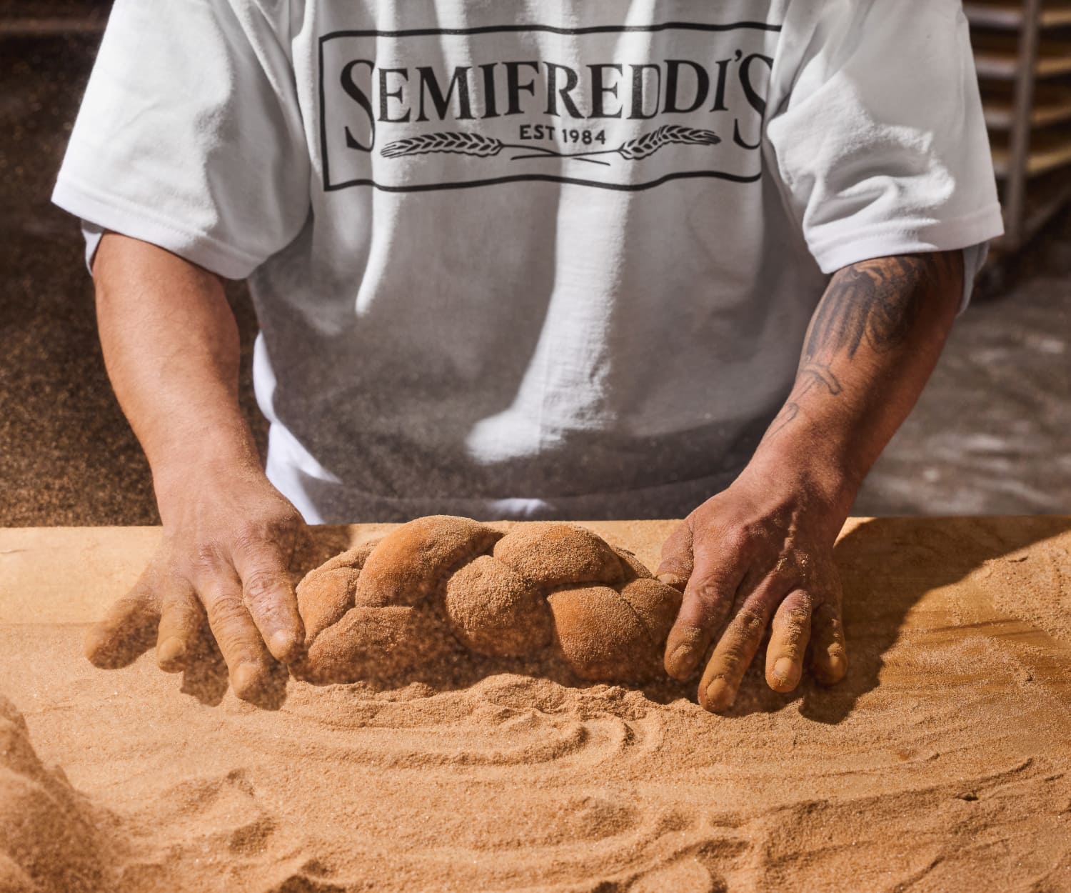
Semifreddi’s has been a trusted bread baker in the San Francisco Bay Area for over 40 years. In 2024, with new ownership and ambitious expansion plans beyond the Bay Area, Semifreddi’s approached Stout Design with an exciting challenge: modernizing its traditional brand without alienating its loyal customer base.

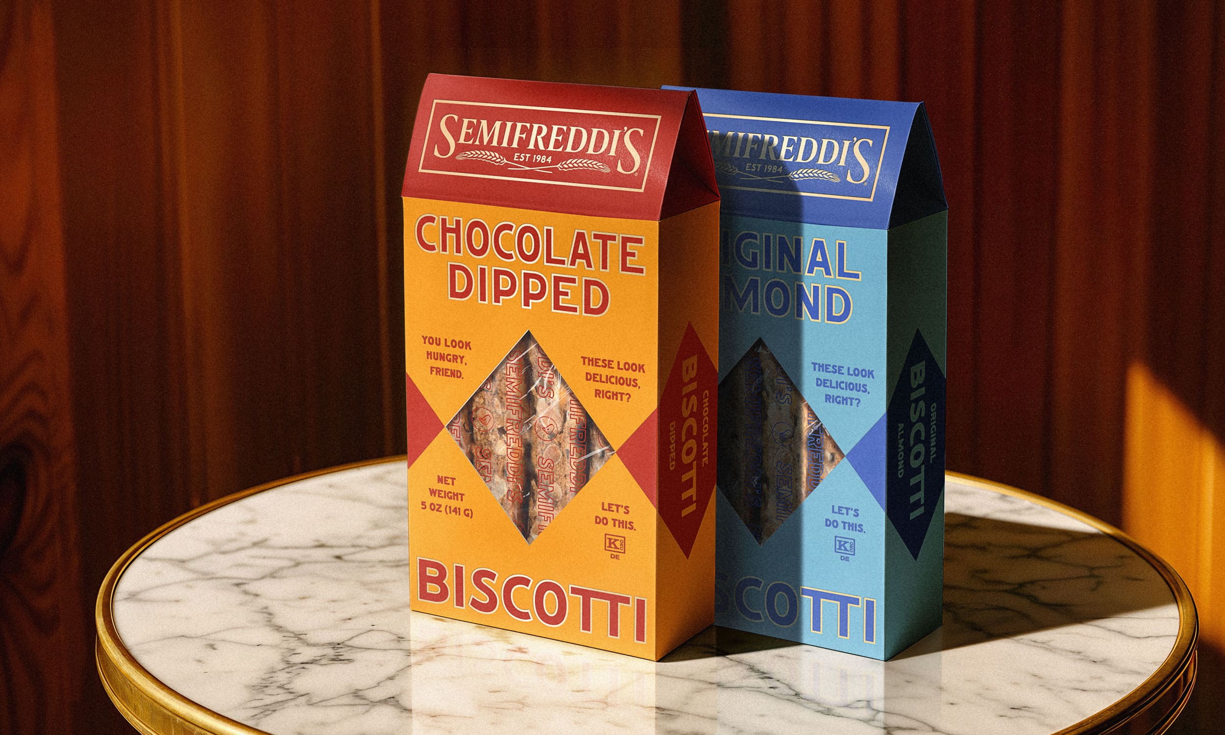
The logo uses a classic serif with a sharp contrast and a wide stance, giving the brand both authority and collaboration. The entire rebrand looks impressive and lively.
Looking at the past designs, you can see the huge changes. The name is more clearly visible and its design does not overshadow the text logo itself. It is light as a gentle breeze, just like the bread itself is baked in this factory.
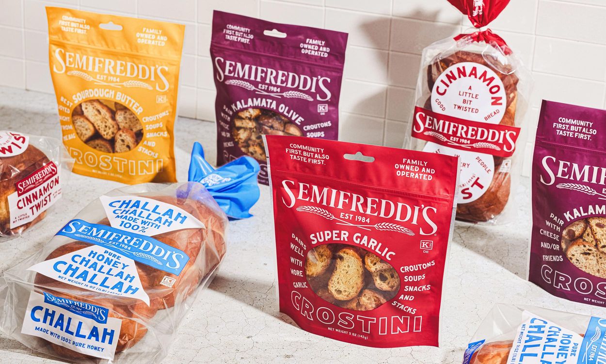
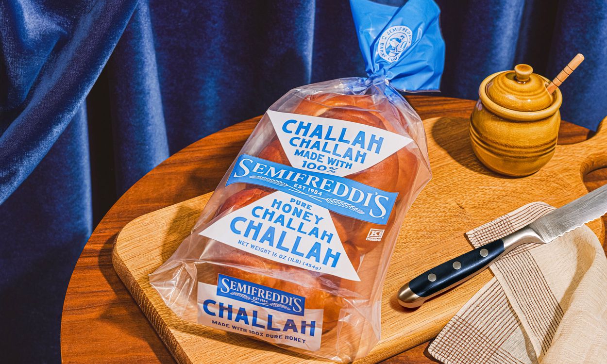
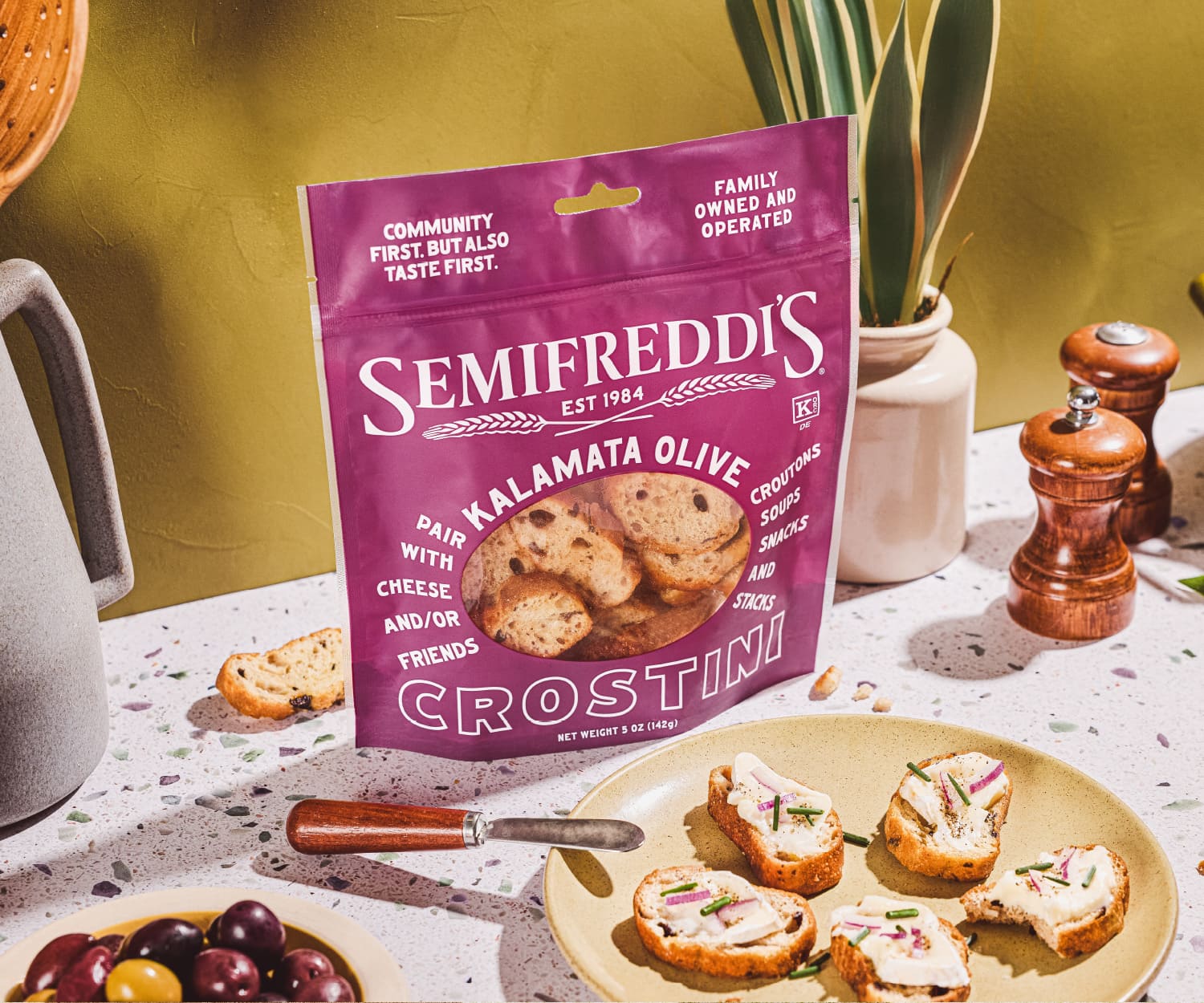
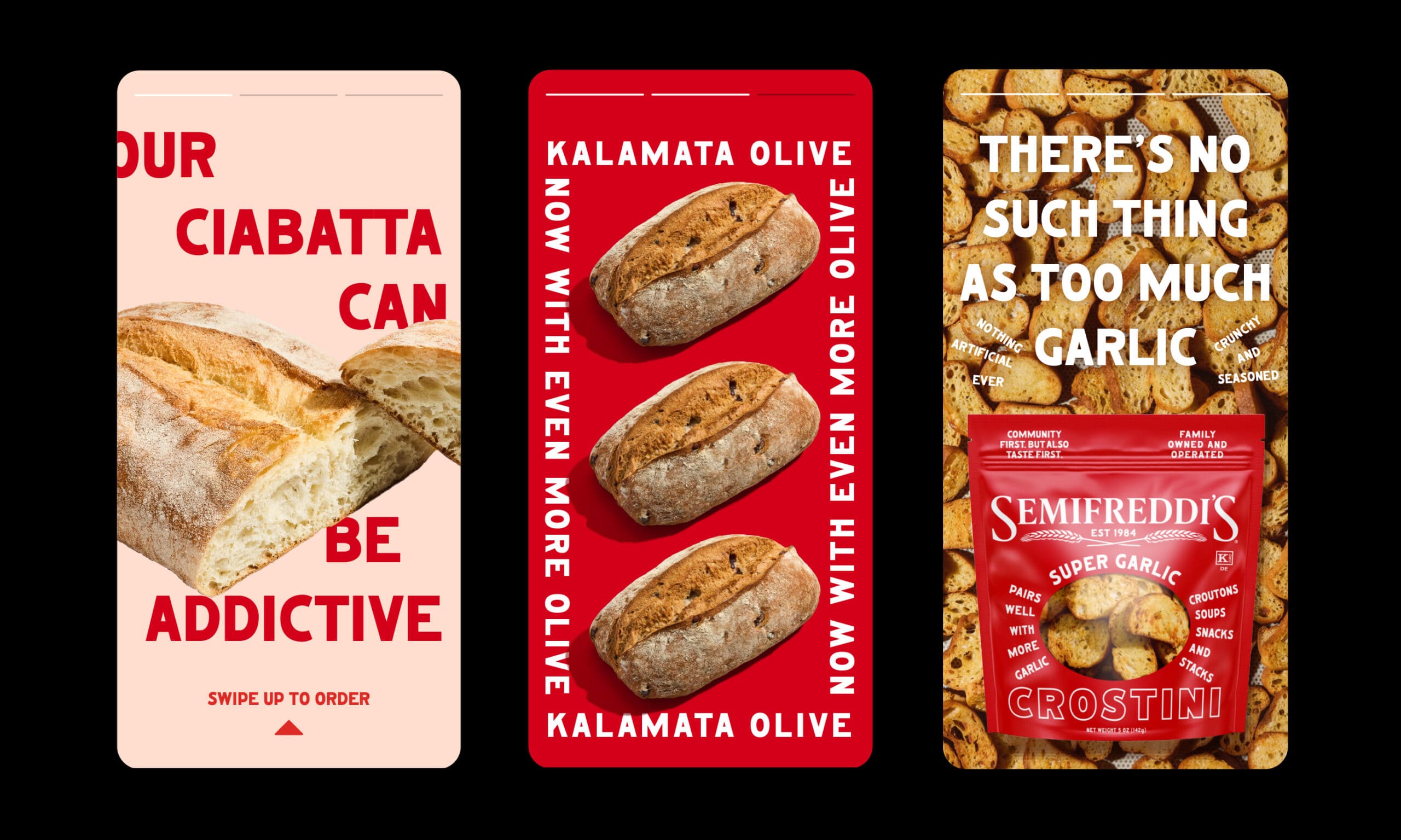
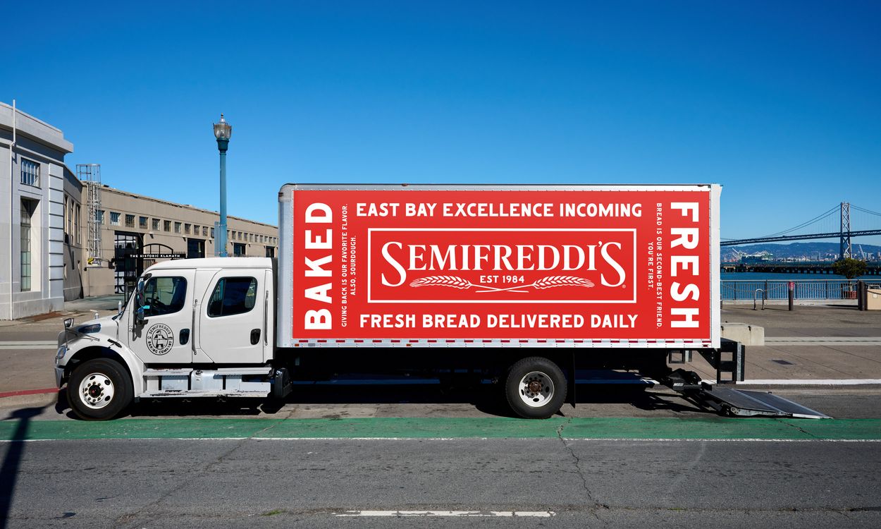
The Semifreddi’s brand fits perfectly into the packaging of bread products. The text is dominated by white color and expressive colored backgrounds.
“Passion and pride are our currency and our people are our everything.” This is what it says on Semifreddi’s website.
It adds “Thanks for being with us for our first 40 years, we can’t wait to grow along with you in the next phase of our journey since 1984!”
“Through a logo refresh, expressive typography, and a friendly, relatable brand tone of voice, the final brand identity and packaging introduced consistency across touchpoints and repositioned Semifreddi’s for a modern audience – while staying true to its legacy.” nicely said the representative of Stout Design.
Photography courtesy of Stout Design.


