


")
")


The Vinted’s marketplace has capitalized on a growing shift in consumer behavior where price consciousness meets the desire to reduce waste.

With the company’s rapid growth and increasing needs, it was time for a change. And since this brand spends most of its life with online sales, the old standards were already too low. So, without a doubt, a comprehensive rebrand was needed.
“The process began with identifying and protecting the core elements users already loved – particularly the iconic handwritten logo,” says Charlie Hocking, creative director at Studio Kiln. “This was seen as a non-negotiable, and formed the heart of the updated identity.”
The character and clarity
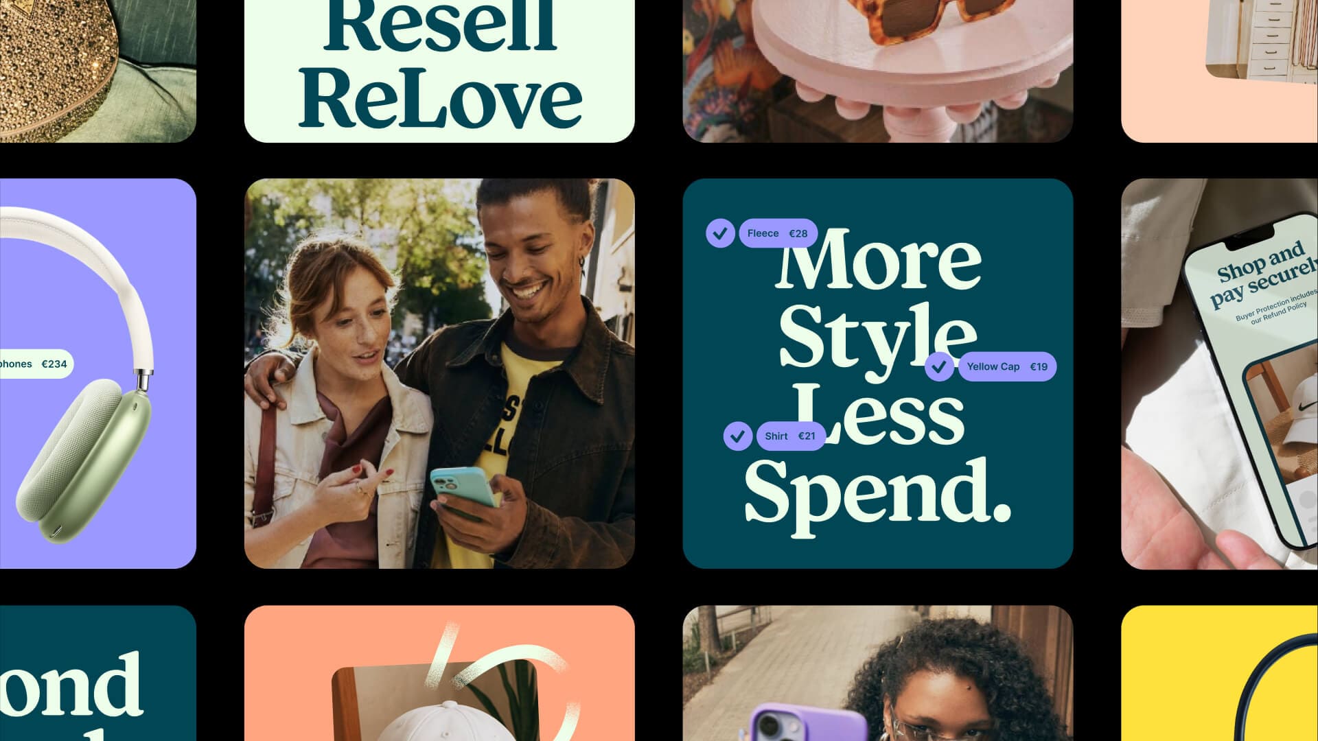
The refreshed identity had to balance two needs: a clear, functional system for global teams and the expressive, personality-driven tone that defines Vinted’s brand. “We focused on designing a minimal but powerful kit of parts – each element carefully crafted to work seamlessly with the others,” says Charlie.
Kiln sought clarity through examples so that Vinted’s international teams could intuitively understand the brand. This “show, not tell” approach means that the guidelines encourage consistency without stifling creativity, allowing for product localization, and keeping the brand’s DNA intact.
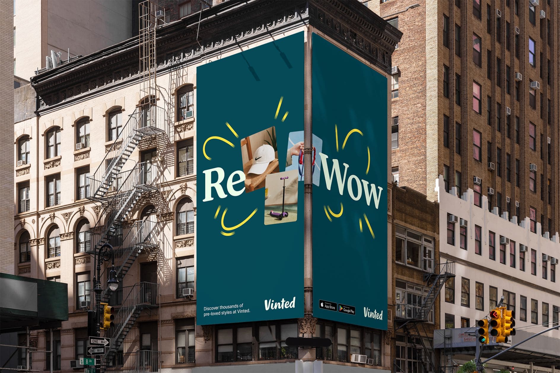
The result is a unified yet adaptable identity, whether it appears on a street billboard in Berlin, an app announcement in Paris, or a social campaign in Madrid.
Tone of sophistication
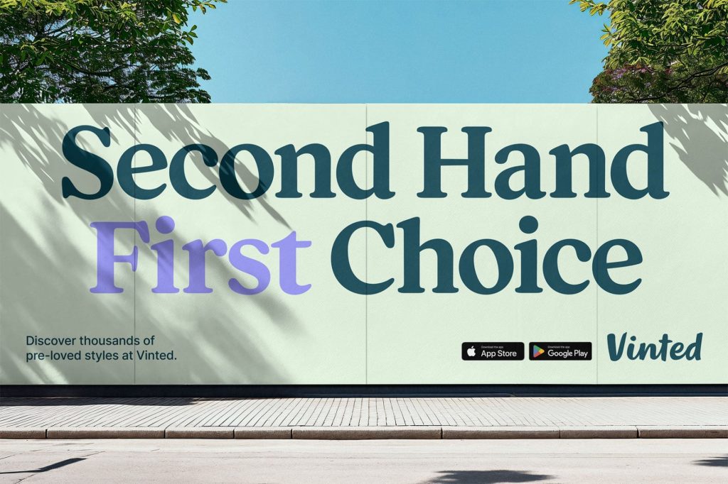
Vinted’s instantly recognizable “Calypso Green” was one of the key color choices. Rather than reinventing it, Kiln refined it, darkening the tone for sophistication and pairing it with a fresh mint hue for contrast and energy.
The broader secondary palette adds vibrancy and flexibility, allowing the brand to capture the excitement of buying or selling a product.
“We wanted people to see the identity and think, ‘of course that’s Vinted!'” says Charlie. “Perhaps they wouldn’t notice the change immediately, but underneath everything has been tightened up and improved.”
Sustainability is the core
As any knowledgeable fashionista will tell you, sustainability is at the heart of Vinted’s mission. But Kiln’s approach avoids the overly serious tone that sometimes plagues eco-friendly brands.
The visual language is built on a constant process of discovery, connection, and celebration, based on a circular economy where unwanted items are given new life.
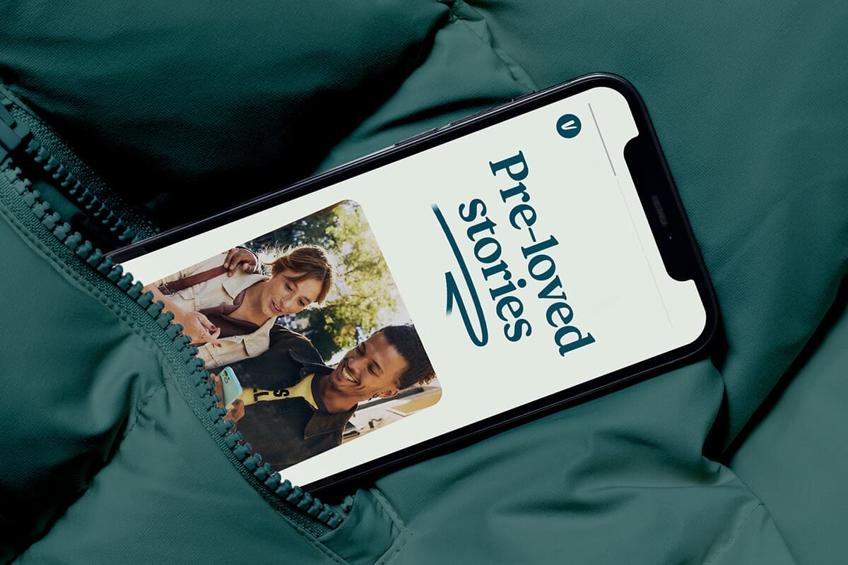
Tactile photography and motion graphics bring warmth and humanity to the brand. Rather than showcasing the shiny perfection of fast fashion, the images convey natural imperfection, giving the digital experience a more authentic, real-world feel.
Globally flexible
Since Vinted is an international concern, Kiln’s solution was a scalable identity toolkit with key constants – logo, color scheme, font, and movement behavior – paired with customizable branding components.
It’s a balance of structure and freedom… allowing the brand to speak with one voice without forgetting its local character.
Standing out and competitive market
In a space dominated by resale platforms, the refreshed identity gives Vinted greater visual distinction. By refining its core palette and adding new colors, the brand can communicate with more nuance, from the trusted Calypso green to vibrant mint accents and accompanying tones.
Combined with the distinctive “VC Honey” font, the look is modern and recognizable, making Vinted harder to confuse with competitors.
Kiln will definitely show that developing a brand doesn’t have to mean starting from scratch. Sometimes the smartest thing to do is stick with what works, improve everything else, and let the changes speak for themselves over time.


