


")

")


Studio Zak created ‘Mimi & Coco’ brand for toddlers
The brand redefines the idea of “care” by blending emotional growth with eco-conscious design.

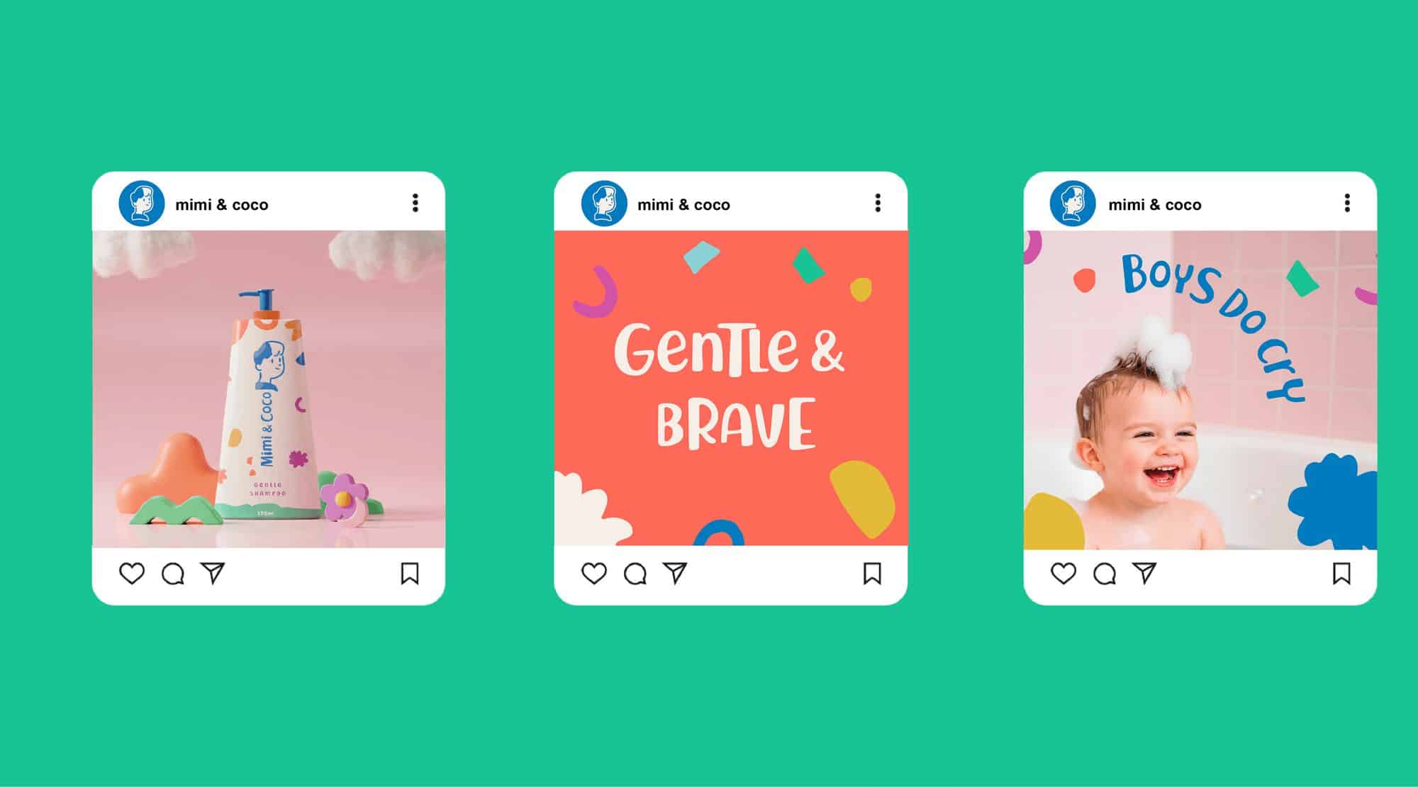
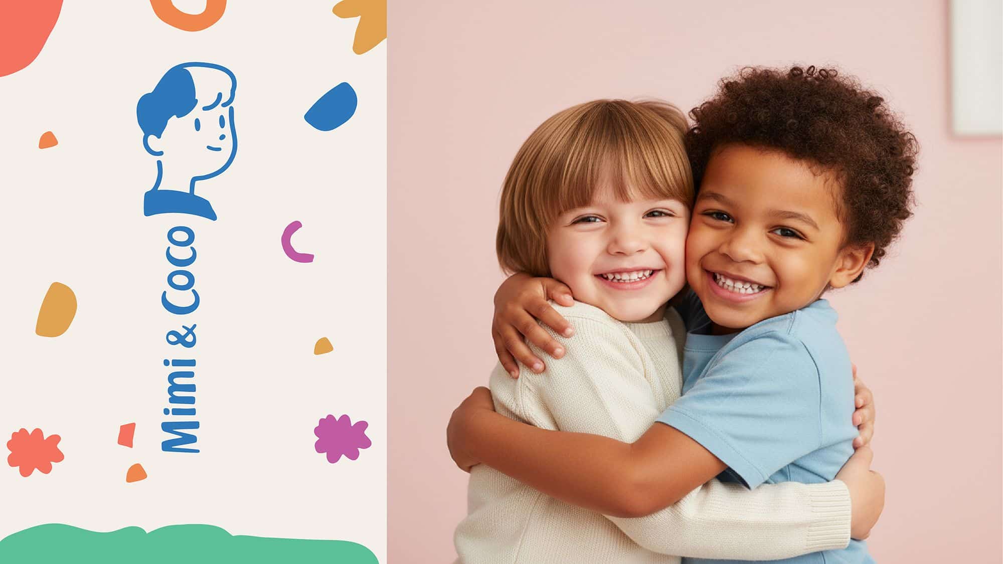
Mimi & Coco is a sustainable body and hair care line created for little ones, where playfulness meets purpose. The essence of this design is the belief that every child has two sides: bold and gentle, wild and kind. “Mimi and Coco” celebrates both sides. The tone of voice and accompanying imagery reflect this duality: light but thoughtful, colorful but calm, imaginative but responsible.

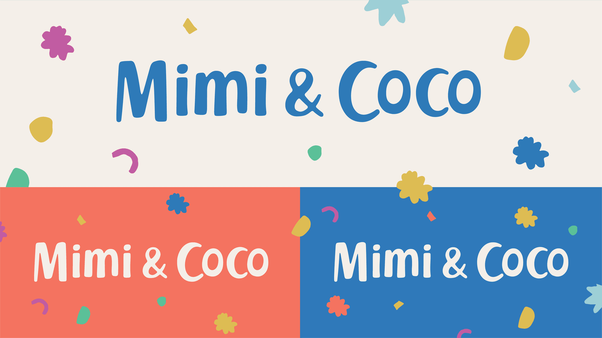
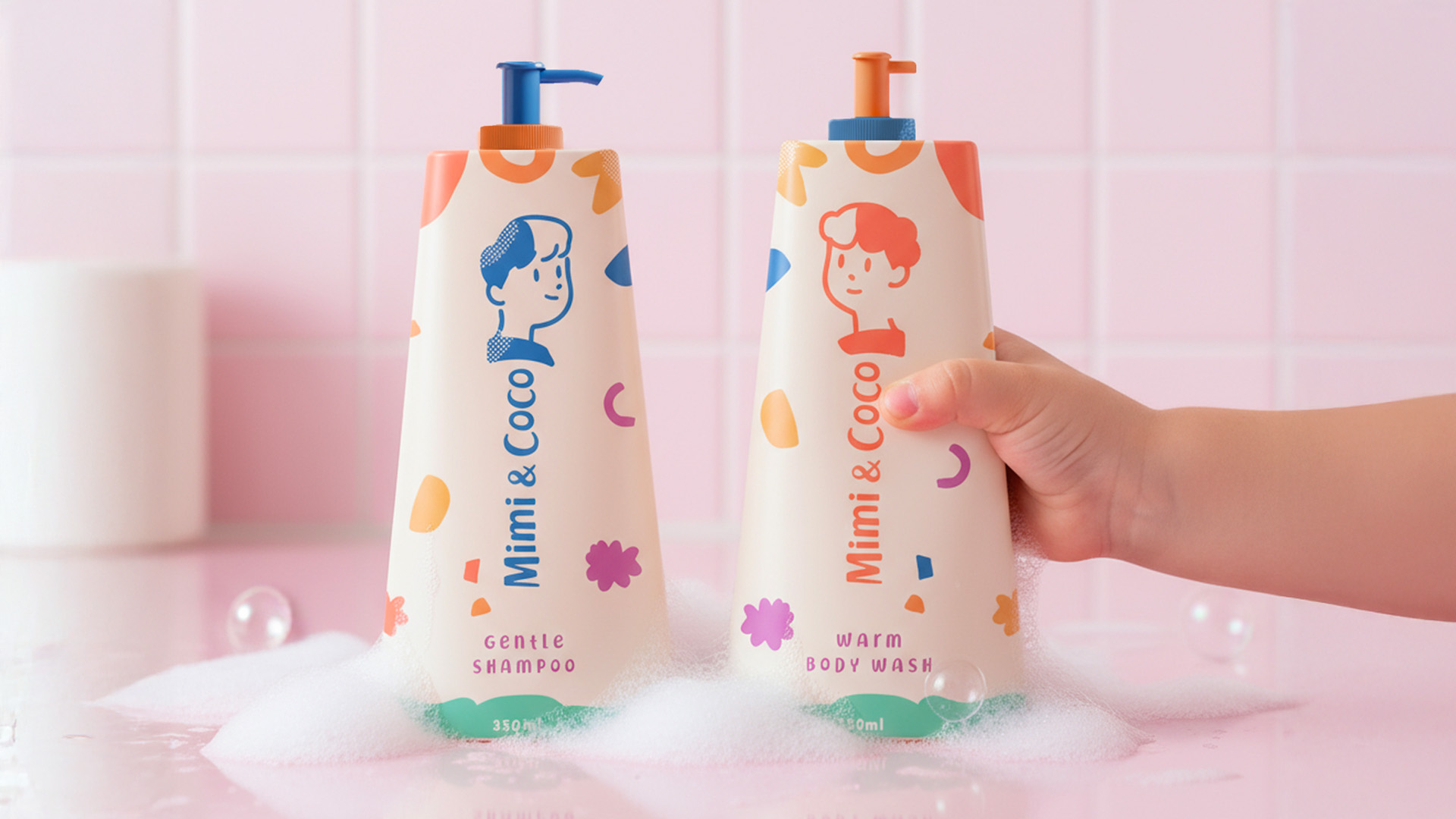
Visually, the brand design draws inspiration from the unfiltered creativity of children’s drawings. The hand-drawn logo combines uppercase and lowercase letters, while illustrations of Mimi and Coco are presented on accompanying graphics in a naive and authentic style. A geometric pattern complements the duo, echoing the building blocks and playful composition.
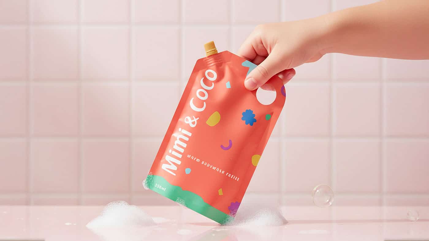
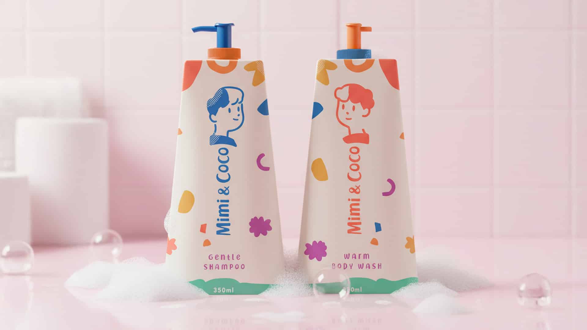
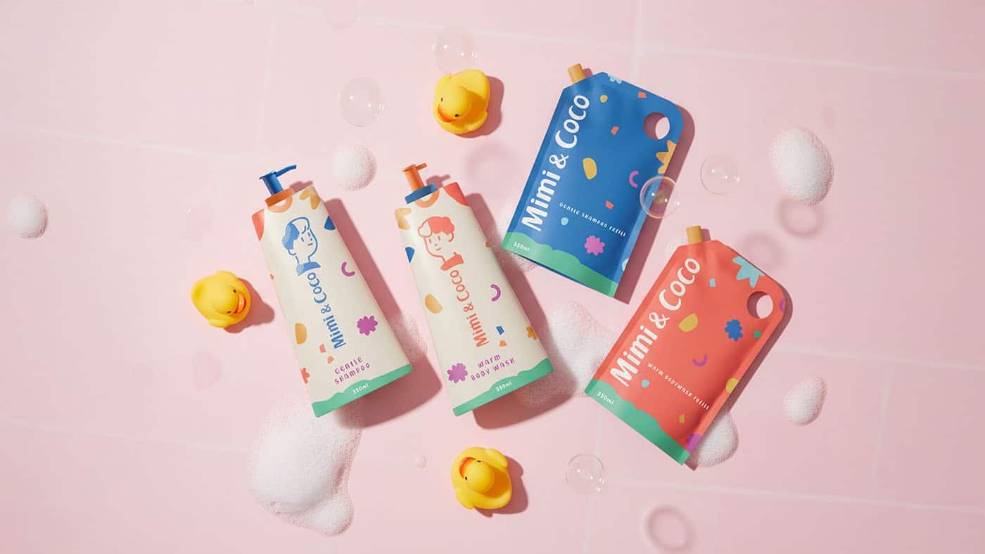
The packaging system continues this honest simplicity. The matte recycled plastic bottles are silkscreened in softened primary colors – dark orange for the body wash and dark blue for the shampoo – with a contrasting beige background that adds softness and balance. The refill pouches invert this palette, emphasizing the brand’s circular design approach and creating a clear visual rhythm between the bottle and the refill bottle.
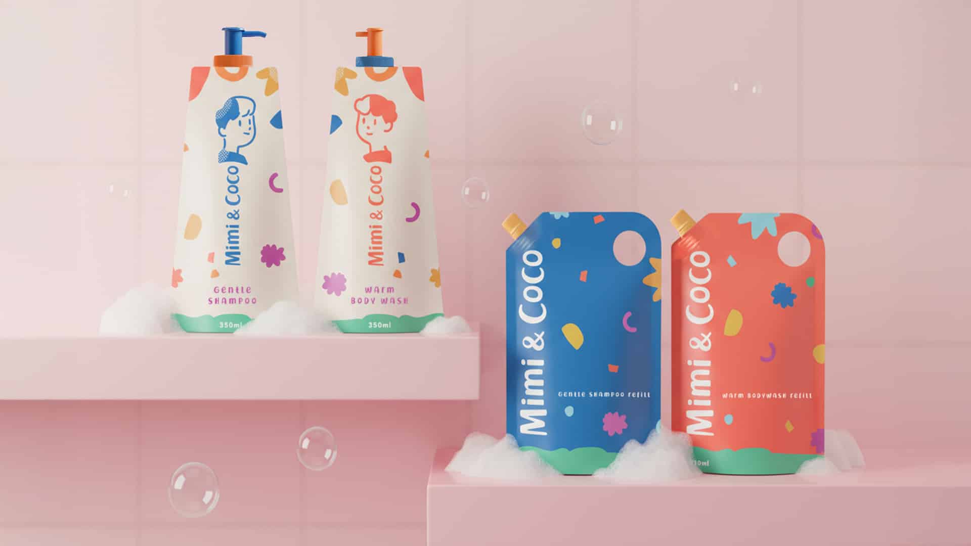
Sustainability is quietly embodied in every detail, from the refillable format to the minimalist, durable finish. The result is a brand that feels fresh and familiar, playful and responsible, poetic and practical at the same time.
Credits:


