


")


")


Téri: a visual identity to spread women’s well-being
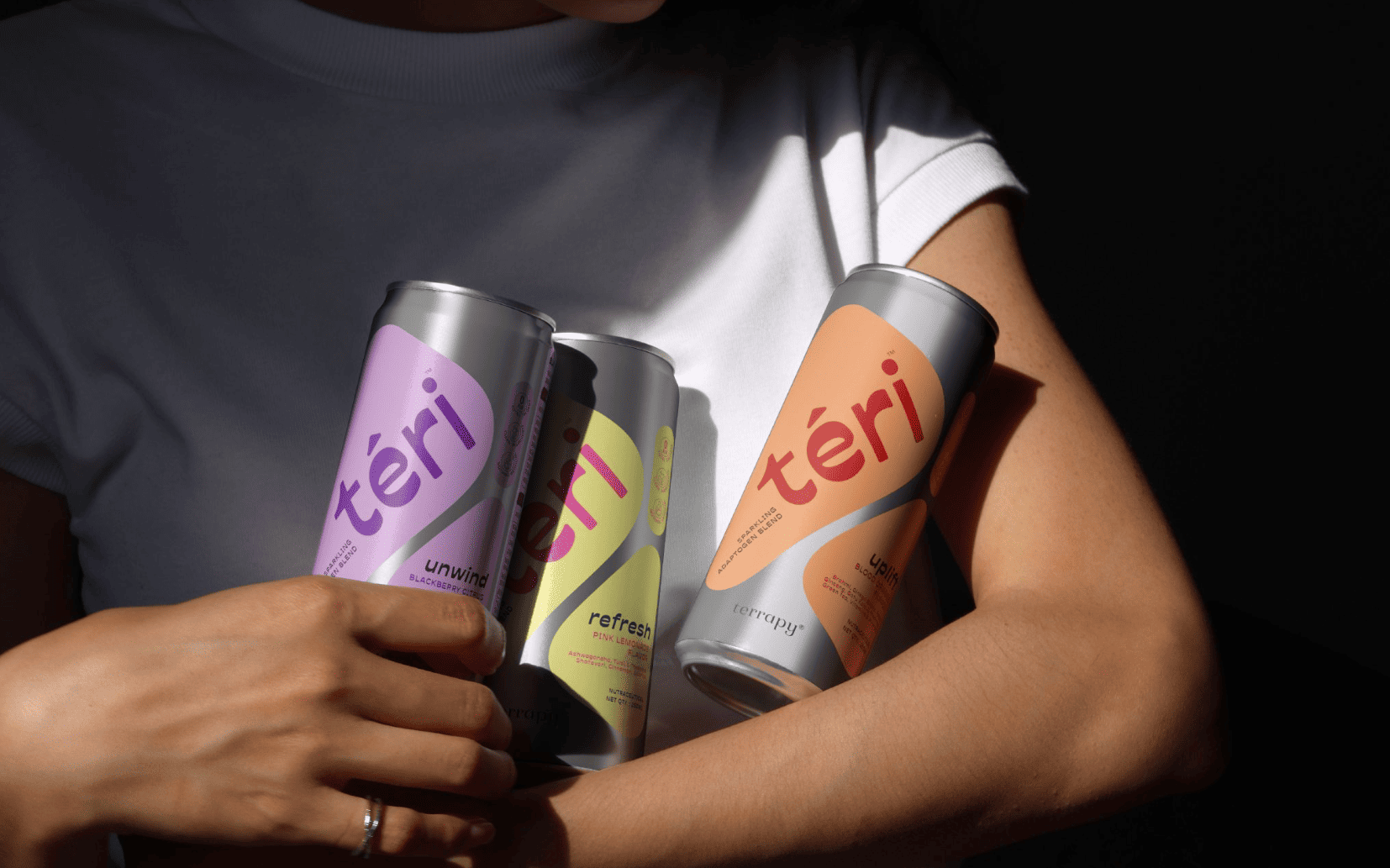
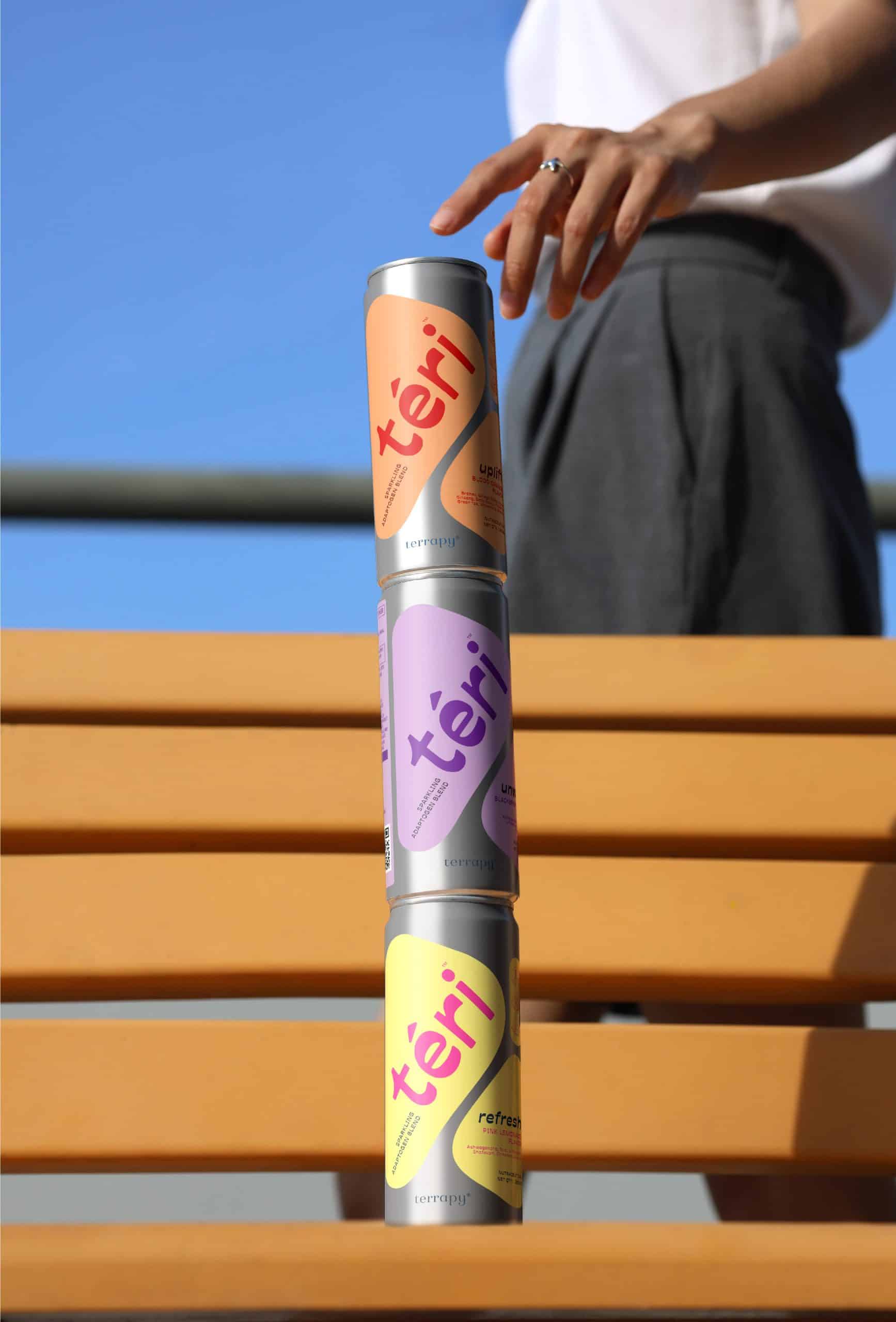
"Téri" is a wellness drink brand chosen by modern and free women in India.

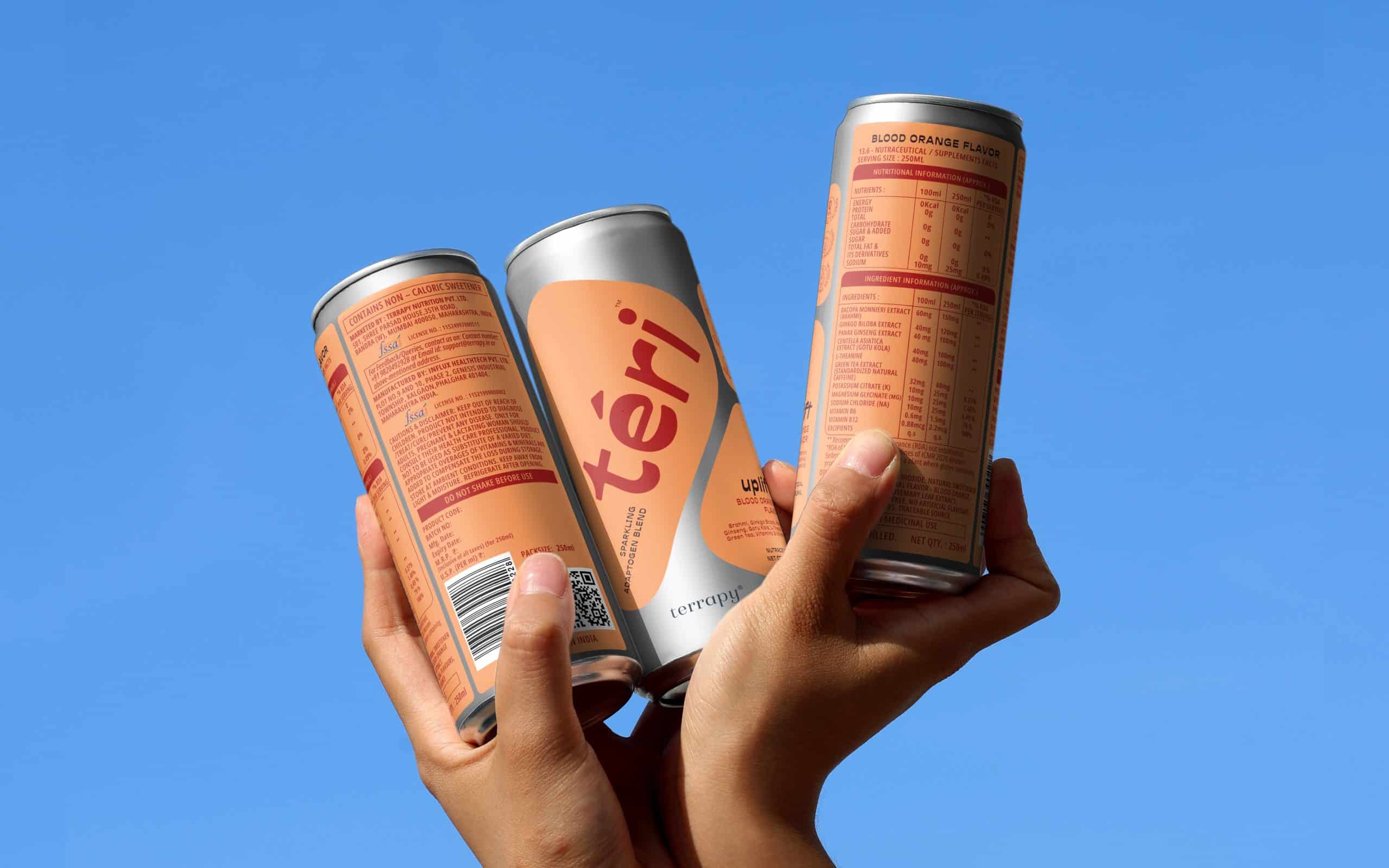
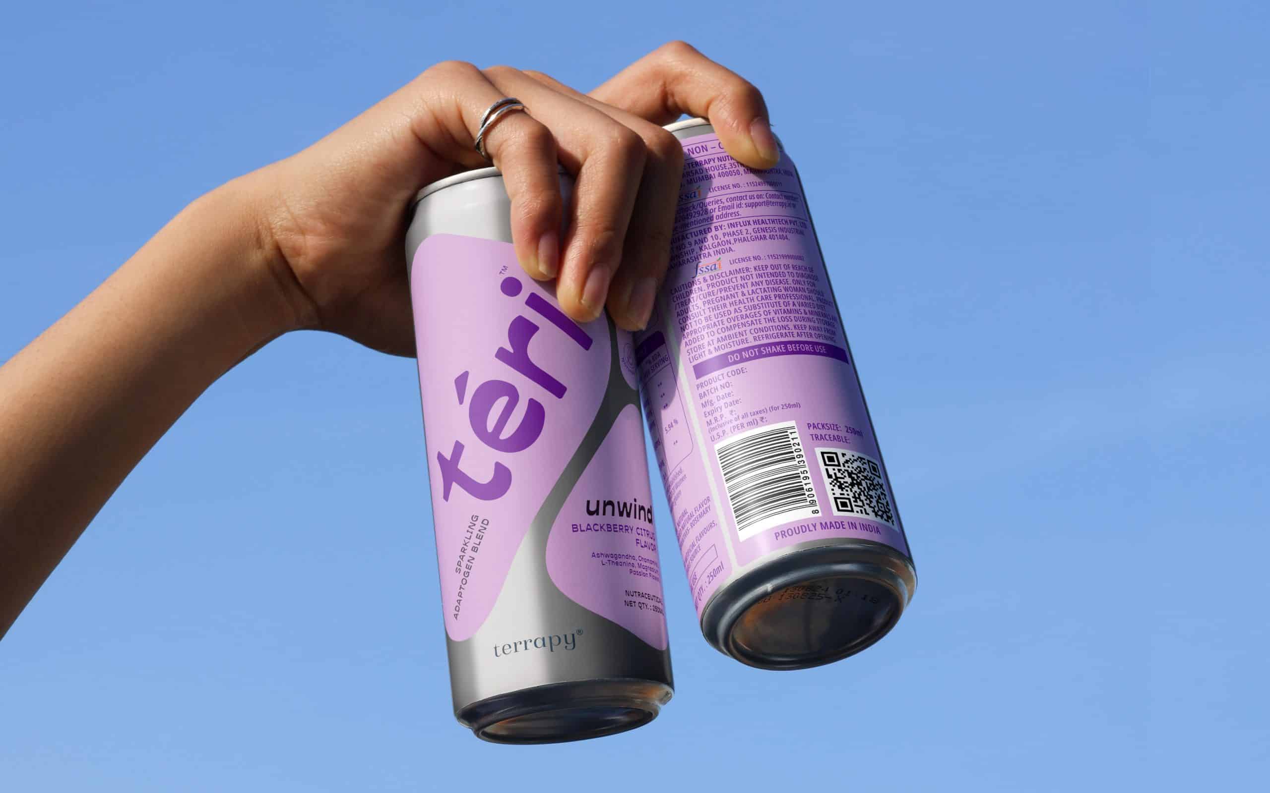
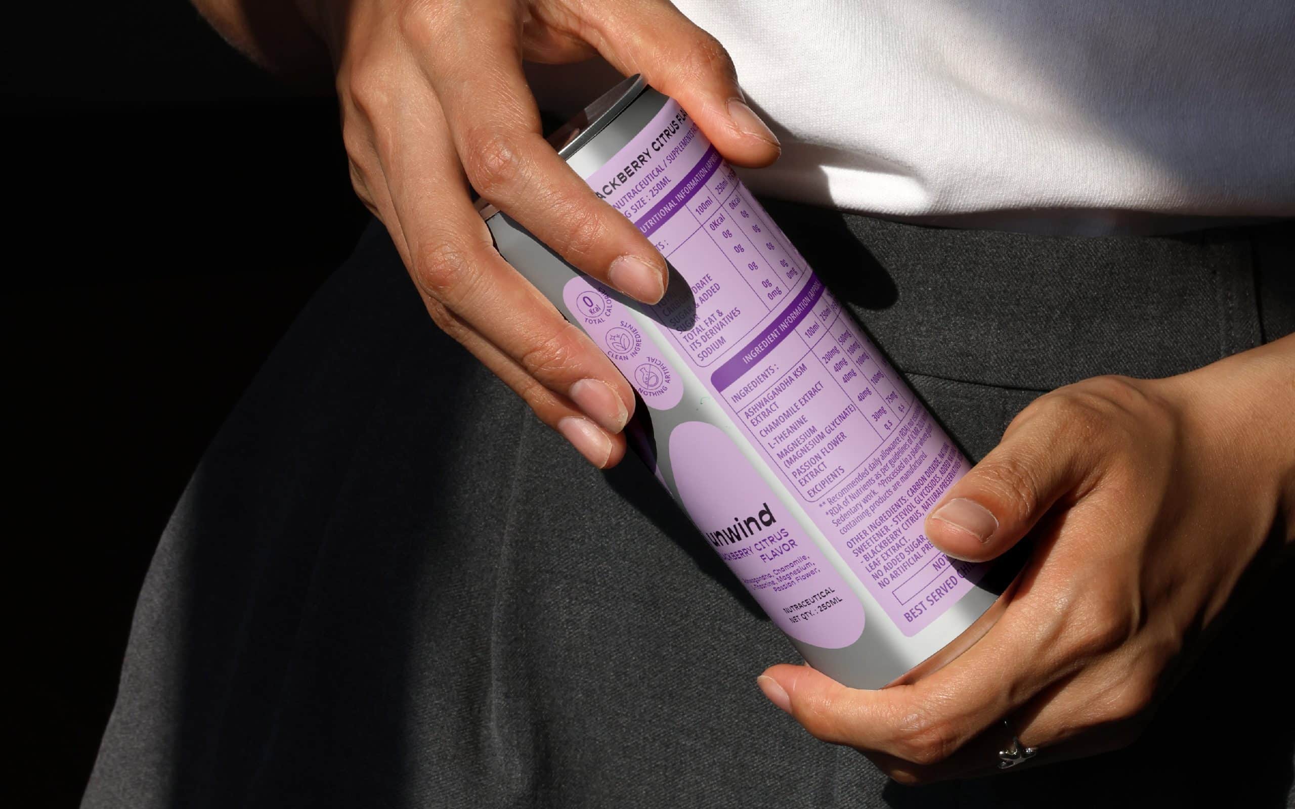
Women’s well-being in India has always been a silent presence in the background. Today, it is moving into real life, into conversations, culture, work, and celebrations. Téri is born from this shift. An adaptogen-based sparkling beverage for women who want well-being that fits into real life: at work, at brunch, at the bar, and everywhere in between.

When creating “téri,” it was less about “building a wellness brand” and more about asking a few honest questions:
- How to create a women’s wellness design that doesn’t seem clinical, didactic, or overly subtle?
- And how to make something functional look social, confident, and casual?
The process aimed to refine the wellness visuals down to what really matters: balance, clarity, and purpose; then reimagine the identity to be calm yet expressive, premium yet easy to understand.
From typography to color schemes and packaging layout, every choice was made to ensure the brand could move seamlessly between different moments in life, rather than being locked into one context.
The brand positions itself at the crossroads of function and culture, balancing scientific purpose with emotional levity. Rather than relying on overt health labels or a predictable wellness aesthetic, the “téri” identity embraces restraint, confidence, and clarity.

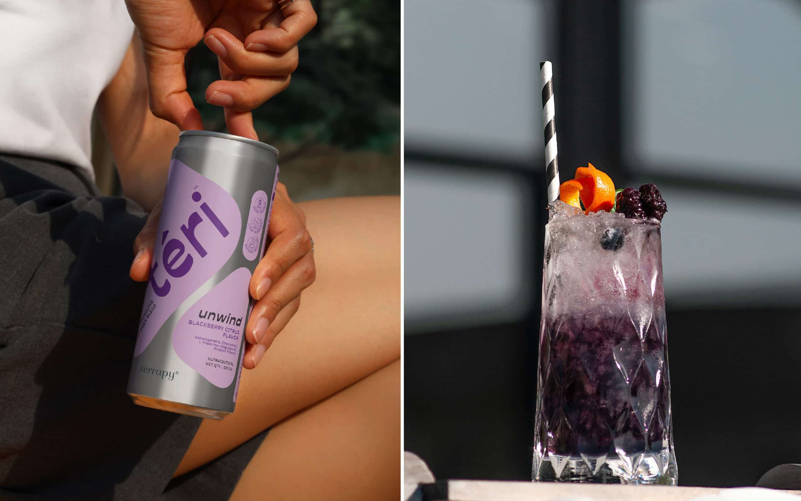
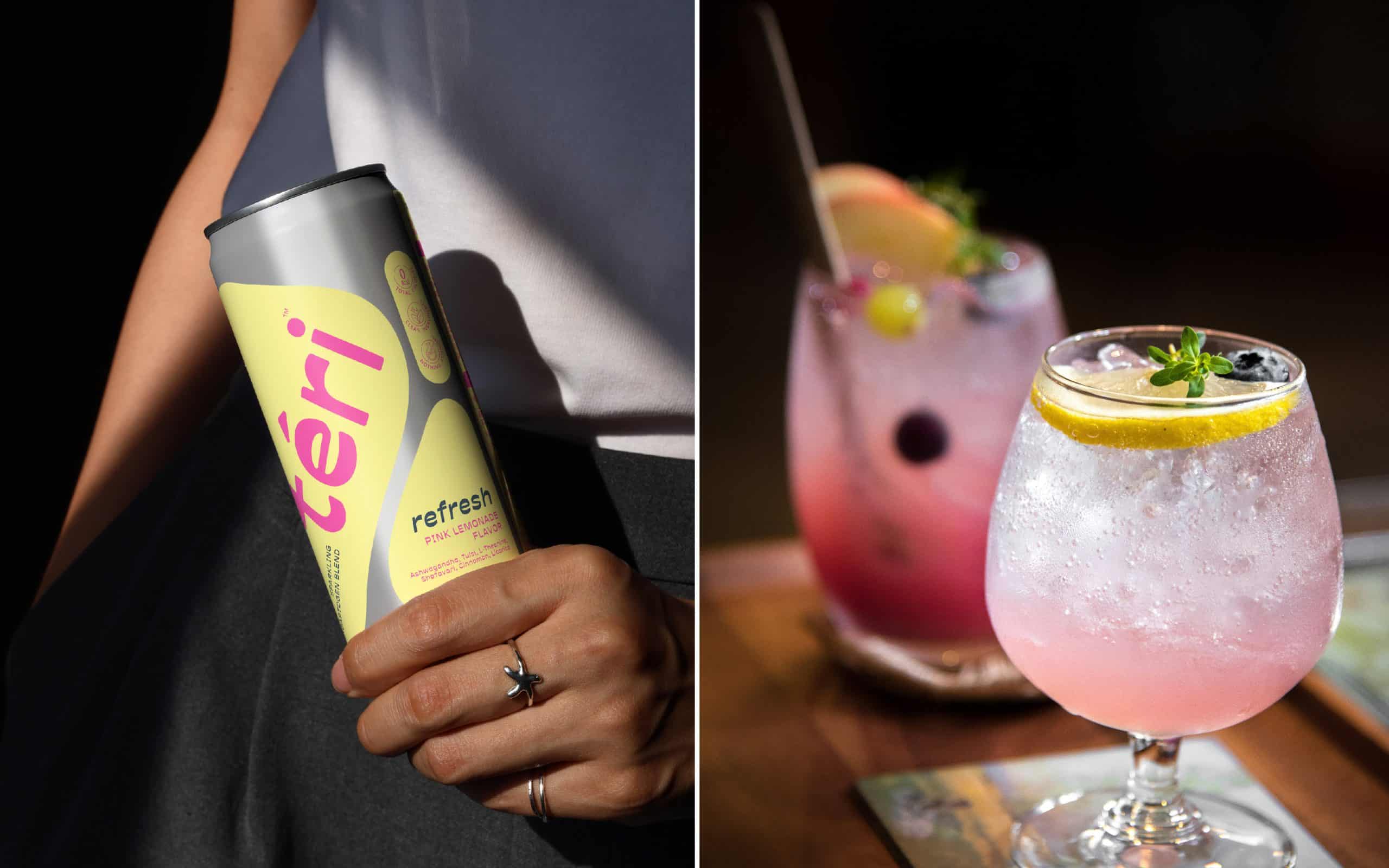
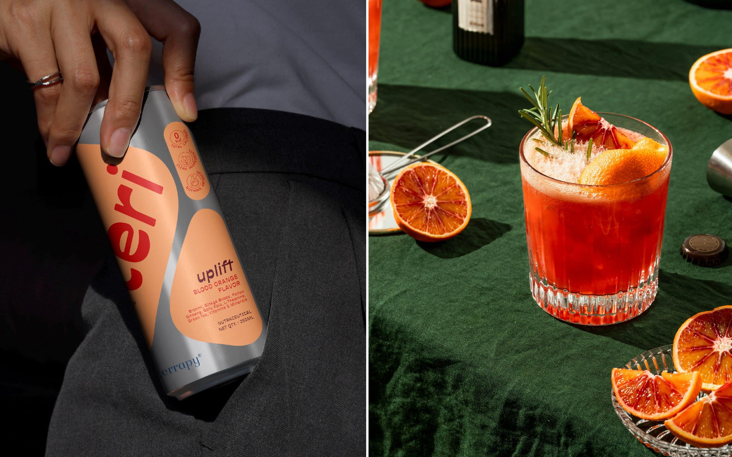
Téri doesn’t take over wellness. It integrates it quietly, seamlessly, and in its own way, redefining what a functional beverage can look and feel like in the modern Indian market.
Credits:
Images:


