


")
")


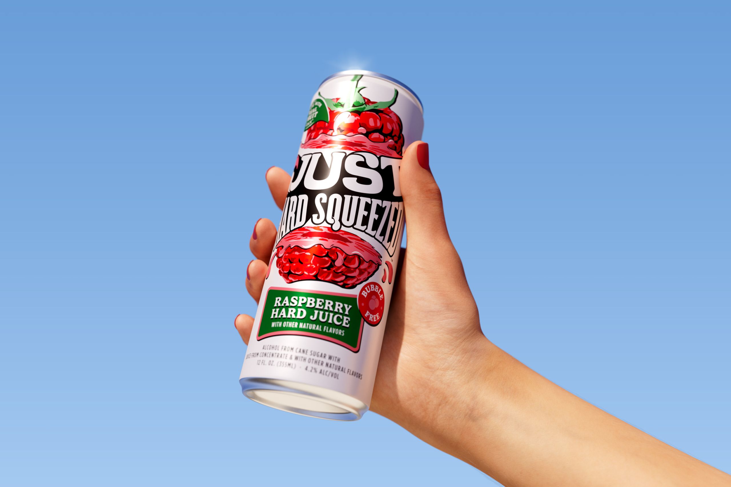
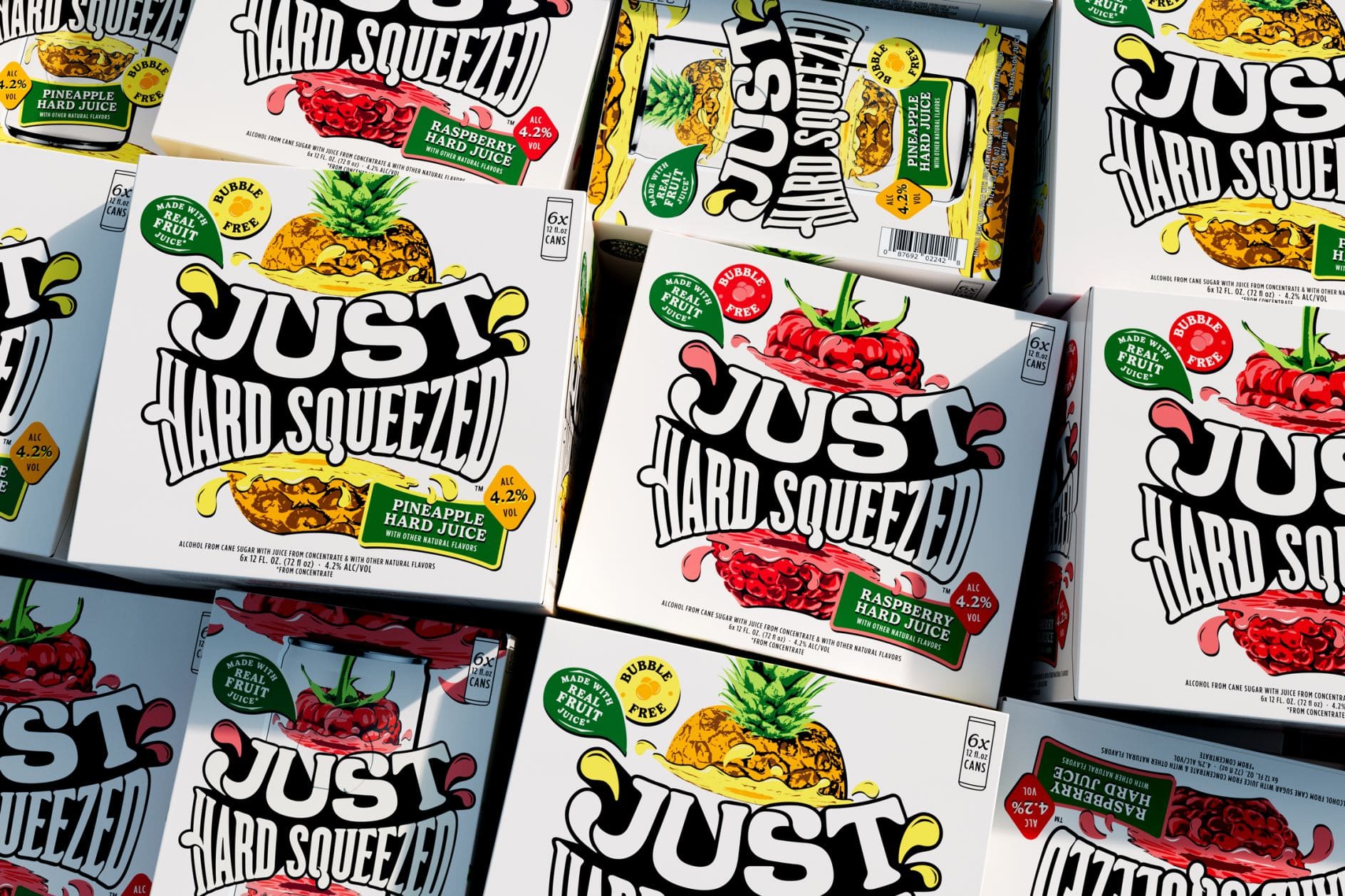
Just Hard Squeezed – the latest release from Boston Beer Company, boldly changes the ready-to-drink (RTD) beverage category by offering non-carbonated, hard juice made from real fruit. The new brand identity made by Thirst.

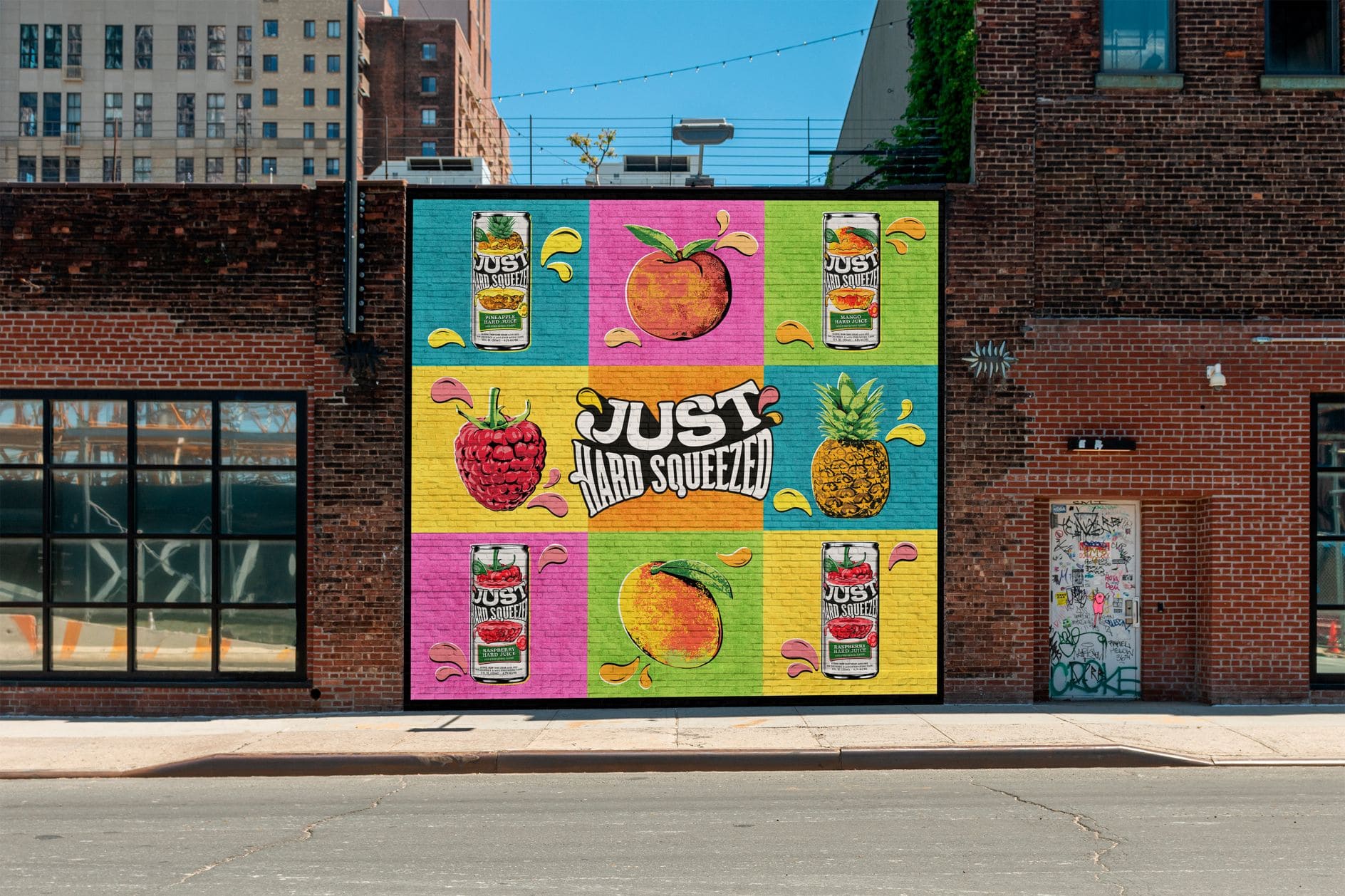
The design studio draws inspiration from 1950s and 1960s pop art and editorial print ads, creating a lush, moody aesthetic that oozes nostalgia but doesn’t feel retro.
At first glance, the Just Hard Squeezed identity is all about bright colors, expressive typography, and soft illustrations, but upon closer inspection, every decision is underpinned by strategic discipline.
Shake up their summer drink lineup with something fresh, fun, and a little unexpected.
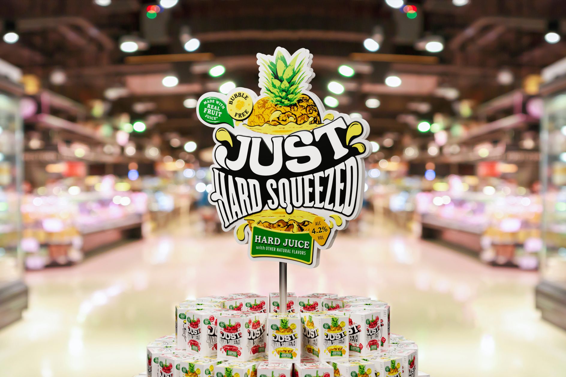
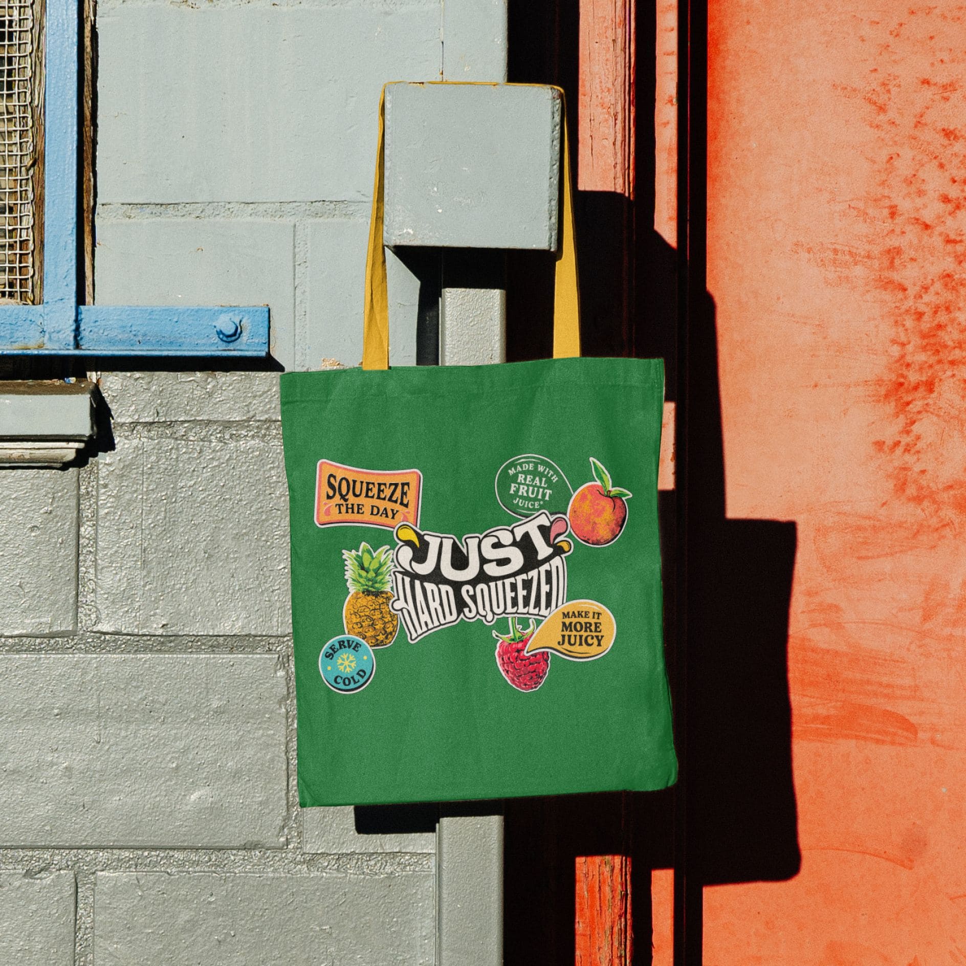
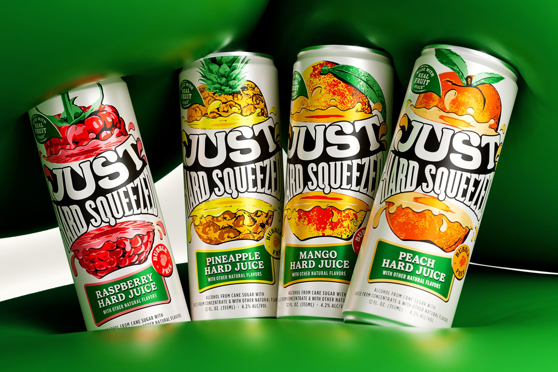
Every design element reinforces a sense of playfulness and taste, from the logo and illustrations to the fonts (Gelica and Gotham) and candid photography, making Just Hard Squeezed stand out in the crowded RTD space.
(RTD) – means ‘ready-to-drink’ and stands firmly in this drink category.
The brand’s phrase “Make moments juicier” became what Associate Creative Director Glen Thorpe calls “an ethos for how the brand should behave.” He adds: “That mindset shaped everything: how it talks, how it moves, how it lands. It’s about squeezing every last drop out of every moment.”
With cartoon-like droplets, colorful fruit graphics, and an energetic style, the design invites consumers to “make the most of life.”
“We approached it like flavour design,” says Glen. “Everything needed to feel as juicy as the product itself… The palette is bright but purposeful – pulled from fresh fruit stalls, nothing artificial. And the type and iconography are curved, inflated and full of ripeness. Even the quiet stuff has that pulpy, expressive quality.”
Every well-thought-out detail has its own function, and nothing is just for decoration.
“We kept stripping it back until every element was doing one clear job – no more, no less,” says Glen. “If something didn’t add to the immediacy, it came out. That’s what helped us stay sharp.”
“We leaned into Pop Art because it felt right attitudinally – expressive, playful, and direct,” Glen explains. “It gave us a way to build flavour and character without falling back on tired RTD tropes… We weren’t trying to go full vintage or retro – it was more about borrowing the charm, structure and energy, then cleaning it up and letting it breathe.”
The future of drinks is definitely leaning towards nostalgia – and this creative design reflects that perfectly. From the bold typography to the playful photography – every element creates that undeniable “pressure factor”.
Standing out in a crowded category isn’t easy, but with “Just Hard Squeezed,” Thirst not only found their way into it but also broke through with this new, simply juicy brand.
Photography courtesy of Thirst.


