


")
")


White Bear refreshes ‘Bold Bean’ brand identity
London-based agency White Bear has unveiled a refreshed identity for cult bean brand with a brighter and more eye-catching image.

Bold Bean products have been one of the best-selling products since hitting store shelves in 2021. The brand has demonstrated that canned and jarred beans can be glossy, nutritious, and proudly luxurious, not just functional.
For the past couple of years, these products have dominated sales, achieved their imagined goals and records, but over time, the visual identity has faded and become less attractive than it should be, so the design agency White Bear helped breathe new life into the company. They listened to the wishes and began consistent work on creating a new identity, which now differs quite significantly from the previous one.

The founder of “Bold Bean Co” Amelia Christie-Miller said – “What I loved about working with White Bear is their mix of creative flair and commercial logic. They know how to build a brand that stands out beautifully while making sense in the grocery landscape. We have big ambitions for the next 12 months and this work is instrumental in helping us get there.”
Kelly Mackenzie, co-founder of “White Bear”, explains the early challenge: “On shelf, one, they were difficult to find because the amount of shelf presence that they had versus the competitors wasn’t that large.
“And two, once you actually identified where the brand was, which was quite hard because the logo was quite small, the challenge was that it was very difficult to tell between the SKU ranges.”
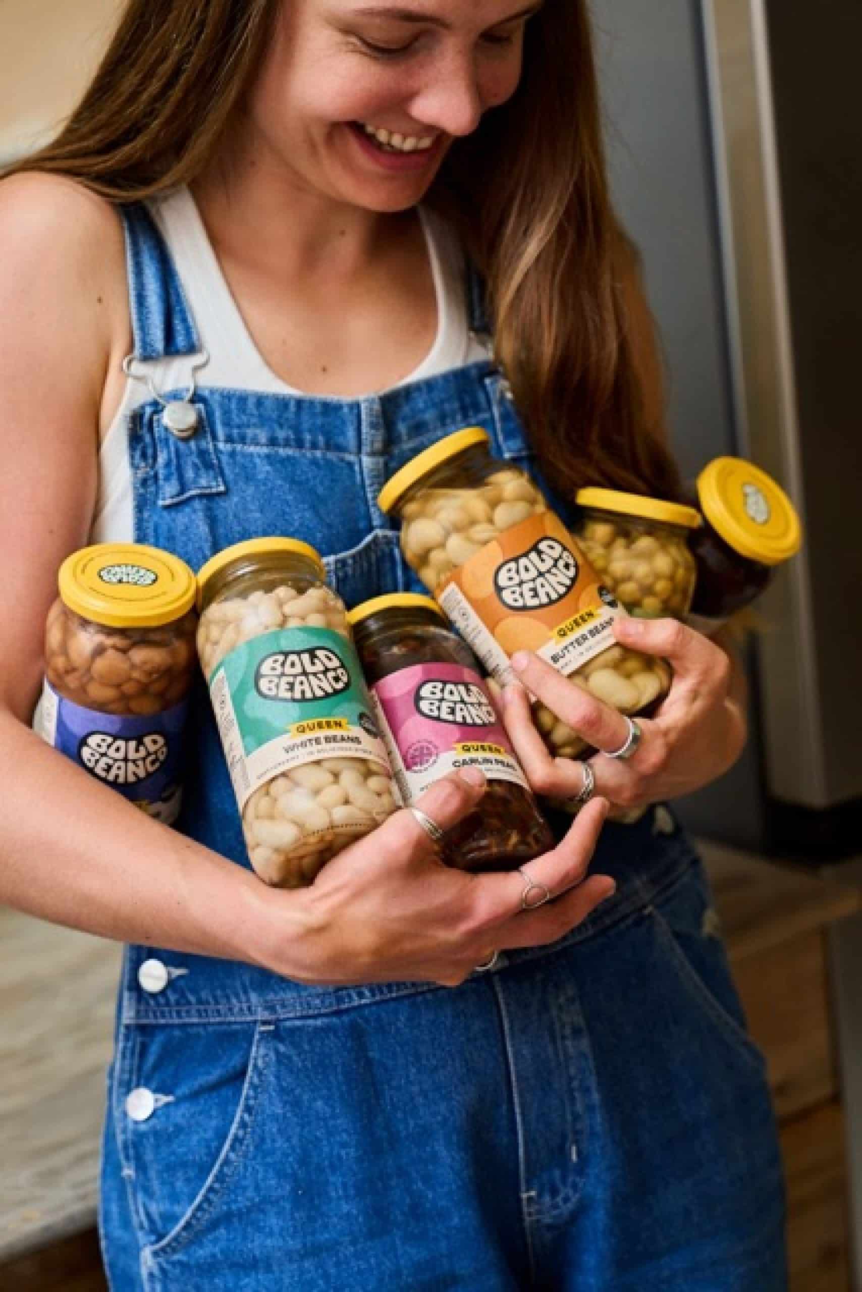
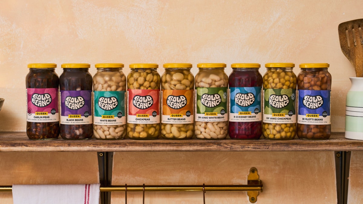
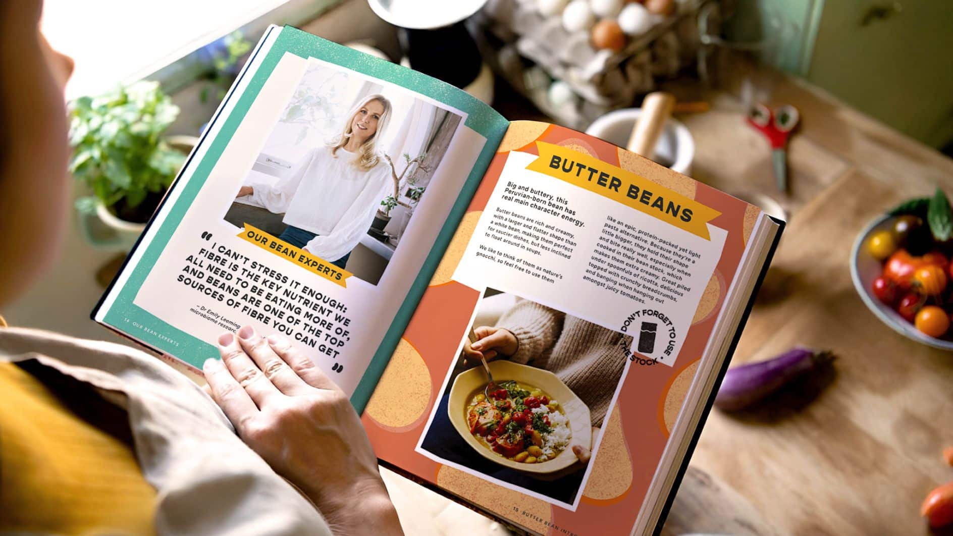
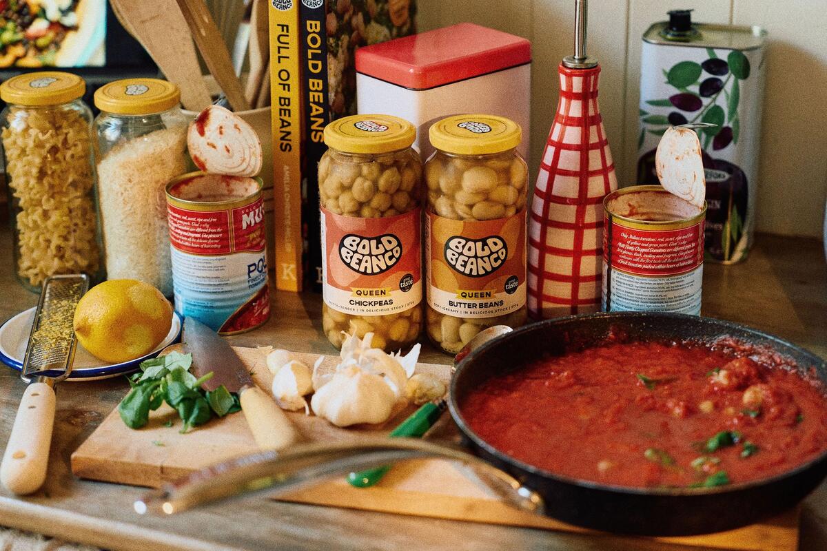
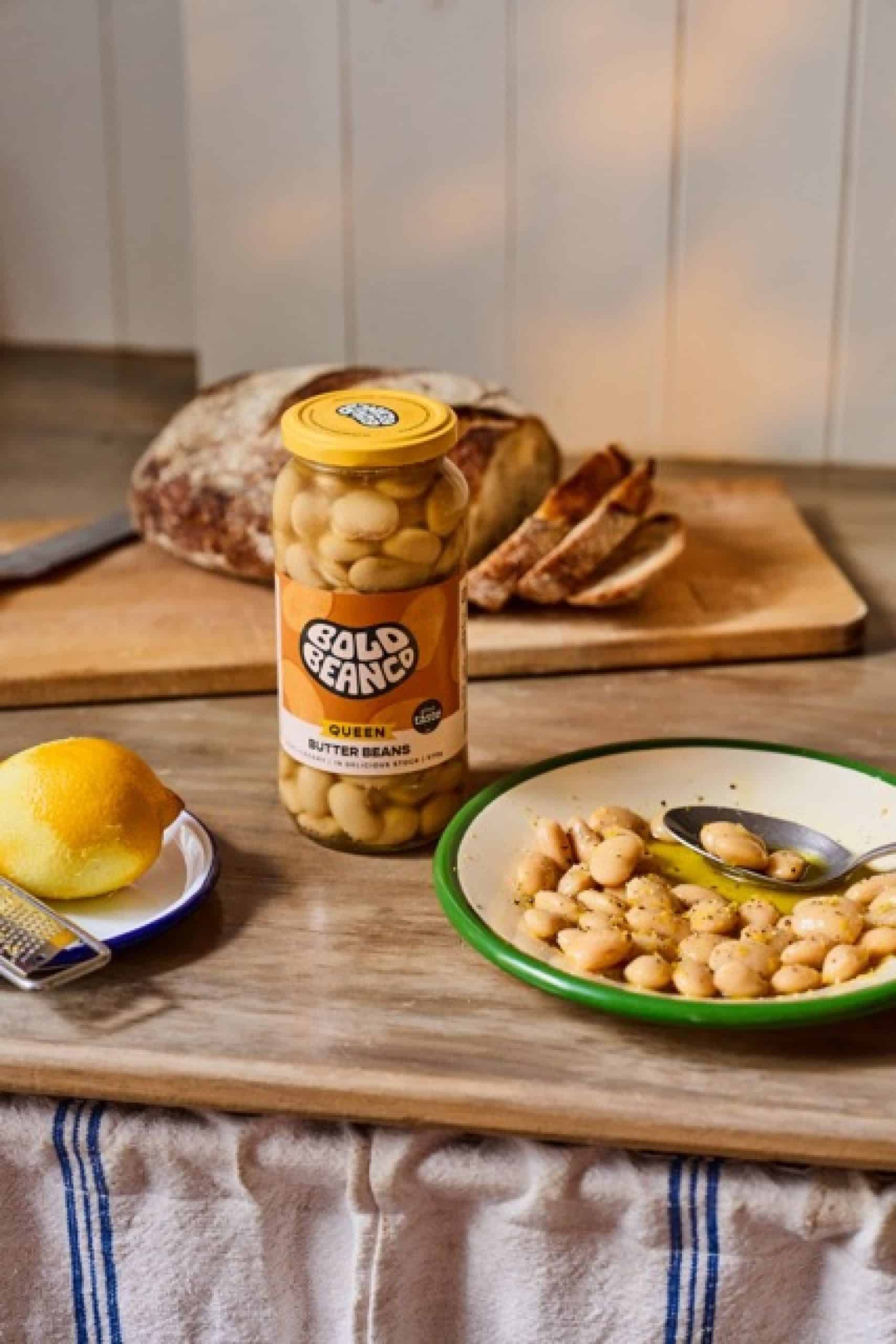
The situation was further complicated by the inconsistency of colors – the reds, purples, and oranges repeated on different beans blurred the distinctions. Organic jars were not immediately recognizable, and even the much-vaunted “Queen Bean” – a larger, rarer bean that justified a higher price – lacked obvious visual cues.
Simplified to amplify
White Bear’s answer was a mantra that guided the entire redesign: simplify to amplify.
“There was just so much clutter on the front of the pack that it made it very difficult for a consumer to go on that normal journey of looking at the pack top left to bottom right, seeing what’s the most important information that I need,” Kelly says. “So we stripped out everything that wasn’t absolutely essential… simplified to amplify became our mantra.”
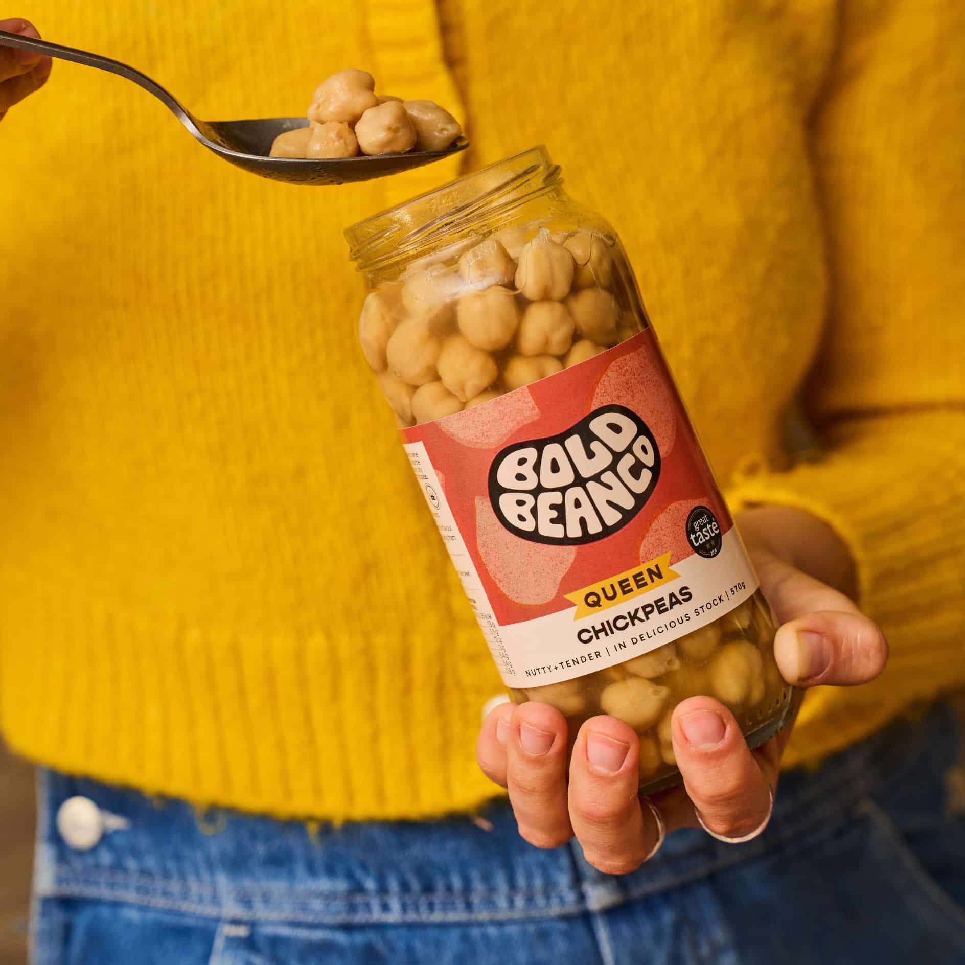
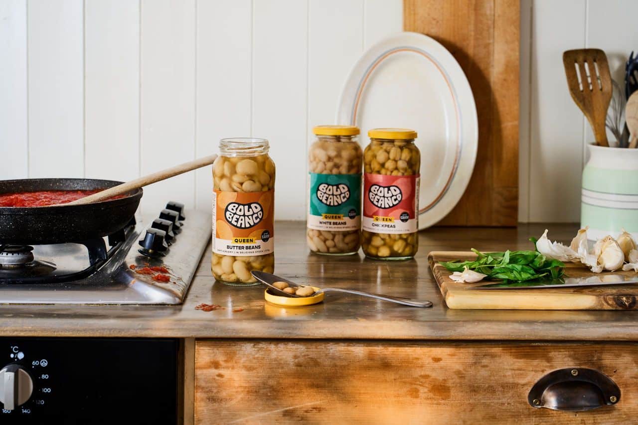
This resulted in a clearer, more prominent hierarchy and a larger-scale logo with a solid black color at the center, rather than the previous contoured shape. This change not only improves legibility, but also gives the brand a sharper, more compelling image.
Organic beans are marked with a green label, while a new gold stripe marks the Queen of Beans. Together, these actions provide shoppers with visual acronyms they can decode in seconds.
Maintaining the credibility of the cult
Scaling up isn’t always easy for a brand rooted in human energy. Bold Bean’s “bean champions” – the loyal fans – were incredibly attached to its quirks, and White Bear didn’t want to alienate them.
“Firstly, it was the logo. We didn’t want to reinvent the wheel in any way. People loved the logo and loved the brand. So what we wanted to do was amplify it,” Kelly says.
The solution was evolution, not revolution, which meant retaining the much-loved rich, foodie tones of the original packs, keeping SKU colors consistent for recognition, and amplifying rather than rewriting the brand mark.
The tension between authenticity and scalability also influenced the textures and hand-drawn elements that appear throughout the system. Each bean now has its own illustrated pattern, giving it a distinctive look while staying true to Bold Bean’s imperfect, human personality.
Control the lid, control the shelf
One of the more playful decisions was to rethink the lid. Kelly explains: “When we were working on the project, we noticed that there’s a bit of a sea of sameness, firstly in the canned aisle, also in the antipasti aisle, where everything looks… quite staid, quite kind of heritage or legacy.
“We really wanted to shake that up and brighten it up by owning a color,” Kelly explains.
That color is yellow, drawn from Bold Bean’s existing palette but now splashed unapologetically across every lid. The agency describes it as a “ray of sunshine” cutting through the aisle, creating an instant navigation shortcut while cementing a brand asset that can stretch far beyond packaging.
What’s next?
The redesign is just getting started, and the new packaging hasn’t fully launched in retail yet. So far, social media has been a testing ground, and the feedback has been overwhelmingly positive.
This reaction shows that White Bear has managed to delicately balance the noise with the features that fans love. The result is a louder, prouder, and more shoppable identity, without losing the charm of the brand’s early days.
In Kelly’s words, “Let’s only use what is essential, in order to really make a fundamental difference to how people can shop the range.”
Bold Bean now has the toolkit to move beyond cult status, bringing beans into the mainstream in a way that still feels personal, imperfect and true to the name.
Credits:


