


")
")


‘Pangram Pangram’ has launched a new modern online platform
An award-winning foundry elevate its type collection with innovative worth to look online platform.

‘Pangram Pangram’ is a type foundry company and constantly fascinates us with its unique typefaces, with the help of which many businesses, designers and individual users have taken advantage of the opportunity to perform design actions in a modern way.

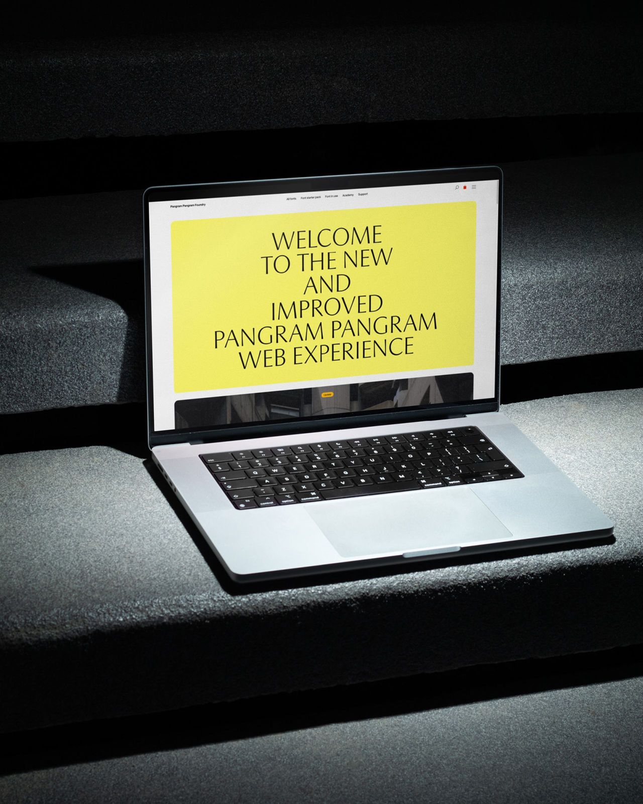
The team of Pangram Pangram unveiled a new website a modern and sleek design that competitors can envy and aims to do more than simply sell fonts.
They rebuilt their platform from the ground up, prioritizing a smoother and more intuitive user experience while letting the fonts themselves take center stage.
“Even though our old site had its moment – it won awards, people loved the look – it just didn’t keep up with where the foundry was heading,” – says Matt Desjardins, founder of the foundry.
While the old design made it tricky to navigate and try out the growing selection of styles, the updated site addresses this head-on by rethinking how people discover, test, and license fonts so that they look as high-quality and thoughtful as the fonts themselves.
“The goal was to completely rethink how people explore fonts, learn about them, test them, and ultimately license them,” Matt explains. “It had to feel just as premium and crafted as the typefaces themselves.”
“The idea was: let the fonts speak.”
Matt draws on Dieter Rams’ philosophy of “as little design as possible” as a pillar of his creative approach. By reducing visual noise, the new website becomes a canvas on which Pangram Pangram fonts shine, drawing users even deeper into the world of the foundry.
Matt points to editorial influence as a key reference, combining modernist grid systems with a magazine-inspired sense of rhythm and hierarchy. “There’s a rhythm to the layout that reflects that,” he says.
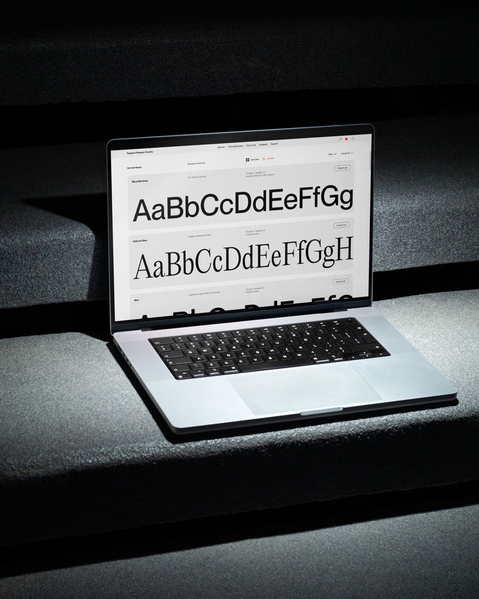
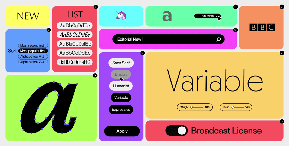
The main task was usability. The browsing experience is now more robust and customizable, with improved filters, search tools, viewing modes, and sorting options helping users navigate the growing library more easily.
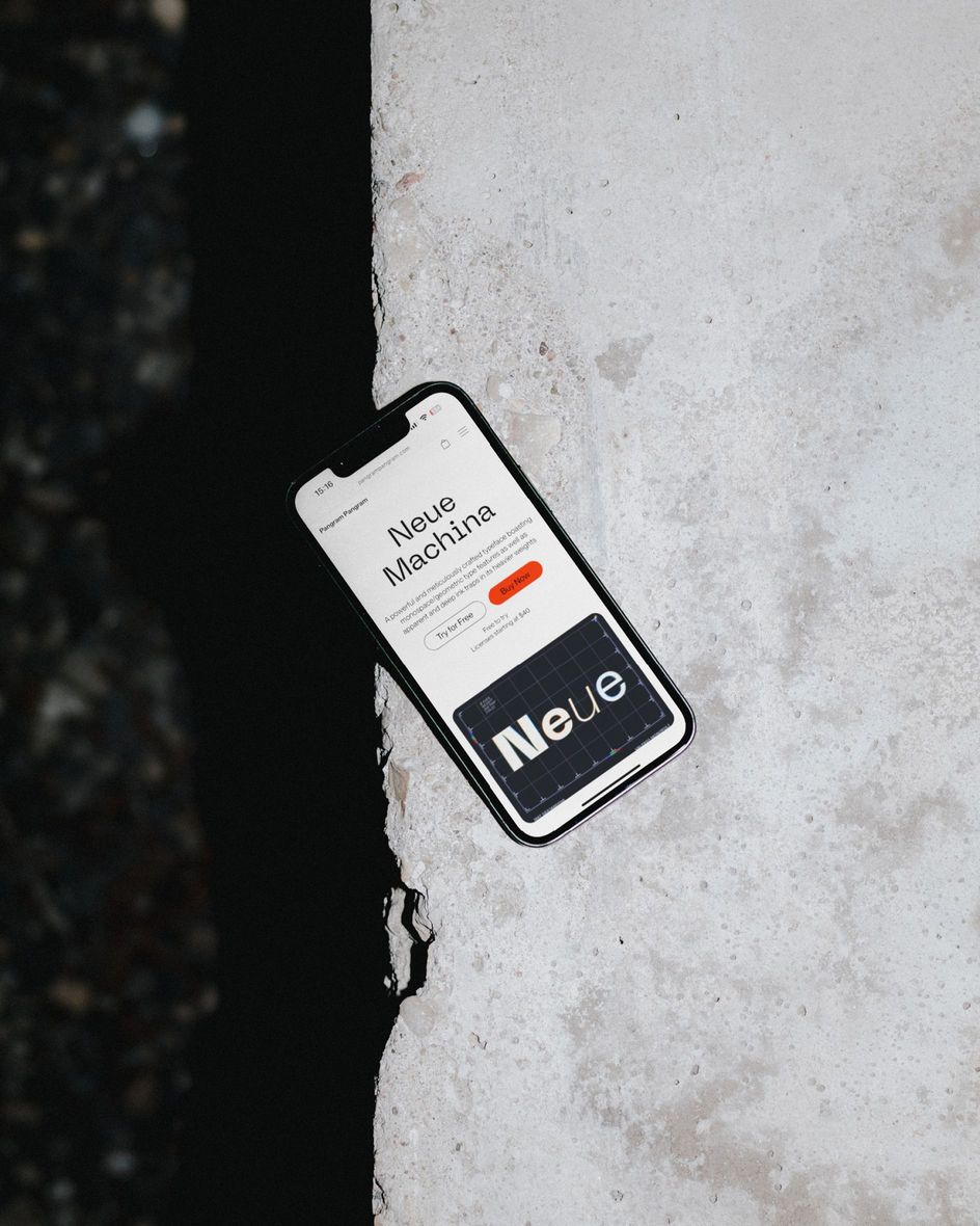
The font pages themselves have been completely revamped, featuring much more detailed examples, alternative symbols, features, and inspiring usage ideas.
Font testing has also become much more dynamic and interactive thanks to updated previews and improved live rendering.
When it comes to licensing, Pangram Pangram has introduced simpler, clearer options alongside an expanded ‘Font Starter Pack’, offering a generous commercial license for smaller projects and a bigger suite of fonts and mockups.
The growing magazine, now called ‘Academy’, is positioned as a space for storytelling, inspiration, and education. Through the Academy, Pangram Pangram can explore designers’ stories, behind-the-scenes processes, and broader cultural conversations about typography.
“We want Pangram Pangram to be more than just a place to buy fonts. It should be a platform for education, inspiration, and community.”


