


")
")


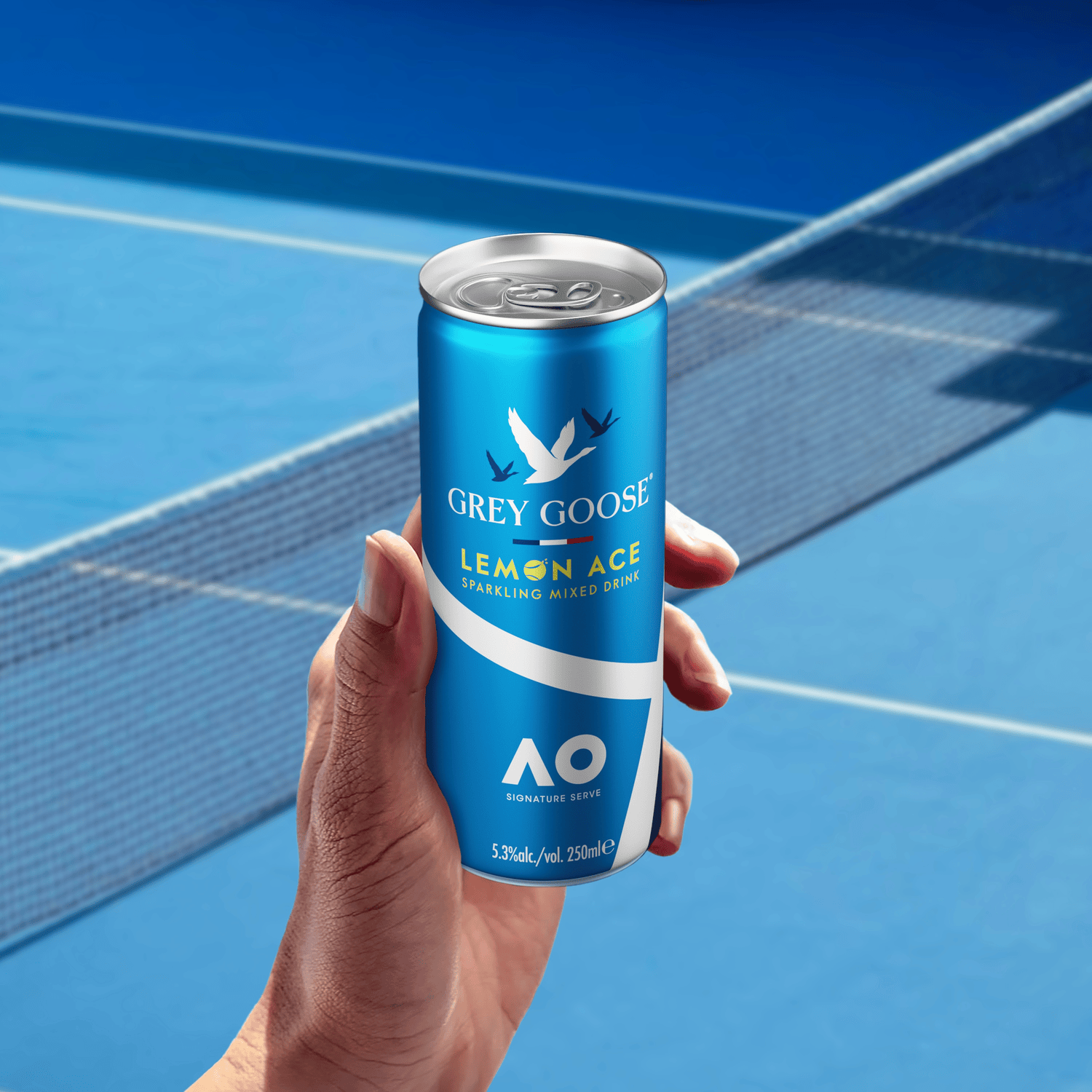
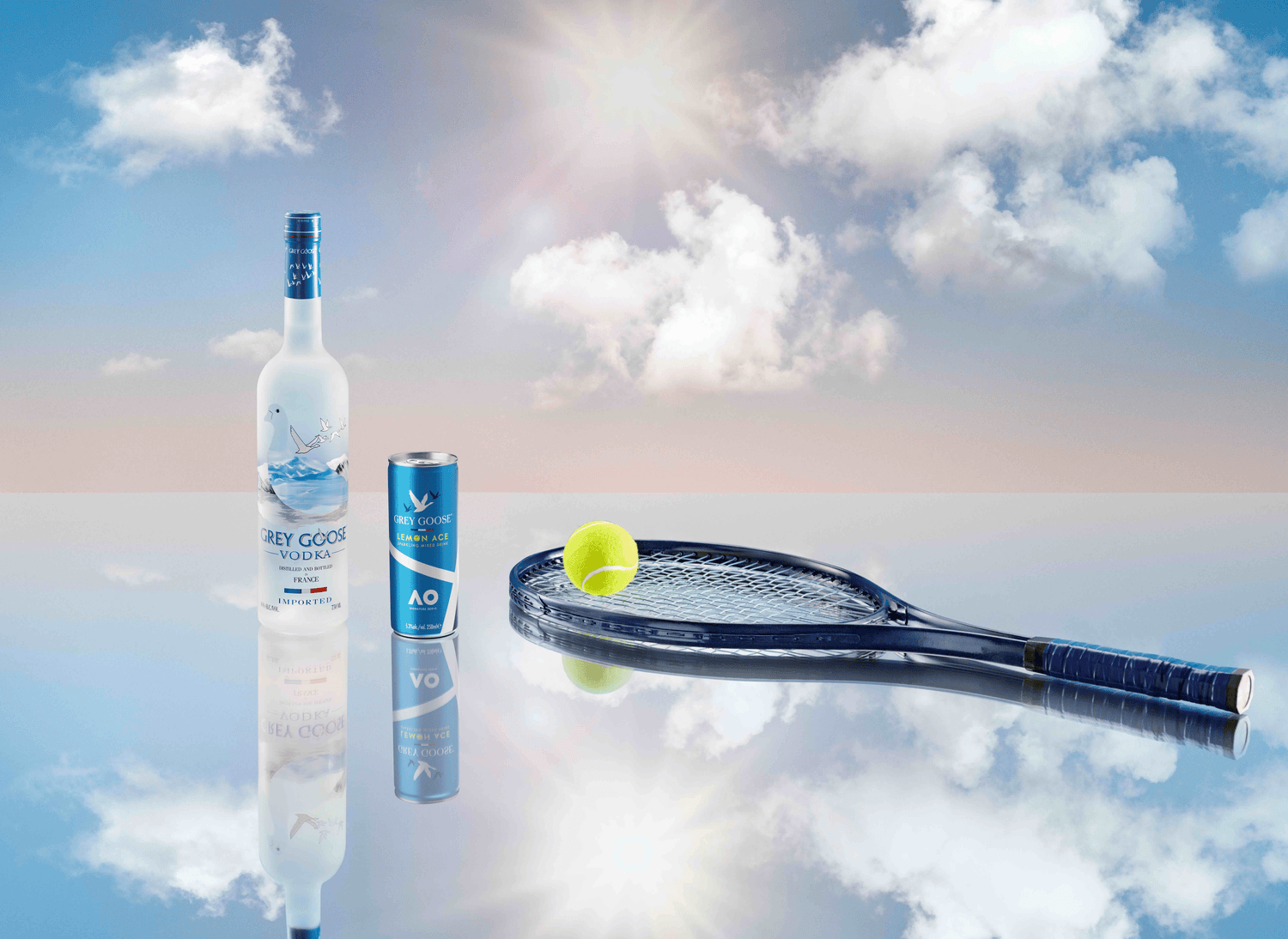
The sparkling lemon drink is perfect for the event and is available only at the tournament. The blue color scheme with white stripes matches the iconic Australian Open court markings. The lemon yellow accents are associated with tennis balls. A design by Intertype Studio was also created for how the serve will look in the serving glass – the lemon decoration resembles a tennis ball spread.

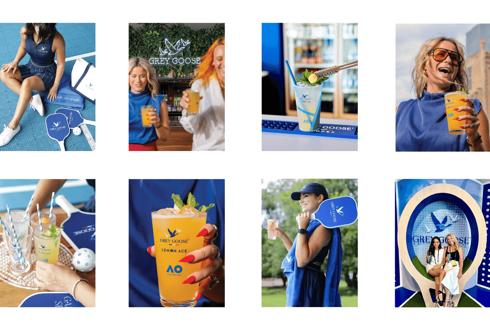
The branding design was carefully considered to maximize online sharing. The can’s design orientation aligns with the courtyard aesthetic, and visitors can hold the bottom of the can and take a photo of themselves enjoying their drink against the courtyard backdrop. This places the Grey Goose brand name prominently on the top of the can, and consumers can generate hundreds of thousands of online impressions.
The can itself becomes the catalyst for an organic, consumer-generated campaign that reflects the inspiring and sophisticated friendliness of the Grey Goose brand.
The Australian Open is known as the “lucky shot” for its joyful and social approach to tennis, and the playful aesthetic of the can design reflects this attitude. Grey Goose Lemon Ace is truly the perfect Australian Open serve.
Photography courtesy of Intertype Studio and Grey Goose


