Taller Design rebranded the ‘Houston Institute’
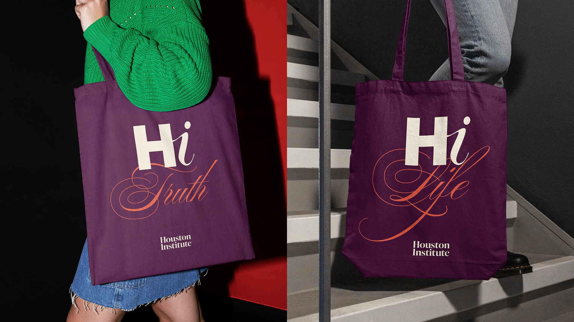
A greeting, the start of a friendship, the start of a conversation, the naming of an institute - all rolled into one.
The Houston Institute helps people at “Rice University (USA)” reflect deeply on the best way to live their lives through the study of the liberal arts, especially philosophy and literature. Their main goal is to develop in students the habit of seeking and loving truth about the fundamental questions of life.
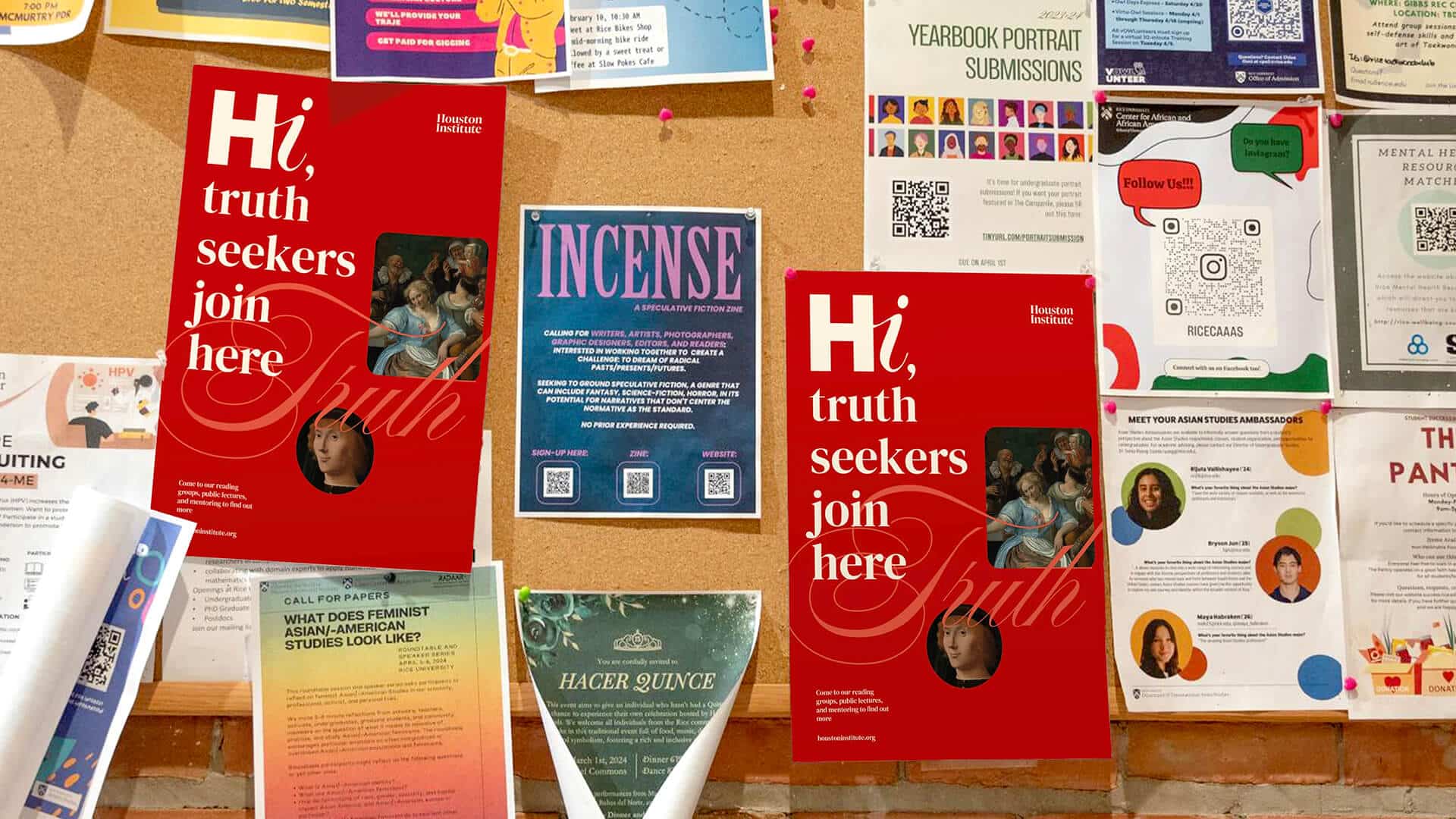
Houston Institute, also known as “HI”, organizes reading groups, public lectures, and provides mentoring services. These are progressive spaces where one can talk in the pursuit of “radical openness” and the ability to express one’s opinions in a safe space.

They are non-credit-bearing, so students come simply because they love literature and philosophy. This institution attracts and connects people through rare intellectual fellowship, fostering empathy and understanding. They are also classically minded, recognizing the importance of long-standing traditions of thought in a modern, pluralistic university.
The challenge was to clearly, visually and verbally, articulate that the Houston Institute provides a platform for students to discover the truth about the fundamental issues of modern life through discussion and study of classical thought and philosophies. This needed to be accomplished by creating a refreshed brand identity and website that clearly explained what the Houston Institute does and stands for.


The Houston Institute is unique in that it combines the ancient and the modern world, connecting the past and the present. Old truths that are still relevant in everyday life, but presented in a different language and structure.
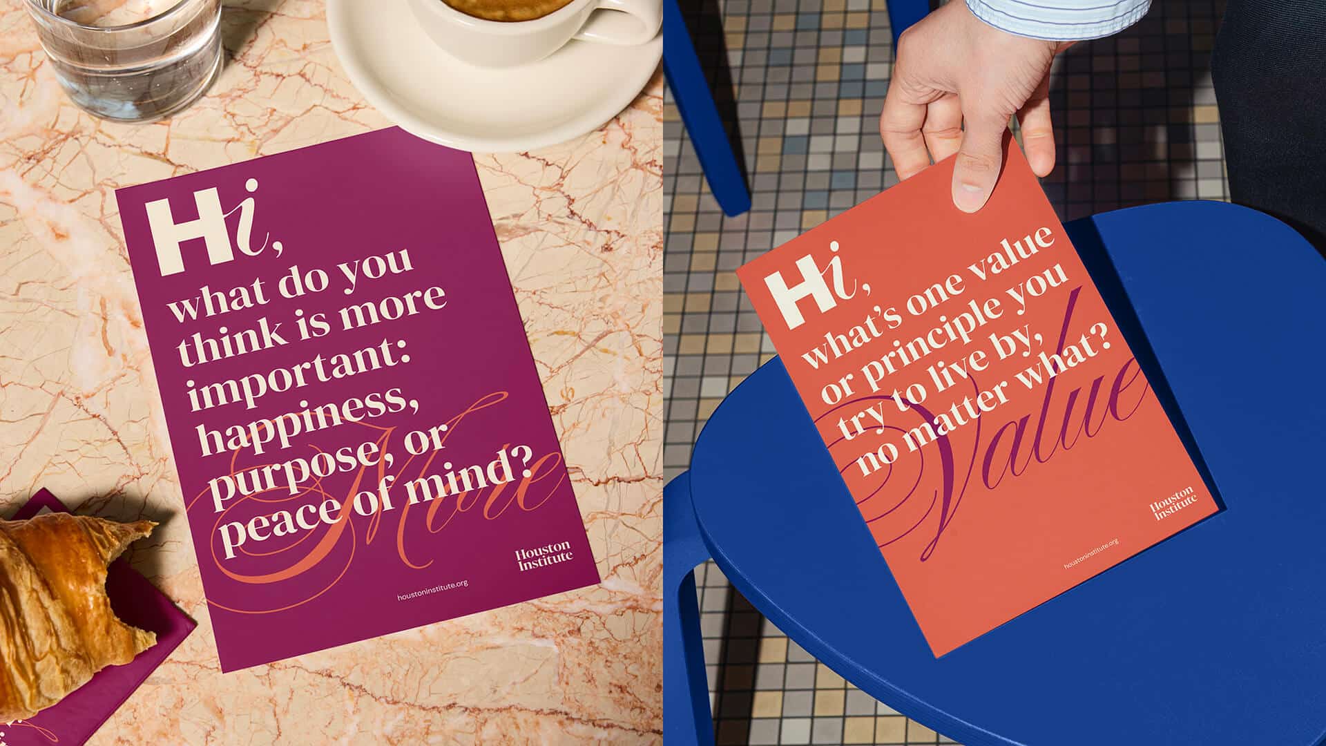
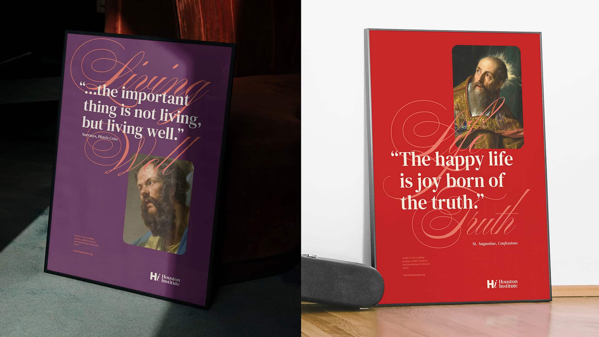
The solution was to imagine that thinkers and philosophers of the past were talking to you today in real time, sharing their useful thoughts about life in the present. As if they were having a dialogue, a conversation between (intellectual) friends.
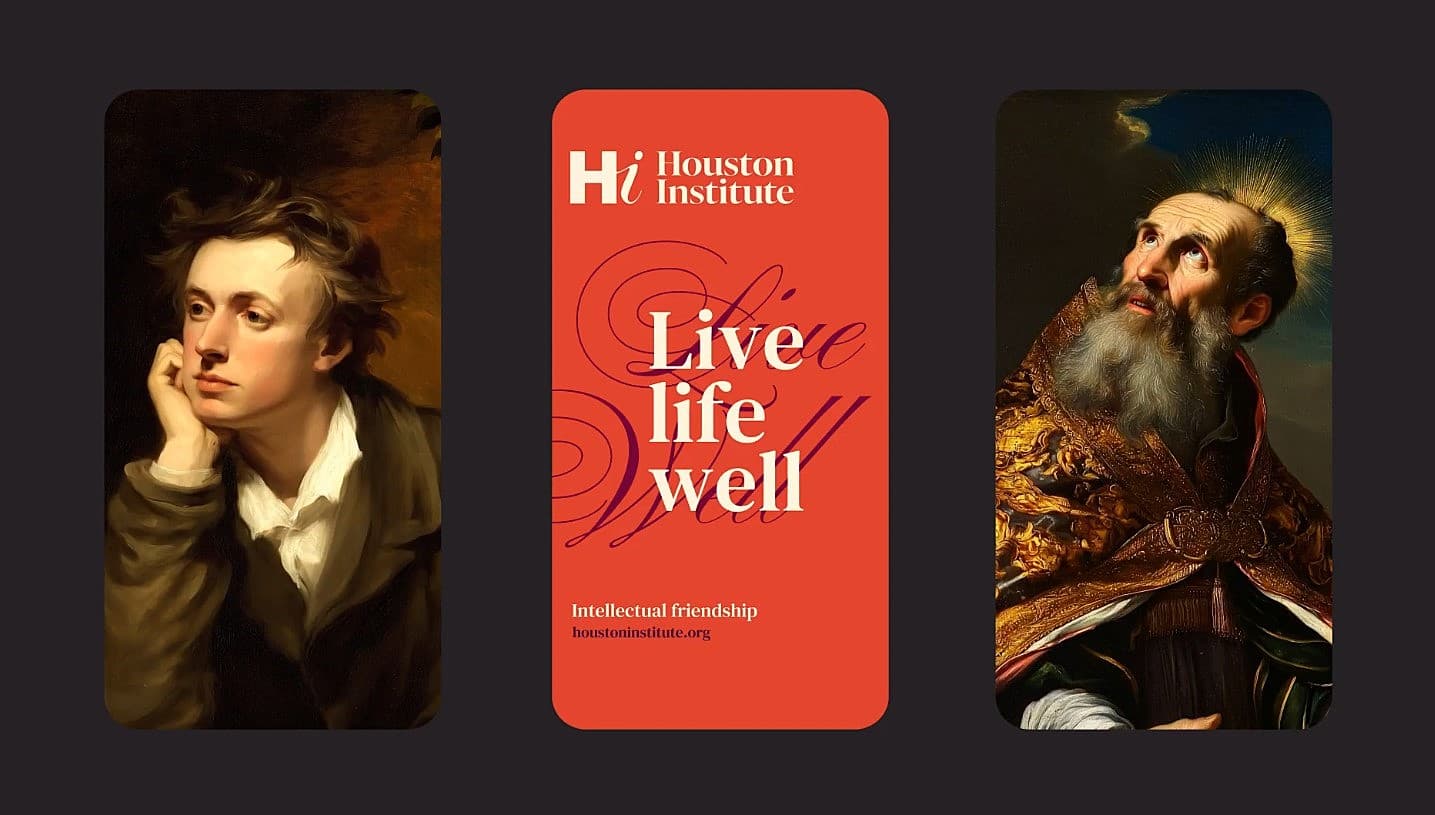
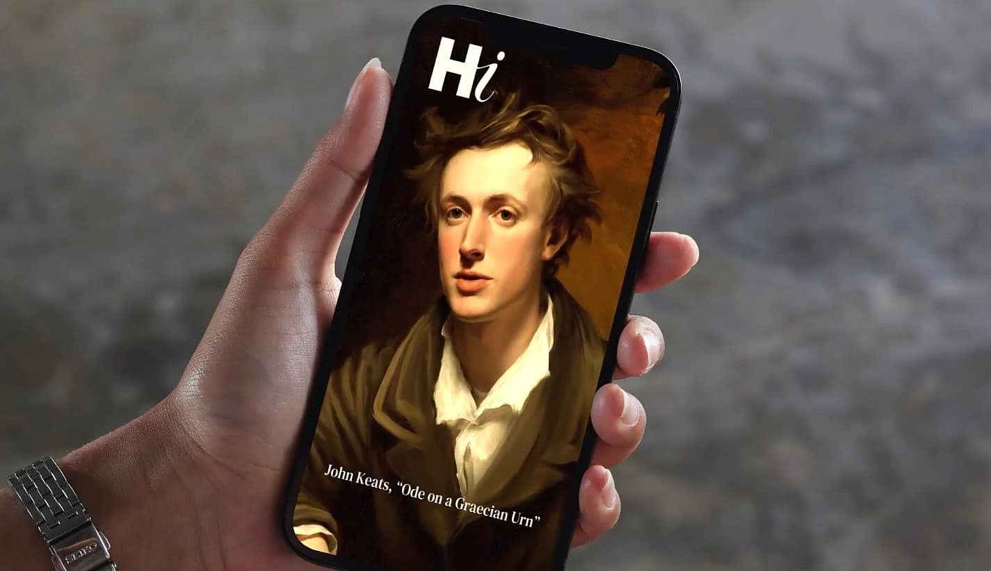
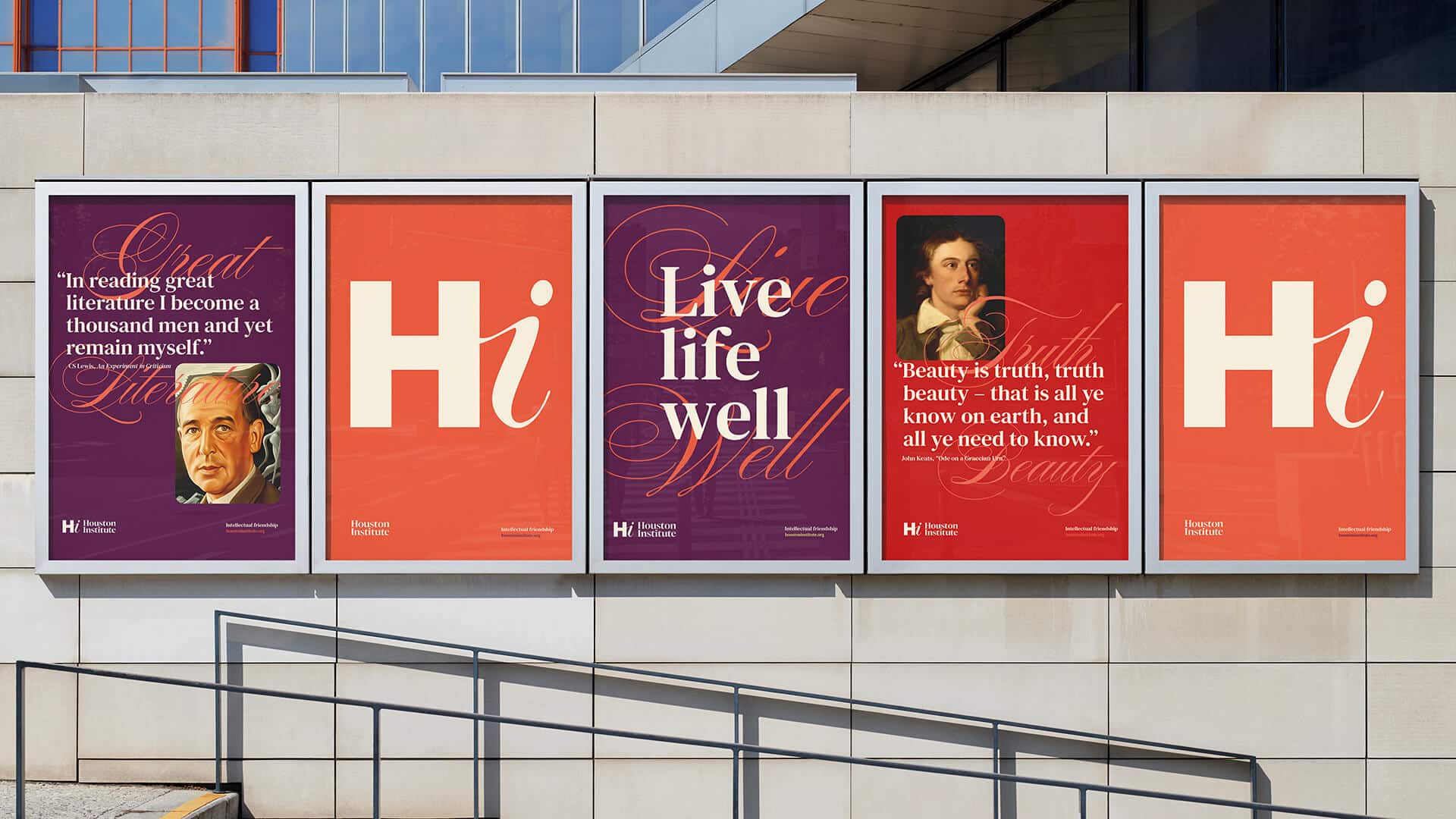
The idea of past thinkers speaking in the present inspired their quotes, conversational text, original paintings and drawings, and animations that gave a strong foundation to their thoughts and themselves. Warm colors gave the brand emotional warmth, while recalling the shades used in old paintings.
Expressive fonts hinted at the classicism of the theme, but at the same time gave it a modernity in its interpretation. Overall, the brand seemed more personal, direct, and open to discussion, connecting communities of the past and present.
Credits:


