


")
")


In 2020, Airport Dimensions acquired ONGROUND Hospitality, a company that operated Sleep ‘n Fly capsules in the Middle East. Airport Dimensions commissioned branding agency Without to redefine and expand its offering to an international audience.

The new strategic direction launched at Lima Airport, with a global rollout planned for the rest of the year, has overcome language and cultural barriers to streamline the offering, creating a new brand and category that stands out in a chaotic world and transforms layovers into overnight stays.
“These sleep stations are a huge growth brand proposition for us, that we want to take across the globe ultimately,” says Lauren Burrill, Airport Dimensions’ global marketing director. “But if we really want to be seen as a disruptor, we’ve got to get people to look up and ask, ‘What is this thing?’”
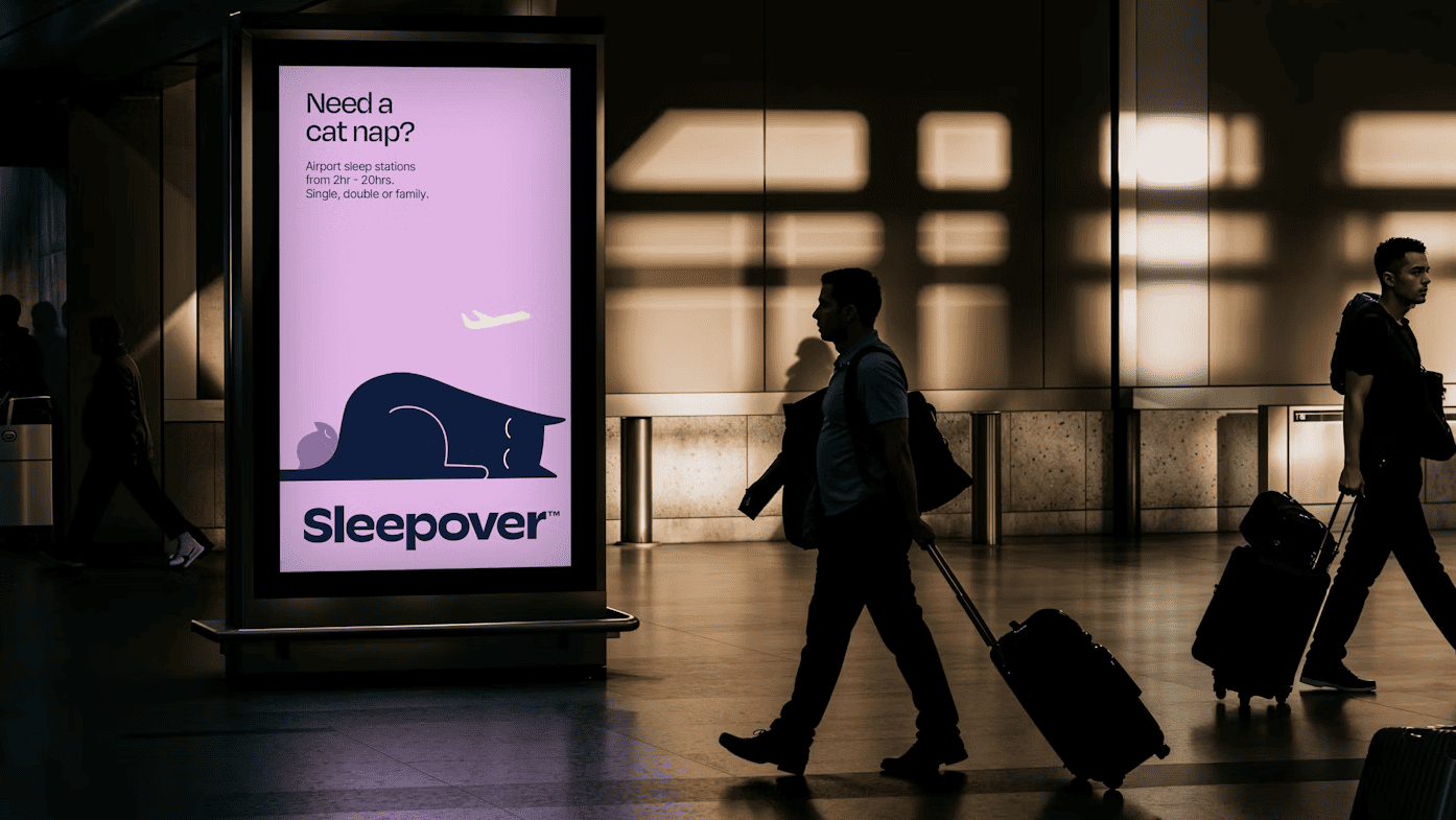
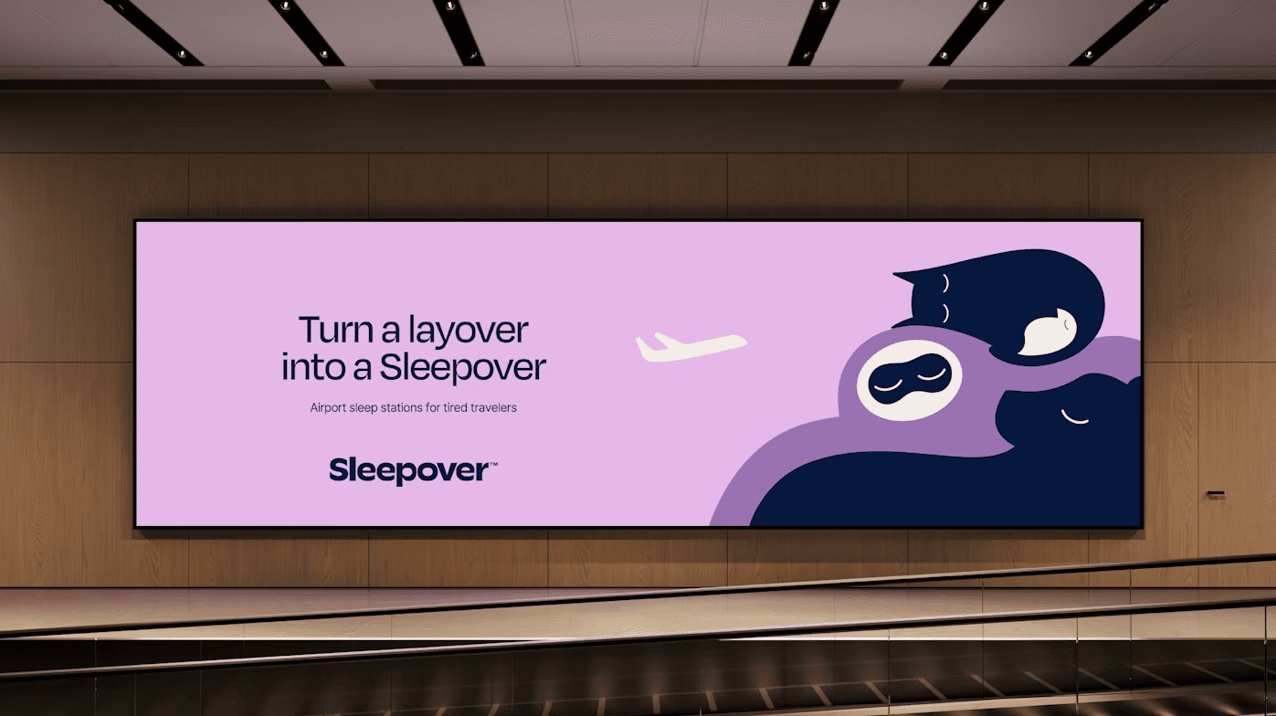
And with that approach comes a new name – “Sleepover” – and a new visual identity. London-based “Without” was appointed after a bidding process, and Burrill says it was a challenging task as they needed to introduce this type of space to travellers.
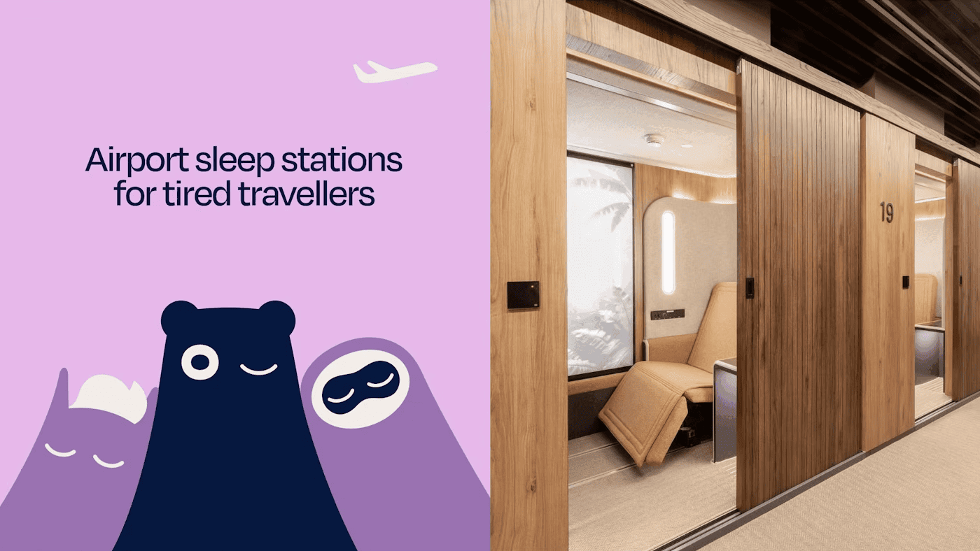

The brand needed a name that focused – not on a room or bed – but on the benefit: moments of deep, snackable sleep, however long or short.
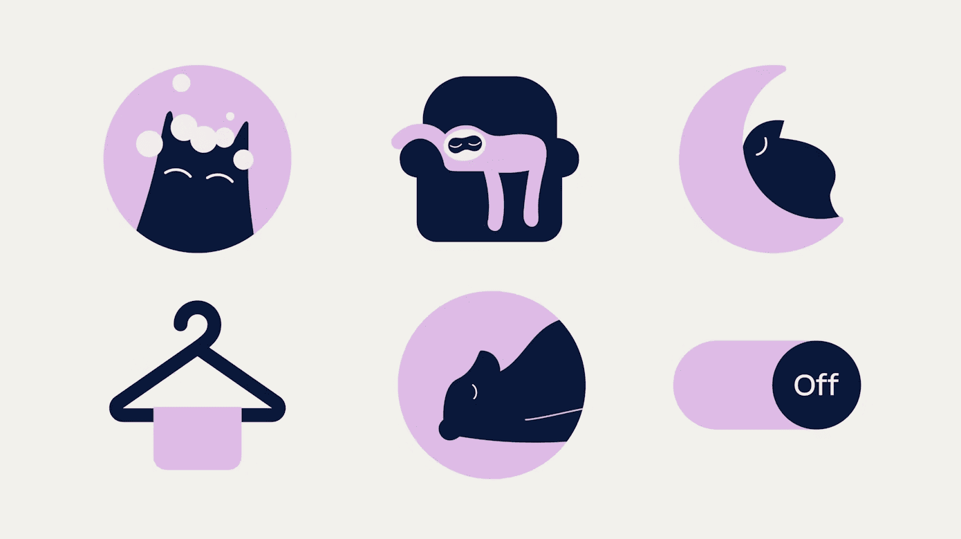
The new sleep mascots, used for advertising, signage and wayfinding, simply and warmly convey the breadth of the offer (duration, capacity): a bear hibernates; a sloth sleeps 15 hours a day; cats doze; birds fly. The contrasting color palette of night sky blue and cloud white (sleep mode on/off), highlighted by a soothing lilac, suggests sleep.
The new identity will be rolled out in seven locations this year alone, including terminals in Dubai and Doha, and was launched at Lima Airport in June. It will be visible at every customer touchpoint, including interior directions, digital signage and product descriptions (specifications such as room size are replaced with iconography to keep the text simple and international).
Philip Koh, Strategy Director at Without adds: “When you are doing something new and potentially complicated – and need people to understand it easily and instinctively across languages – you have to strip away the noise, to simplify and to speak directly to primal emotions. The Sleepover brand is designed to communicate on this universal, intuitive, level.”
Without design director Adam Evans said the fact the brand had to create a new category made it a challenging, but exciting brief.
He says in the strategy phase they identified three things the new identity had to do – it had to be clear, to explain what this new sort of airport offering was, it had to stand out in the visually “hectic” airport environment, and it needed to work for international customers across many different languages.
“We needed visual cues that didn’t rely on words,” Evans explains.
“Very few people like airports. And I think people underestimate that when people travel, they aren’t their normal selves,” she says. “You have all these heightened emotions and you need to make sure that the brand feels really accessible.” says Burrill.


 control in your hands")
