


")
")


‘Coca-Cola’ branding visuals of 1970s detailed in a book
A new Standards Manual dives into the archives of The Coca-Cola Company and reveals the inside story of the creation of its visual brand over a fascinating ten-year period, 1969-1979.

An independent publishing imprint company ‘Standards Manual’ delve to a Coca-Cola visuals of 1970s and bring it to a new book.
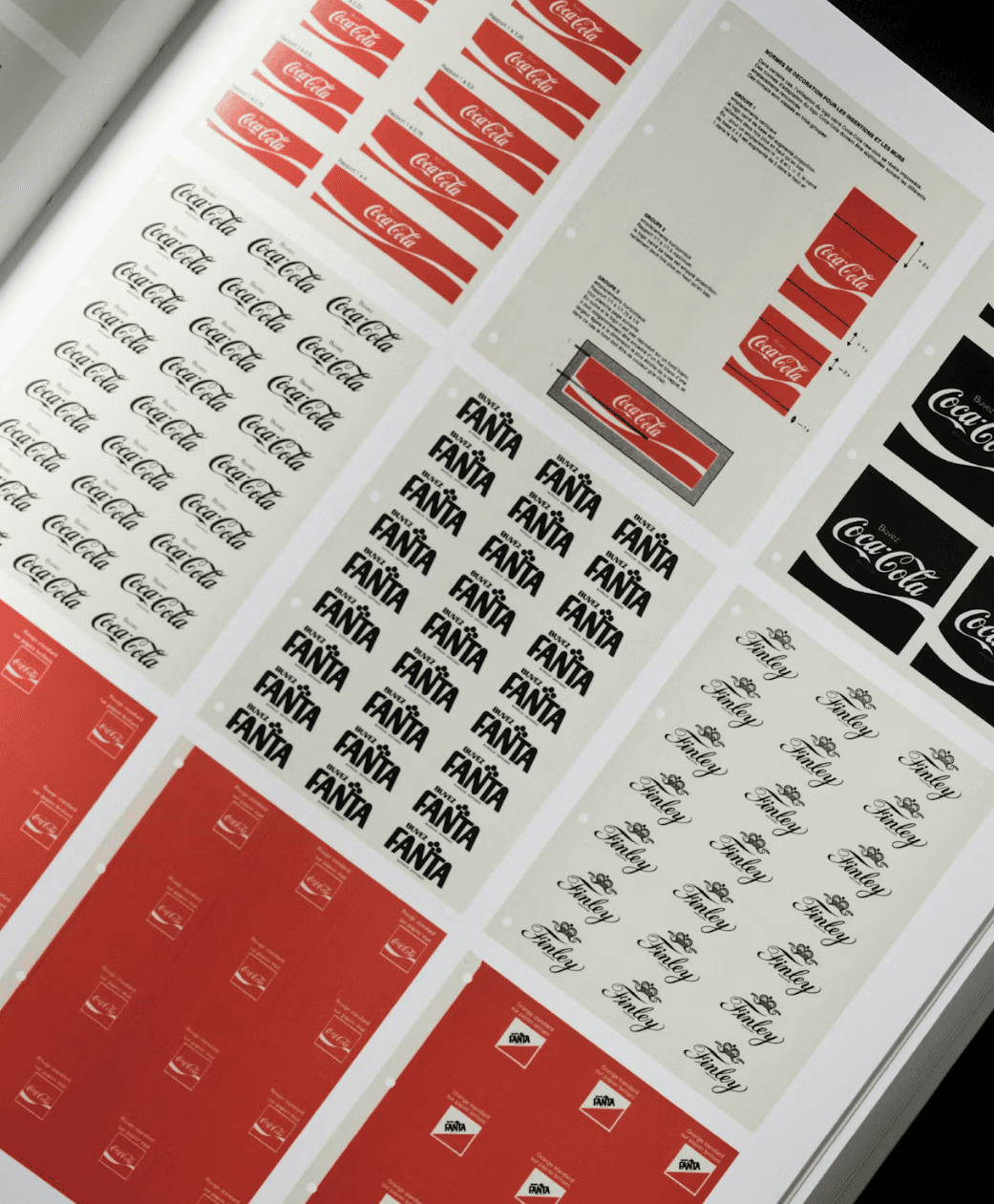
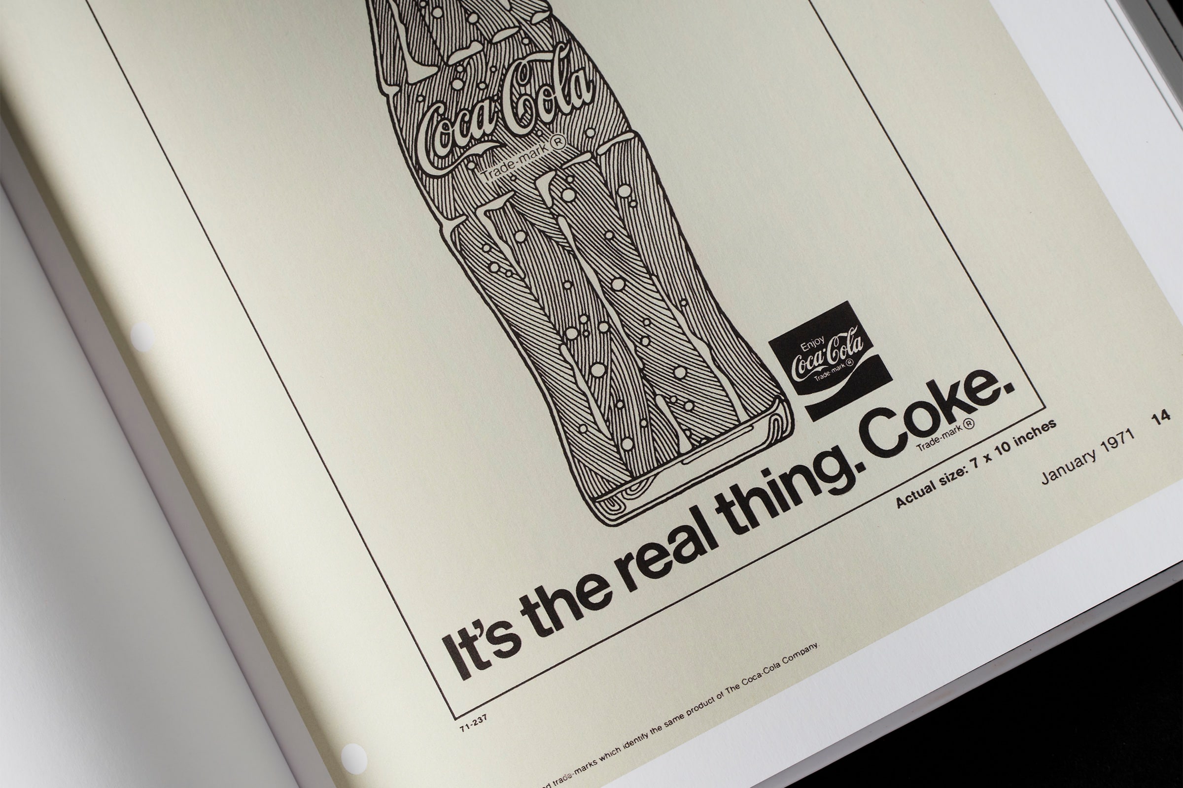
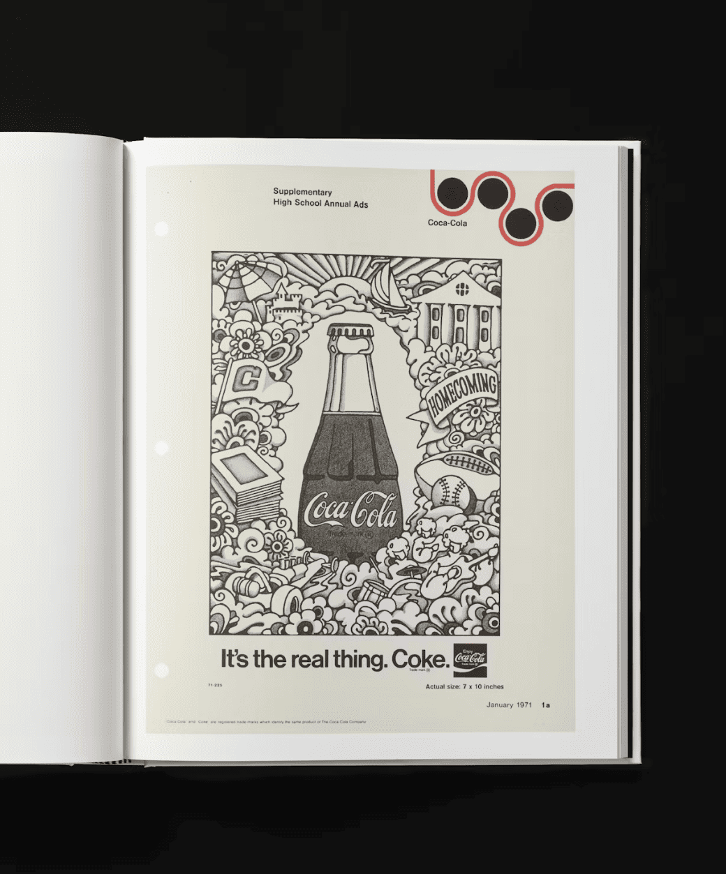
The book covers famous campaigns such as ‘It’s the Real Thing’ and also shows how graphic elements such as the ‘Arden Square’ were used.
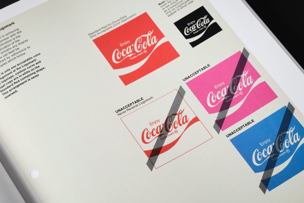
Lippincott & Margulies’ visual overhaul of Coca-Cola was felt across everything from identity and packaging, uniforms and vehicle livery, to the brand’s wider communications strategies.
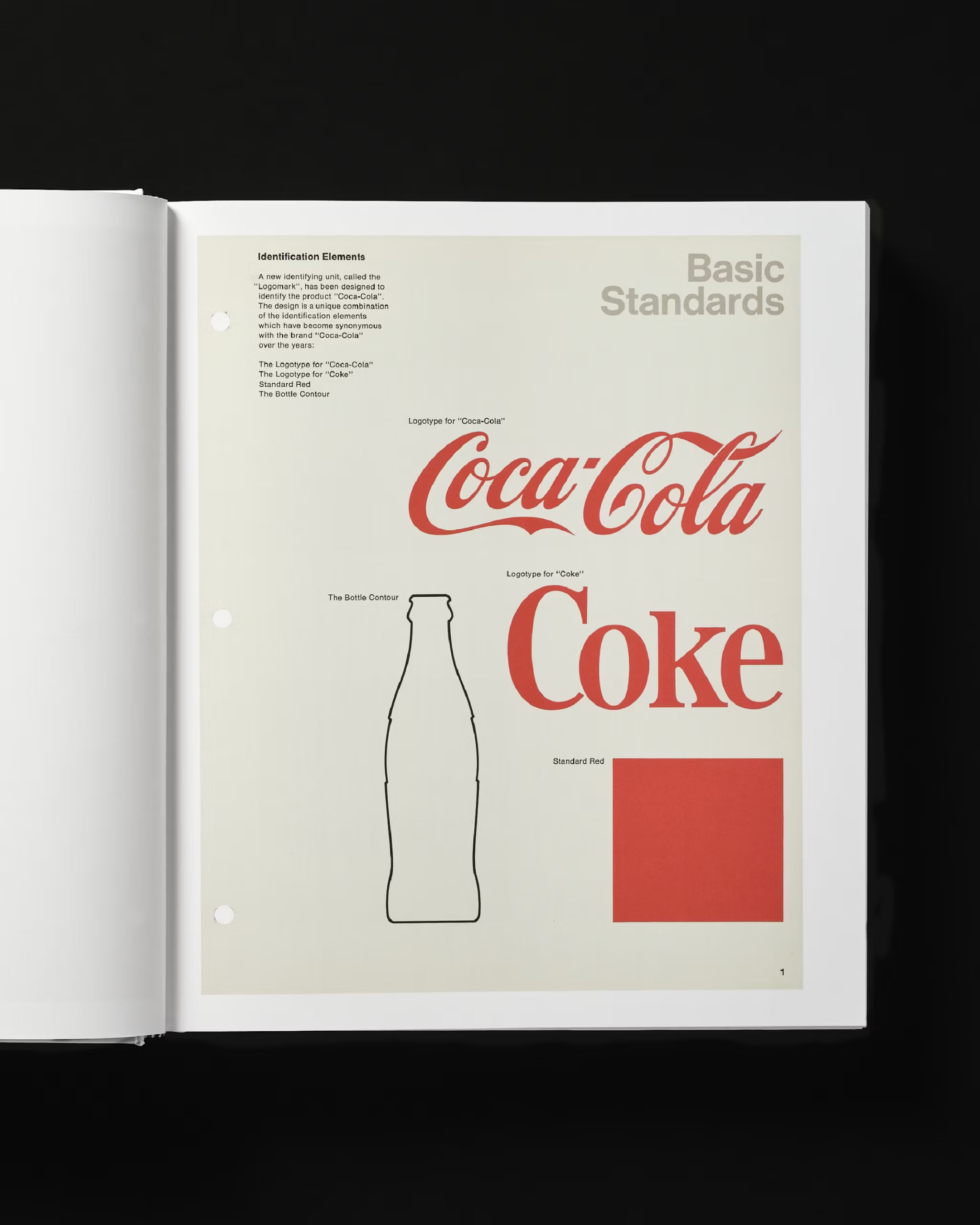
With the increased use of Helvetica, as Coca-Cola approached the 1970s, much of the work of this period stands out as embodying the brand’s own approach to more modernist principles.
At the book “explores a period in the company’s branding history that spans prolific advertising campaigns to a deep focus on modernist design systems”. wrote the publisher.
“Responds to research which shows that young people seek the real, the original and the natural as an escape from phoniness”. – says the brand manager, Ira C Herbert.
Going back to the origins of this great company, in 1886 Frank Robinson, an accountant for the drink’s inventor, John Pemberton, “drew the capital letter logo that, with only slight modifications, has since appeared on billions of bottles and cans,” writes New York magazine’s Christopher Bonanos in his book of essays.
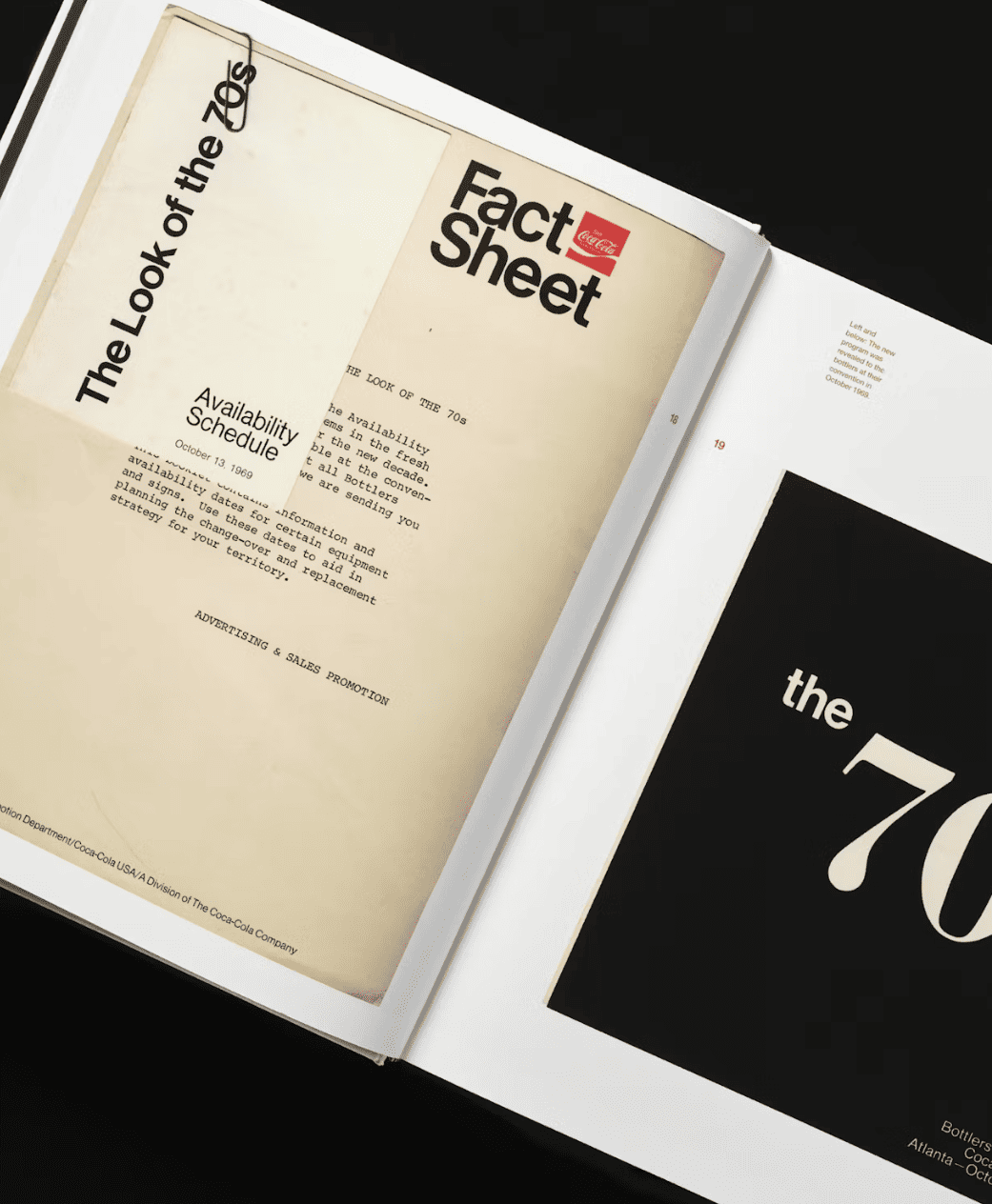
In addition to illustrated pages from various brand manuals, the 500-plus page book’s introduction (written “Standards Manual”) also features other archival material, much of which has not previously been seen publicly.
The book’s foreword is written by Coca-Cola’s Rapha Abreu, vice president of global design and Sue Murphy, senior director global design.
“The heart of Coca-Cola design lies in its commitment to creating joy,” they write.
“It’s this simplicity, infused with thoughtfulness and care, that makes Coca-Cola’s design language so enduring.”


