The best fonts for small text. Is it simple or a huge challenge? As more and more we have deal with the different size screens its normal, that the needs for a small text is very important task.
Legibility is everything, and font legibility determines how well your design conveys its message, whether on a mobile phone screen or in a printed manual.

In my work as graphic designer the text is not just an aesthetics. Its about functionality in all respects.
This is where sans-serif options like “Roboto” or “Open Sans” come in handy. Applying the font becomes seamless when legibility is top priority, with each letter standing out – no hassle, no issues with illegible characters.
Serif fonts like “Times New Roman” or “Georgia” have their place. They add elegance, especially in traditional print environments, combining the clarity of the font with sophistication.

When looking at web design the choice of font is more crucial. With platforms like Google Fonts, we have a toolkit that ensures text legibility and ultimate readability even in the smallest spaces. Here, every pixel counts for a better user experience, while maintaining text quality across devices and operating systems like Android and iOS.
Combining your design aesthetics with ease of use takes the success of your message to a new heights.
When looking at technical aspect we can see how letter spacing and text positioning can make or break readability. These important elements breathe life into the design, preparing it for easy navigation and interaction.
Selection of Small Text Fonts
It’s many different types of fonts, but for small text I distinguish some most important:
Serif
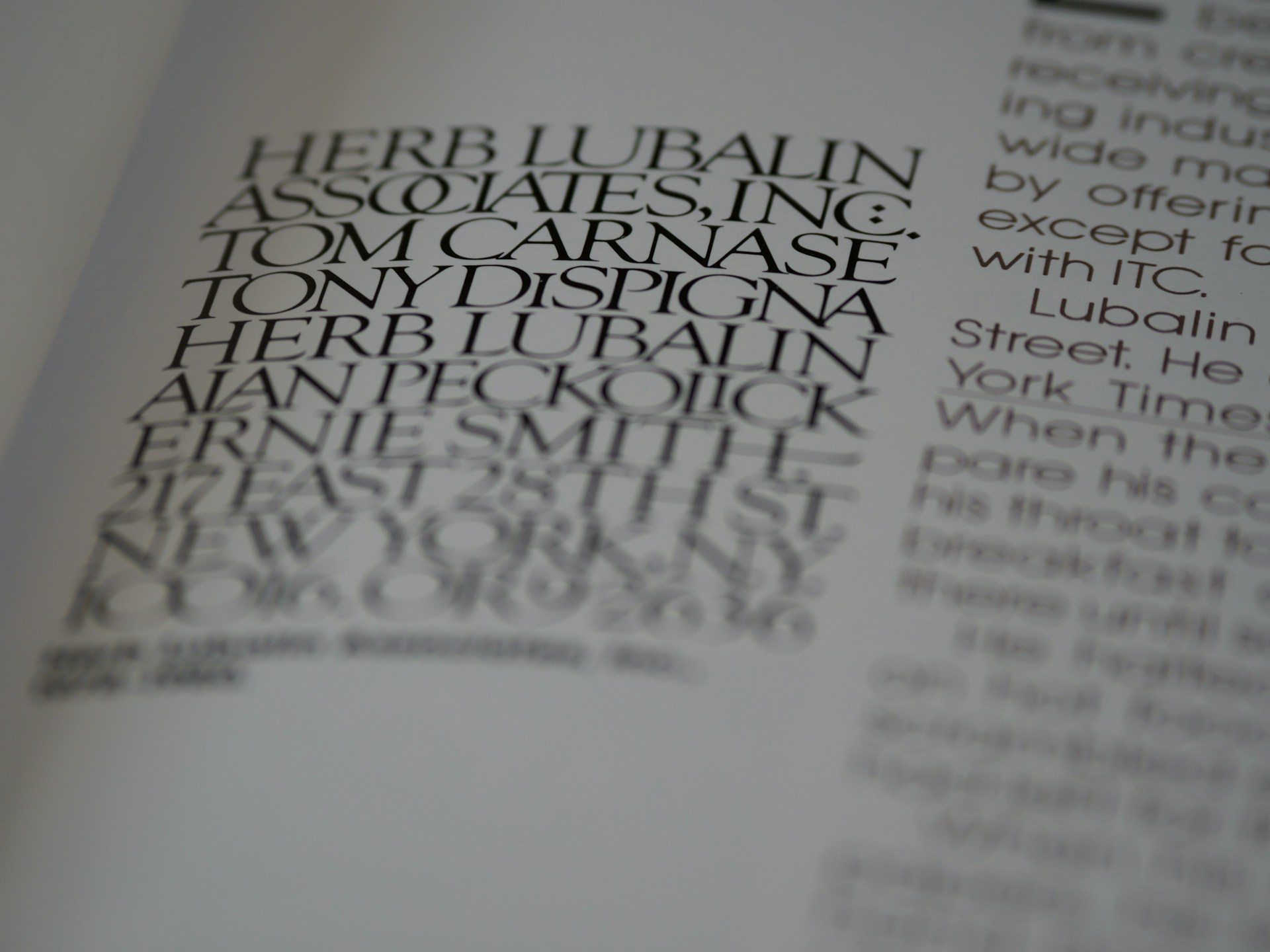
Magazines, books, newspapers, and most long-form print formats use serif fonts. Just think of classic publications like The New York Times, The Wall Street Journal, or Time:
- Magnita font have a graceful appearance in small print sizes. These fonts have no shortage of detail, which is important for digital typography.
- Megalona font is a choice of versatility and font clarity. It will be perfect for a variety of purposes while maintaining its charm and legibility.
- Rodian font is one of the most popular choices in the serif segment, it is very suitable for writing large amounts of text. It is easy to read and looks great.
- Edita font offers a smooth reading experience, perfect for long texts like books. It understands how to keep your eyes moving without straining, which is crucial when reading small print.
- Monteci font has a warm and inviting character, with rounded serifs for easy readability. It gives the reader a sense of depth and boldness, making it a good choice for both print and digital media.
- Ogg font has a unique combination of elements that makes it the choice of the next generation of brands. This font will definitely work on both large and small screens. He has a lot of experience working with various designs.
- Morjuis font enriches with elegance, gives grandeur to delicate text. A font that does not lack style, and the words are easy to decipher. Makes reading easy and innovative.
Sans Serif

Sans serif fonts are one of the most popular and attractive, that doesn’t have little dashes at the end of each letter (like Times New Roman, which does).
- Helvetica Now font might be widely considered one of the best sans serif fonts around. It enriches a text that has many variations. Suitable when you need something quick and with the knowledge that it will not deceive you.
- Cora font breaks the norm with its extra-large X-height. Legibility standards rise as each letter stands out clearly.
- Code Next font is another beautiful geometric sans serif font. Designed with a focus on clarity, making it perfect for digital environments. The font’s versatility allows for creative flexibility in designing layouts and websites.
- Open Sans font is a basic and reliable choice in the Google Fonts collection. It does not lose its usability even when the text size is reduced.
- Source Sans Pro font is completely reliable. Provides clarity and assurance that content remains accessible.
- Inter Sans font stands out for its completeness and reliability. You can use it to write large amounts of text. It looks beautiful both in large letters and down to the smallest.
Specialized
For narrow and complex text situations, these fonts can also be used for small text that requires a specific look.
- Lipa Agate font plays its superhero role, ensuring font clarity in tense contexts.
- Arcade Classic font gives pixel art a retro feel while keeping even the smallest details visible.
- Conterbury font combines vintage style with legibility standards, making words look like fine art forms. Never sacrificing legibility while maintaining an old-fashioned charm.
Handwritten and Decorative
These fonts add personality with their relaxed, handwritten style, making them great for manuscripts and in printed media.
- Borderland font with each letter looks crisp, like ink on paper. Perfect for text that needs warmth and simplicity. No distracting swirls.
- EB Garamond font has a stunning style with a decorative undertone. The graceful letterforms adapt perfectly to large and small typography.
- Baskerville font is ideal for your designs when you always want something unique. The letters of this font are arranged as they should be, so it will not be difficult to apply it to your projects.
- Sacramento font symbolizes lightness and friendliness. Everyday writing adds individuality. The text remains easy to read and stands out, perfect for informal settings. It maintains a sense of place.
Pixel and Display
These fonts comes in a huge size along with bright ornaments to beautify your design because beauty is always the most important. This type of font fits very well in small text frames as usually.
- Focus Grotesk font balances versatility. Whether it’s body text or headlines, it sticks firmly to the closest thing to a visually good-looking image.
- Bitbybit font a retro pixel sans serif that comes in (regular and bold) styles. It easily maintains visibility across different screens, improving the user experience due to its inherent design trends.
- Gravenora font carefully crafted serif font brings you another level of sophistication. It blends in beautifully as a lowercase font design.

Small Text Key Characteristics
You can find many simple fonts for small text that are perfect for your design, you should pay attention to the following characteristics:
- Clear letterforms: Avoid fonts with overly decorative or intricate designs that can blur the characters.
- Good spacing: Fonts with balanced letter spacing (kerning) prevent text from looking cramped.
- Distinct characters: Choose fonts that make letters like “O” and “0” or “i” and “l” easy to distinguish.
- Appropriate weight: Choose fonts of medium thickness – fonts that are too thin or too bright can strain the eyes.
- Simple design: Sans Serif fonts are best suited for screens, while Serif fonts can add elegance to print without sacrificing legibility.
Versatility in Usage
Good fonts don’t just work in one area. They have to adapt.
The best fonts for small text should be appropriate for different parts of the page. Fonts should be bold in headings, smooth in body text, and concise in subtitles. The transition should be natural, ensuring distribution, consistency, and easy reading.
The right font doesn’t just look good – it makes your message clear, your writing style and efforts memorable. The easiest fonts to read are simple, with clear letterforms and balanced spacing that ensure your audience stays engaged.
Choosing Right Font for Web Design
The primary types of website fonts is “Serif”, “Sans Serif” and “Script “. The aspects of readability on the web are immutable. Users want something that is easy to read. Fonts like “Open Sans”, “Roboto”, “Helvetica”, and “Arial” are great to use.

Best Website Fonts
These fonts are ideal for website design because they are easy to read and can be suitable for a variety types of websites.
- Lato font is a sophisticated sans-serif which equally suited to titles and main small text, its rounded, classic proportions create a sense of harmony and warmth.
- Sofia Pro font is a sans-serif font with a modern look and geometric lines. It is specially designed to be easily readable even at very small sizes, making it perfect for web design.
- Graphik font offers over 18 styles featuring clean, elegant lines and varying letter widths. It is suitable not only for website design, but also for other clean designs.
- Publico font the serif style evokes the old-fashioned newspaper look that still fits modern web design. The font, which comes in several text families, is bold and expressive, with contrasting thick and thin lines.
- Caponi font is a versatile serif font with three families (display, slab, and text) offering slightly different, yet complementary appearance for your web design.
- Poppins font is a sans serif typeface family with a clean, minimalist aesthetic based on geometric shapes and perfect circles.
Fonts Technical Aspects
By simplifying the process, fonts will load well while keeping the design intact.
CSS integration and browser compatibility are important. Fonts should look the same across browsers. To achieve this, you need to be aware of the specifics of each platform.
Ensuring compatibility means a smooth user experience. The same quality on every screen. Ensure reliability.
Thoughtful design takes these nuances into account. It’s all in the details. The fonts not only enhance the digital experience, but also seamlessly integrate into the design structure, carefully meeting to accessibility standards.
Final Thoughts
It’s important to choose not only the best fonts but also the most reliable ones for small text. Pay attention to clarity. Sans-serif fonts like “Open Sans” and “Roboto” do a good job of keeping letters clean and legible. Carefully chosen Sans-Serif fonts add elegance. They provide visual balance.
Web design requires fonts that are readable on all devices, don’t forget responsive design. Anticipate differences in screen resolutions. “Google Fonts”, like “Arial”, offer great alternatives. These fonts are important in both digital typography and print, as they increase legibility.
Better typography design requires informed decisions and it all depends on the designer who chooses certain fonts and how they are able to incorporate them. That’s the science.


